

The multi-device world is well and truly upon us. We are all using 2 or more devices in a day. As a matter of fact, in our recent webinars on Responsive eLearning, one of our polls showed that audience members were using an average of 3+ devices in a day.
Simultaneously, we’re also getting used to seamless access to content across our multiple devices – think Dropbox, Kindle etc.
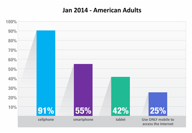
A recent survey on American adults reported:
Responsive eLearning
This multi-device world is leading to a responsive web. You find more and more websites becoming responsive and delivering a great experience on all devices. They’re also relatively future friendly in terms of expected compatibility with any new devices that may be released in the market in future.
A good example is our own website – www.upsidelearning.com. I encourage you to load this site and then play with the window size of your browser to see how the site responds.

Jeffrey Veen, CEO & Cofounder of Typekit and author of The Art and Science of Web Design says:
“Day by day, the number of devices, platforms, and browsers that need to work with your site grows. Responsive web design represents a fundamental shift in how we’ll build websites for the decade to come.”
The same holds for the need for responsive eLearning too. While the web started becoming responsive a few years ago, eLearning is just beginning to move in that direction now.
The key benefits that responsive eLearning can bring are:
- A single source solution which is cheaper to create and manage
- Enhanced reach to your mobile workforce and increased uptake
- Ability for employees to access eLearning on their own devices
- Ability for employees to access eLearning outside office hours including during travel and waiting times
- Making (compliance) training programs more convenient to complete
- Ability to track your eLearning program completions or results across device types
- Ability for employees to continue their learning experience from one device to another through bookmarking via an LMS
With more and more enterprises wanting to put their eLearning on tablets and mobiles, I think 2014 will turn out to be the year of responsive eLearning. We’re ready for that with our own Framework for Responsive eLearning Development – FRED, which makes responsive eLearning design and development easy, less costly, and reliable.