
Using Certain Types Of Visuals To Elevate Your eLearning Content
Did you know that 65% of the population are visual learners? If your course material isn’t catering to visual learners, that’s a huge gap.
But creating effective, visually engaging eLearning material goes beyond simply adding a few screenshots and GIFS to break up the text. If you want to aid your audience’s comprehension, think strategically about how you visualize your information.
Here are 5 essential types of visuals you should be using in your eLearning courses. They will help you visualize information in an engaging way and also act as handy tools for your audience.
1. Infographics
Infographics are one of the most versatile types of visuals you can create. They’re perfect for summarizing information, simplifying complex concepts, and breaking down steps. As you probably know already, there’s a ton of different approaches you can take to creating an infographic. The type of infographic [1] you create will depend on the information you want to visualize.
For example, you could create a list of infographics to summarize important tips at the end of a lesson. Presenting the information visually can make it more memorable. Plus, your audience will be able to save the infographic as a quick reference sheet for later.
Use icons and images to illustrate points on your infographic. This is an opportunity to get creative with your design! You could also use an infographic to compare and contrast [2] ideas or options. For example, this infographic compares the 3 different types of motivation. The visualization can make it easier for people to see the connections and differences between ideas.
2. Timelines
Timelines are one of the most widely used types of visuals. Everybody recognizes them when they see them. That makes timelines a handy tool for visualizing processes, progress statuses, and events.
For example, you can demystify processes by visualizing the steps in a timeline. Take "inbound marketing" as an example. It might seem like a complicated process if you were to write it out, but a simple timeline makes it easier to wrap your head around:
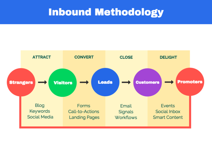 The timeline breaks down the process into color-coded steps. This simple graphic can be a helpful reminder for your audience to refer back to.
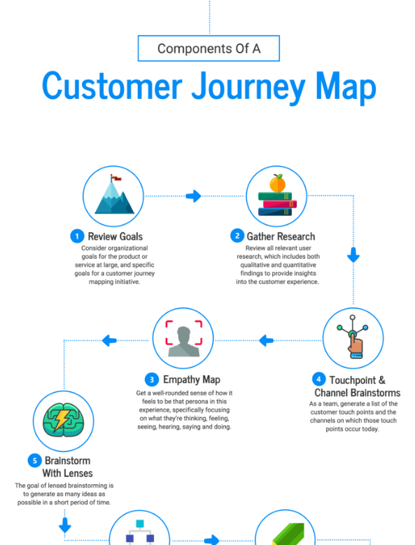
Timelines are particularly helpful if you need to cover a lot of steps or points in time. Try this: include a simple visual (like an icon) for each point in your timeline. This will give readers an image to associate each point with, making it more memorable.
Take a look at how simple icons are used to illustrate each point in this timeline:
3. Charts
A simple chart can be the difference between confusion and comprehension. A good chart will help readers understand data in 5 seconds or less.
Like infographics, there are a ton of different types of charts you can create. But not all charts work for all types of data. Make sure that you pick a chart that won’t skew your data. For an in-depth guide to picking the best charts for your data, go here.
Charts are a type of visual that you can include in a presentation slide to break up the text, or in a video to drive home important data. Their key is to keep your charts simple. Don’t try to cram too much data into one chart. Instead, stick to one central idea.
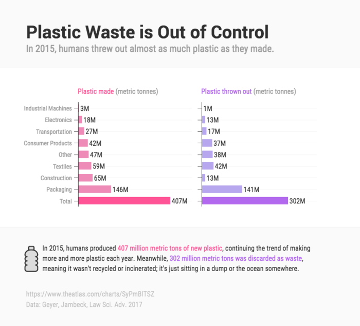
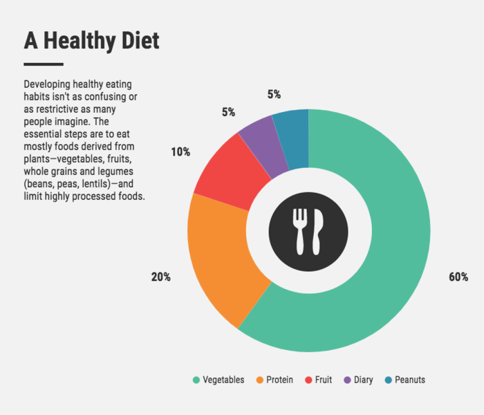
For example, you could use a chart to visualize some particularly shocking data:
 Or to show changes over time.
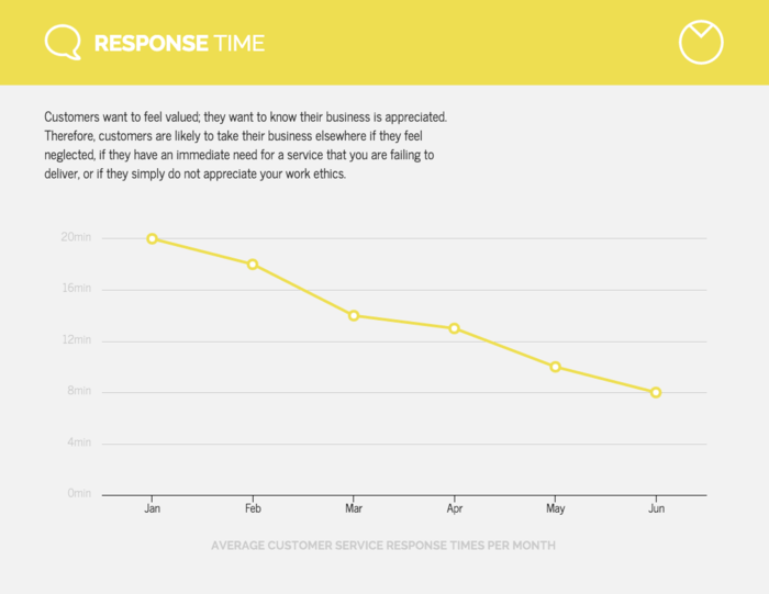 Equally important – provide a description of your chart. Don’t assume your readers will understand the chart immediately, there’s a good chance they will need a bit of context.
4. Mind Maps
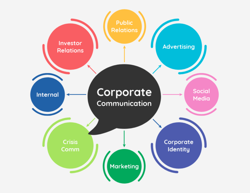
Mind maps are a super useful tool for brainstorming, connecting ideas, and showing how parts make a whole. Typically, a mind map starts with one central idea, with other ideas branching off from it.

Mind maps are useful for visualizing how one part relates to the big picture. This could come in handy if you want to show how the topic of your course fits into a larger set of skills, or how each lesson in your course is connected. It could also come in handy if you want to break down a complex process.
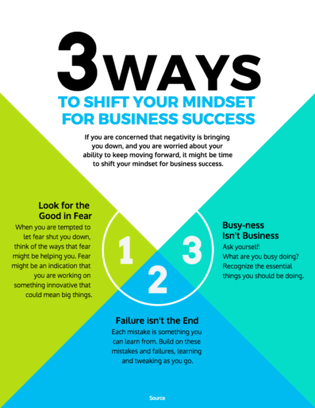
5. Posters
Like infographics, you can create posters that summarize key information from your course. The benefit of a poster is that it will be optimized for print. That means your audience can print it out and pin it up in their workspace or in their notebook for quick reference. A summary poster can be a nice bit of extra content for readers to take away from the end of a lesson. The key to designing a good poster is to not overburden your design with too much information. Keep text brief and rely on visuals to communicate information.
Here’s a pro tip: What’s the main action you want your audience to take after they read your poster? Do you want to motivate them to work on a project? Inspire them to make a change in their lives?
For example, this poster calls on the reader to shift their mindset towards business success:
Think Visually
These are just 5 of the ways you can visualize information. Really, the possibilities are endless! Look at your eLearning content, and try to find pieces of information that you think would work well as a visual. To help you get started, here are some types of information that work well as visuals:
- Lists
- Statistics
- Quotes
- Numbered steps
- Quick tips or hacks
So think visually and elevate your eLearning content to the next level!
References:
