Table of Contents
Looking for inspiration to create the best landing page for your school or elearning website? Then, you have come to the right place.
Building a landing page that has everything you need to attract more customers is a time-consuming process nevertheless necessary.
The potential benefits that come out of a successful landing page that has all the key elements it needs to gather and convert leads are invaluable. A landing page becomes even more essential when you are running a marketing campaign and you want to feature your online school to boost brand awareness and promote your online courses.
According to WordStream, the average landing page conversion rate across all industries is 9.7 percent. With 10 percent as the benchmark, you can aim for a landing page that will bring the results you need.
If you don’t know where to start, this article shares a few landing page examples that showcase online schools and their training programs in the best light possible.
Let’s check them out!
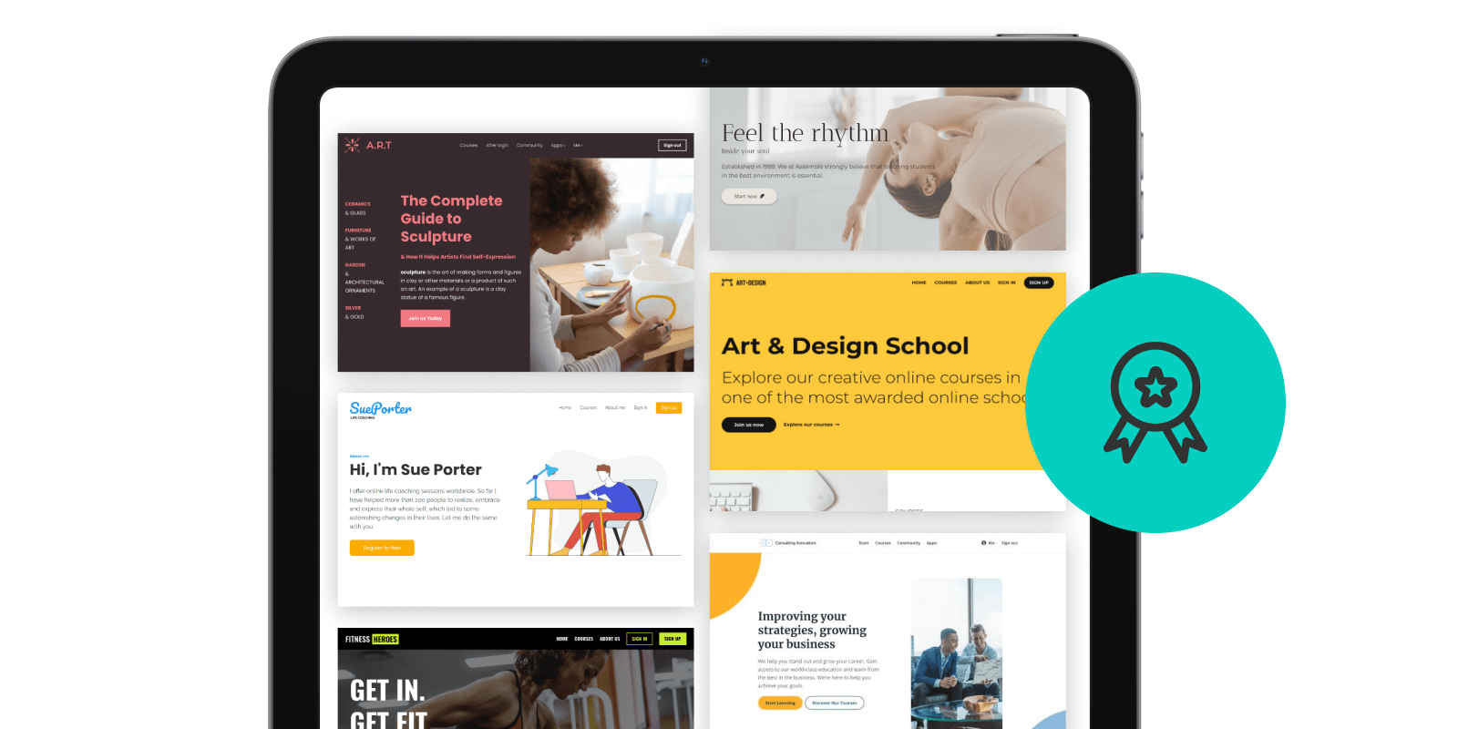
10 Best Online Course Landing Pages That Will You Get Inspired
- 1Better Lettering Course (Hand Lettering for Beginners)
- 2One Funnel Away (Steve J. Larsen)
- 3Final Cut Pro X for YouTubers (DIY Video School)
- 4PRISM (PR Couture)
- 5Creator Pass (ConvertKit)
- 6Instagram Domination (Foundr)
- 7Live Off Your Passion (Scott Dinsmore)
- 8Story School (Jamie Jensen)
- 9The 21/20 Healthcare Challenge (Greg Todd)
- 10The 10x Emails and Six Figure Emails (Joanna Wiebe and Ry Schwartz)
- 11Ready to Create a Landing Page for Your Online School?
#1 Better Lettering Course (Hand Lettering for Beginners)
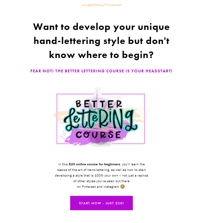
The Better Lettering course is for beginners who want to get better at lettering and the name of the course says it at once. Its unique value proposition is communicated at the top of the page and the solution it offers is teaching the basics of the art of hand-lettering with just 20 dollars.
The choice to keep the background white helps to make the landing page clean and clutter-free. The call-to-action – CTA button, is purple so that it stands out and fits with the rest of the graphics on the page but also the colors of the brand.
What’s interesting about this course sales page is that it uses the lettering artwork of the creator – Caroline, to guide the website visitor to scroll through the page and take the appropriate action.
Caroline takes good advantage of the visual element and brings creativity to the forefront. Besides, this is what the course is all about. She also takes the time to explain what is inside the course and lists the resources that students will get upon purchase.
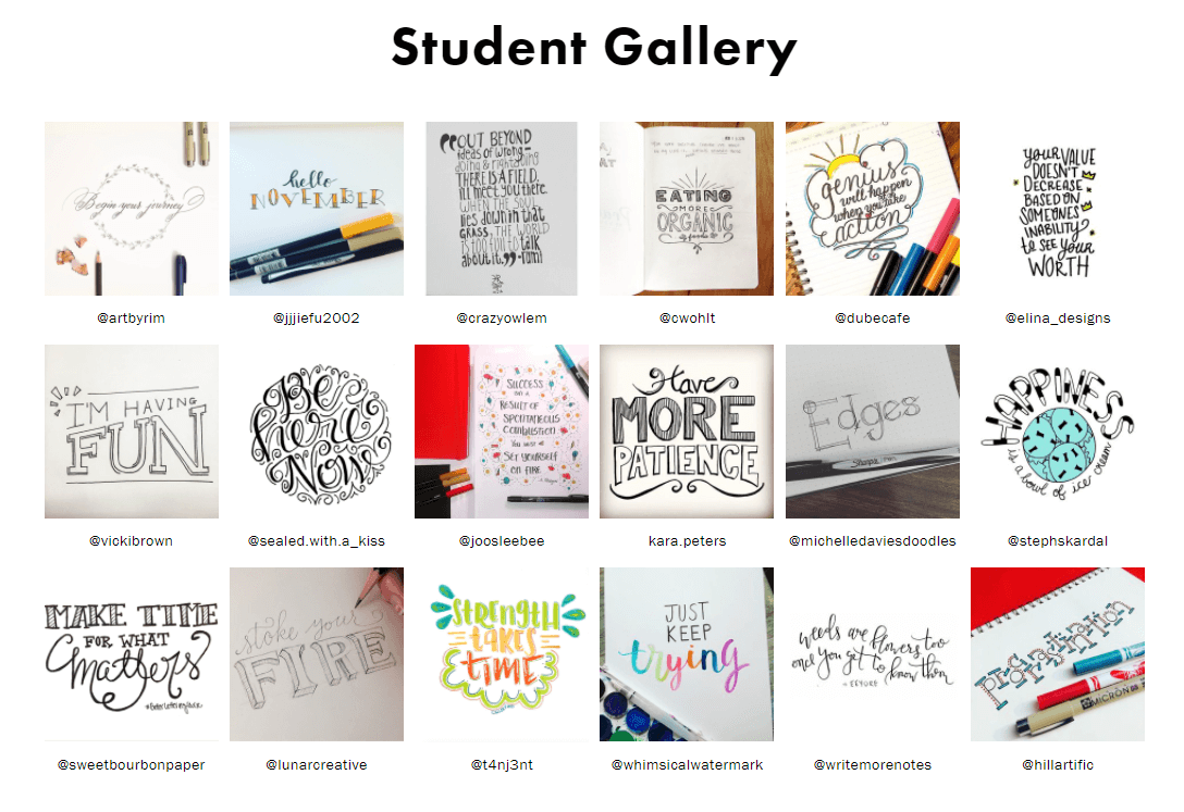
Lastly, the landing page showcases some of the students’ work through a photo gallery giving interested potential students an idea of what they can create for themselves.
#2 One Funnel Away (Steve J. Larsen)
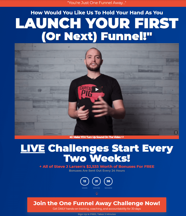
Steve J. Larsen’s ‘One Funnel Away’, is calling out to his target audience, encouraging them to sign up for a challenge. In doing so, he lets people know that the course’s resources are worth a lot of money but they come for free which is a great incentive for those who want to learn more about sales funnels.
Steve makes sure to present this challenge as the easiest way to create sales funnels and his course ‘One Channel Away’ helps to remove those mental blocks that may be preventing students from enrolling.
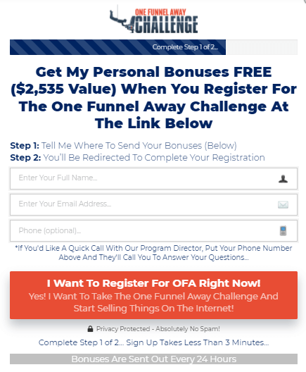
He also makes it super easy to opt-in, adding a lead capture pop-up form that allows people to register for the course and get additional bonuses for free.
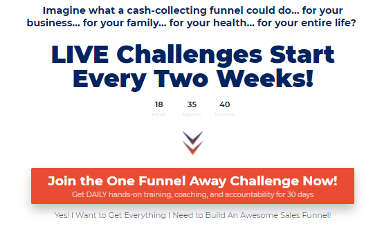
Apart from that, adding a countdown timer on the landing page is an awesome way to urge people to enroll. In this example, it is a must, since the course is repeating and accepting students every 2 weeks.
While red, blue, and green are high-contrasting colors, they work in great balance here allowing the course creator to focus on getting his message across.
The little arrows between the different sections are subtle but have a significant role to play in conversions. They slowly but surely guide the website visitor to the CTA buttons of the page.
#3 Final Cut Pro X for YouTubers (DIY Video School)
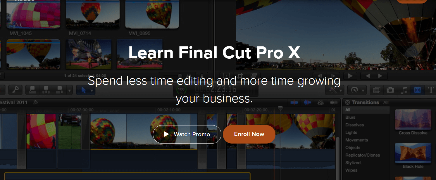
The DIY Video School presents the ‘Final Cut Pro X’ course intended for YouTubers. As soon as you land on this page, you can tell the course and the school has something to do with video editing. The background image helps to reinforce this idea, while it welcomes people on the page and helps to set the scene.
Also, this landing page greets website visitors with two strong CTA buttons in the hero section. While the ‘Watch Promo’ is transparent the ‘Enroll Now’ CTA is presented with the orange color which makes it clear it is the preferred choice by the course creator – Caleb Wojcik.
Caleb wants and expects that students will click on the latter.
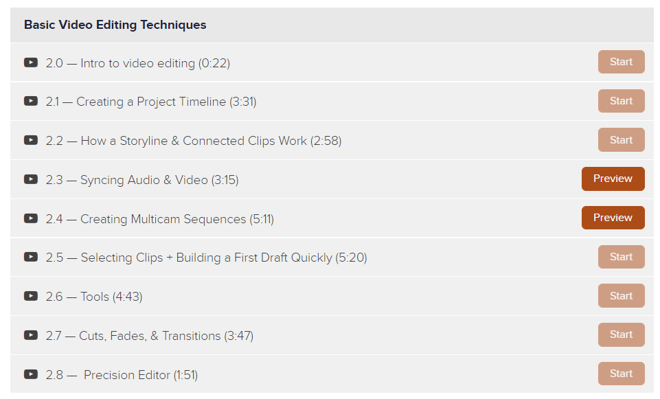
After listing the benefits of enrolling in this course, Caleb makes sure to include the course curriculum. In there, shows the series of videos that are inside the course and also adds a ‘Start’ CTA button on each.
No student gets access to these videos once they hit ‘Start’ unless they first pay for it. However, Caleb gives them free access to two videos he selected to allow them to ‘Preview’ part of the course. This is an excellent strategy that allows students to take a sneak peek inside the course before choosing to commit to it.
#4 PRISM (PR Couture)
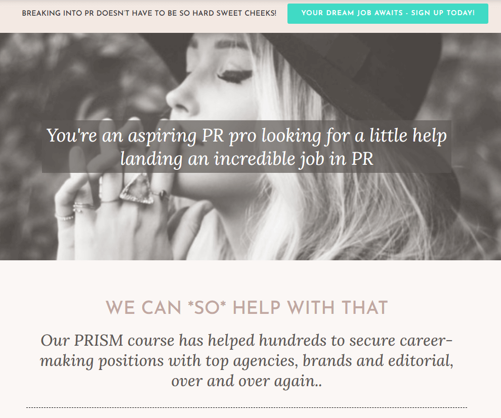
The PRISM course by PR Couture tells you what it can do for you right away. So if you want to ‘break into PR’ and ‘you are an aspiring PR’ you can ‘land an incredible job in PR’ with ‘a little help’ from them.
The copy here is spot-on, not only because it is relevant to the PR industry, but also in the way it uses positive language and addresses the target audience directly. It appears to be strong, confident, and trustful, allowing people to let their guard down and believe what is being said on this page.
The cyan color on the CTAs makes it stand out from the rest of the elements on the page which is mostly decorated with nude-like color shades.
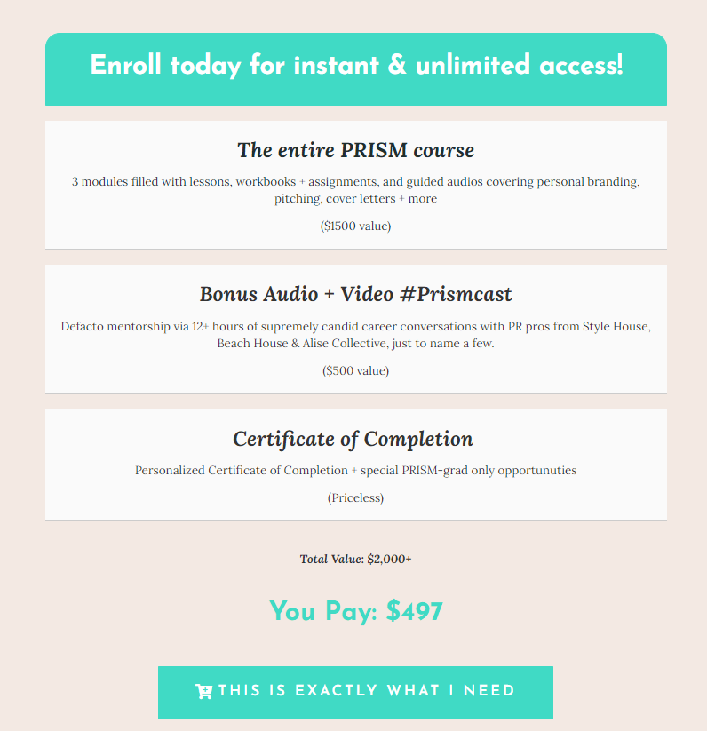
Crosby – the founder of PR Couture, believes in her course and she isn’t afraid to show it. As you scroll through the page you will see that she breaks down her course, showing people the value it comes with each package.
What comes as a surprise with this landing page is that it presents the certificate of completion as an extra asset that people can take from this course. How much does it value? Well, it’s definitely priceless.
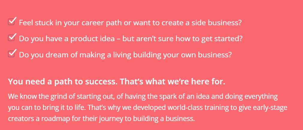
#5 Creator Pass (ConvertKit)
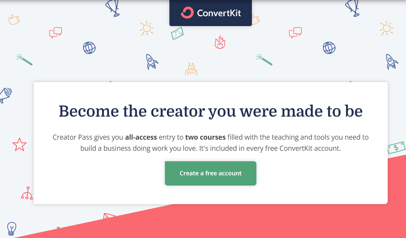
ConvertKit – one of the most popular email marketing platforms in the market, features Creator Pass – an online course that can help creators build a successful online business. ConverKit’s course sale page is not as long as others from this list, but it is equally powerful. Its minimal web design elements give out more information than intended and help people get what they need.
To get people’s attention right away, ConvertKit also addresses the main pain points that most aspiring entrepreneurs face.
Three short but targeted questions on pain points and a convincing statement that says how the company is fit to offer a solution are enough to make them answer ‘Yes’ and then proceed with a purchase.
Throughout the page, ConvertKit makes extensive use of bullet points as well. As a winning copywriting practice, adding bullet points inside the copy come with many advantages. Apart from expressing clear benefits and promises, they make the text more memorable, create symmetry on the page, and help to avoid clutter.
They are also easier on the eye and work as short headlines while reducing the need to add lengthy subheads that may end up confusing the reader.
#6 Instagram Domination (Foundr)

Foundr’s Instagram Domination course is created by Foundr’s CEO – Nathan Chan. Nathan is the person who appears in the intro video in the hero section of the landing page. Once you hit play the video starts and continues to play on while you scroll down the page, which works as a nice hook.
Foundr’s entire course sales page uses video testimonials and presents them as ‘results’. This helps to show the impact that the course had on existing customers who already enrolled in it.
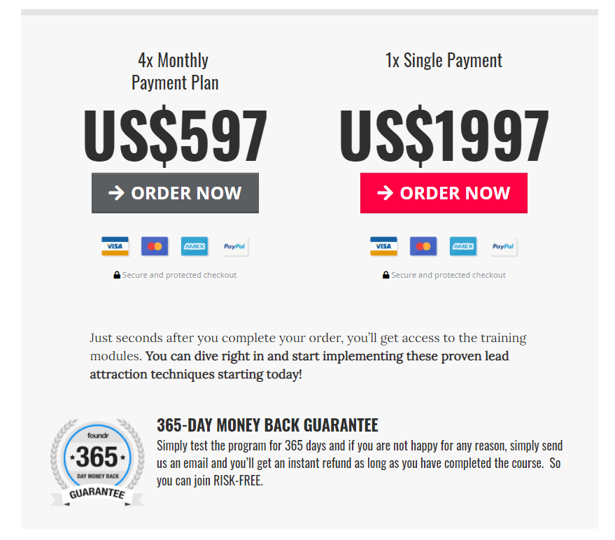
Apart from that, he makes use of quotes from big personalities like Gary Vee and Michael Stelzner from Social Media Examiner to boost credibility. Also, he uses bullet points to structure the copy and adds two pricing options while giving emphasis on his preferred choice – the red ‘Order Now’ action button.
Finally, many course creators include a FAQ section at the bottom of their homepage, but Nathan chooses to do this differently.
Apart from the ‘Results’ section, he gets to answer the most frequently asked questions with real-life examples and testimonials that provide all the evidence – social proof, potential customers need.
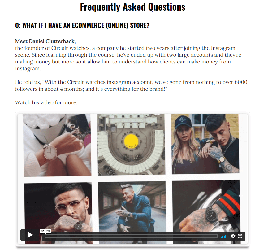
What’s great about this approach is that it shows how Foundr can go beyond mere words and the course it offers can bring the actual results people expect. In the FAQ section, you also get to see how clients with diverse demands can use this course to their benefit and fit it to their own personal and professional needs.
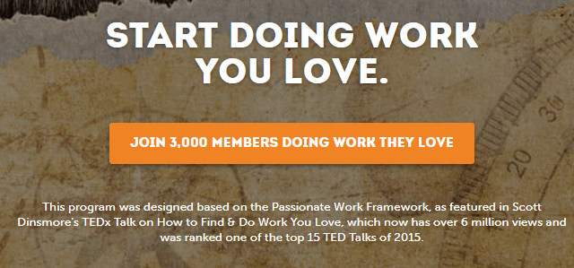
#7 Live Off Your Passion (Scott Dinsmore)
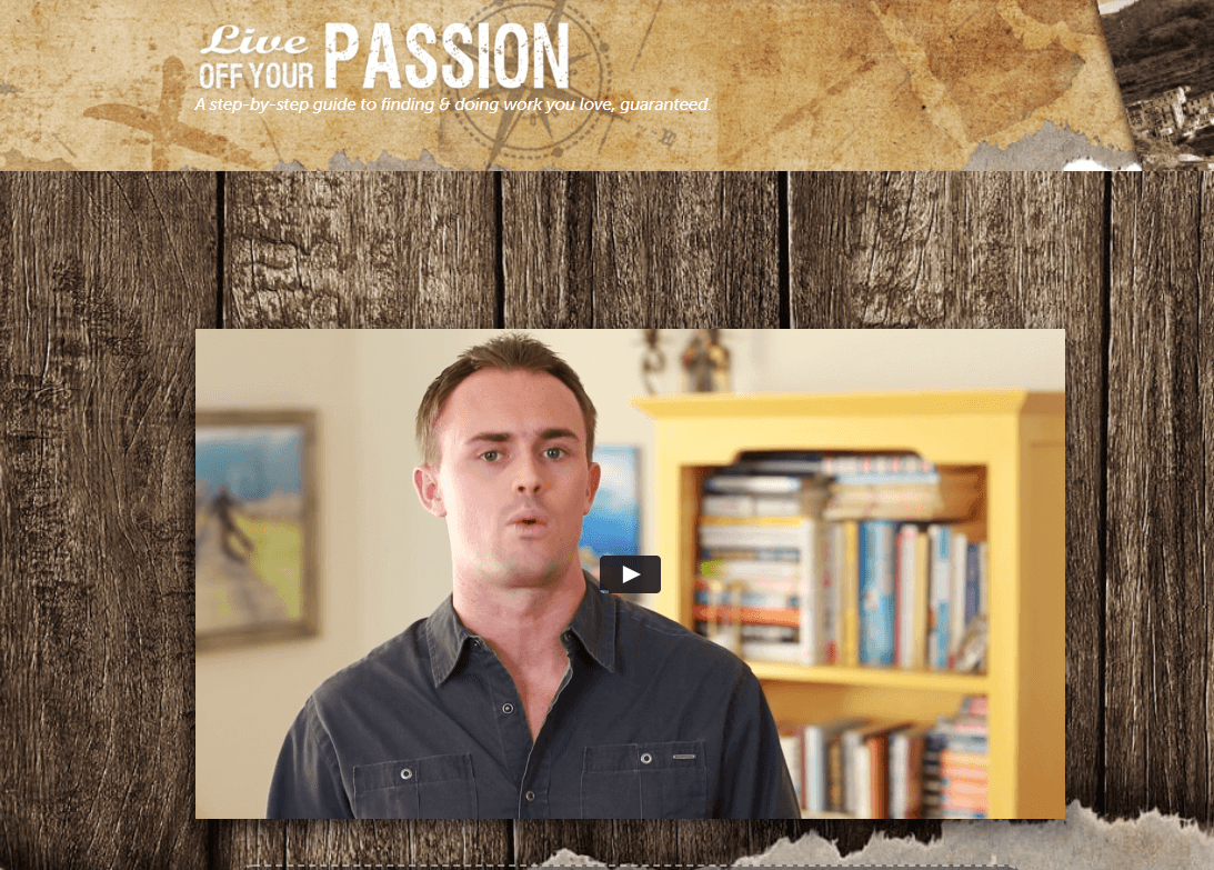
Scott Dinsmore’s ‘Live Off Your Passion’ is a course that aims to help people find the work they love and enjoy. After addressing the key problems that his target audience faces, he explains how his course has helped people get what they want and can do the same for you.
On his landing page, Scott uses social proof to get more subscribers to his email list and community. To do this he uses the most inspiring career and life transitions showing how some of his customers achieved their goals.
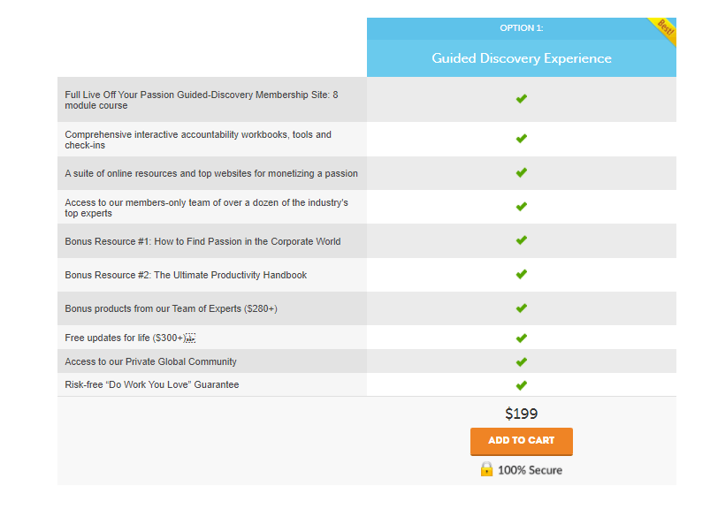
When clicked upon, the CTA button ‘Join 3,000 members doing work they love’ leads further down the page where it shows a checklist of all the things included in the work program and the main CTA that prompts people to add the course to their cart. Then clicking ‘Add to Cart’ takes them to a dedicated checkout page.
For those who want to skip all that information in between and are ready to buy the course, this is effective, but for those who are indecisive, it works better to go through the customer testimonials first.
All the other action buttons lead to the last CTA as well, which makes this the key conversion point. If Scott manages to convince people to click on the last one, he has increased his chances of conversion at large.
#8 Story School (Jamie Jensen)
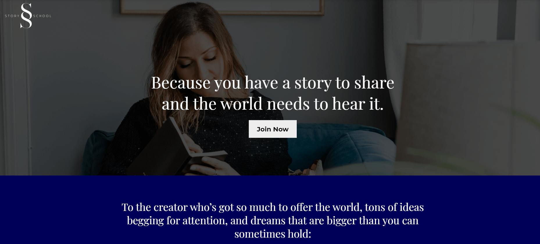
Story School is a 12-module video-based training program that teaches writers the principles of story dynamics and structure. Whether they want to write a book, create a screenplay, or a brand story, this course created by Jamie Jensen, has a lot to offer. You can tell that by simply browsing the landing page.
Even though the page uses long-form texts, it still manages to address and speak to the customer directly. In fact, it does what it promises to do inside the course, and that is creating a story – an intro, the main body, and a conclusion. Since the written word has power, Jamie decides to use it to her advantage for her own copywriting goals.
In the hero section, the header text captures the attention right away and encourages people to keep on reading.
Once clicked, the CTA under the header immediately directs people to a checkout page that prompts them to purchase the course. In order to ‘seal the deal’, there is no time to waste and as Jamie does here, there is a need to grasp the opportunity to drive your website visitors further into your sales funnel.
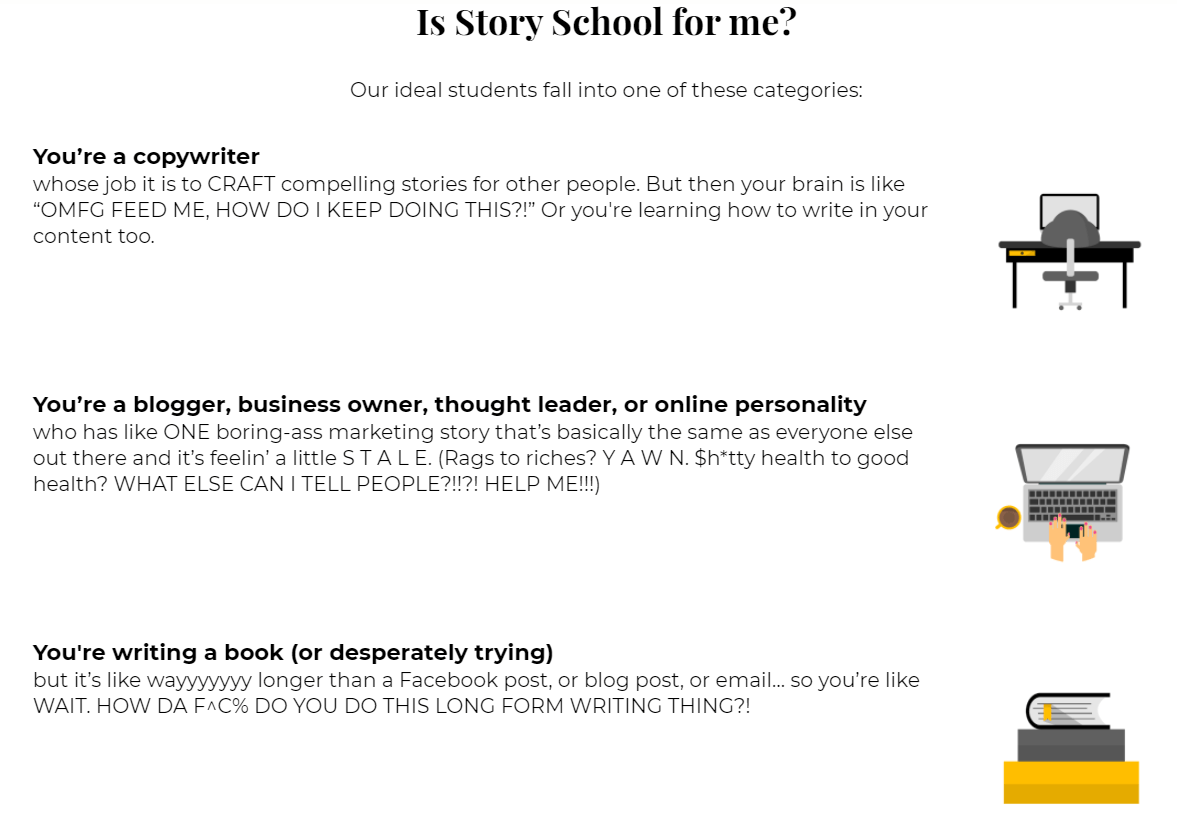
To set expectations for both ends – course instructor and student, Jamie also makes sure to include a section that explains who this course is for. To do this, she lists the categories of her ‘ideal students’ and helps writers understand what they can get out of this course.
The way she writes the copy is clearly emotion-focused. Here, she appears to be a bit more flexible in terms of the way she writes the copy. This helps to add a fun note into all the ‘seriousness’ as people try to decide whether to buy the course or not.
#9 The 21/20 Healthcare Challenge (Greg Todd)
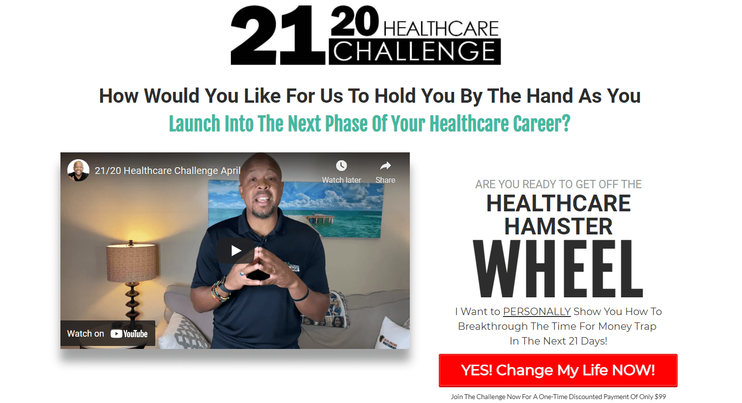
Greg Todd’s 21/20 Healthcare Challenge, is exclusively for healthcare professionals and aims to help them achieve better in their careers. As a healthcare mentor, business and career coach, Greg is able to communicate his knowledge and expertise using his sales webinars – both at the top and bottom of the web page.
Since video is more direct, it helps people understand what’s inside this course right away.
Throughout the page, Greg uses different types of fonts, font sizes, and colors, but also adds some capitalized letters to draw more attention to specific parts and words. To make the red CTAs stand out even more, he makes them pop or jump using special motions.
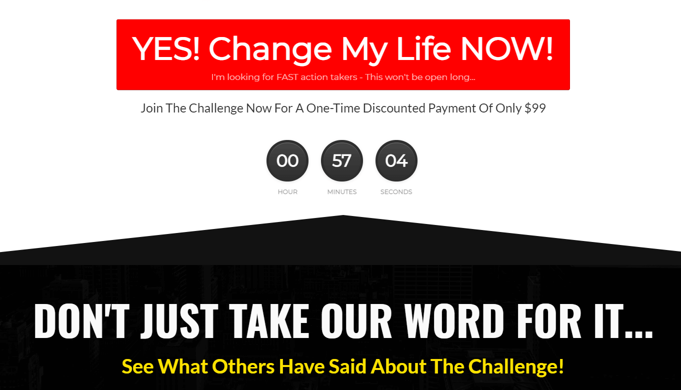
Greg doesn’t stop there, and he creates a series of video testimonials from customers who have taken up the challenge course and loved it.
Overall, this is another great landing page example that shows just how the landing page design you choose can influence the consumer’s decision. As Greg divides a section with a big arrow, he guides the website visitor to click on the action button.
Want the same effect with your course landing page?
Try out LearnWorlds website builder which is like no other landing page builder, that allows you to add section dividers, widgets, pop-ups and many other cool elements on your landing page!
#10 The 10x Emails and Six Figure Emails (Joanna Wiebe and Ry Schwartz)
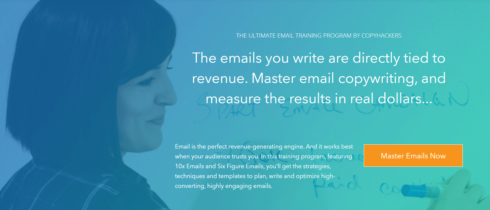
This landing page features two courses – 10x Emails and Six Figure Emails that can help anyone master email copywriting. Created by Joanna Wiebe and Ry Schwartz these two courses are bundled together and can help people further grow and scale their businesses.
The way both courses are presented on the landing page allows website visitors to get key information about each one. Going through the modules, the page explains each step-by-step giving them a general idea of what they can expect to learn.
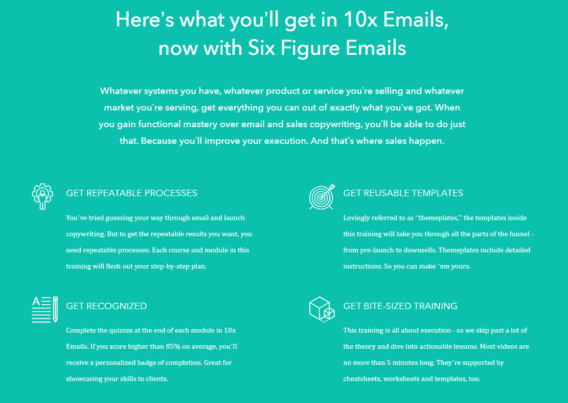
Apart from the learning aspect though, the course creators focus on the benefits of completing the courses. Getting more recognition, bite-sized training, reusable email templates, and learning all the processes of writing effective emails is more than any would ask for.
Since most people are reluctant to pay for any product online, it is important to ensure that they can carry out ecommerce transactions with confidence. Letting them know that – like Copyhackers do in this example, increases your chances of making a sale.
Ready to Create a Landing Page for Your Online School?
A high-converting landing page carries immense value, and every successful marketer knows this too well. To get lead generation and sell your online courses, you need to position all the key elements of your elearning website in the best way.
Apart from functionality, you also need to consider the copy and the design of your landing page. Add all the key elements that can make it strong – address the pain points of your target audience, use powerful media, and persuasive CTAs that can drive conversions.
To maximize your results, you need the right tools that will make it happen.
With LearnWorld’s website builder, you can build amazing landing pages, dedicated course pages, and sales pages within a few minutes.
Ready to get started? Get your free 30-day trial with LearnWorlds today!
Your professional looking Academy in a few clicks
Start FREE Trial
Kyriaki is a Content Creator for the LearnWorlds team writing about marketing and e-learning, helping course creators on their journey to create, market, and sell their online courses. Equipped with a degree in Career Guidance, she has a strong background in education management and career success. In her free time, she gets crafty and musical.

