
What is responsive e-learning design and why do you need it? Find out in this blog.

Why responsive design?
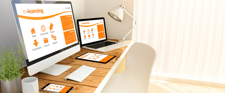
With an increasing number of people accessing the Internet through mobile devices rather than desktops, it makes sense to create online courses that are accessible on these devices. This is why creating courses with responsive design has become necessary.
What is responsive design?
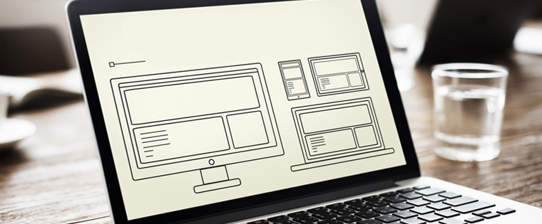
Responsive design or Responsive Web Design (RWD) is a technology that aids the creation of websites that are ‘responsive’ to the screen sizes of different devices, from desktops to mobiles. The technology uses HTML to make this possible. Responsive design frees the learner from having to adjust the zoom or pan options on their screen because the onscreen elements will resize themselves to fit the screen of the device on which they are being accessed.

With companies adopting the BYOD (Bring Your Own Device) policy, employees/learners with multiple devices will access online courses. It is also likely that they will move across different devices while accessing the courses.
With responsive design:
- Content can be created once and accessed on multiple devices.
- Content is not restricted to be displayed on a specific size or type of screen.
- The elements on a page such as the menu, footer, and images will adapt based on the device they are accessed on, which creates a fluid learning platform for learners.
Responsive design is web-based; this means learning will be accessible through a single URL. It eliminates the need to create separate web and mobile modules for an e-learning course, which makes it easier to update and maintain content.
Uses of responsive design
Responsive design is useful when the e-learning has to be accessed offline.
When the course has to be used for a long period of time, creating it with responsive design will make it easier to adapt it to additional devices, even in the future, without having to redesign the course, but allowing for content updates. Job-aids, product information, or other content learners need to frequently refer to, while on the go, become flexible when they are created with responsive design.
For learners who live in a multi-device, multi-screen world, where you have no control over the device they will use to access e-learning, responsive design is the ideal choice. Gain insights on the what, why, and how of responsive design for e-learning by accessing this free webinar Designing and Developing Responsive eLearning for Multiple Devices.
Responsive E-learning Examples
Let us look at some responsive e-learning courses developed by CommLab India.
1. Online assessment on communication styles
The course was for a client who wanted to develop an online assessment on communication styles, modeled on the Myers Briggs communication style assessment.
The client wanted the results displayed in a graphical format and the course had to run on all mobile devices such as smartphones and tablets to be accessible to their employees working in locations such as retail outlets and warehouses. We used responsive design to meet the client’s requirements.

2. Training on process mapping
This course on process mapping was for employees of a footwear manufacturing company. The course was created using responsive design because it had to be:
- Accessible on iPads
- Accessed by employees spread across the globe

With learning design taking a device-agnostic approach, responsive design can be the solution to your design woes. Learners can access such courses on any device, at any place.