
Despite the continued growth of eLearning, classroom training is still alive and well. That said, not all ILT is created equal. In our last article, we touched on how instructors can be made better with the right materials. So in this article, we’re going to dive a bit deeper into those same materials (namely the Instructor Guide and Participant Workbook). We’ll look at what made them awesome, and how they helped improve both the instructors and the overall training experience.
The ID Audit
The first step in the process for this project, was performing an ID audit on the materials. The client was full of SMEs, but they acknowledged that the materials could use some ID TLC. Are you ever faced with another department handing over a “complete” slide deck, asking you to “make it look pretty” for them?

Even if you have mad design skills, isn’t part of your job to make sure the content is educationally sound and engaging for the audience? Of course it is. Thankfully, this client recognized the need for us to go through that effort. So, our initial pass through the materials was to clarify and rectify scope, sequence, and reinforcement of learning. In our case, most of what the client started with was pretty good. That said, some sections needed to be longer or shorter, some needed to be moved around, and other places we needed to beef up reinforcement of the learning points.
Beauty is Only Slide Deep
The next step was improving the slide visuals. As an instructional designer, you know this is more challenging than just making something look cool for the sake of looking cool. After all, this is still an educational exercise, so the slides need to look cool while supporting the learning process.

It’s your job to take what the client provided and ensure the visuals don’t distract from the major learning points. Sometimes this can be supporting images. Sometimes it can be charts or graphs. And sometimes it can even be a little white space. Onscreen info needs room to breathe, so don’t cram too much into a single slide. This goes hand-in-hand with appropriate chunking, so make sure your content flow and your visuals align on all fronts.
Anatomy of a Great Instructor Guide
Not all Instructor Guides are created equal, and not one style of IG is right for every situation. For our client, they had a wide range of presenters. They needed something that could help more inexperienced trainers while not getting in the way of seasoned vets. We also needed to provide enough structure so that everyone was presenting a consistent message.
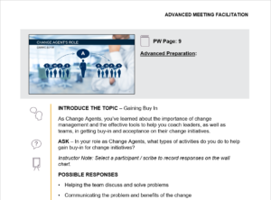
The solution we provided had 5 main components:
- Small thumbnail of the slide for orientation
- Reference to the corresponding Participant Workbook slide
- Highlight of any advanced preparations needed for this slide
- A set list of directives for instructors to follow
- Custom icons corresponding to each directive for quick reference
Note: If you’re going to customize the Notes page layout, it’s important to do this from the Notes Master to ensure each page is consistent!
Let’s review what each of these added to the overall usability of the Instructor Guide.
Thumbnail: This isn’t anything special, but the idea is to make the image small so it doesn’t take up too much page real estate. Don’t be tempted to remove it! The slide is the center-point of the materials, so instructors still need to ensure they’re keeping aligned with the currently displayed slide.
Reference to Workbook: These course materials included a robust Participant Workbook (which we’ll look at momentarily) so the Instructor Guide gives a cross-reference to the corresponding page in the workbook. The course is full of activities and structured note-taking opportunities, so it’s helpful for the instructor to guide learners to the correct pages from time to time.
Advanced Preparations: Most slides don’t require advanced prep, but some activities do. This could be flip-charts with pre-populated information or large pages taped up around the room. This section gives the instructor queues for when they’re practicing the presentation. This ensures they have everything in place for the activities to run smoothly.
Directives: Since this client had such a range of instructors, we wanted to create a consistent structure and to tier the prompts. To accomplish this we created an established list of directives. These directives documented each step of the training flow for the instructor. Additionally, the directives followed by nested content supported both new and seasoned presenters. Directives were bold and easy to see at a glance. For those that knew the content, they could ignore the supplemental information. For those that needed more of a crutch, the additional information was there both as a practice aid before class, but also to fill in any gaps in a pinch during the presentation.
Icons: These go hand-in-hand with the directives. They provide a high-level visual queue for those instructors that know the material well. They can glance at the icons and see the next thing coming without stopping to read the content.
Fully Engage Your Audience with a Killer Workbook
Sometimes you need to bust out a cheap course, where “checking the box” is priority #1. We get that. In those cases, PowerPoint’s 3-up (the 3-slide per page printout with the lines next to each thumbnail) can serve as a place for people to scribble notes. However, those “workbooks” go untouched more often than not in most classes. Reality check: most people stink at taking notes (present company included). The 3-up is only marginally better than a blank notebook, which isn’t enough to kick-start note taking for most people.
Tons of students WANT to take notes. They want to leave the class with a resource documenting the best information from the class they just attended. But unless someone is good at writing and listening, what they end up with is typically minimal, scattered, and not super valuable. On the opposite end of the spectrum, some people consider handing out a “manual” with all the info already in it. The problem here is that this gives a message to students that you’ve already handed them everything you’re about to cover. What better invitation to play on your phone or check email the rest of the day?
Facilitated Note-Taking For The Win
To truly engage students in effective note-taking, you need the right balance. This is what we call Facilitated Note-taking.
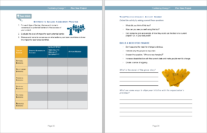
So, check out the pages above. There’s lots of good information already provided within the workbook. Right from the start, students can see this workbook will be a resource for them after the class. This encourages them to add to it, because they’re planning to keep / use it. But the key is that not all the information is in there. Some sections have headers, but need the details populated. There are reflection questions to complete or tables / charts to fill in.
All the pages have various prompts for users to complete sections of notes, rather than needing to document everything from scratch. This gives structure to the note-taking, and ensures that things will be well organized when the class ends. Additionally, all the activities from the course are contained within the flow of the workbook. No appendix (except for a glossary or other supplemental information) and no extra handouts. Everything valuable is in the workbook, where it falls within the course.
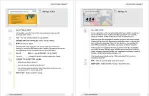
Tie the Workbook to the Instructor Guide
To ensure the workbook remains a central part of the experience, it’s tightly woven into the rest of the materials. As you can see in the images above, there are no screenshots of the slides. Instead, we used various graphic assets to align the workbook page to the corresponding slide. Additionally, the Instructor Guide (shown below) always references the corresponding workbook page. This way the instructor knows what the students are looking at, and can refer them to a certain page at any point.
Some people at this client saw the value in the custom workbook solution right away. It was one of the “must have” aspects of the new approach. There were some others that feared the extra info, lack of slide screenshot, and reduced white space would be more distracting than a basic note-taking packet. However, once we did a pilot section of the course, everyone was a convert. We’ve repeatedly found that this style workbook encourages students to engage. This obviously benefits them in-class, but also translates to better retention and provides them with a more robust, yet personalized, resource to take away from the class.
So, for any of your high-stakes ILT classes coming up, consider the benefits of more robust materials. While it may not be the right solution for every class you create, it can really push your feature courses over the top.