


When PowerPoint first came out as an alternative to whiteboard and paper presentations it looked fresh, dynamic and really did its job of engaging participants and making learning fun and entertaining. However, overuse and rapid developments in technology rendered this way of presenting information rather dull. The power of making its point has diminished greatly since most often people just click ‘next, next, next’ so they can get to the end and then forget all about it.
But all is not lost. Keeping learners engaged simply requires some fine tuning of the way the slides are visually designed. Heavy text, obsolete fading effects and cluttered information all have to go and be replaced by attention-grabbing, point-making state of the art design.
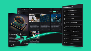
4 Ways to effectively use visuals in e-learning
It sounds like a lot of work but if one follows a few simple guidelines, the results will come surprisingly easy. So check out these four tips on how to best use visuals when designing online training courses:
-
Allow for white space
It might not seem so at first but in an e-learning course white space is almost as important as the actual content. Where graphic design is concerned, each empty space on a screen has a purpose. Using these spaces judiciously manages to deliver the content in a balanced, easy to grasp manner.
White space is meant to help learners see what is really important and focus on that information instead of getting confused by too much text or simply decorative images. Providing enough empty space on the slides makes the screen pleasant and renders a calming effect. In its turn, this creates a level of comfort that encourages the learner to focus on the content without the hassle of confusing intricate methods of viewing the information.
It’s important to keep in mind that learners have only a few seconds to look over the screen and get an impression. If they will find it too crowded or confusing they are very likely to simply skip over it.
-
Use visual frameworks and animations
The purpose of any learning material is to be remembered and replicated in real life. In today’s highly visual world it is important to harness the power of imagery in online learning modules. Once the order of the information is set, it is time to figure out the layout and the extra elements that will be used in building the module.
Animations will prove of real help as they can pace the flow of information and ensure that the audience is always focused on the right thing at the right time. Since they are so popular and entertaining, they can also be used as the main means of rendering the content and get the learners to interact and assume an active role in the process.
There are also very many ways of transforming text information into visual material:
- graphs and pie charts show proportions and percentages
- timelines are great for rendering sequences of dates
- hierarchy arrangements can show how things are ranked in layers (organizational diagrams for example)
- relationships between elements can be illustrated with the use of clusters
- elements that fit together can be presented in jigsaw form
- connections between a central concept and adjacent ideas look good in the shape of a mind map
-
Images should really be worth a thousand words
The pictures in any learning material need to be meaningful themselves in order to bring any value to the module they are part of. The information is the essential data while images play a complementary and pivotal role in making the desired lasting impact.
Achieving this is easier if the images manage to get an emotional response from the audience. The ancient playwrights were very much aware of this since what they sought with their writings was for the public to achieve catharsis – a purification through emotions.
Of course the designer also needs to be fully aware of who the main audience is in order to be able to pick appropriate visuals. Since the learning content will be viewed in a corporate environment by employees who may come from different cultures and have varied sets of core values, it is imperative that all images are politically correct and don’t have any shocking or offensive potential to anyone.
Furthermore, actual pictures are preferable over clip art as they look a lot more professional. Needless to say that the quality of the chosen imagery also plays a big role in how the user will perceive the entire course.
-
Make the content interactive
If you go into a big electronics store, there are bound to be children over by the big screens, gaping at the colorful images playing on it. You’ll see that if those screens are within their reach, younger kids will touch them and try to scroll up and down. It’s because they have seen their parents do so with smartphones and tablets but also because there is a natural human desire to interact with the environment and alter it.
Grown-ups know better than to aimlessly touch a laptop screen in an attempt to move elements around but if given that possibility, they will enjoy it just as much. Interactive activities generate curiosity, and in its turn this leads to enhanced information retention. Using the mechanics of online gaming also has the power to motivate and engage, making the learning experience a memorable one.
Final thoughts
Power Point may well be in a rut but there’s no reason not to get out with it with the help of smart and engaging visuals. All instructional designers need to do is spruce up their visual design skills and keep their audience in mind when putting together learning materials.