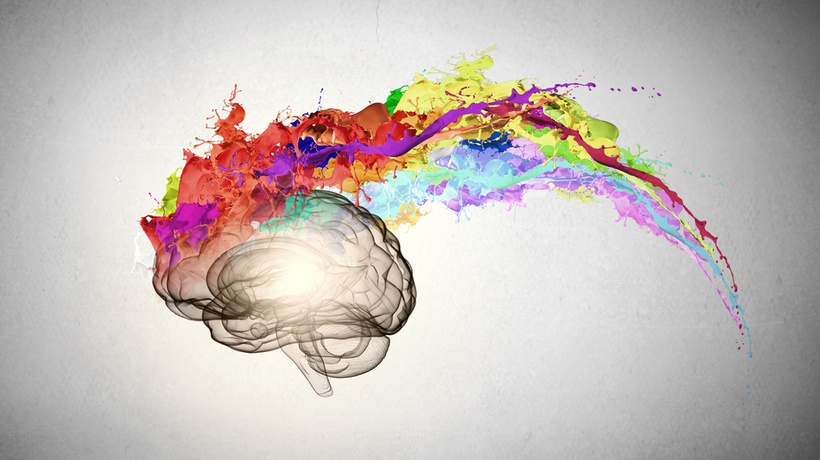
Discover The Role Colors Play In Digital Learning
It is a scientific fact that color plays a great role in helping human beings learn better by affecting their perception and evoking different emotions. As Learning and Development (L&D) and Instructional Design are wholly based on helping people learn better through the use of psychological triggers, understanding how to use color to design better digital learning is something every Instructional Designer should know. Before we lay down some tips on how to use color in your design, let us first have a look at the subject of color psychology, or how colors affect a person’s psyche.
Color Psychology
When a person lays eyes on an object, the eye registers the color of the object, communicating with the hypothalamus in the brain. The hypothalamus in turn signals the pituitary and the thyroid glands, which secrete chemicals that affect a person’s behavior. Colors influence a person’s behavior so much that when a person decides how they’ll interact with an object, 60% to 90% of that interaction is determined by color. Color psychology has been used by marketing teams of organizations for ages, and it is time that Instructional Designers take advantage of it too.
Color Associations
Every color is associated with a feeling or state of mind, and it is important for designers to understand these color associations if they’re to use them in their digital learning design. However, it should be noted that these color associations are just guidelines to be taken with a grain of salt and not hard and fast rules. How a person interprets color is largely dependent on their personal preferences, experiences, cultural differences, upbringing, as well as context. The following are general color associations that have been found to evoke certain feelings in people.
- Blue
Blue signifies trust, peace, order, and loyalty, and is a favorite of corporate organizations. Blue should never be used with food as it curbs hunger. - Yellow
Yellow is indicative of happiness, fun, or playfulness, and thus is used by brands that want customers to associate them with happiness; for example, organizations that deal with toys, candy, food, adventure sports, etc. Yellow is also used to bring attention to something, which is why it is used in traffic signals. - Green
Green is associated with nature, creativity, and peace. It is usually used by organizations that want to associate themselves with nature and the environment. Green is also associated with safety and “doing things,” which is why it can be used as a Call-To-Action in digital learning courses. - Orange
Orange is associated with a sense of urgency, but also fun. Orange is an overwhelming but inviting color, which is why it is used by eCommerce companies on their “Add to Cart” buttons. It can be used in digital learning to influence learners into clicking a button. - Black
Black has long been associated with luxury, sophistication, elegance, timelessness, and it has a classic feeling to it. It is used by brands that sell high-end items. Using the right tone of black is very important in Instructional Design, as it is a common color for text. - White
White again is a very common color, it is associated with spaciousness, freedom, and majesty. White works well with other colors to accentuate the feelings associated with those colors.
How Do You Use Colors In Instructional Design?
Now that you know what common colors are associated with, let us see what can colors be used to do.
- Reduce boredom and passivity (red)
- Stimulate mental activity (yellow)
- Reduce confusion (blue)
- Soothe eyes (green)
- Improve attention spans (warm colors)
- Direct attention (bright colors)
- Improve readability (contrasting colors)
- Enhance learning and comprehension (as opposed to black and white)
- Improve recall (color images)
- Set the mood (warm colors are stimulating, while cool colors are calming)
Conclusion
You can use colors in various combinations to affect learners in different ways if you adhere to color psychology. Don’t use more than 3 tones if you’re just beginning to use color psychology in your courses (you’ll get better with time), and remember to use colors in a 60:30:10 ratio rather than all 3 in equal amounts. Read up on color psychology and color theory to get a more detailed idea of what colors to choose for your courses.