
Calling all eLearning aficionados! We’re back with a brand-spanking new blog post all about eLearning assessments. When we work with subject matter experts to develop multiple-choice questions we see the same mistakes again and again that make a big impact on the validity and reliability of assessments. But don’t despair, we’re going to show you how to fix them!
Blog 

12th Nov 2020
How to create effective visual training content
- Written by: Emily Pinch
- Categories: Effective eLearning, Visual communication
- Comments: 1
Training. A word powerful enough to send shivers down the spines of those tortured by countless uninspiring, bullet point laden training presentations on… You can’t even remember! Training content tends to be associated with being dull and ineffective, but it doesn’t have to be this way. Inspire, engage, and transport your audience away from the land of lifeless training and into the world of compelling visual content. Here are some tips on why and how you can make your training content more effective through its structure, visuals, and design.
WHY your training content needs to be visual
“If learners think that it looks bad, you may have lost a good percentage of the battle in getting them to pay attention” – Patti Shank, Director of Research, The eLearning Guild.
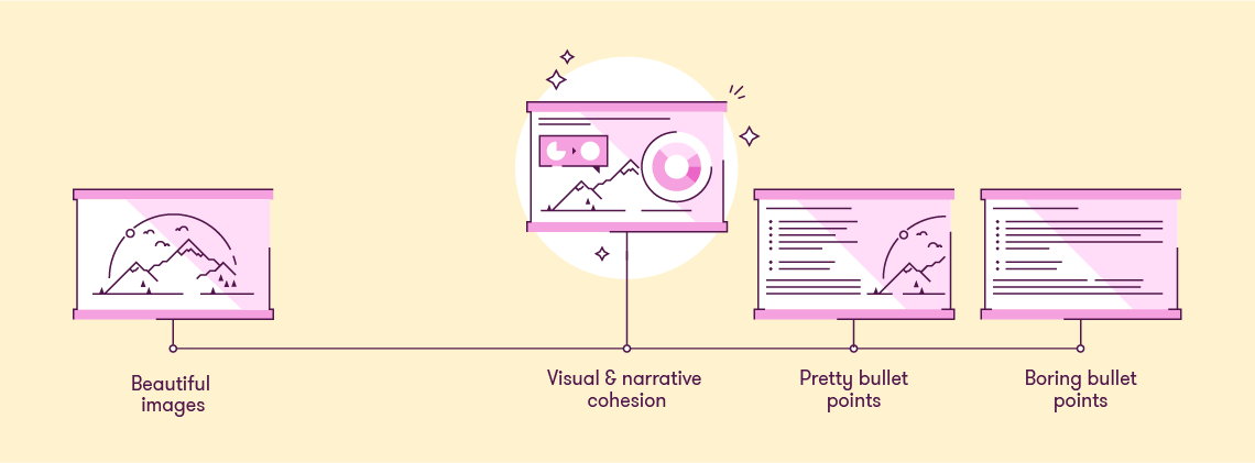
How do we avoid falling into the trap that Patti describes? The first thing we can do is get rid of all of those nasty bullet points.
But often this pushes us to the other extreme – where instead of bullet points, we have beautiful Instagram-worthy images and no text at all. Yes, they look nicer, no they don’t help us understand machine learning, or a sales cycle…
Then what happens is we try and combine these two ideas – take our bland bullet points and put a nice image in the background. Again it looks nicer, but it’s not helping learners understand anything more deeply.
For that there’s another way. It involves visuals that help explain the content, with short labels instead of full bullet-pointed sentences; the images are stunning, but also meaningful; and crucially the visuals don’t makes sense on their own – they need a presenter or narrator to guide the learner through the content.
That’s all lovely isn’t it. But how do you reach that happy medium to create this effective visual training content? Let me explain.
HOW to create effective visual training
What tool to use?
PowerPoint.
Training content can be distributed to learners in various ways: it could be presented in person, presented online or be a self-led online course. Whatever the scenario, PowerPoint gives you the right balance between quality and cost to support these various use cases.
PowerPoint is great for rapid learning content creation, but some eLearning and training content providers often produce tedious ‘click through’ courses that send people to sleep. When used properly, PowerPoint has all the tools to enable you to animate visuals, add interactivity and create well-designed slides – the perfect ingredients for a tasty training treat! Animations will bring static visuals to life and can aid the explanation of tricky concepts, while interactive elements engage the user and can be used to reveal content or navigate self-led courses. Not convinced your training content needs to be more visual? Read on…
You can create great training material in PowerPoint, but if you’re after something different, check out our guide to PowerPoint alternatives.
Effective content
Bullet points are a poor choice.
Training content often falls unsuccessfully between positions. “Proper” writing – like in a book – works fine. Animated or video content – like on TV – works fine. Audio-only content – like the radio – works well too. But, a lot of training content somehow fits in the middle – mixing trite bullet points (not full prose), with audio that conflicts with the text. Even though this approach doesn’t work, many persist with it.
The most engaging content follows a well-structured flow or story. It’s important to get this right first so you have something solid to build on when moving onto visuals and design.
Top tips when structuring your content:
- Identify your key message or story: Make sure your key message is clear – what do you want people to remember from your training? What do you want them to change or what action do you want them to take?
- Ensure relevance for your audience: Continually tie your content and key messages back to your audience and their situation, so they can see the relevance in the material. This will help them to better understand your key message and make them more likely to remember and act upon it.
- Have a solid structure: Often the framework of Problem > Solution > Impact is a good one to follow. Tell a story with your structure and take your audience on a logical and flowing journey. For more inspiration, have a read of our blog post on how to use familiar teaching principles to better structure your content.
- Limit bullet points and text: Your slides are for your audience’s benefit and shouldn’t function as your own personal teleprompter. If your slides say just about everything that you say, then your audience won’t know where to pay attention – to you or to your slides
- Remove the nonessential: This applies to the content of your talk and to the visuals on your slides. Cutting the superfluous is one of the hardest things to do. Whilst all your content may seem important, if you are limited on time then you need to really cut your content and focus on what essential messages to include.
- Focus visual attention: Your slides should complement your verbal message, not detract from it by unnecessary visual clutter. Don’t overwhelm your audience by throwing all your content at them in one go, their focused visual attention is short so split out your points into shorter bitesize chunks which are quicker to digest. Use animation to break things up and stagger the entrance of information or visuals, especially if the content is complex.
Once you’re happy with your content, it’s time to translate your message into meaningful visuals.
Effective visuals?
Decoration isn’t enough.
Decorating text-based training content isn’t enough to actually create visual training content. It isn’t visual training content unless the visuals actually help do more than just make things look nice. Printing a book on patterned paper doesn’t create a graphic novel. Putting a nice picture in the corner of a PowerPoint slide doesn’t create visual training content.
Just adding pictures doesn’t mean you’ve enhanced the content. This is the difference between decoration and visualisation.
Visualisation is essential for effective visual training content
If you want to create visual training content, then you need to use visualisation to create material that actually helps your learners understand what it is that you are trying to help them learn. Think charts, diagrams, pictures, animated sequences. Think of the thing you might sketch on paper or a flipchart if you were trying to explain something face-to-face. Then make that visual training content using a tool that works for you. PowerPoint isn’t the only way to create your content, but it can be one of the easiest, and it plays (relatively) nicely with Articulate Storyline and Adobe Captivate.
Top tips for visualisation:
- Establish relationships within your content: Is there a process or journey you can use as a theme throughout your presentation? People remember stories that flow well better than disjointed messages.
- Use relevant images: There’s nothing worse than a cheesy stock image that has nothing to do with what you’re talking about. Only use images that support and enhance your message rather than distract from it.
- Explain your graphs and charts: Charts can be complicated; you often need to see all the detail to understand the bigger picture. What’s important is that you guide people through your charts. Using animation to build things up in a logical sequence and then highlighting trends, or key data points will help your audience understand the chart and what the implications of it are.
- Cut down text on slides: Keep text to a minimum and break up longer points into key words that are much easier for your audience to take in. Pairing up key points with an icon enables quicker recognition of terms, making it easier for people to take on information, so they can spend more time thinking about the content/implication/outcome or listening to the presenter talking.
- Show locations on maps: If you have a list of locations, try animating them across a map. Create your own editable map to show locations around the world and how they might all connect, global route maps for travel or logistics or to link data to specific locations.
- Use timelines: Dates and events are so much easier to understand when you arrange them on a timeline. They also look much nicer than a bullet-pointed list with some haphazard illustrations.
- Replace text with labelled images: Why have a paragraph of text when you can label professional product images or annotate parts of a complex diagram. Use animation to reveal labels one by one to stagger the information, making it easier for your audience to follow along.
- Consider a variety of formats: Different formats provide a different type of experience for your audience – audio, visual, video, interactive – a mixture of a few will have the best impact and keep your audience engaged. Variety is key, especially for self-led eLearning courses.
- Use animation: Visualising your content is great, but animation is key for pacing the flow of information and keeping your audience engaged. Instead of revealing a complex slide all at once, build it up step-by-step. This gives you the opportunity to talk about each point individually, synchronising your narrative with your visuals.
For more helpful tips on creating more visual presentations and eLearning, check out this article.
So, you’ve figured out what the most effective visuals are to convey your all-important key messages, but how do we make them LOOK awesome?
Effective design?
Bad design puts learners off.
When it comes to training content, your audience will be quick to judge your presentation by its visual style. If your training looks awful (100 slides on a white template, six long bullet points in unmatched fonts, anyone?) learners will expect the worst. If the content is good but the presentation sucks, your training becomes demotivating and demoralising.
So, don’t let your slide design let you down, here are some key principles of presentation design that will help make your visuals more effective…
- Use high-quality graphics: High-resolution images will truly help enhance the visual impact of your slides. Unsplash is one our favourite free stock photo sites but there are lots of other sources out there. However, good graphics won’t work if they are plonked on your slide without any thought. Use alignment and cropping to resize and arrange your images neatly, or use the image to tell part of a story.
- Image editing: You don’t need fancy photo editing software to adjust your images, you can do a lot just within PowerPoint itself! Head to the ‘Picture Format’ tab in the ribbon within PowerPoint for various adjustment controls. If you want to take things further, here is a guide on custom image cropping, perfect for when you want to crop to specific shape or ‘cut out’ part of your image.
- White space is important: Whilst high quality images look great, it’s important to leave space for other content on your slide. Create areas of contrast with clear focal points to focus your audience’s attention on the key information.
- Choose your fonts well: Too many different fonts in a slide or a presentation can be distracting, limit yourself to one or two – we’ve got a good guide to help you if you’re struggling to make a decision. Generally, sans-serif fonts are often easier to read on slides than serif fonts. Font size also matters, the less text you have, the larger your fonts can be. For help on choosing the right font or making sure your text formatting is consistent, check out our tips and tricks.
- Use grids to guide you: A grid system helps to lay out your content in a clear and consistent way. Grids help you organize your content into easy to follow sections whilst eliminating wonky alignment that will distract your audience.
- Colour themes: Setting the right colour palette is essential, it gives everything a consistent feel and allows you to adhere to your brand. The best way to handle colours in PowerPoint is to set your template colour theme. You can also use colour as a language to convey meaning and help your audience understand the content, for example red for wrong, green for right, yellow and black for danger.
But one word of warning! Attractive training content is necessary for success, but only if you’ve put effort into consolidating and visualising your content first!
So, there you have it all the tips and tricks to help you transform your training content into effective and memorable experiences! We all know why our content needs to be more visual, but now you know how to get there. Spend some time on editing your content, think about the best visuals to support your content, and then use the key principles of presentation design to tie it all together beautifully! Your audience will thank you for it, trust us.
Leave a commentRelated articles

01st Dec 2023
Presentation tips & tricks advent calendar
It’s finally here, the holiday season! As the nights grow longer and the air grows colder, we know that all you want to do is settle down near a roaring fire, and snuggle up under the blankets with a good book PowerPoint presentation. Well BrightCarbon are here to help, with our festive presentation advent calendar.

23rd Nov 2023
Improving CPD from the ground up
As a presentation agency, we know a thing or two about keeping audiences engaged with effective storytelling and eye-catching design. So, we put together a few pointers to help your CPD blossom and get your audience buzzing!
Leave a Reply
Join the BrightCarbon mailing list for monthly invites and resources
Tell me more!BrightCarbon is our “go to” for all of our professional presentations, always delivering high quality projects on time and on budget.
Cynthia Rogan Apex Learning

I have read your blog its awesome