 If you’ve ever seen NBC’s popular show The Office (U.S.), you’re probably familiar with the infamous “Dinner Party” episode where Michael Scott and Jan host a dinner for a few work colleagues that goes horribly wrong. *Spoiler*: the episode ends in a huge screaming match between the couple where Jan throws a “trophy” at Michael’s TV and the police are called, all while their guests are still there. The evening can be summed up as the following for the guests there: chaotic, frustrating, impossible to navigate, unpredictable, and inconsiderate of the guests’ experience (but obviously hilarious for us viewers).
You need to think of your learning platform as your own intimate dinner party that you’re hosting for your guests, who in this case, are your platform visitors. Carefully consider the learning environment you want them to see, the experience, where you want them to be guided, and what you want them to take away. If any negative part from the summation of the “Dinner Party” episode applies to your online learning platform and user experience (UX), your guests will almost definitely not return, at least not willingly.

- The basics: what is LMS user experience (UX)
- Intuitive learner experiences for employees
- Personalized learning experiences are a necessity, not an amenity
- Self-paced learning and learner autonomy
The basics: what is LMS user experience (UX)
Think of all of your favorite apps. Amazon, Instagram, Netflix, Starbucks, FitBit, etc. are all obsessed with the user’s experience and journey. Despite the business vertical, user experience matters and it’s what guarantees that your visitors will keep showing up. It also maximizes brand exposure and awareness while your users frequent the apps.
UX in your learning program specifically points to the experience of both your learners and admins while working inside your learning management system (LMS). When we hear about user experience, we usually are referencing the learner’s experience on the front end, but ensuring that admins engage positively with your system is what sets the program up for success. If the admins are struggling with an LMS’ UX, then you can almost guarantee that your learners will too.
For example, if you’re taking a guided tour of Rome, do you want a tour guide who has seamless transportation and confidence/excitement in navigating you, or do you want the tour guide who is relying on a half-functioning GPS with a lemon for transportation? Easy answer, right?
A poor UX is harmful to back end and front end users, both of which can cause your bottom line to bleed out resources.
- The back end: admins 👩🏾💻
Learning and Development (L&D) admins are like our on-set film directors; they truly run the show. These are the people who need to be able to quickly create and input content, give learner feedback, and pull reports for what is and isn’t working to make sure your organization hits its learning targets. eLearning Industry points out that a subpar LMS can actually prevent admins from being able to accomplish all of the above and, additionally, require them to spend needless time figuring out how to navigate a cumbersome system.
They also validate that, “in many ways, the LMS becomes a hindrance to online training success instead of serving as a solid foundation for the L&D program”. Basically, if we are not setting admins up to succeed, we’re probably setting learners up to fail (zoinks).
- The front end: learners 🙋🏻
This one is more obvious – if your audience likes what you’re putting out, they’ll keep coming back (somehow Justin Bieber has stood the test of time on the same principle – we’re just as shocked as you).
If you’ve ever had to do your own taxes, you’ve probably felt the pain in the *** that is a tax form (AKA just an atrocious user experience overall – we can probably all agree on that). Thankfully, sites like TurboTax and HRBlock offer their services so you can virtually submit your forms on websites that take you through a seamless journey that does not leave you sobbing to your mother.
Part of the reason people hated doing taxes before these sites is because the forms are confusing and cumbersome to the point of ripping one’s hair out. Similarly, if an LMS is frustrating, confusing, or unenjoyable to work inside, you can bet that your learners will resist your pleas to complete training, let alone take the initiative to learn on their own. That’s a bummer, and it keeps learners from developing new skills or striving towards professional growth.
Overall, you want your L&D team and your learners to maximize their potential inside of your learning platform and training program, because this is what generates business impact. What this boils down to cutting down the turnaround time for the creation and deployment of training with an LMS that makes the admin experience more user-friendly.
In addition, learners need to be able to focus on their learning content instead of trying not to spew a four-letter word every time they need to log in. If your LMS is preventing learning from happening, you’re spending money and resources on a program that is hurting more than it is enabling.
So what should you focus on when building a UX that both learners and admins want to contribute to? Here are three places to pay particular attention to.
Related: The Critical Importance of The Learner Experience in E-Learning
Intuitive learner experiences for employees
Plain and simple – we like things that are easy to look at and simple to use. Admins agree. Learners agree. We all agree here.
If a piece of technology makes it difficult to deploy training and simultaneously makes it difficult to learn anything, you’ve got this (not so) special scenario where no one who should be invested in your platform wants to even touch it. This is what causes wasted resources, time, and money if the platform is too challenging to navigate.
Above is a fine example of UI that is an absolute turnoff. Back in the day, this is what old school iTunes looked like. On this page, you notice a bunch of different options thrown at you that are in no way organized, streamlined, or cohesive. RIP old iTunes. Let’s look at how far we’ve come since then (see below).

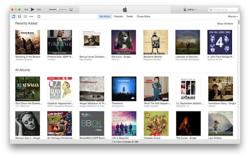
You’ll notice now that there is a much clearer journey to take to figure out which music to listen to. Visitors can browse content suggestions and radios, or go straight to their personally curated playlists and most recently played songs. There are options, and the options make sense on the interface.
The moral of the story here is that a seamless, chronological, and enjoyable user interface makes the work everyone needs to accomplish less of a grand effort and more intuitive. If your platform is tough on the eyes and even harder to move through, admins and learners alike will avoid it at all costs (even if the cost is high).
Related: Bring Content Curation Into Your Corporate L&D Strategy
Personalized learning experiences are a necessity, not an amenity
Differentiated learning experiences reinforce corporate learning by meeting the needs of different learning styles. Whether your learners need visuals, webinars, ILT, social learning components, or the old school slide decks and word docs, you need to have your bases covered.
An LMS that enables blended learning means that you can not only expand your horizons beyond ILT and word docs, but you can still maintain what you know works. Learning platforms should be modern enough to let you supplement what you’ve done in the past with new methods of learning design. The same way we enjoy Netflix because the experience is tailored to our interests, your learning system can operate the same way.
You can amplify this kind of personalized learning by leveraging a platform that is powered by AI, so that those personalized touches do not come at an extra time expense for your admins. Machine learning in a platform can make it easier to tag content and suggest content to ensure your learners are getting the most out of their journey, and the look and feel speaks to their interests and job skills.
Related: Why AI-Powered Personalized Learning Experiences are Here to Stay
Self-paced learning and learner autonomy
Learning plans should enable your audience to learn in the flow of work so that they can take greater ownership of their own learning. The ideal situation for admins is to be less tied up with hand holding, and for learners to take the initiative to better themselves.
Such individualized learning can happen through social learning, where your learners are engaged with one another in the platform. The aim is to have an online community of learners that are asking each other questions, soliciting feedback from subject matter experts, and even posting their own user-generated content.
When your learners are contributing their own bite-sized content, this fuels your library and enables your learners to enjoy micro-learning in the flow of their regular workday. Similar to how we quickly look up how to do things on YouTube, your audience can learn this way in your organization without having your admins push out more content (pretty sweet, right?)
Related: What is Learner Autonomy?
Like the way you look
Every piece of technology we use is another opportunity to highlight your brand and mature your overall brand experience. In other words, even the internal user experiences and user interfaces of tech stacks reflect on our company and brand as a whole.
You want each pocket of your organization to enjoy the work that they do just as much as external customers enjoy what it is that you do. Learners are happier and more productive when their user journeys are seamless and easy to use. Poor user experiences can suck up unnecessary time and resources, and ultimately discourage learners and admins from wanting to go above and beyond.
A simple test you can give your platform that is probably similar to how you reflect on first dates: do you like looking at it? Do you like spending time with it? If the answer is no, evaluate your options, because your admins and learners probably feel the same way.
Final thoughts – don’t let your platform be the corporate technological equivalent of Michael and Jan’s dinner party (chaotic, frustrating, impossible to navigate, unpredictable, and inconsiderate of the overall experience). No one needs that in their life.
Ready to peak around and understand how to make learning your organization’s competitive advantage? Download the Docebo Learning Suite overview today!