Creating Branching Scenario Layouts
This is an example of the thought process for creating layouts for a branching scenario.
I created a branching scenario prototype in Twine a while back about an instructional design consultant screening and booking a new client. My previous posts have shown my process for planning and writing the scenario. Now I’m going to show my work and my thought process for some of the development process, starting with creating layouts.
You can review the scenario prototype and the map of the decisions in my previous post.
Identify What Layouts Are Needed
Many branching scenarios are simulated conversations. That means you’re mostly focusing on two characters talking plus the choices.
For a simulated conversation, you only need a few different layouts.
- Intro screen
- Conversation with choices
- Ending
The bare minimum is 3 layouts, although you might choose to have more. For example, you could have different layouts for positive and negative endings.
This scenario is a little more complicated. I have a simulated phone conversation, but I also have some email interactions. I also have some longer “cut scene” phone conversations that require some back and forth between the characters without interaction. That means I need the three layouts noted before, plus some additional ones.
- Intro screen
- Email with choices
- Phone conversation with choices
- Long phone conversation
- Ending
Create Layouts in PowerPoint
Intro Screen
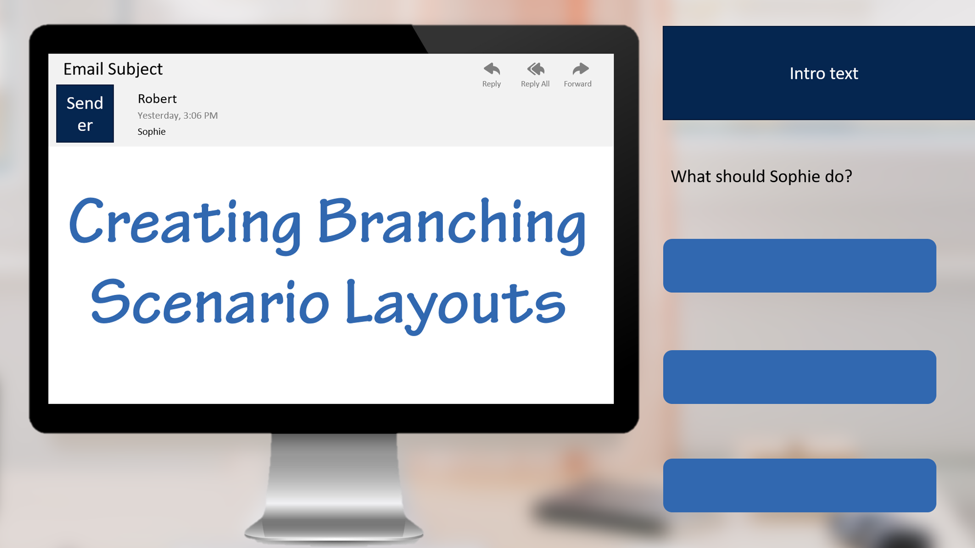
You can start by sketching on paper, but I’m starting in PowerPoint for this project. The first layout I mock up is the intro screen. I need space for the introduction paragraph, a character (Sophie), and a button to get started.
For the background, I want to set the scene of a home office where a consultant like Sophie might work. I chose a photo by NorbertLevajsics on Unsplash and blurred it. At this stage of development, I often work with just shapes in PowerPoint and no real images. I usually wait to add images until later. This time, I wanted the background to help me figure out the layouts and the placement of the computer for the email interactions.

Email with Choices
For the email interaction, I’m going to focus on the computer rather than showing the character. I keep the background, but change the focus to zoom in on a computer. I also use a computer image from Storyblocks as a frame around the email. I keep the choices on the right. In these mockups, I’m using the lighter blue for buttons and the darker blue for text and image placeholders.

Phone Conversation with Choices
I want to keep the buttons on the right, the same as with the email layout.

Long Phone Conversation
For the long phone conversations, I want to show both Sophie and Robert. I need some space for conversation bubbles so they can have some back and forth. My initial thought is to do a split screen showing the two characters. The background on the right is by MattHoffman on Unsplash.

I’m not quite sure about this layout. If I was going to use voice over for this scenario, this would work well. I’d drop the conversation bubbles and just show the characters changing as the speaker changes. I’m planning to just use on screen text though. If I use this layout, I need to add some navigation to move forward and backward. This layout gives me nice large text bubbles, but it might make it harder to get a sense for the whole conversation. It also doesn’t seem like there’s quite enough separation between the two settings, so I probably need to add a line or play with that more.
Because of that, I decide to try something else for the longer phone conversations: a comic style layout. This is nice for showing a whole conversation. I’m worried the text will have to be too small to fit it in though. Maybe this is too much on the screen at once and will be information overload. I’m also not quite sure this visually works as well for a phone conversation as an in-person conversation.

At this stage, I’m not quite sure what I want. I will probably end up building one of the conversations (or at least part of one) in both layouts to see what I like best with actual content. I think I might want to look at some other comic style layouts for inspiration too.
Ending
I’m going to use the same basic layout for all of the endings. This is like the intro slide, but with a potentially larger block of text for feedback.

Next Steps
While I’m not happy with the layouts for the long phone conversation yet, this is a good first pass through creating layouts. It’s probably enough for me to start developing, knowing that I’ll keep tweaking as I get into the tools working with actual content.
I’m going to develop this in both Storyline and Captivate so I can show the process and final product in both. Watch for future posts showing that process.
I spent about 1.5 hours creating these initial layouts in PowerPoint. That would have been a little less if I hadn’t selected background images too. That total includes some time picking character images for Sophie and Robert, although those aren’t shown here.
Looking for More?
Read the previous posts to see my process for creating this scenario.
2 thoughts on “Creating Branching Scenario Layouts”