4 Tips to Convert Training Presentations into Engaging Online Courses
With organizations looking to convert classroom training material into online courses, how can we turn boring presentations into engaging self-paced online courses? This blog shares 4 tips for the same.

As we all know, PowerPoint is a popular teaching medium and Wright J (2009) rightly says, “PowerPoint is a convenient prop for poor speakers, it can reduce complicated messages to simple bullet points.”
Across the world, PowerPoint has made inroads into most corporate training programs. We often come across references such as ‘Death by PowerPoint’ and ‘PowerPoint Poisoning’, criticizing the bulleted lists and standardized, boring look of PowerPoint decks. These are critical and sarcastic terms for boring presentations overloaded with information, which bore and exhaust learners.
With organizations now looking to convert classroom training material into online courses, how can we turn boring training presentations into engaging self-paced online courses? In this blog, I would like to share 4 important tips for the same.
1. Use text sparingly and convey the meaning through relevant images
Though we know a presentation with heavy text is not effective, many of us don’t consider this while preparing training presentations. As we all know, the goal of a presentation is to transfer information, knowledge, and inspiration from the trainer to the learners. Reading takes time, and it is boring to look at text-heavy slides without images. When learners see text on the slide, they start reading. As they do so, they won’t be listening to what the trainer is saying; also, they won’t be able to concentrate on what they are reading because, well, the trainer is talking.
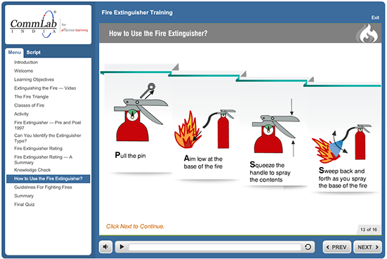
We can turn this boring training presentation into an engaging online course by using less text and convey the meaning through relevant images. Simple graphics and visuals can be used to reinforce important points. This will help learners stay focused throughout the course and recall information quickly, without wasting their time reading too much text on the screen.
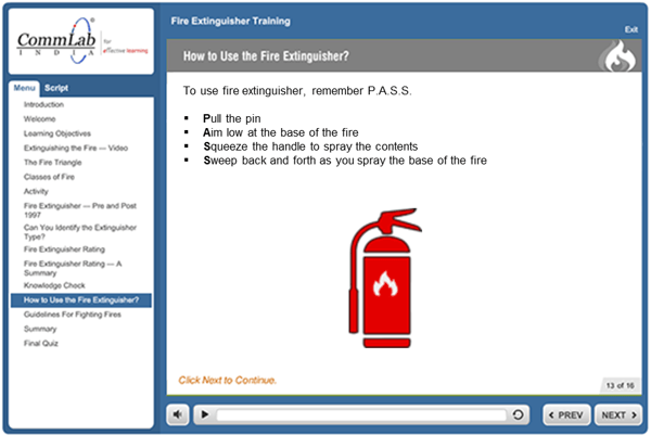
Example: To explain how to use the fire extinguisher, we can use icons instead of only on-screen text.
Before:
After:
2. Ensure that one slide covers only one learning point
In a presentation, we often try to cover several points on a single slide. If each point is going to be covered in the presentation anyway, it really doesn’t matter if the points are on separate slides rather than a single slide. But then we think we will have too many slides in the presentation and it will take too long to complete. Actually, it won’t. Too many points on a slide can confuse learners and they won’t be able to emphasize on individual points.
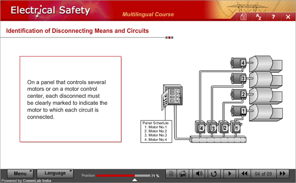
We can make such training presentations engaging courses by keeping screens simple with only one learning point per screen, to reduce cognitive load. By ensuring that one screen covers only one learning point, we ensure the learner has ample time to go through each screen and finds it easy to understand each topic, and then move to the next topic.
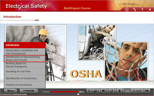
Example: Instead of covering the ‘Identification of Disconnecting Means and Circuits’ in a single slide, we have divided it into two slides as shown in the following screenshots.

3. Use background images with text
In a presentation, we often use a single image for all the bullet points on a screen. These bulleted lists kill the presentation because learners will struggle to pay attention to the lists and recall them as they are not visually rich.
We can avoid this situation by placing bullet points on one side of the screen and changing the image on the other side of the screen as each new bullet point appears. Using related images can turn your course into a visual treat and this would help learners absorb information very quickly.
Before (bullet points with a single image):
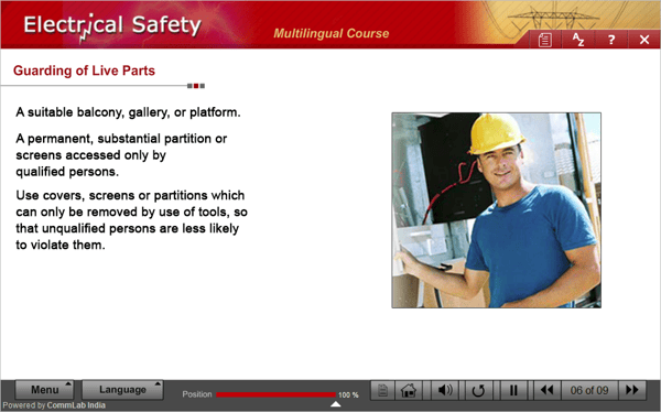
After (bullet points with corresponding images):



4. Highlight text to make your point
If a slide is full of text, without any highlights or formatting, it becomes difficult for learners to focus on the important points or key terms.
We can help learners focus by highlighting key words with different colors and fonts. Presenting important facts and concepts in colorful tabs and providing definition boxes are other ways of focusing on the text. Learners know exactly what they should focus on, and this also helps make important concepts stand out. We can thereby ensure learners remember all definitions and keywords, reinforcing learning.
Before:
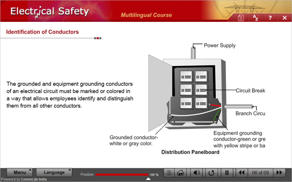
After:
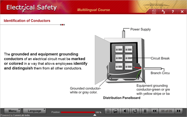
Hope these tips help you transform your mundane classroom presentations into engaging, immersive online courses your employees will love to take. Have more tips? Please do share!


