
Captivate 2017 is the recent launch by Adobe and is turning out to be A piece of cake for eLearning developers to create responsive ELearning modules. If I have to pick an eye catching feature from the tool I would surely pick “Fluid Boxes” which is one of the new features added to Captivate 2017.
Captivate 2017 is the recent launch by Adobe and is turning out to be A piece of cake for eLearning developers to create responsive ELearning modules. If I have to pick an eye catching feature from the tool I would surely pick “Fluid Boxes” which is one of the new features added to Captivate 2017. With Fluid Boxes, developers relish unique authoring experiences and develop responsive HTML5-based eLearning content faster, without programming knowledge.
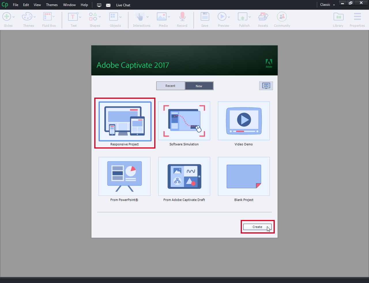
- Open Adobe Captivate 2017 and select “Responsive Project” and then click on “Create”.

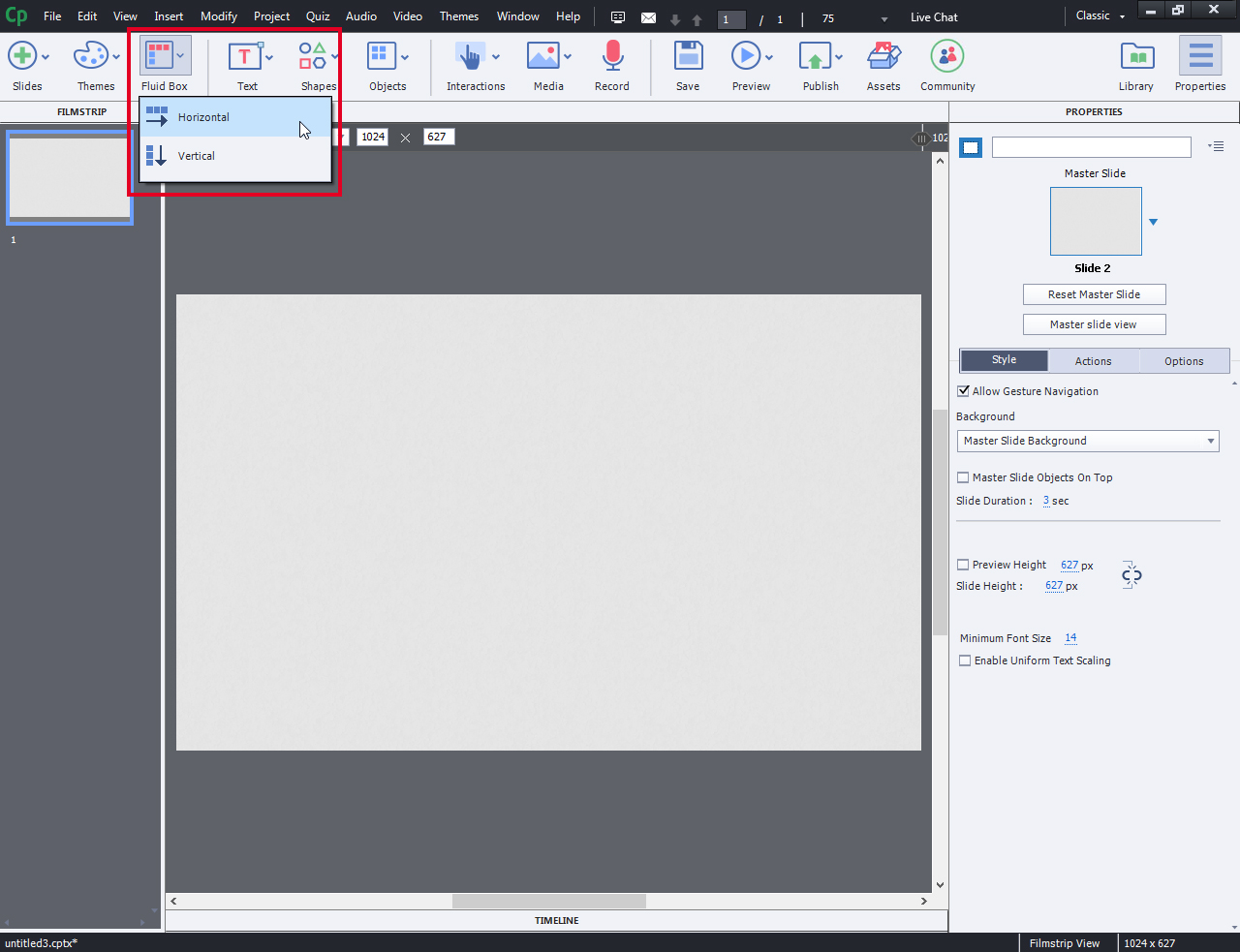
- From the options available at the top, click on “Fluid Box”. This will allow you to choose one of two different fluid boxes arrangements:
- Horizontal
- Vertical
Choose according to the design you want to achieve.
- Now, choose the number of fluid boxes you want to have on the screen. You can choose as many as you wish. Note: Fluid Boxes can have different configurations.
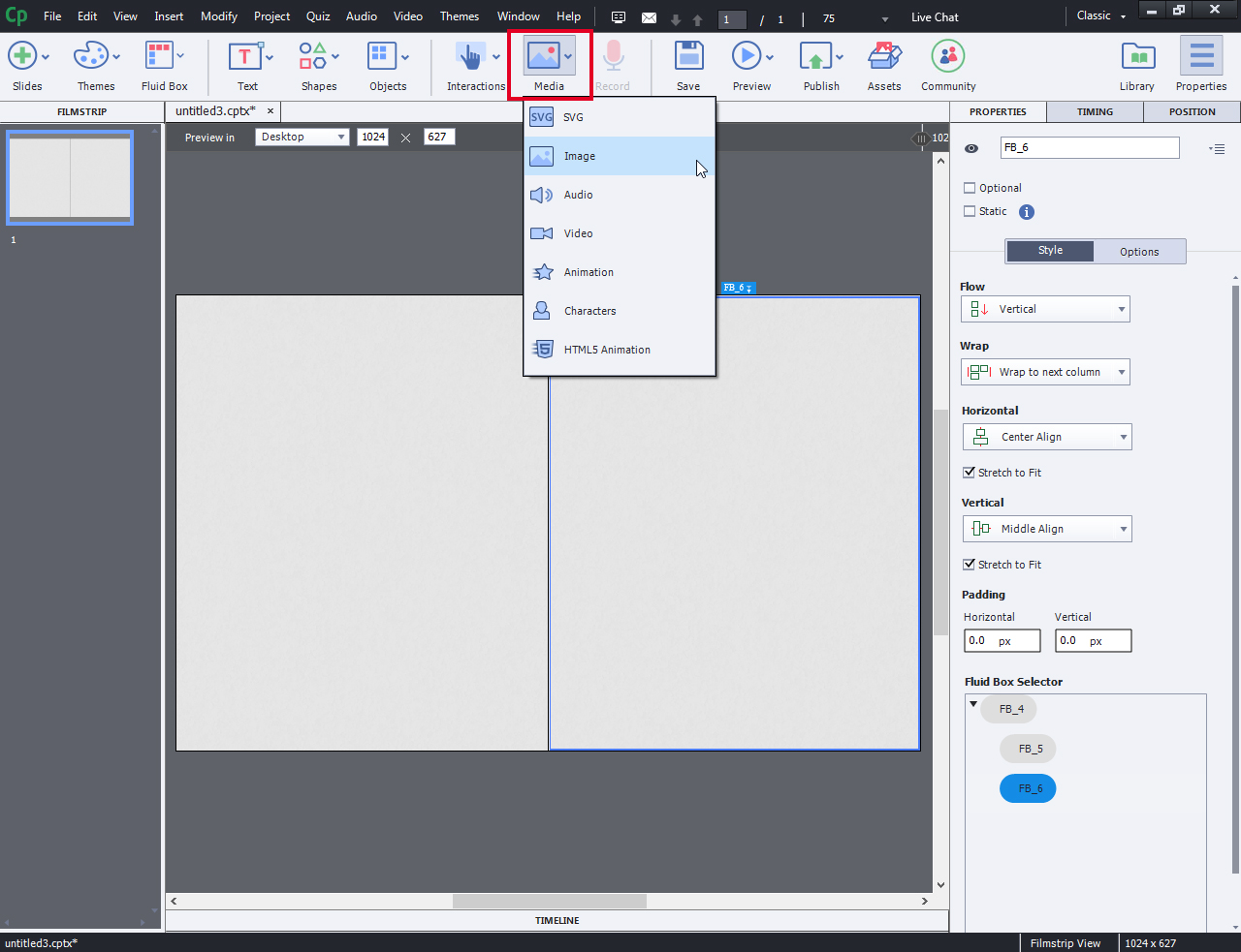
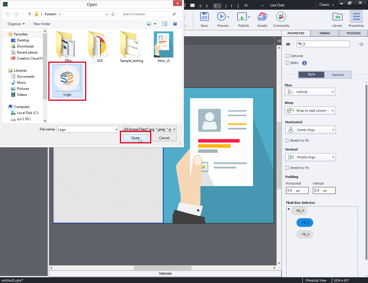
- Select Fluid Box and insert image from “Media” Tab.
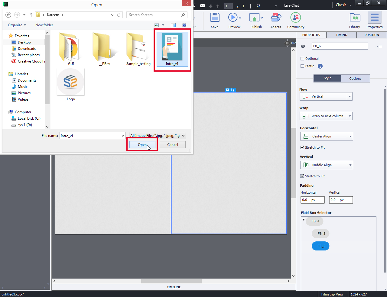
- Browse the image from the desired location and click “open”. Let us name this as Fluid Box 1
- Similarly insert an image in the other fluid box. Let us name it as Fluid Box 2.
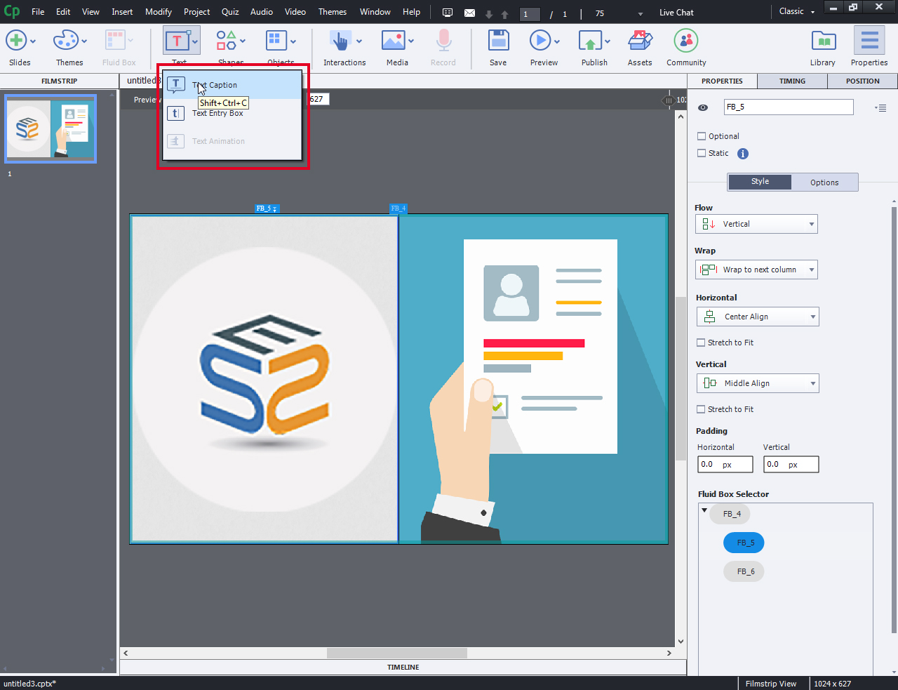
- From the options available on Top, click on “Text” dropdown and insert the text you wish to add on the Fluid Box 2.
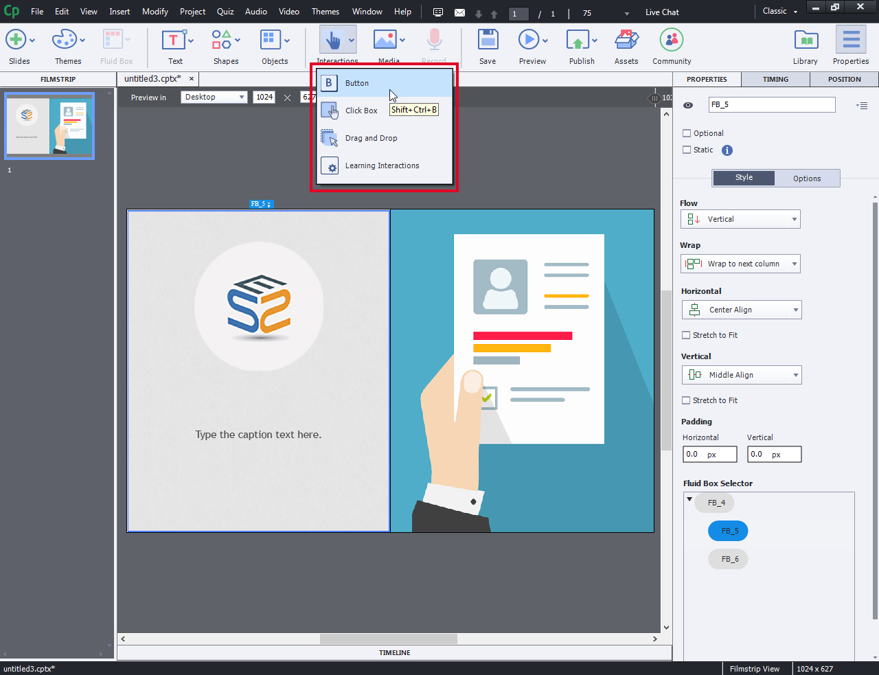
- Click on the “Interactions” tab and select the required interaction from the available default interactions from dropdown list.
- Write required Text and Design the Button as you like.
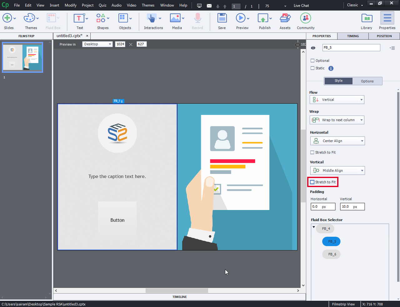
- Deselect the marked “Stretch to Fit” option for better customized view.
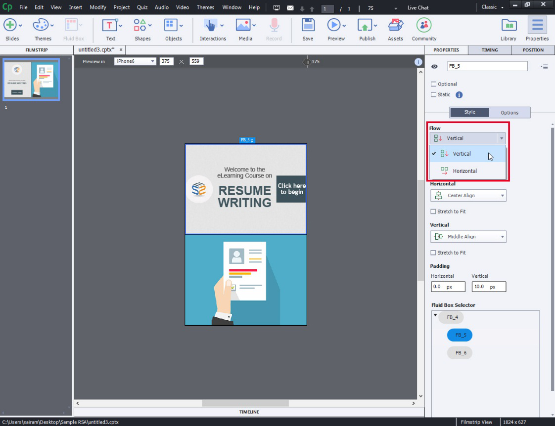
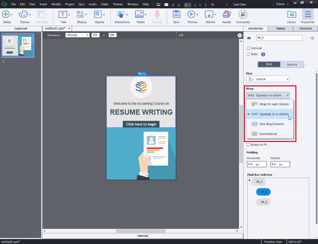
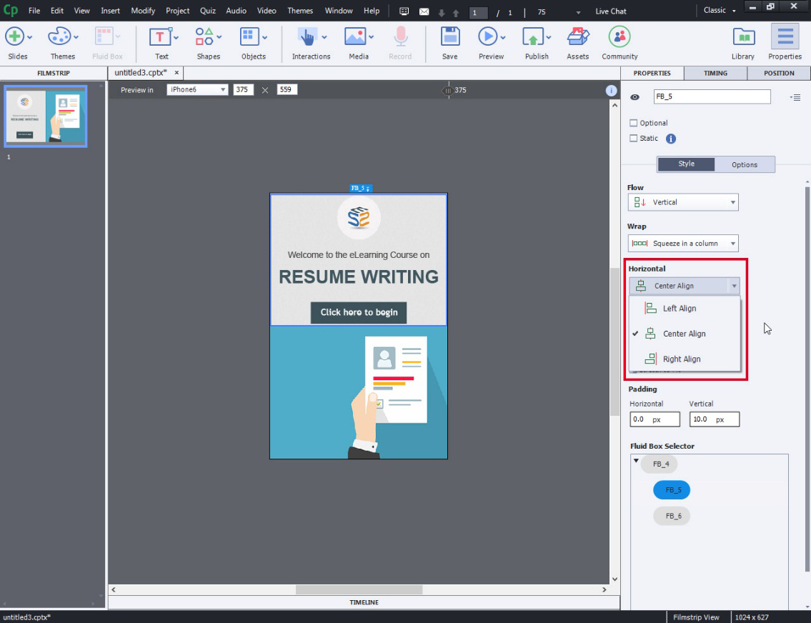
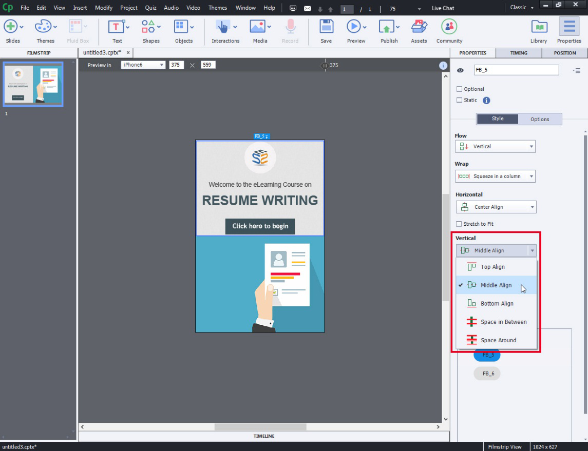
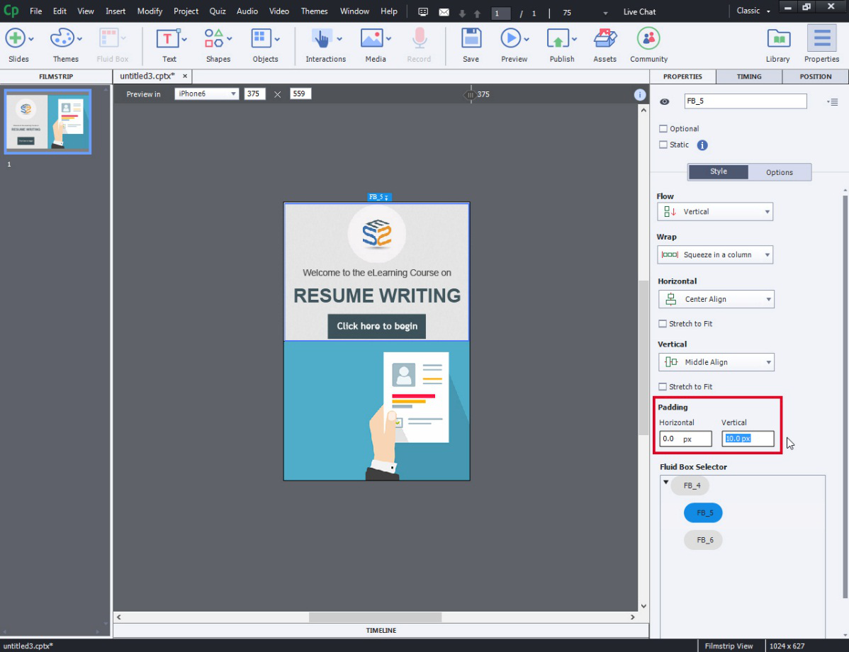
- Now let’s look at the customization options available to customize the “Fluid Boxes”. The options available are FLOW, WRAP, HORIZONTAL, VERTICAL, PADDING. Use these options as per your design requirements.
- Flow
- Wrap
- Horizontal
- Vertical
- Padding
- Flow
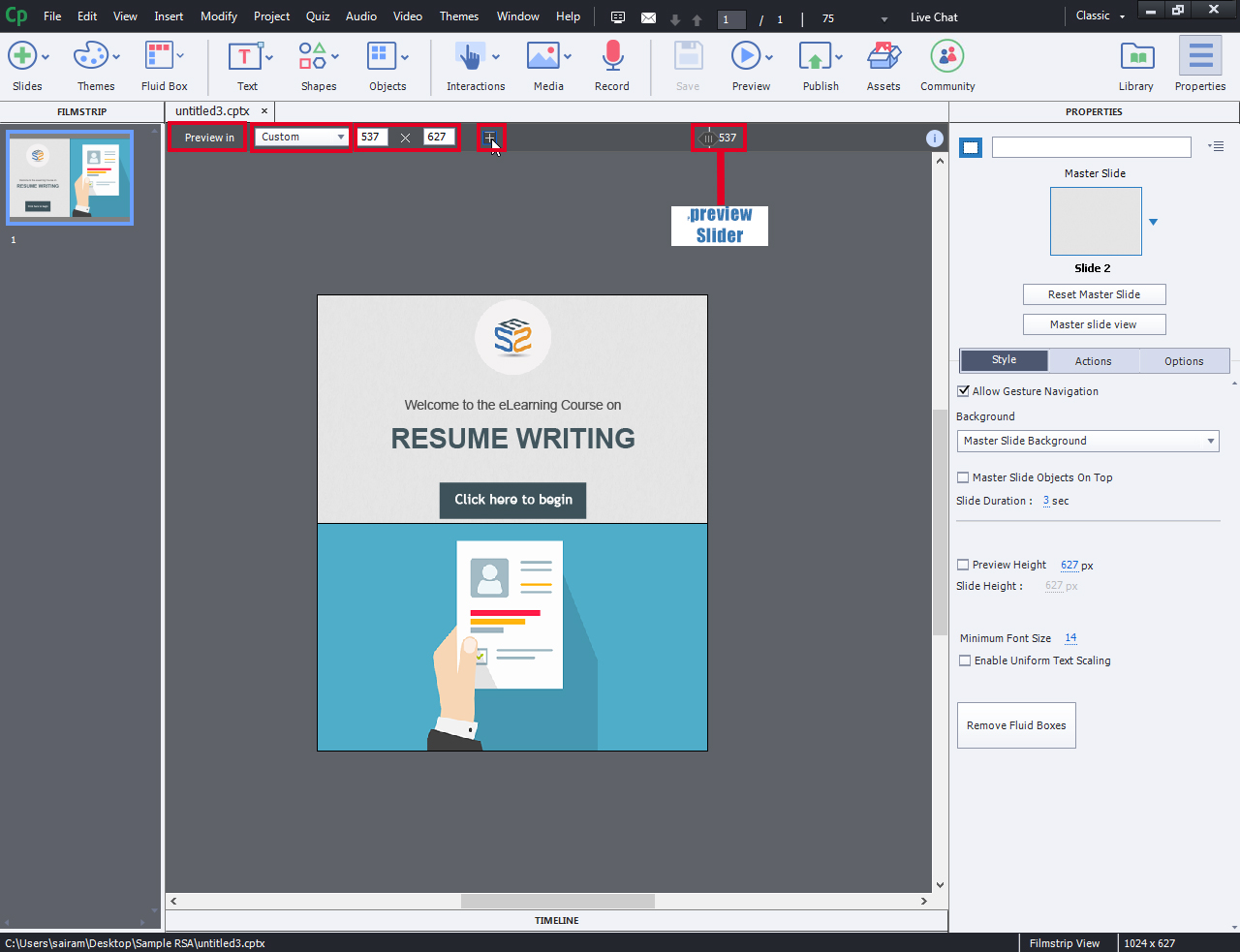
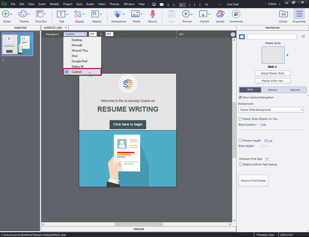
- To preview the project on different devices, choose the dropdown menu beside the “Preview In” option. Alternatively you can enter your own width and height and with the help of “preview slider” you can adjust the size that you wish
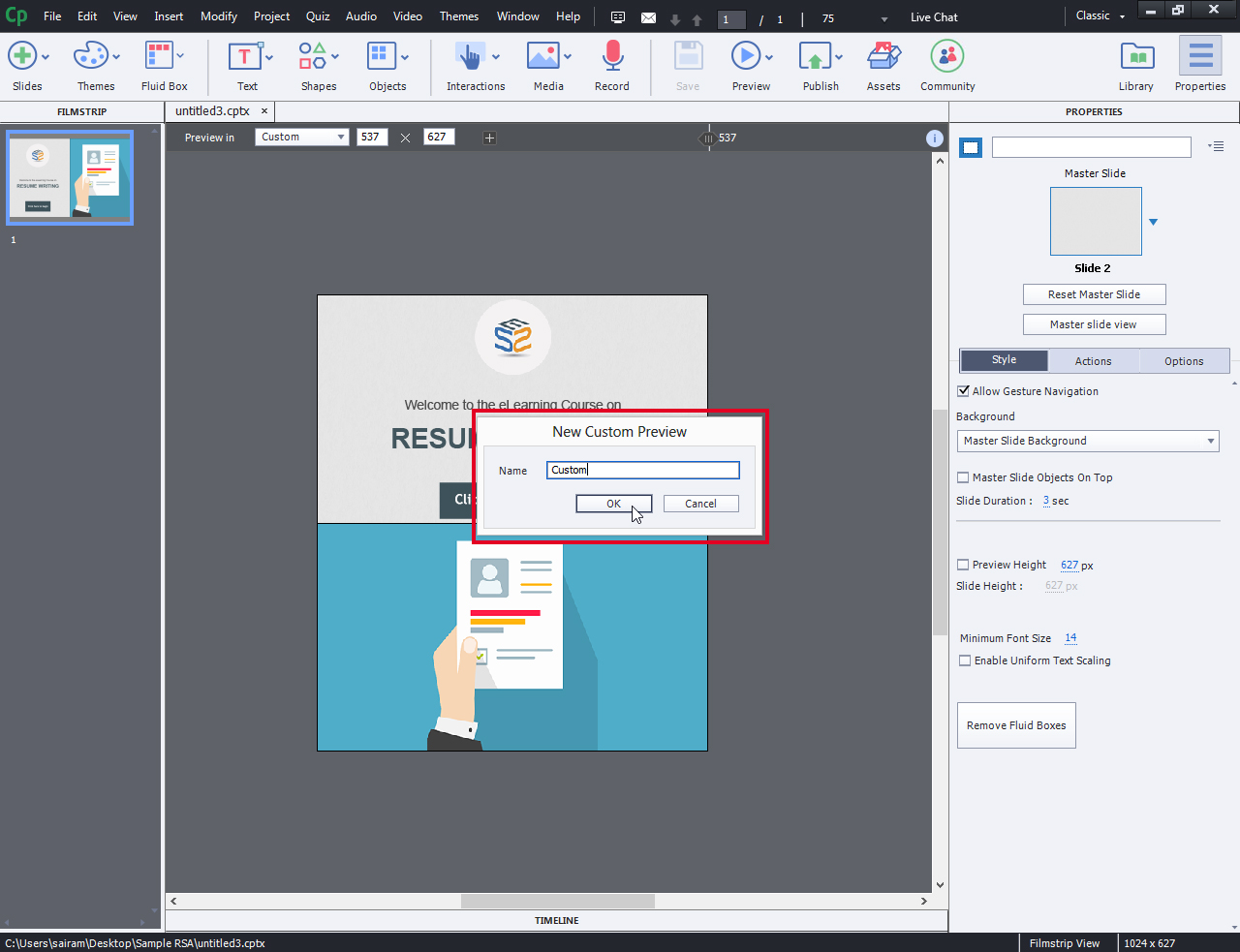
- Once you have made an adjustment to the default, you will see a tiny little plus Icon and by clicking on it you can create a name for your own custom preview and click OK.
- You can see the saved adjustment in the dropdown “Preview In”.
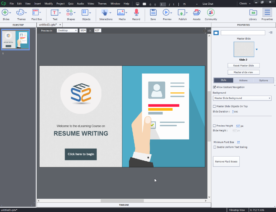
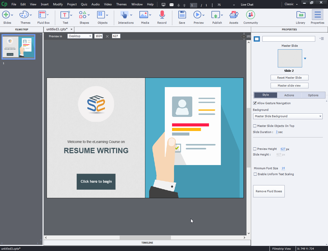
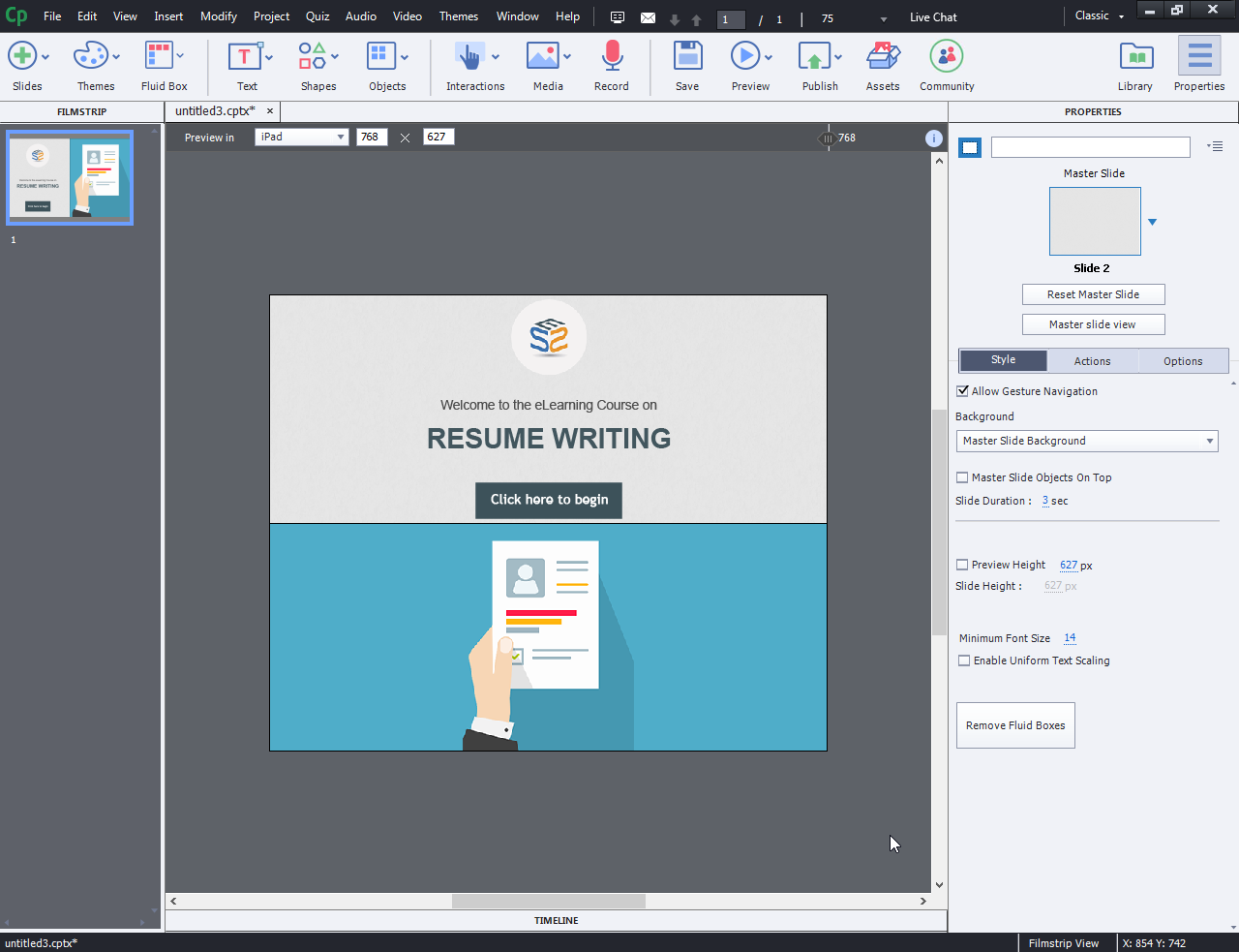
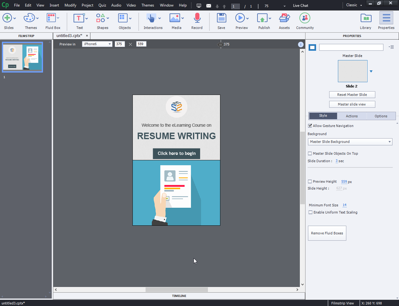
- You can view your slide on different devices.
- Desktop:
- IPad:
- Mobile:
- Desktop:

Original post link: http://www.swiftelearningservices.com/how-to-use-fluid-boxes-for-web-responsive-design-in-captivate-2017/
Actually, I know that Responsive web design is an approach to web design that makes web pages render well on a variety of devices and window or screen sizes. Recent work also considers the viewer proximity as part of the viewing context as an extension .
In CP2017, first release, each project using a theme different from the Blank theme (which is not the default theme) started with a Title slide. Like all content slides based on master slides, fluid boxes were already set up in the Title slide. This is not the first tutorial I see where the important warning is missing: you need to switch to a slide based on the Blank master slide. Had to add that information multiple times in forum questions.
Sorry for that add-on, very few has been published about Fluid Boxes on Master slides, except the few blog posts I wrote. Same with the importance of rulers and guides when editing or setting up a theme for a responsive project with Fluid Boxes.
You must be logged in to post a comment.


