
 You and I may not have formal training in graphic design, but our eLearning courses and presentations still need to look good.
 You and I may not have formal training in graphic design, but our eLearning courses and presentations still need to look good.
So how do we create designs for workplace learning that aren’t like the average snooze-fest our audiences constantly suffer through?
You know … the ones that are endless, text-heavy, bulleted lists using the default formatting of our authoring tools. 😥
Where do we even begin to improve our designs?
I have a single word for you:
CRAP
Wait … what?
Let me explain …
The single biggest improvement in my projects happened when I read The Non-Designer’s Design Book by Robin Williams and learned these four simple graphic design principles:
Contrast
Repetition
Alignment
Proximity
Yes, these four words are given the acronym CRAP, but I promise:
If you apply them, your end result will be anything but.
My goal in this article is to teach you the basics of these four visual design powerhouses.
And not just that…
I want to show you how you can easily implement these principles to improve your designs today.
Let’s put this in context
You may have heard of these principles. Or maybe you’ve even heard the CRAP (or CARP or PARC) acronym.
But let’s actually put this in the context of workplace learning.
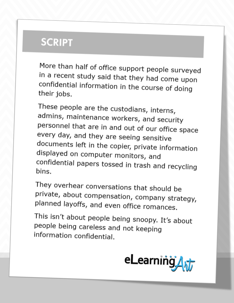
I think a picture is truly worth 1,000 words and like to see actual examples. I’m guessing the same is true for you. So, to illustrate the CRAP principles, let’s work with a short script from a hypothetical program on information security. The script runs like this:
To get started, I’ll put the text on each slide, and build from there. As you’re about to see, beginning here lets me show you the impact of the first principle:
C is for Contrast
The basic idea of the C principle is that thoughtful variation of, and differences between, the elements in a project help to create interest and impact. You can apply contrast on a single slide or across slides.
Here’s my starter file:
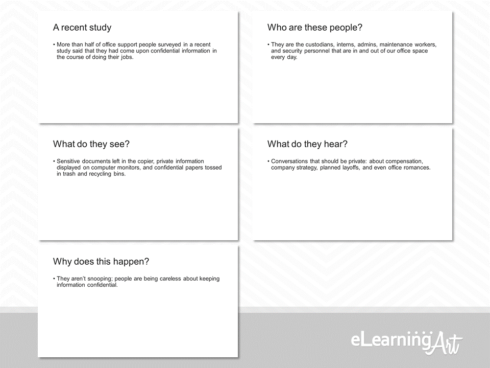
I know that some people (not you, right?) would call it a day right here and say “Done!” Unfortunately, this really is c***! There is no variety in the material, and virtually no contrast either. Boring!
Let’s add some simple contrasting elements. Now, compare the starter file to the spiffed-up version shown here:
That’s so much better! And the good news is that this noticeable improvement required just a few minutes of added development time. I updated the master slide with the blue box, and selected and added the five eLearningArt icons. Quick!
With this solution, there is greater contrast within each slide (the blue to white contrast is strong), and between the slides (the icons change to match the subject of the slide).
Contrast is an important design element, but I think it’s critical to point out that when I say “add contrast” I don’t mean “make every slide different.” I’ve taken that approach in the following example. Do you think it’s working?
This set of slides show tons of contrast in treatments from slide to slide—actually no two slides are the same.
That’s too much contrast! Although Robin Williams tells us not to be a wimp when it comes to using contrast, it’s pretty important to avoid going nuts with it, too!
Here’s why: When each slide is different from the last, a viewer spends time figuring out what’s going on visually when they should be paying attention to the material presented on the slide. That’s not what we want in our workplace learning programs.
The next principle is an important partner to contrast, and keeping it in mind helps me stay out of the kind of trouble this last example illustrates. Let’s take a look at that now.
R is for Repetition
The R principle, repetition, creates a visual pattern.
This powers-up contrast because when we detect something different in a pattern, that difference stands out. When we allow a viewer to become comfortable with a repetitive design element, a contrasting change can be attention-grabbing. Attention—we want it!
If you were viewing these slides in succession, would the fifth slide surprise you a little? That’s the goal. Repeat, repeat, repeat, repeat, bang!
In practice, the principle of repetition can serve several purposes, including:
- It unifies the presentation graphically, making a visually satisfying statement.
- It guides the design of the slides, reducing decision-making (and development) time.
- It sets up an opportunity for contrast, helping to maintain viewer attention.
Incorporating repetition in your program also helps your viewer with program navigation. It reduces the viewer’s mental processing of the “Where am I?” question, and this, in turn, encourages a focus on the material being presented.
Personally, I think repetition is like signs in an airport. When I walk from Concourse A to Concourse D using signage as my guide, repeated colors, arrows, fonts, and other design elements assure me that I’m headed in the right direction.
The people viewing our programs are like travelers at an unfamiliar airport. We want to make sure they can quickly take in the design of the slide and know that they’re on the right track so they can navigate easily from one “concourse” to the next.
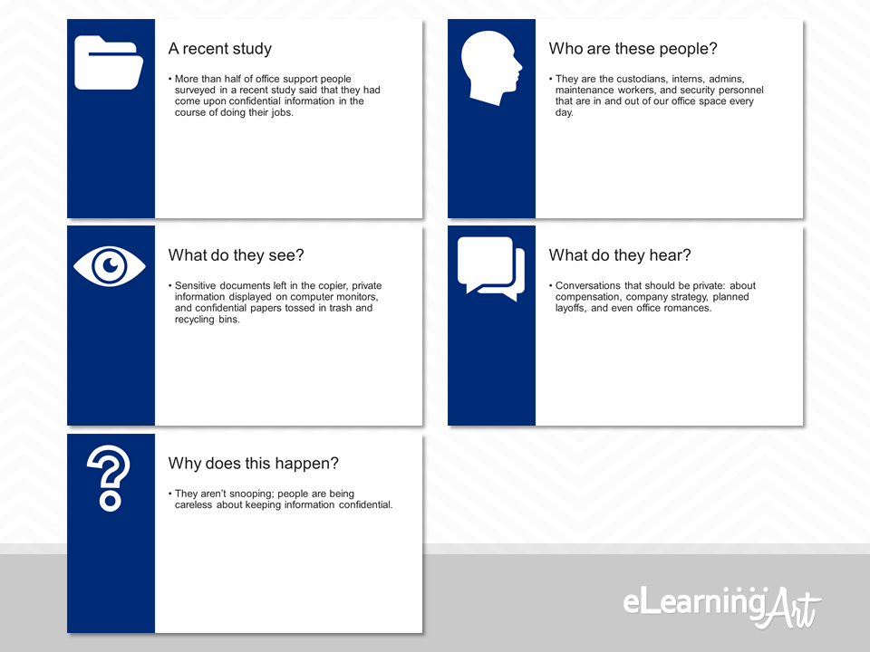
Here’s an example of how I might accomplish this goal using repetition:
Here, the first slide (the one that introduces the study) receives a distinct design treatment. The next three slides provide details related to the first slide. These tie back to the first slide with the addition of a green bar, just to the right of the blue box.
When we get to the last slide of the section, which delivers the big point, another distinct, high-contrast slide design is used. It’s different, giving contrast, but part of the family, too. The whole thing feels like a strong, cohesive set. The viewer has easily traveled from Concourse A (the first slide) to Concourse E (the final slide).
This set of slides also illustrates our next principle. We’ll tackle that one now.
A is for Alignment
When we employ the principles of contrast and repetition effectively, and actively avoid randomly or carelessly putting things on slides, we’re applying the A principle. The result is an aligned look and feel.
Personally, I think this principle is the secret sauce that makes people say “Wow, this program is really great!”
Why? Because even when the material covered is dull as can be, if the overall design is in alignment, like it is in the example just shown, the presentation feels sure, confident, and professional. As a result, the viewer perceives that they are in good hands, relaxes a little, and enjoys the show.
So, that’s one aspect of alignment. You want to deliver a balanced and cohesive look and feel across the entire program.
A second, and just as important, aspect of alignment happens on the slide level, and applies to the text and objects you place there.
Here’s a simple text-based slide that is a pretty big mess, a real slapdash work effort:
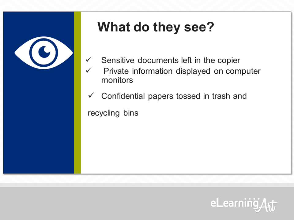
The slide’s not a total loss—it can still be read and understood, but note the elements that are out of alignment:
- The eye icon isn’t centered in the blue panel.
- The slide title sits too far to the right.
- The checkmarked bullets show inconsistent spacing both between and within the lines.
Now take a look at the same slide with everything aligned and orderly:
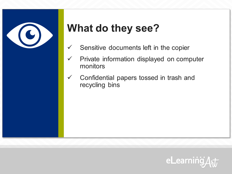
This looks better, hands-down. It also reflects well on the person who developed it. They were clearly in control of the material, and knew what they were doing. Everything is snapped into place just right.
Not only that, but this slide is more than just legible. It has a visual hierarchy.
Visual hierarchy generated by the alignment allows a quick mental assessment of which slide elements are most important.
Take a look at the unaligned example above with the idea of hierarchy in mind. Can you see how hierarchy is lost in all of the chaos? Check the second example, too. Does that one guide your eye visually?
I may be starting to sound like I’m stuck on repeat, but looking good and providing hierarchy are both important to ensure that our viewers capture the information we are putting in front of them. Alignment across a program and on each slide helps get them there.
Now, with all of that in mind, let’s dive into the final principle.
P is for Proximity
As with alignment, paying attention to the P principle, proximity, delivers slide designs that focus the viewer on what counts, the material presented.
One time proximity comes into play is when we are building individual slides that show several elements. In general, the rule runs as follows:
- When items in proximity of one another are similar, treat them similarly.
- When items in proximity of one another of different, emphasize that difference.
Let’s zoom in on a one-slide example here:
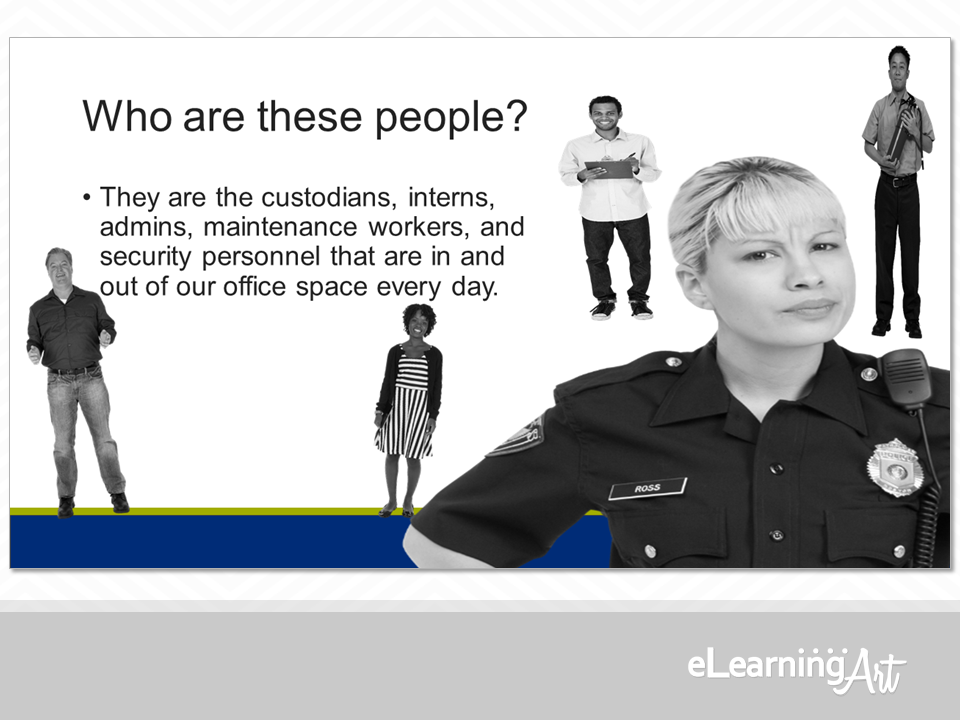
Officer Ross seems to have a justifiable reason for concern here! Each of the roles listed in the on-screen text are added to the slide using eLearningArt cutout characters. Great so far, but each character is presented—and stretched, squashed, and twisted!—without any relationship to one another. Even though they are similar (i.e. all cutout characters, all grayscale, all representing the roles), they are not treated in a similar way.
Let’s try another version, with attention paid to proximity, as well as the other principles:
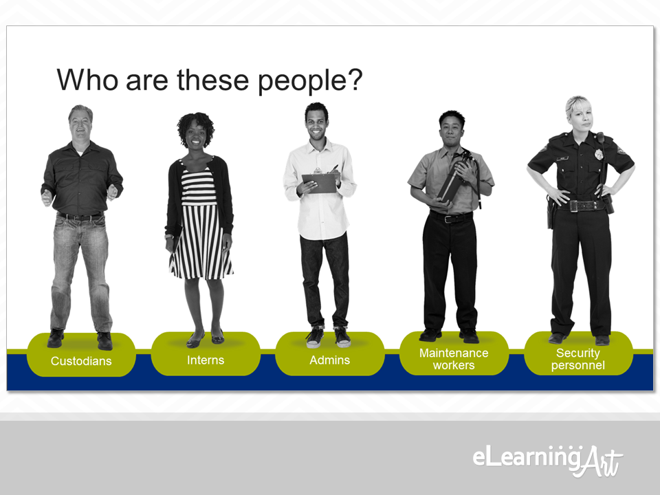
I think Officer Ross should be smiling, because this looks 110% better! (Maybe she’s just a tough cookie? I don’t know.)
We’ve got contrast, repetition, alignment, and proximity all nicely displayed on this slide, and the viewer’s going to have an easy time understanding that we are discussing people in a variety of roles.
Also, as an added bonus, this tidy approach really lends itself to animating each of the characters onto the screen in a logical and attractive way.
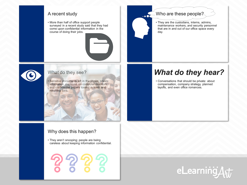
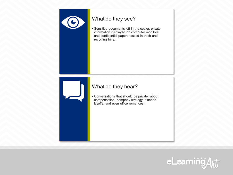
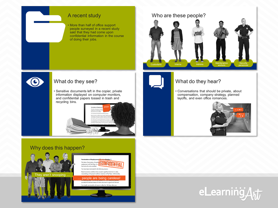
Proximity is also important across slides, so I try to keep it in mind whenever two or more slides display similar information. For example, the two slides in the following examples share parallel questions.
These next two slides employ the proximity principle pretty well:
I could stop there, but I think the slides could do more, so I’ve stepped things up a bit:
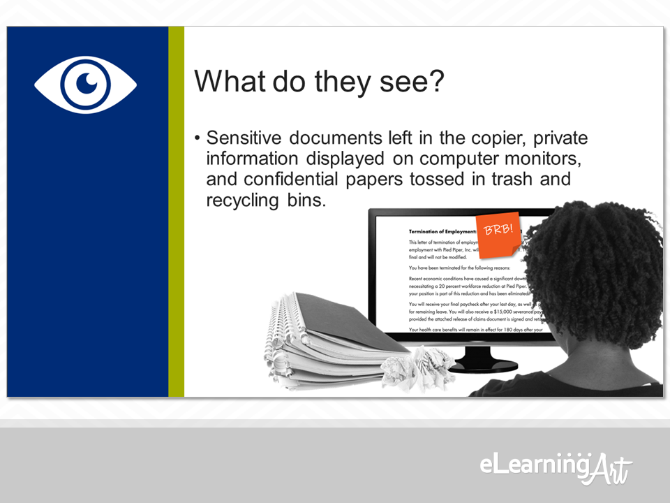
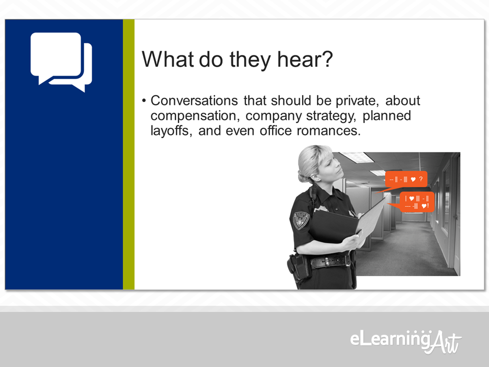
In both examples, the graphics on the slides work to illustrate what’s stated in the on-screen text. In the second set, though, our characters (remember them from the previous slides?) are unintentionally seeing and hearing confidential information.
I’ve also paid attention to making sure that the graphic assets on the slides in this second example build repetition and display alignment. Some of this is a lead-up to the final slide, too, as we’ll see in just a moment.
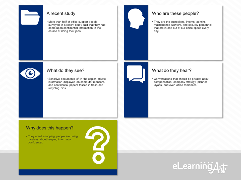
Proximity can also play with contrasts. The rule here is that if two things are different, don’t just make them kinda different. Instead, make them really different!
Compare these two examples of the final slide. Why give your viewers something like this (a pretty typical solution, I’m afraid):
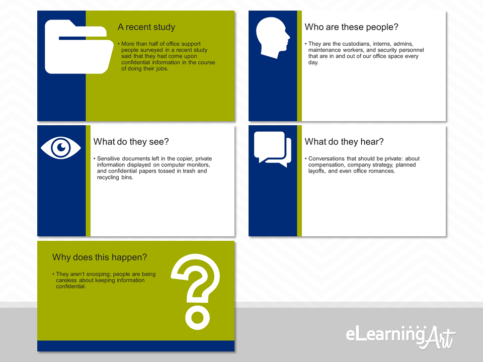
When you can just as easily and much more impactfully give them this?
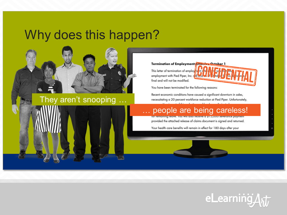
Here, we’ve got two really different elements right next to each other. The contrast is amped up by playing with scale—tiny people next to a big computer screen—and color—a bright-white screen next to the gray of the characters.
Speaking of color, you might also note that the bright red-orange that has been associated with the confidential information in the previous two slides is back, loud and clear. This is the first really big splash of that color in the slide set, so creates its own cross-slide contrast, too.
In sum, these approaches not only keep the viewer engaged by telling a little story, but—voilá— they deliver the slide’s content in an eye-catching way.
And there you have it!
Four design principles easily applied to slides, each of which can make a big difference in your program. Remember the acronym and you’ll be happy with the results, because:
CRAP means no more c …
… yeah, OK, you get the joke by now, right? But really, your projects will be better just by employing these principles:
C is for Contrast
R is for Repetition
A is for Alignment
P is for Proximity
That means you can start with this:
And proudly deliver this:
Nice work! It really pays to give a CRAP!