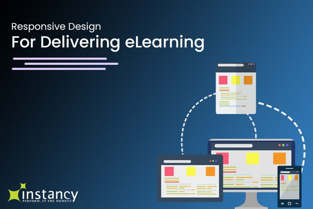
Responsive Design for Delivering eLearning on Multiple Devices like Tabs, ipads, Smart Phones and Desk tops. Responsive Design for Learning Management System Interface.
Would you like to deliver eLearning that only works on One Device or on Multiple Devices?
The New Rule is responsive eLearning design – “One version that works on all devices”
What is “responsive design?”
When used about technology in 2013, “responsive” means that a program, website, or application works on any device you want to use, without any extra effort on your part. Since we started using smart phones, and then tablets, you as a user had to download different versions of a program to your phone, your tablet, and your PC. These different applications rarely worked exactly the same on each device. Sometimes, they behaved very differently. Sometimes, text was tiny, or images were too large, or you only saw the menu and not the content.
If it was a headache for you as a user, can you imagine what a headache it was for the developer? In addition to phones, tablets, and computers, developers had to create programs all over again for Windows, Android, and the Apple systems! Sometimes, a provider like Instancy had to keep track of NINE different versions of their software and eLearning content!
Authors developing eLearning content had similar challenges, making sure their e-courses were designed for the systems that learners used.
Now, Instancy has implemented intelligent responsive design, so that eLearning courses created on Instancy Learning Content Management System (LCMS) and delivered through the Instancy platform are offered in appropriate formats for the devices used by your learners.
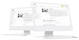
Responsive Design in eLearning, delivering eLearning Content for a Multi Devices
HTML5: not a magic bullet
HTML is one of the languages that makes the internet work. It controls how words and images are displayed on your browser screen.
HTML5, the newest version of this language, allows web-based applications like Instancy to work seamlessly across all your devices. Interactive content provided inside these applications, such as audio and video files, will play on your device the same way it plays on your laptop.
However, taking advantage of the responsive design features supported by HTML5 is not as easy as flipping a switch. Responsive design suggests that content be displayed appropriately on the target device, not simply resized for a small screen. For example, Apple devices won’t display Flash-based animation, so content delivered by Flash must be provided in a different form.
This is an enormous change, although our end users may not ever notice that their applications work better across the multiple devices they use to access mobile learning.
We in the eLearning industry have already seen the benefits. However, we think that it is the Instancy Authoring Tool users who will really notice and be able to benefit from responsive design as implemented in Instancy. Thanks to HTML5, learners will be able to enjoy interactive eLearning content across all their devices. The door is open for the next revolution of our industry: the mLearning (for Mobile Learning) revolution.
Figure 1: Enable Dynamic Content Resizing
To begin taking advantage of what HTML5 and Intelligent Responsive Design can do for your course development work, use the new Enable Dynamic Content Resizing option within the Instancy Authoring Tool. Thanks to this new option, your eLearning content will be automatically resized to fit any of the multiple devices your learners use.
We have already implemented the new technology in the learning management system (LMS). All devices (PC/Laptop browser, Tablet or Smartphone) can access the LMS. Once your course is uploaded to the catalog, it will be accessible on all devices without any additional work on your part.
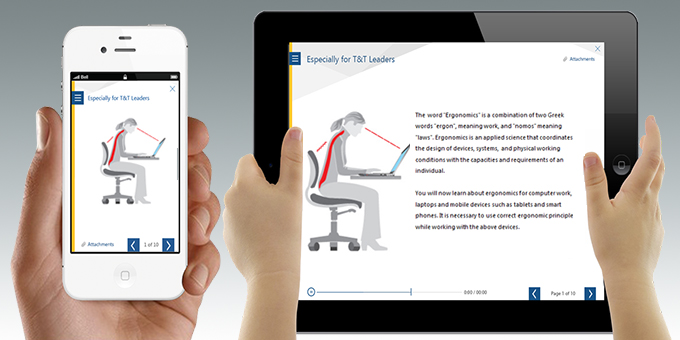
In the image below you can see how the catalog page adapts to desktop, iPad and iPhone
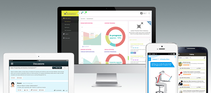
Figure 2: Responsive Design for Learning Management System Interface
Notice in the figure above that the image is automatically sized correctly for the screen, rather than cropped the way it might have been before HTML5.
At Instancy, we will continue to add HTML5-based innovations throughout our system. If you’d like to learn more, please contact us at info@instancy.com If you simply want to stay on top of what we’re doing, sign up for our newsletter at the link to the right.


