

If you are a trainer, an HR manager, or an online course designer, you know it is now time to design and develop courses for mobile users. With high-end smartphones that stream at 4K speeds, increased battery life, and bigger screen sizes, you can expect mobile devices to eclipse desktop or laptop computer as the preferred medium to consume virtual content.
Google Insights reported that on average, people use 2.5 connected devices per adult, and “mobile is now central to almost all kinds of internet activity.”
You should create eLearning courses keeping in mind that your learners will take them on all kinds of devices, from the desktop computer with its chunky monitor to the mobile device with its palm-sized screen. Get ready to deliver.
In this post, we will tell you how reading on the mobile screen feels different than reading from a larger laptop computer screen. We will also provide tons of tips to help you create a distraction-free mobile viewing experience that aids learning.
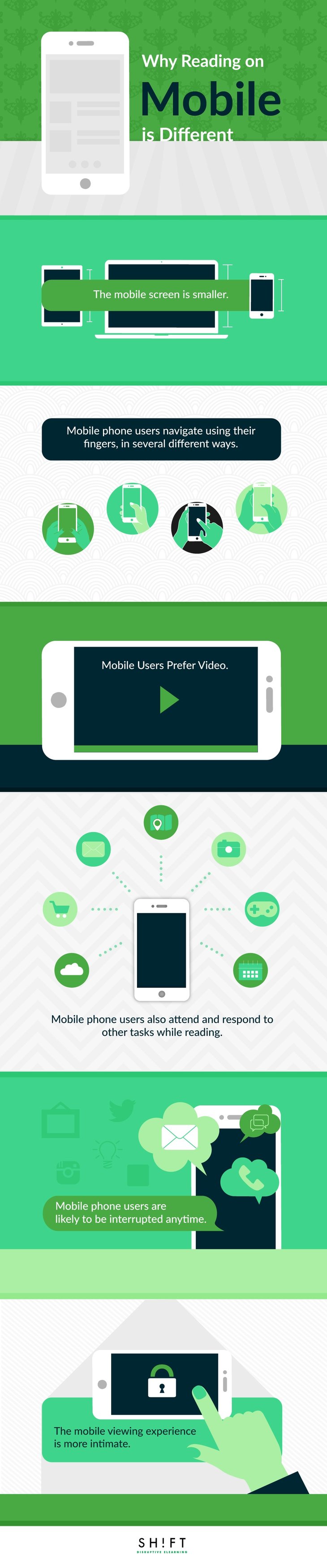
1) The mobile screen is smaller
The key to creating a stellar learning experience is readability. If learners cannot instantly get what is written on the screen, your course has failed to fulfill its purpose.
Although mobile phone screens have become bigger in recent years—from an average of 3.9 inches in 2011 to 5.1 inches in 2014, according to eMarketer—they are still a lot smaller than the average desktop and laptop computer.
Therefore, your objective is to design eLearning courses with small screens in mind and make sure that they are readable on any device.
Here’s how to design for small screens:
- Keep text to a minimum. Because mobile phone screens are smaller than the average desktop screen, don’t overwhelm learners with too much text.
- Do not use very small font sizes. Unfortunately, there is no standard font size for mobile screens because different fonts render differently. However, as a rule of thumb, remember that any size less than 16 pixels makes it challenging for the reader to understand text on the mobile screen.
- Do not use very large font sizes. On the other extreme, large font sizes create undesirable breaks in the text and affect the flow of reading.
- Choose typefaces and type settings based on the task. Users perform a variety of tasks on their smartphones. The quirky font you use on a button or beside an icon may not be as readable when you use it for a larger chunk of body text.
2) Mobile phone users navigate using their fingers, in several different ways
Designing for mobile screens presents a unique challenge because of the way these devices are used. We navigate a course on a desktop or laptop computer using the mouse or finger pad. However, we use our fingers when we navigate online content on mobile devices, meaning most of the times we block a portion of the screen from view. To compound matters, we tend to change our grips to carry out different tasks or when we switch between mobile devices. So it 's hard to design a mobile course that will let learners interact with it, in the tactile sense, consistently across devices.
However, you can create a smooth user experience if you follow these tips:
- Learn here how we hold the phone differently to perform different actions.
- Place the most critical pieces of content on that part of the screen where they won’t be covered by the finger(s) gripping the device.
- Leave space around the edges of the screen to facilitate easy and obstruction-free scrolling.
- Create ample-sized touch targets, so the clicked state is visible when you touch or tap the target.
- Design keeping different types of fingers and finger movements in mind. Some people have thick fingers. On the other hand, children tend to have difficulty tapping the right target area. Leave space around an interactive element to increase tap size.
3) Videos are more popular among mobile phone users
According to a research study undertaken by Google, smartphone users engage far more with mobile videos—they are less distracted—than when they watch them on any other medium, like the TV.
According to another researchstudy by Google,smartphone users feel more connected to the videos they view on their phones than when they watch them on their desktop computers or television. They are also more likely to share the videos and ads they watch on their phones than those they watch on the desktop PC. However, they have a preference for SHORT videos.
So, don’t hesitate to incorporate videos into your responsive eLearning courses. Here are some tips:
- Produce short, engaging videos. Your learners may live in an area with poor data coverage; don’t test their patience with lengthy videos that take forever to load. Take cues from Twitter (It allows videos no longer than 30 seconds) and Instagram (It allows videos that run for no more than 15 seconds).
- Use videos to demonstrate complex procedures; this is an effective instructional strategy.
- You can use videos to create an interesting alteration within your course modules that immediately breaks boredom and monotony.
Also read:
- 9 Ways to Use Video in Your Online Training Courses
- Why Video is a Must-Have for Your Mobile Learning Strategy
4) Mobile phone users also attend and respond to other tasks while learning
If your learners are using their phones to access your eLearning courses, then it is likely that they have other things crowding their minds too. This means you don’t have their full attention because they are also, consciously or unconsciously, attending and responding to other events/tasks going on around them. For instance, external variables like lighting (This light here is not very bright. I will find some other place to sit and read.), Internet connection (Why is the video taking so long to download? Let me check the Internet settings.), and movement (I will watch this video while I am on the subway.) affect the learning experience.
You have to make sure that your responsive eLearning courses rise above distractions and deliver an engaging and smooth learning experience.
Keep the following tips in mind:
- Find out the micro-moments of your learners. Micro-moments are those rare, extremely short time-periods during a hectic, distraction-filled day of your learners when (context) they turn to their smart phones to search (intent) for a quick (immediacy) answer. You would want to be the one who provides them with the answer or the solution they are looking for, through your eLearning course. Before you plan and design for mobile learning, carry out a thorough research to find out about the micro-moments of your learners, so you can be at the right place at the right time armed with the right solution.
- Capture the micro-moments quickly. The micro-moments are fleeting. Mobile phone users want to know at once, and you have to give it to them, FAST. So make sure that your course is not bogged down by slow-loading pages and videos or at first glance, seems as if it has no value for learners.
- Place your course in context. Address the “when” and the “where” of your learners by figuring out the usage scenarios of your courses. Step into the shoes of the learners to analyze their micro-moments. Then customize your course to deliver a smooth learning experience. For instance, if your learners are engineers who will want to have an operational checklist in hand when they are in the field, you should use bright-colored text that shows up clearly.
- Establish relevance. Cut to the chase right away. Your learners will most likely be on the move. They don’t have the time to read through large chunks of text or make sense of wooly thoughts and convoluted tangents. And if you make them try too hard, they will give up and move on. So prioritize and place the most important piece of content right at the beginning, spelled out in unambiguous, precise, and concise language. After all, you need to convince learners that you have the answers they want.
- Create scannable content. Learners should be able to scan the content on a page to figure out if there is anything relevant for them. Establish a strong visual hierarchy to create clarity. Use bulleted lists to draw attention to critical pieces of content.
5) Mobile phone users are likely to be interrupted any time
If you own a smartphone, you know how busy this little device is. It rings, buzzes, dings, blinks, beeps, and glows almost always. If you have the phone on you, it is likely that a call, a message, or a notification will come through any time. Smartphones can be distractions as well, says Naomi S. Baron, professor of linguistics at American University and author of Words Onscreen: The Fate of Reading in a Digital World.
So it is certain that your learners will be distracted as they go through your training courses. Your goal is to maximize the visibility of your content.
Here're some tips:
- Place your most important content first. Keep in mind that you are crunched for screen real estate on the mobile phone. On a desktop computer, there is ample above-the-fold space on the screen to comfortably fit 4-5 paragraphs. Not so on the mobile phone.
- Use a catchy headline to hook learners.
- Start with an overview or summary of what the screen is going to teach.
- Make it easy for learners to carry out the tasks you have designed for them on a particular screen. For instance, if there is interactivity on the screen or a video that they have to watch, make sure that the buttons, tabs, or icons are easy to spot and make sense of.
6) The mobile viewing experience is intimate
Because mobile devices are small, we hold them close to our eyes to read better. We tend to hold our smartphones just 12.6 inches away from our eyes while we sit about 20 to 23 inches away from the desktop computer.
But we are not just physically closer to our smartphones. Take a look at how this pint-sized device has woven itself into our lives.
We wake up to its alarm and check a post or two or browse the news on it before we head out to work. We wind up our day by journaling the day’s events, reviewing our to-do list for the next day, or listening to a meditation audio, all on our phones. We share an intimate connection with our phones. As reported by The Pew Research Center, the average American perceives his smartphone as a device that helps him stay connected, be productive, feel happy, and become free. For him, his phone constitutes a profoundly personal territory (So what if it has been provided to him by his company), sacred and to be respected.
As an eLearning developer, your goal should be to deliver a learning experience that feels personal, intimate, and friendly.
Do not talk down to the learners. Don’t be preachy! Instead, talk to them and be that helpful buddy that everyone turns to when they want solutions.
As a training manager, HR executive, or an eLearning developer, you cannot ignore the mobile revolution. Your learners are more likely to be found buried in their smartphones than poring over books in the neighborhood public library. Catch them and talk to them in the way they are accustomed to listening.