
How Visual Learning Improves The Learning Experience
There's some debate about visual learning – and learning styles in general. There is evidence that tailoring learning styles to one type – visual, aural, verbal, physical, etc. – doesn't make a difference to how learners perform. However, there are quite a few things we can still agree on when it comes to visual learning.
Visual Learning Benefits
First of all, visual learning is fast. We process images 60,000 times faster than words. That doesn't mean you can learn 60,000 more things in the same amount of time, but it does mean your material is taken in at a much quicker rate. And with the speed at which business moves these days, any time advantage you gain for your team is a huge win.
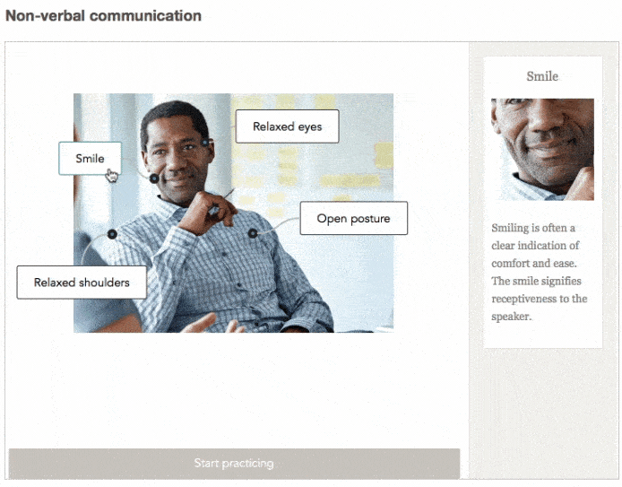
Second, images can convey complex concepts or relationships with an ease that can't be duplicated with text. For example, this information about body language is much easier to visualize than try to explain with paragraphs of text.
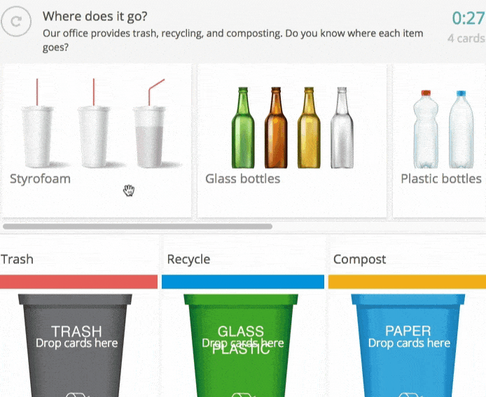
A third benefit of visual learning: when you teach with images, you can at least partially remove language barriers. With so many companies now hiring from all parts of the world, when you get a concept across without translating huge blocks of text you have more time and energy to focus on your training content. For example, this interactive exercise about proper waste disposal uses both images and text to create a training exercise which is universally understood.
Graphic Design Concepts Improve Visual Learning
Our brains are tuned to the content of visual information. Over one-third of the human brain is dedicated to analyzing images. It's a process so complex, it can't be matched by computers.
But image quality counts. This means different images have different impacts. Contrast using scale, color, hierarchy, and space plays a role in how much of our attention an image receives. These design elements also play a role in where we focus our attention on.
The best images combine graphic design concepts. Use at least two concepts together. Scale and color, space and hierarchy. But you don't have to stop with just two. In our final example, we'll combine scale, color, and hierarchy.
Let's look at each element first. Then, we'll tie a few of the elements together in a real-world training example.
Scale
Scale, or size, lends importance to objects by calling attention to them. Larger objects tend to be more dominant. This seems pretty obvious, but you can combine color and scale in ways that create balance. For example, a small, warmly colored object can attract as much attention as a larger, cooler colored object.
Color
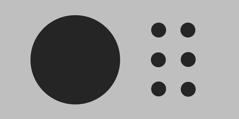
Red, orange, and yellow are the warm colors. Subjectively, warm colors are seen as more active and energetic. They appear closer to the viewer. Green, blue, and purple are the cool colors. Cool colors are often subjectively viewed as more subdued or relaxing than the warm colors. These colors appear farther from the viewer. Take a look at these two images. What do you notice about them?
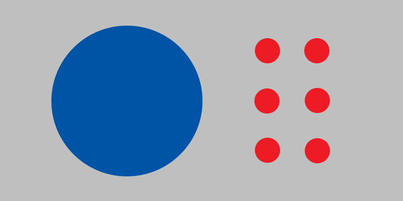
In the first image, the red circle really jumps out at you. It's the largest element in the image, and it is also a warm color. It's impossible not to see, and it makes the smaller blue circles harder to see.
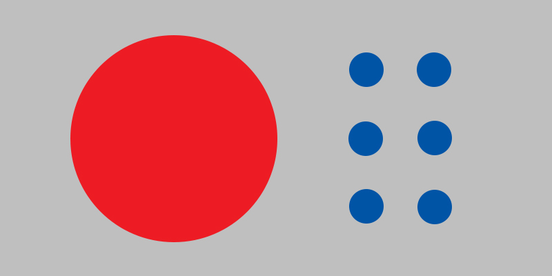
In the second image, the small circles are easier to see. The warm red makes them "jump out" at us. The large circle is still the biggest element in the composition, but it doesn't dominate the image the way the large red circle does. The cool color helps balance the large circle's scale.
But beware: approximately 4.5% of the population is color blind. Therefore, you never want to rely on color alone to convey a concept.
Hierarchy And Space
Hierarchy is another way to create significance among visual elements, and can be thought of as the placement of objects. There's a reason C-level executives are at the top of the company's About Us page. They are the leaders of the company, and placement at the top instantly tells you that.
Space is another important way to create relationships in an image. Elements placed close together are inferred to belong together, while elements spaced far apart are inferred to be unrelated elements.
If the graphic below represents two divisions in a company, it is easy to imagine the relationship. The circle at the top is automatically assumed to be the head of the division, with the smaller circles below representing the rest of the team.
You probably noticed that the example also uses scale to emphasize the hierarchy between the top and second rows. We might also infer that the third row of circles is subordinate to the second row, and this relationship could be further emphasized with a difference in scale between those rows, also.
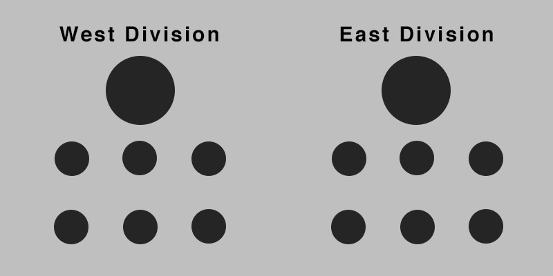
So, we are actually combining three design elements here. We use a clearly defined hierarchy of elements, with scale to emphasize the top of the hierarchy. And, we use space to create the two divisions and develop the relationship between two different groups.
Applying It All To Your Training
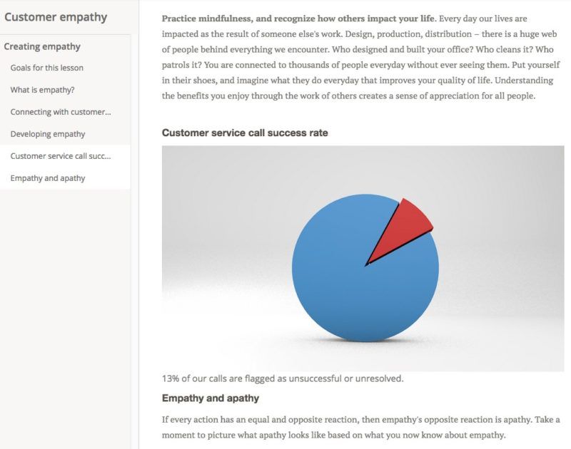
Let's pull these concepts together and put them in a training graphic. Using what we know about scale, color, and hierarchy, we'll create a pie chart for our training on customer service calls. We'll use color and hierarchy to call attention to the smaller piece of the chart, and that will offset the larger scale of the less relevant section of the chart.
In the example below, the larger piece of the pie chart is important, but we actually want viewers to spend an equal amount of time looking at the smaller portion of chart, as that is the focus of the training. We create an overall balance using warm and cool colors to offset the difference in scale between the two sections of the chart. And, since warm colors stand out from cool colors, we focus attention on the smaller section of the chart – the part we want to emphasize. And finally, we place the small section of the chart higher up to help call attention to it (hierarchy).
Conclusion
Visual learning isn't an intellectual shortcut for the creator or the learner. You still have to put thought into what you are creating and how it will be received. Apply graphic design concepts to visual learning elements and you will improve the effectiveness of your training.
* All graphics were created by Michael Chappelle
