
Ever felt like this?
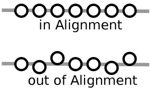
You hit the sack after a big day. You snuggle down into your bed and drop off to sleep dreaming about design principles. You awaken after what you think is a great night’s sleep, but as soon as you move to get out of bed, you are assaulted with an excruciating pain in your neck. As you stumble out to your morning coffee, you realise with a dawning horror that you have slept funny and now your neck is ‘kinked’ and out of alignment. Pain is going to be your ‘bestest buddy’ for the balance of the day. Ouch!
When it comes to design elements in your e-learning modules, the same lack of alignment will cause your learner’s ‘pain’. For example:
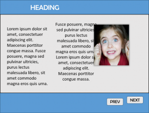
Notice how everything seems to have been thrown haphazardly on the page? It’s not easy to look at, is it? The heading doesn’t line up with anything; the text on the left of the page has been left aligned, whereas the text on the right of the page has been centre aligned; the picture seems to have been added as an afterthought (or by accident, not too sure about that one) and it doesn’t line up with anything. Even the navigation buttons don’t line up with each other. It looks like the next button has had enough of the previous button, and he’s ‘taking his bat and ball’ and going home.
Now imagine if the designer had taken this approach to the entire module with a complete lack of regard for not only alignment, but repetition as well. Your learner is going to end up trying to find their way through a Frankenstein of a course, using what precious learning power they have, to interpret what they are seeing and make sense of the mess. They should be using that learning power to construct meaning from the content not the visual elements.
As a designer, this lack of alignment makes things appear unprofessional, messy and thrown together in a hurry
What is Alignment?
Alignment comes into your design in a number of ways. At its core it’s about elements being in line with each other. For example:
Your body text uses alignment. If you look at text on a page, it can generally be left aligned, right aligned, centre aligned or justified.

For left aligned text all of the sentences start from the left of the text box, right aligned text from the right, centre aligned text spreads out evenly from the middle; and justified text tries to spread all of the words out from left to right to create a column of text.
Personally, I try to avoid using justified text unless I am going for a newspaper column effect. Otherwise it leave a whole lot of uneven spaces that look messy.
Whatever alignment you decide for your body text, adding the design principle of repetition means you should stick with it throughout the module. Having text boxes thrown around with random alignments (left align here, fully justified there, centre aligned over at the side.) looks unprofessional, messy and forces the learner to process extraneous stuff that is not relevant to what they are learning.
The only time I would recommend using a different text alignment is to contrast a heading or a caption.
Alignment really comes into play when you are placing your assets (graphics, text boxes, shapes) on your slides. All of the assets on your slide are connected by an invisible line. Even items that are far away from each other. Always try to align assets with other assets.
For example:
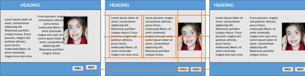
The orange lines show how these invisible lines connect everything on the page. Once you can identify and line up those invisible lines it leads to a much cleaner, professional looking layout. As mentioned, this allows the learner to use their learning power for what they are learning about, as opposed to making sense of what they are looking at. Design at its core is about helping people make sense of what they are using, looking or interacting with. It’s not just about how it looks, but how it works.
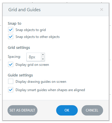
A grid is your best friend when it comes to aligning items on your page. You can access one in Storyline by going to the View ribbon and selecting the Gridlines tick box.
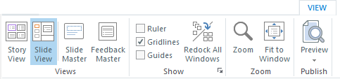
Need further help? Select the Show options to select object snapping, smart guides and more.
Finally, one of the best kept secrets in any software, is the ‘align’ menu option. In Storyline it’s located on the Drawing Tools > Format menu which appears when you select an asset.
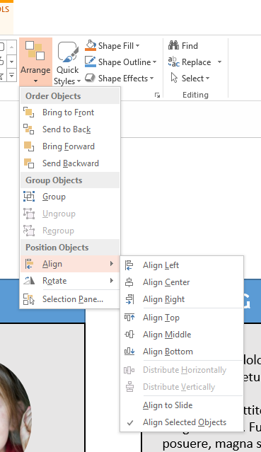
This will allow you to select multiple assets and align them whichever way you want! Want to space three items out evenly on a page? Select all three items, click Align Middle, and then click Align Horizontally. Easy! Makes it much easier on you as a designer when it can be done automagically.
The fact you can do it automagically means there is no excuse for bad alignment in your modules!
Do your learner a favour, and align align align! Having everything aligned on your page makes it easier for your learner to process what they are looking at. It gets them directly to the learning, as opposed to being lost in the mess.
Reference:
Image Excitement (July 2011). Credit: Alexandre Normand https://www.flickr.com/photos/alexnormand/5992512756. Used under Creative Commons Attribution 2.0 Generic license, no changes made.