
Responsive eLearning Design For Higher Engagement And A Better Learning Experience
Background
Mobile learning, or learning on the go, provides multi-device support.
- This means that all mobile learning courses run seamlessly across devices ranging from smartphones or tablets to desktops or laptops.
- As an extension, the learners can choose to learn on the device they prefer.
- Additionally, they can move between devices during a given course with the flexibility to resume on another device exactly from where they left on a given device.
Slowly, there is a shift from offering this multi-device support that featured a fixed layout (mobile-friendly or adaptive eLearning design) to a dynamic design (mobile-first or responsive eLearning design) that automatically adapts to the viewable area of each device.
Should You Consider Investing In Responsive eLearning Designs?
As is true for any transitions, this raises associated questions like:
- What exactly is a responsive eLearning design?
- When should you invest in responsive eLearning designs?
- Does it indeed create a better learning experience?
In this article, I provide answers to these questions and then outline tips that you can use to create great responsive eLearning designs. I wrap up the article with 7 examples from our repository that show you how you can create great responsive eLearning designs that will create a more engaging learning experience.
What Are Responsive eLearning Designs?
Unlike the first-generation, mobile learning solutions that were mobile friendly (worked on all devices but featured an adaptive or fixed layout), the mobile-first or responsive eLearning designs adapt to the viewable area of a device creating an optimal view and a better learning experience.
Interestingly, the responsive eLearning designs draw their inspiration from the responsive website designs.
To illustrate the difference between adaptive and responsive eLearning designs, see how the same content would appear across devices:
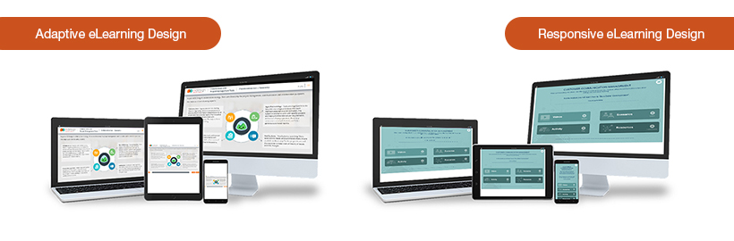
Responsive eLearning Designs Have The Following Two Characteristics:
- Optimal viewing across devices that creates a better learning experience.
- Learning interactions that are optimized for mobile devices and thereby create higher engagement.
Why Should You Invest In Responsive eLearning Designs?
While mobile friendly or adaptive eLearning designs provide the flexibility to learners to consume learning across devices, they are designed primarily for layouts of desktops/laptops. As a result, they work well in the landscape mode on tablets and smartphones. However, in the portrait mode, the content shrinks.
Furthermore, since they are not primarily designed for mobile devices, they use learning interactions that are not optimized for mobile devices.
You Should Invest In Responsive eLearning Designs:
- When you anticipate the predominant consumption of eLearning on smartphones.
- When the eLearning courses feature shorter nuggets (microlearning-based approach). Remember, it is unlikely that your learners will take up a 45-minute or 60-minute course on a smartphone.
- When your learners ask for the informal learning nuggets to practice, refresh, or apply their learning on the job.
- When you have on-going updates that are short and need to reach the users just in time.
- When you want to push learners to face challenges and upgrade their skills.
- When you want to encourage self-directed learning.
- When you want to target personalized learning.
Take a look at the following stats that prove the rise in consumption of content on mobile devices and more significantly, why you should adopt a mobile-first approach:
- According to the latest Digital Future in Focus report from comScore [1], we’re long past this tipping point in some countries, with India, Mexico and Indonesia having more than up to 4 times higher smartphone vs desktop audience.
- 70% of learners feel more motivated accessing training on a mobile device, as opposed to a PC [2].
- 83% of mobile users say that a seamless experience across all devices is very important [3].
How Can You Create Great Responsive eLearning Designs?
Here is a list of my 5 tips that will help you create great responsive eLearning designs for your learners:
Tip 1
If you are planning a first-time roll out of response eLearning design in your organization, do plan for a focused user group testing early in the development cycle. This will ensure that the feedback can be applied in the eventual delivery and you get a clear affirmation that responsive eLearning is indeed the answer your learners are seeking.
Tip 2
Start the design from the smallest real estate (smartphones) and then build up to other devices. Validate the design feasibility on the smartphones, particularly the portrait mode. With this foundation, you will be providing optimal viewing across all devices that learners may opt for.
Tip 3
There is a significant process of eLearning content customization that you need to factor for. Once this is done, can you offer an optimal learning experience across different devices with different viewable areas? For instance:
- On smartphones, you should plan to offer the “must-have content” in the first pass. Create room for exploration and layer the related information.
- You need to optimize the file sizes so that there is no challenge of loading. Remember, on smartphones (on the go), your learners are not going to wait for the content to load. In case this optimization is not adequate to get the required loading time, do look for alternate imagery for smartphones.
Tip 4
Simple and intuitive navigation is vital in creating a great learning experience, and this aspect assumes a greater relevance on smartphones on account of limited real estate. Obviously, what would work for a smartphone will not look as good on another devices, so do select different formats so that you are able to offer equally good learning experiences across devices.
Tip 5
Effective learning interactions hold the key to a successful and sticky learning experiences. Remember not to transpose what worked on tablets/laptops; this would not work and in fact, may come in the way of big thumbs.
Similarly, all clickable buttons or other assets must be large enough. Otherwise, the learners would find the approach to be cumbersome, and they will lose interest, including suspending the learning on smartphones.
7 Examples Of Great Responsive eLearning Designs
Now, I pick 7 examples of responsive eLearning design. In each example, I have highlighted why we love this design.
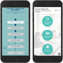
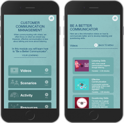
Example 1: Learning Experience
I love the immersive learning experiences and engaging learning journey in this course. It offers short, nugget-based formal training and Performance Support Tools (PSTs or job aids) for learners in different formats; videos, decision-making scenarios, and gamified assessments. This is not all. There is curated content that is updated periodically so that learners keep coming back for more!
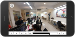
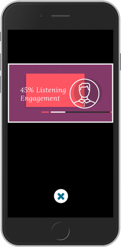
Example 2: Unique Interactions
I love the simple yet intuitive interactivities that emulate a mobile app design approach in this course. The Virtual Reality (VR) nugget is my favorite as it offers an immersive and sticky learning experience.
Example 3: Usage Of Video-Based Learning, Learning Path And So On
I love this approach as it leverages the power of video-based learning in a microlearning format; context-setting, explaining a concept, providing a solution, or creating a learning summary.
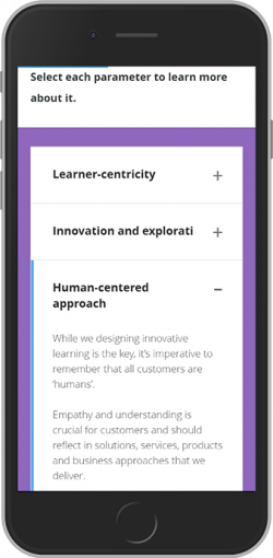
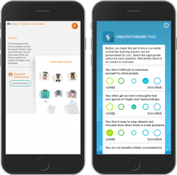
Example 4: Usage For Personalized Learning
I love this course for the granularity of microlearning-based learning paths to offer a personalized and participative learning journey.
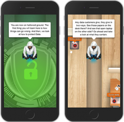
Example 5: Usage for Formal Learning
It is used as a prelude to a larger course, such as data security and privacy. The microlearning format used is that of a parallax website with interspersed learning elements as the learners complete their journey. I love the anchor; an ethical hacker who leads the learners through the learning path with highly interesting comments.
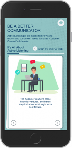
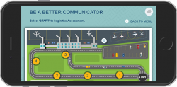
Example 6: Usage For Informal Learning
I love this course as it features a very real and relatable situation that each one of us would have encountered at the workplace! It uses a decision-making microlearning format where scenarios drive the learning journey along with a fully responsive design appeal, using our custom HTML5 framework.
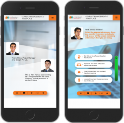
Example 7: Usage Of Quizzes And Scenarios
I love the combination of microlearning with quizzes and scenarios for higher engagement and better retention of formal training or Performance Support Tools (PSTs or job aids).
I hope this article provides you with insights on what responsive eLearning designs are and when should you invest in them. I also hope that the featured examples showcase how you can use the responsive or mobile-first eLearning designs to create better engagement and higher impact training.
If you have any queries or need any specific support, do contact me at apandey@eidesign.net.
Read More:
- How To Use Responsive eLearning Design For Better Learner Engagement
- Top 10 Features Of Trivantis Lectora Inspire 17 For Responsive eLearning Development
- Top 8 Features of Captivate 2019 That You Can Use to Create Immersive Learning Experiences
- 10 Mobile Learning Trends For 2018
- Free eBook: 12 Examples That Prove Mobile Learning And Microlearning Is An Essential Combination To Meet Your Learning Mandate
- Migrate To HTML5-Responsive Or Mobile-Friendly eLearning To Create High Impact Learning Experiences
- 10 Awesome Ways to Use Mobile Learning for Employee Training
References:
- Mobile Marketing Statistics compilation
- Why should you consider mobile-first for your corporate training?
- 38 Mobile Marketing Statistics to Help You Plan for 2018 [+VIDEO]
- Enhance Your Learning Strategy with the eLearning Trends in 2019 - August 8, 2020