


In today’s world images matter a lot more than they used to. It’s probably because we live among screens and are constantly assaulted by alluring or aggressive visuals. Human behavior is driven by what we like and everyone from the advertising industry to department stores or online retailers are doing their best to tap into this in order to make us choose their products or services.
When you enter a supermarket, for example, the first things you see are fresh fruit and vegetables, flowers or some tasty-smelling pastry products. That gives a fresh sense of wellness and puts the customer in a positive (buying) mood.
Imagine if you were to go in and be met with racks of toilet paper and cough medicine. They are both very useful and probably on your shopping list but you’d still rather get to them later, after thoroughly enjoying the sight of shiny ripe grapefruits.
Since the way things look play such a great part in a person’s decision to buy or go through with something, it puts instructional designers in the position of paying a lot more attention to how training courses look rather than focusing mainly on the learning objectives and information to be delivered.
5 Tips for better graphic design in e-learning courses
Without further ado, here are a few ideas instructional designers usually find useful when they want to create new training courses with better graphic design:
-
PowerPoint is out
It used to be a lot easier in the time when PowerPoint was king and all you needed were a few nice pictures and some of the fly in/ fade out effects to ‘wow’ an audience. One might still get the ‘wow’ factor out of that today but it will be only because the whole thing would seem delightfully obsolete – like playing music on a tape.
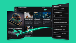
Luckily, one does not need an extensive academic education in order to be able to create good, attention holding graphics. There are a lot of very useful tutorials available on the web and a few useful tips for making things look fantastic. Anyone can create eye-catchy infographics or interactive presentations.
-
Choose an appropriate layout
Consistency is of the utmost importance in any learning material. The end user needs to get accustomed to a certain pattern and know what to expect at the next step, not to be surprised or bewildered every time the screen changes. For this purpose, it is advisable to pick a layout right off the bat and build the entire module on that particular structure.
People naturally scan a page from top to bottom and left to right. As a result, important information should always be placed at the top while the relevant points ought to be somewhere to the right.
Unlike detective stories where it is best if the reader is still wondering “who done it” until the last page, in e-learning it is unwise to hide the focal points and make the user search for them by clicking something or going through heaps of less important facts. They will most probably get bored, click on the little x at the top of the page and open a novel by Agatha Christie on their e-book reader instead.
-
On the font front
With so many types of fonts, there is a great temptation to use a whole bunch of them. Still, as I pointed out before, consistency is highly important so picking two (or maximum three if it’s a longer module and you need them to differentiate between various types of information or activities) is the safest bet.
Going whimsical is not a very good option – though it might be funny to spell out safety information with gothic symbols – users are more likely to focus on the writing rather than on what it says so it end up defeating the purpose. The writing should be very clear, decently sized, with titles and subtitles a little larger or in bold.
Since e-learning is versatile and can be accessed across a wide range of devices, choosing fonts that read well on any type of screen is best. Making it easy for the end user to follow the course flow is what ultimately guarantees its success.
-
Out of all the pretty colors
Since we have long left behind the days of black and white film, it’s all about the color these days. Just as with fonts, there are so many options – all the main ones and the elusive turquoise, magenta and teal that men can’t really distinguish for the life of them.
Colors have the capacity to grab attention and, when used wisely, generate emotion. It’s a known fact that emotion facilitates learning so picking the color palette for an e-learning module is an essential step.
Once more, moderation is the way to go with no more than three colors for the entire presentation. It’s all right to use them for the written text in order to make some aspects pop out but too many colored words can prove tiresome for the eye so carefully pick what information needs the color treatment and leave everything else in the plain, old-fashioned yet thoroughly effective black. It’s best if the colors are contrasting ones, otherwise there is the risk of nothing standing out.
-
Images worth a thousand words
Once the layout, the fonts and colors are picked, it’s time for selecting the visuals to be incorporated. While all the things mentioned before are more or less free, with pictures it is a bit trickier since, while you can still find some both great and free, for many of the great ones you have to pay royalties.
Furthermore, the quality of the images is also to be taken into consideration – a blurry picture will only distract the learner and give the impression the whole course was not professionally designed. Once more, the designer ought to make sure they will look just as good on any device.
Images should help make a point or enhance important information. If they are there just for the aesthetic effect, they just clutter the screen for no reason. Using symbols or visuals that contain cultural references is fine as long the entire target audience is familiar with them. Images should not need further explanations or short history lessons, as their purpose is to illustrate the information they stand by.
Conclusion
Regardless of the topic of an e-learning module, the way it looks will have great bearing on how often it is accessed and how learners react to it. Keeping it simple, coherent and eye-friendly is a sure way of achieving better information retention and learner engagement. And you don’t need a college degree in Arts to make it so.