
What do you picture when I say the words “eLearning Quiz?”
Are you seeing a question with multiple choice answers?
Was there anything on the screen besides text?
You probably didn’t picture something like this:
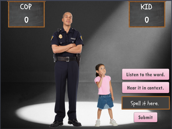
Well, that’s the quiz eLearning great, Jackie Van Nice, designed for an Articulate Heroes Weekly Challenge on Spelling Bees and Interactive Vocabulary Quizzes.
Let’s dissect this quiz and see if there’s anything we can learn from it to apply to our own designs.
Before we break down the quiz elements, you can can view the course here.
Here are the 10 things I like best about Jackie’s design:
1. Push beyond “form” to “free form” design
There are two basic design frameworks for quiz designs: form and free-form.
Here’s a side-by-side comparison of Jackie’s freeform quiz vs a traditional quiz.
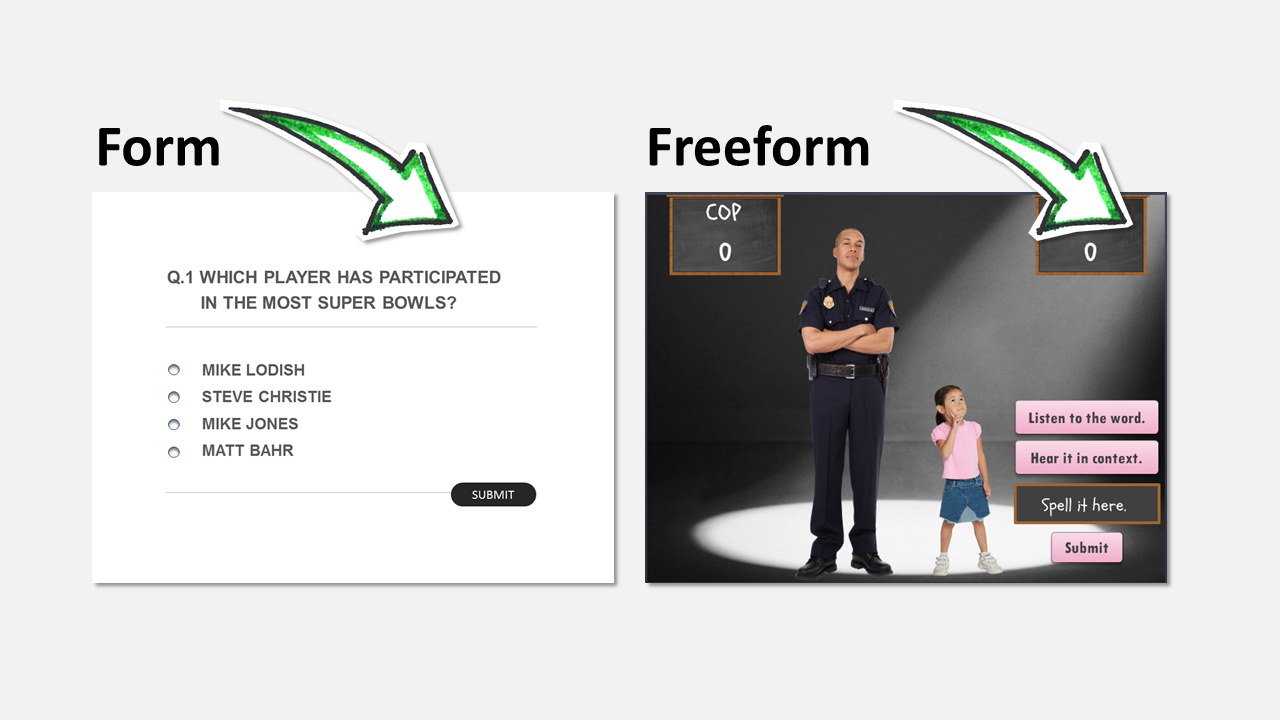
The difference in the designs above is striking.
You may not know it, but most of the good quiz authoring tools (Articulate Storyline, Adobe Captivate, Lectora Inspire, etc) give you total control over your quiz design.
At its core, a good free-form quizzing tool will allow you to do 5 things:
- Customize the backgrounds of the slide
- Customize the interactive elements (e.g. buttons, scores, etc)
- Move the interactive elements anywhere on the slide (e.g. radio buttons, fields, etc)
- Control the flow based on response (e.g. different answers branch to different outcomes)
- Insert non-quiz elements (e.g. blank slides that you can link to)
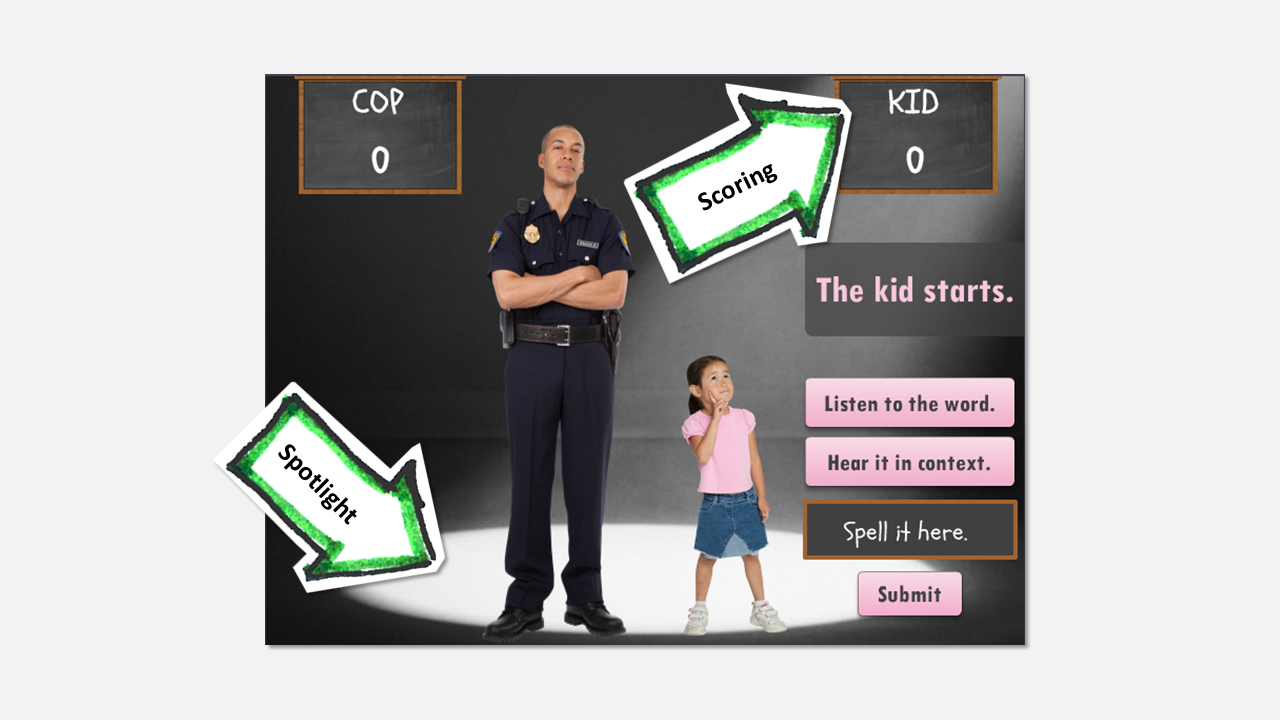
For this design, Jackie used the Storyline text entry method for the core functionality of this free-form quiz in the “Spell it here” box.
2. Incorporate interactivity to boost engagement
Jackie included interactive features to the course that added a lot to the design and your can read more about the technical details here in her writeup here. Some of the interactive elements include:
- Buttons to trigger the audio prompts
- Text entry for quiz input
- Running total of the score
- Custom results screens based on performance
3. Don’t be afraid to use humor
I’ve written before about using an informal tone. It’s easy to get bogged down with a formal tone for corporate eLearning. But informal tone (and humor) can be a big improvement to the user experience.
For this course, terms like “outtie” and “shiv” and their use in a sample sentence made me laugh.
Obviously you need to use some good common sense, and it depends on the subject matter, but humor can be engaging.
4. Get creative with intro slides
A good place to start is with an interesting static intro screen. But Jackie takes it a step further.
The slide build she uses accomplishes several things. Check out the sequence below:
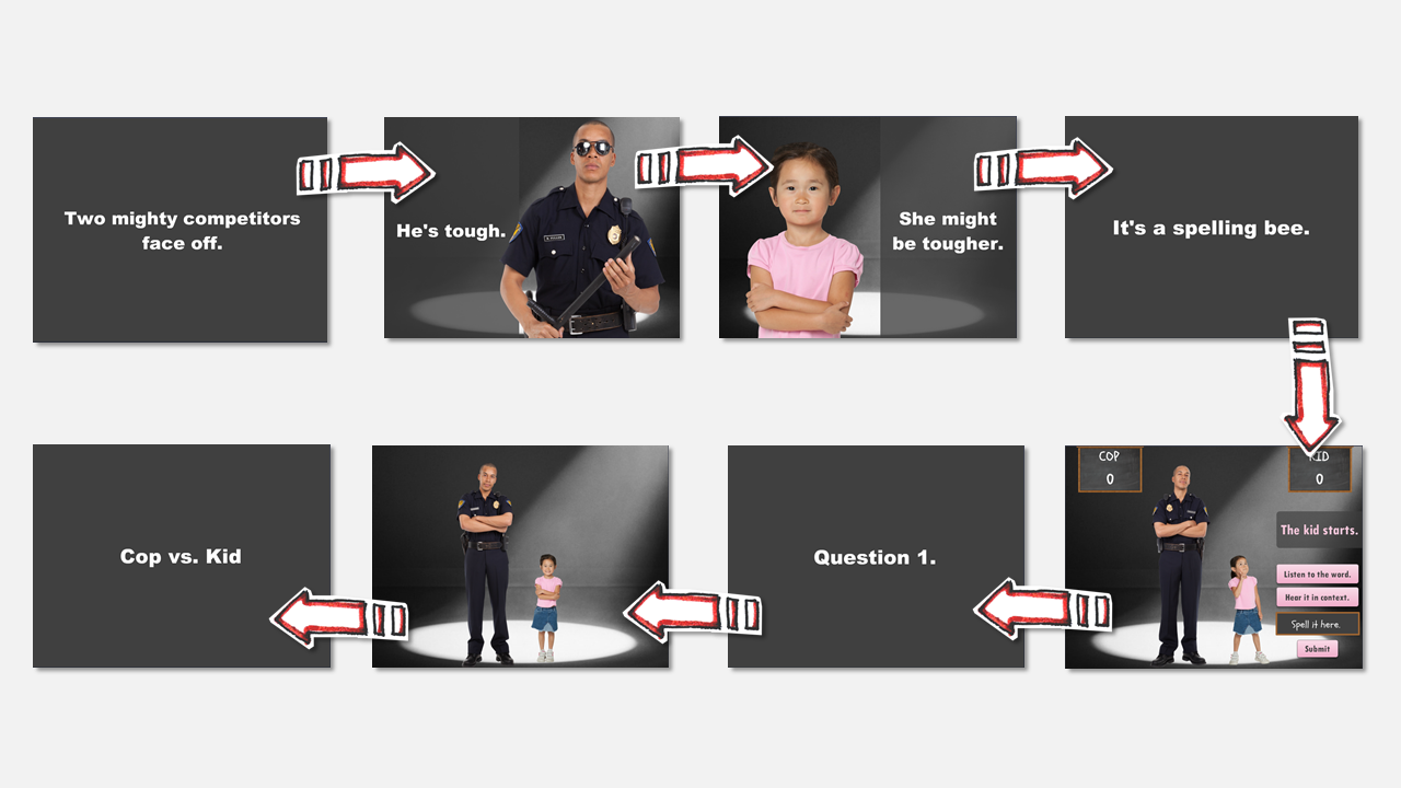
The whole sequence is only 15 seconds long, but here’s what Jackie is able to establish in that time:
- Story: Two competitors and the key actors are a cop and a kid.
- Purpose: Spelling Bee.
- Tone: Informal and fun.
- Instructions: She leads into Question 1 with a break slide, then, like in good video game design, you don’t need a user’s manual to figure out what to do next. The instructions are clearly on the first slide.
She gets the point across with very little text. In fact, besides the actual quiz slide, there are only 20 words in the intro.
5. Change character expressions for right or wrong answers
After each question, Jackie loads a custom feedback slide that tells you if you got the spelling correct. I like that it’s not just a text response; she uses character expressions to show the emotion of getting the answer right or wrong. Check out the image below:
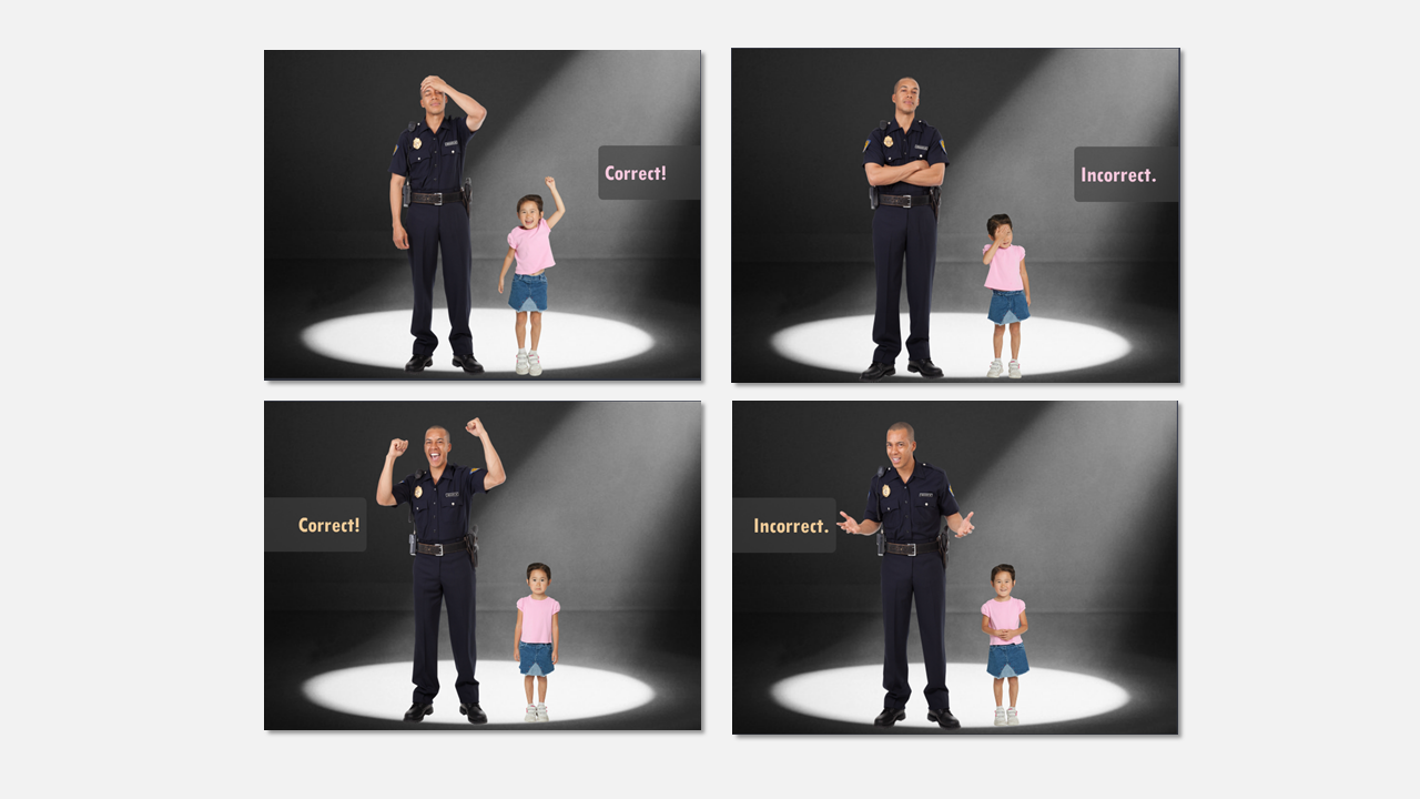
When I think about the poses that I’ve photographed characters in, here are some that I think work well for quiz feedback.
- Correct poses: thumbs-up, aok, winking, clapping, cheering, jumping, and proud.
- Incorrect poses: sad, confused, frustrated, bored, and angry.
Looking at the poses below, you can guess pretty quickly which is a correct vs incorrect pose.

6. Use backgrounds to emphasize characters
I like the simple, clean focus on the background, which I’ve talked about in lesson on de-emphasizing background to highlight the characters. I had also taken my own pass at creating a spotlight effect a few years ago, but I like Jackie’s design.
Here is an updated video where I try to recreated Jackie’s spotlight effect in PowerPoint. It only took me about 5 minutes, which is cool.
This sort of background scene uses the Wall, Baseboard, Floor technique that I first saw David Anderson do, and you can see my video on the WBF technique.
7. Create a consistent design element
If I had to sum up the style in 3 concepts, I would say: Dark background, school, game-show.
Dark Background Theme: The first thing you’ll notice is that the dark background carries throughout all course elements.
School Theme: Jackie created a shoolish game show feeling. Here are the elements that brought the theme together:
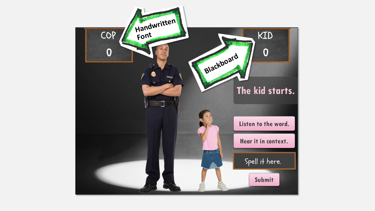
Game show theme: The scoreboard and the spotlight both make this course feel like a gameshow.
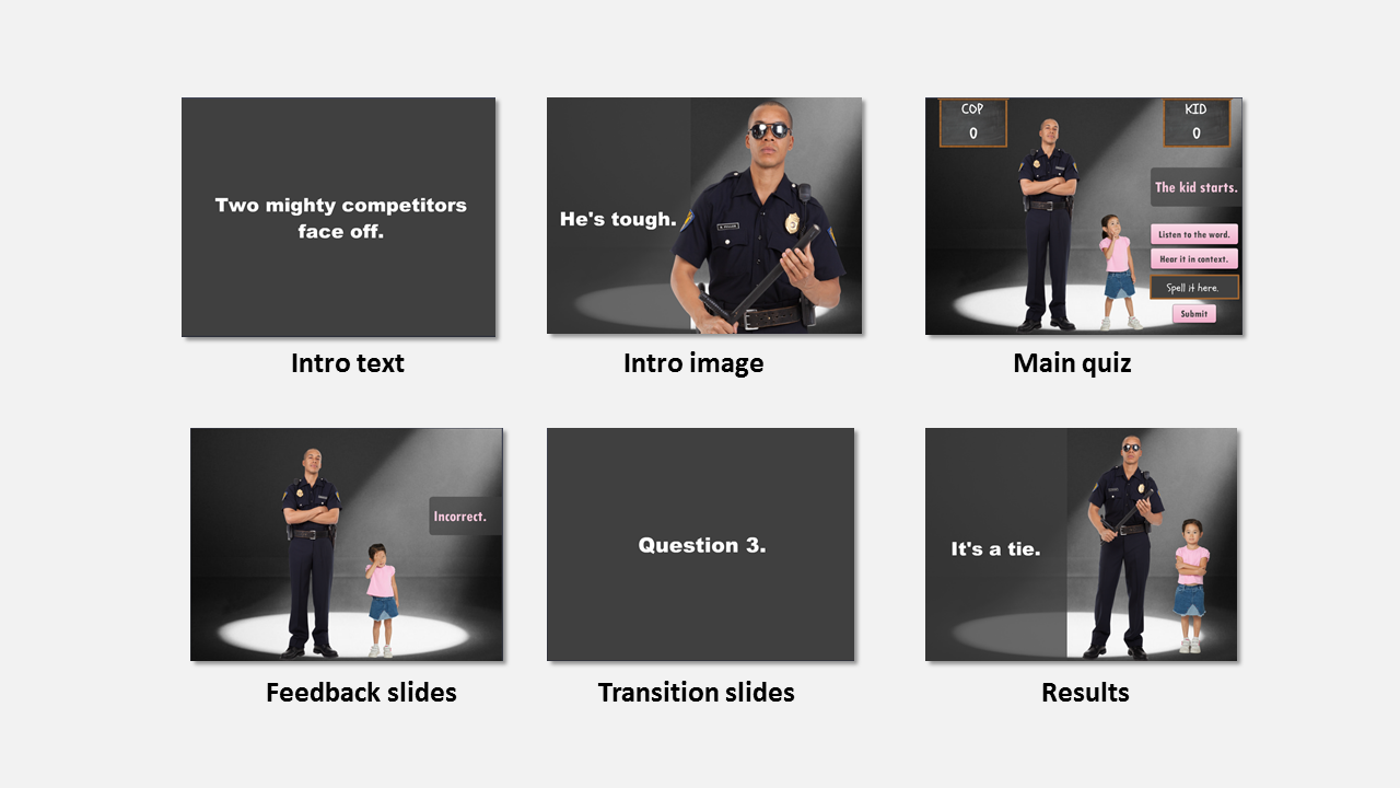
8. Add slides between questions for feedback and transitions
In this case, Jackie has two both a feedback slide and and transition to the next question. Good quiz authoring tools will give you the ability to link to custom content from (and between) quiz questions.
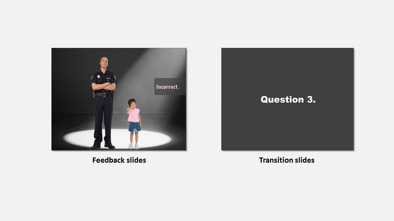
While these transitions are just providing right/wrong feedback and a transition to the next slide, you could link to additional content that supports the lesson. Or, you can get fancy and turn a quiz into a branching scenario.
eLearning examples
Jackie is always creating cool examples and sharing them on her blog. I look forward to getting the emails of her new posts. If you want to follow Jackie, visit her website and enter your email on the right navigation to get email updates when she posts.
What were your favorite elements of the quiz?
After looking at Jackie’s course, what are your favorite elements? Any lessons you’d like us to create how-tos about? Share your thoughts in the comments below.