

Most PowerPoint presentations suck.
You’ve probably seen your share of bad ones.
(and you may have even delivered a bad one yourself- I know I have!)
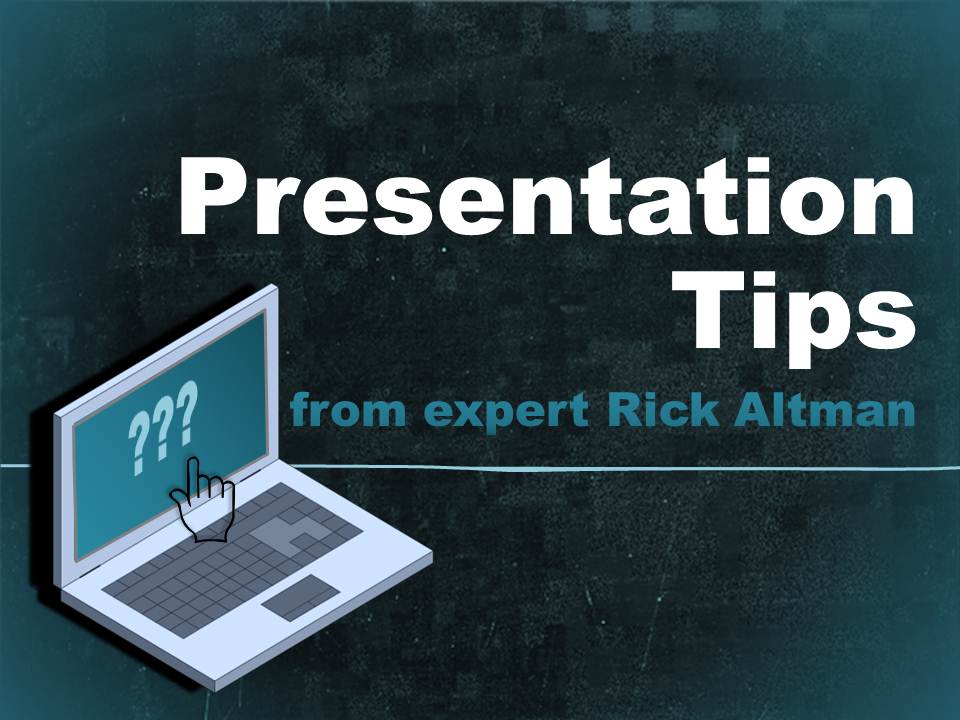
That’s why I interviewed presentation guru Rick Altman to share some of his best tips on giving better presentations.
Rick shares not only “why” most presentations suck, but also “how” to make them better.
In fact, he wrote a highly rated book with exactly that in the title: Why Most PowerPoint Presentations SUCK; and How You Can Make Them Better. So I know he’s the right guy!
Not only is Rick a popular presentation author, he’s also the organizer of the Presentation Summit, an elite conference that pulls together the top presentation minds in the world for 4 days.
With that said, let’s get on with the interview!
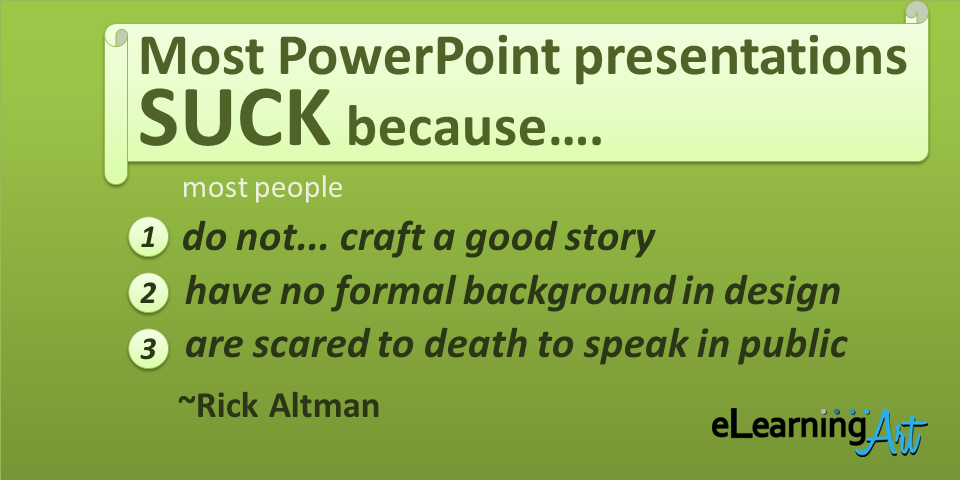
Why do most PowerPoint presentation suck?
Most people do not really understand how to craft a good story, they have no formal background in design, and they are scared to death to speak in public.
Then there are two ironies:
- PowerPoint is actually too easy, so very few people take the time to learn it as they should; and
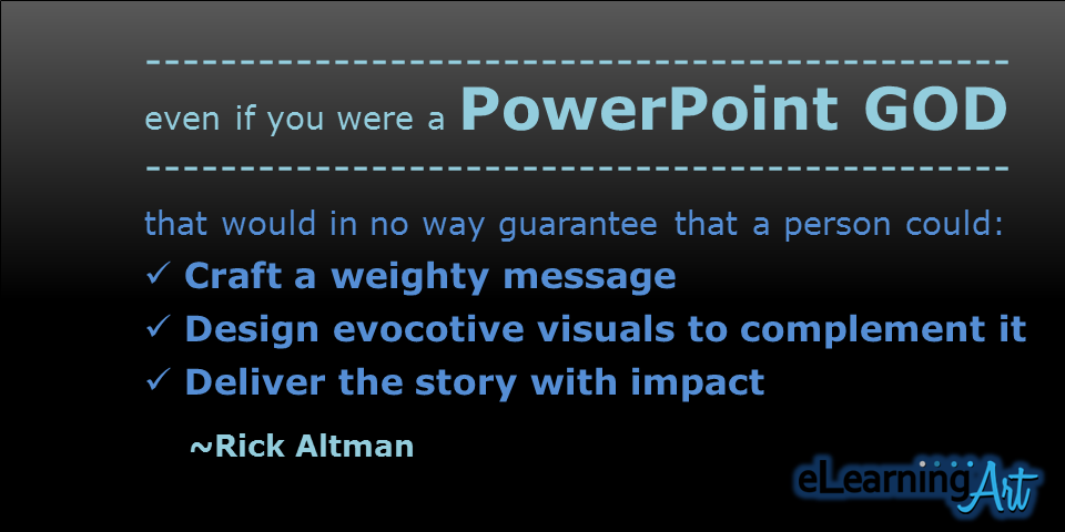
- even if you did take the time to learn it properly — even if you were a PowerPoint god — that would not in any way guarantee that a person could craft a weighty message, design evocative visuals to complement it, and then deliver the story with impact.
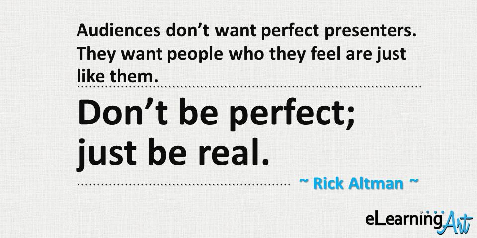
What’s your #1 tip for becoming a better presenter?
Audiences don’t want perfect presenters. They want people who they feel are just like them. That should be incredibly comforting news to all nervous presenters. Don’t be perfect; just be real.
What’s your best tip for good visual presentation design?
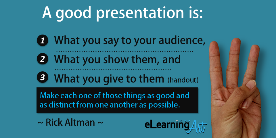
A good presentation is made up of three things:
- What you say to your audience,
- what you show them, and
- what you give to them (in the form of a handout).
Make each one of those things as good and as distinct from one another as possible. When you begin to think separately about these three critically important components of the presentation experience, you will begin to think like an effective presentation designer.
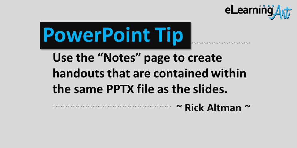
When you teach PowerPoint, what tip gets the most oohs and aahs?
Relative to my last answer, I open the most eyes when I discuss how to use the Notes page to create handouts that are contained within the same PPTX file as the slides.
Most people have never spent even a second in the Notes master so they never knew you could globally reformat the Notes pages to allow them to better accommodate the creation of handout pages.
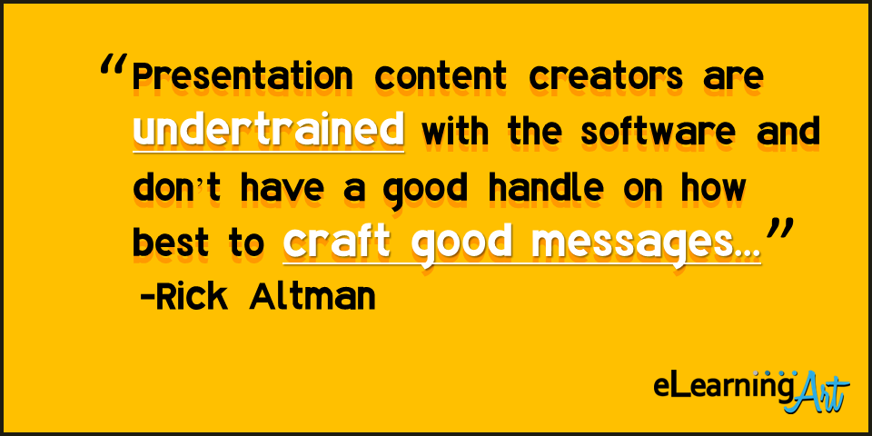
Is PowerPoint to blame for bad presentations?
Please. What can I say that hasn’t already been said a million times?
Who blames the hammer instead of the carpenter for a bad remodel?
See my earlier comment: a vast majority of presentation content creators are undertrained with the software and just don’t have a good handle on how best to craft good messages.
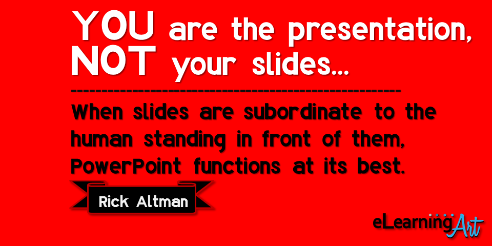
How does PowerPoint function at its best?
When everyone understands the simple axiom that you are the presentation, not your slides.
That immediately places everything in the proper perspective and does not compel you to try to do too much with your slides.
When slides are subordinate to the human standing in front of them, PowerPoint functions at its best.
What makes a PowerPoint presentation exceptional?
Nothing.
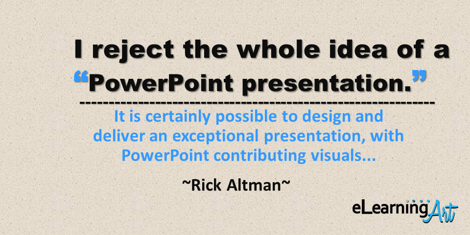
It is impossible to make a PowerPoint presentation exceptional.
See my previous response: it is certainly possible to design and deliver an exceptional presentation, with PowerPoint contributing visuals.
So some of this is parsing semantics — I reject the whole idea of a “PowerPoint presentation.”
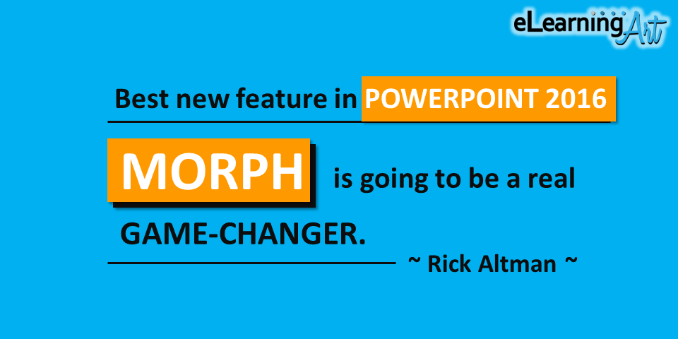
What PowerPoint feature are you most excited about with the latest release (2016)?
Morph is going to be a real game-changer. I have been complaining for over a decade that we do not have enough control over motion paths and over the animations that involve an object’s changing size. Now we do. Now we can create the end of an animation with meticulously-positioned objects just by moving those objects on a slide. The Morph transition takes charge of the animation between the “before” and the “after” slide. That is so much more precise and so much more intuitive than wrestling with the animation functions that have tried to perform those tasks.
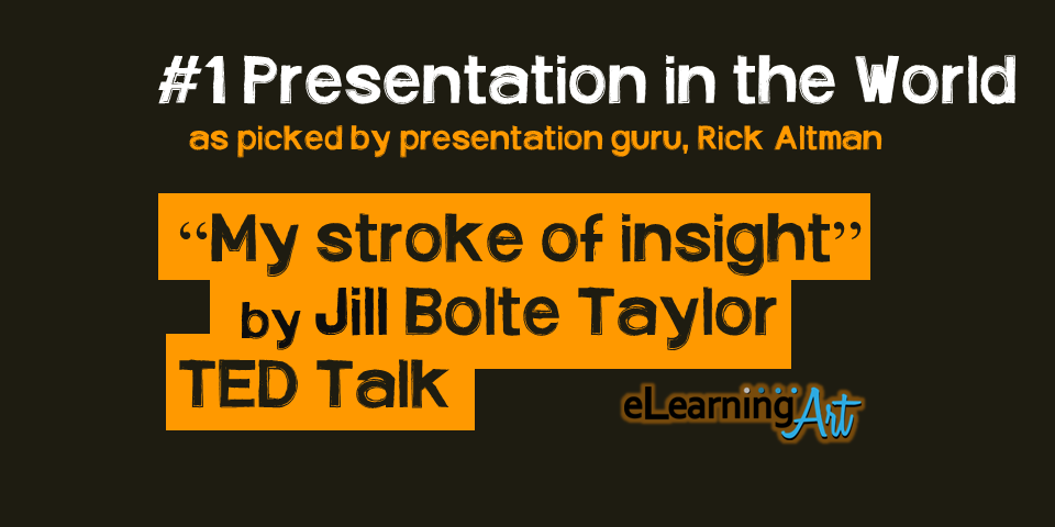
What’s your favorite presentation?
Hard to go wrong with Jill Bolte Taylor, the neuroscientist who described her own stroke to her TED audience. This after using an actual human brain as a prop.
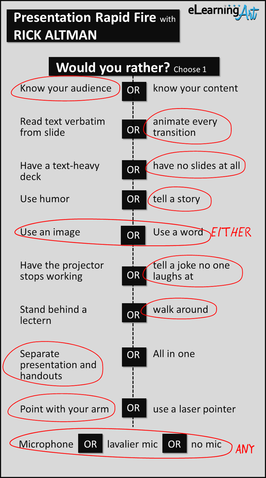
Rapid fire- Would you rather?
Note: Rick’s selections in bold
- Know your audience OR know your content
- Read text verbatim from slide or animate every transition
- Have a text-heavy deck OR have no slides at all
- Use humor OR tell a story
- Use an image or use a word EITHER
- Have the projector stops working OR tell a joke no one laughs at
- Stand behind a lectern or walk around
- Separate presentation and handouts OR all in one
- Point with your arm OR use a laser pointer
- Microphone OR lavalier mic OR no mic ANY
Free eBook and Rick’s book
If you like Rick’s tips, you can read more from him here: Why Most PowerPoint Presentations SUCK; and How You Can Make Them Better.