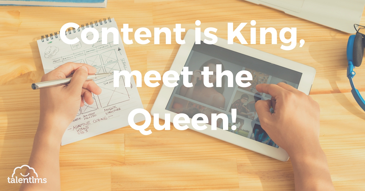
“Content is King”.
If that holds true and we believe it, then graphic design is the Queen! That’s right folks. You may have the best text and the best course materials, but your graphic design (typography, colors and images) will be the first features that will attract and retain your learner.
It’s very easy to lose track of your course structure in terms of graphic design, especially if it is not your main forte. Before you hire a dedicated graphic artist to flesh up your course text, have faith.
You can create a complete course – text and graphic design with the aid of these time-proven best practices. Read on to find out how many you can check off!
Typography Tips
Use font that is clear and device independent. A font that looks elegant on the tablet may not look as good on a smartphone. You would lose your mobile learners automatically.
The Arial font is a safer choice, as it shows well on all devices. There is nothing more unfortunate in an eLearning course than the content “lost in devices”!
Another advice is not to use more than two different fonts. One type to emphasize the headings and the other for the main content. Try using only two font sizes to avoid as well confusion.
Color Caution
If there is one element of a course that creates effective changes in the learner, it is the color. Use color with extreme care to evoke the desired emotions in your learner.
For example, use the blue color for font describing material for an exam to avoid stress and anxiety. Here are a few more eLearning color points you’ll want to consider:
Stick with a color scheme that involves 2 to 3 colors, any more than that and your design can start to look like a mess. Try to stick with one color for fonts for the main body of the text throughout your eLearning course.
Similarly, choose one color of the heading and another for the sub-heading to make them stand out. Pair contrasting colors on the color wheel.
For example, combine a light green font with a dark blue one to create a sense of drama and appeal to your eLearning course with such a graphic design.
Layout Ideas
Your eLearning course layout has a direct influence on the way your learners perceive, comprehend and retain information. When learners log into an eLearning course, they scan the page from top to bottom and left to right.
To make the most of this habit, place the most important information, such as main information near the top and the right-hand side of the screen.
Another good practice is to place similar objects or concepts next to one another to emphasize their connection. Use different colors to highlight different groups of information. Important information through links and images should be prominent. Draw the learner’s eye to key concepts by using symbols and arrows (and be consistent with their use throughout the course) making them the central point of the page.
Cohesive Visuals
Visuals, such as image, icons, and graphics, enhance engagement and create a sense of suspense and excitement in the course. They also help draw attention to the core concepts of the course.
As a professional practice, always integrate royalty free and high quality graphics and images. There is nothing more annoying than a blurry image in an eLearning course!
Use images that are relevant to the subject matter. Images used for their “coolness” serve very little purpose. In fact, they divert learners away from the learning goals and objectives. Also, try to localize the text and graphics for your audience so that they are able to relate to the content easily.
The White Space Issue
Have you heard about cognitive overload? Think about the overwhelming feeling you may have had when looking at a document with lines and lines of text and figures. Your brain feels confused and you do not feel like scanning the entire page.
Avoid filling the entire page with text and graphics. A bit of white space on each page helps avoid cognitive overload in learners. Leaving blank spaces on your pages encourages the learner to look at the desired information automatically. Absorbing and retaining knowledge is easier this way.
Do you know your audience?
The best thing about eLearning design is that you can modify it to benefit the learner. It is mandatory to understand as much as you can about your audience.
Every image, block of text, and color you choose for your eLearning course must offer some benefit to your audience. Each feature in your course must serve a learning need or inspire your unique group in some way. It should redirect their attention whenever necessary.
A good sense and practice of integrating graphic design is essential for an effective course. Use the power of the graphics to create a cohesive look – a unique theme that follows the course content closely.
Using these six best practices, you can design an eLearning environment that is beneficial to your learners.
| Tags: eLearning Tips