For this post I’ll be talking about video games and their impact on instructional design. This idea came to me earlier today while playing Mario Kart Wii with my son. At 36, I’m three decades older than Avery, but as I watched him play, I couldn’t help but find a new appreciation for the Mario Kart franchise that I, too, played when I was younger, in that it serves as a great generational equalizer. You may have another game that allows you to relate to younger ones just as I have with my six year old.
Watching him have so much fun with a game I also love got me thinking about how this phenomenon can be applied in the work place. And there’s no mistake about it, it is a phenomenon. As a father, I’m in uncharted waters in my family in exploring this method of connecting with Avery. When I was his age, video games were just coming to market (The Nintendo Entertainment System, for one). And sure, my dad could play the games with me, but he didn’t have the nostalgic privilege of reacquainting himself with characters he met as a child.
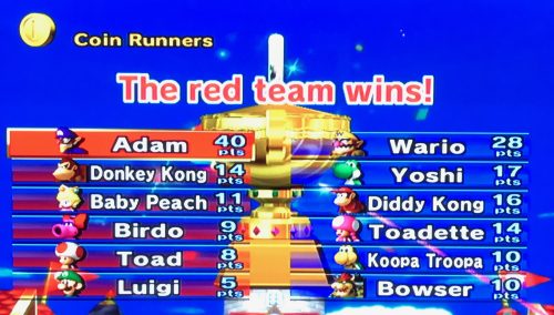
The same is true for today’s workforce. With millennials on the rise in the workplace, I would be a fool not to consider ways to lessen the generational gap when developing corporate training modules. Take a look at the image below (from Mario Kart Wii) that players are presented with after a Grand Prix – a series of four cumulatively scored races – and try to pick out the instructional design concepts that are in play on this screen alone. Then, read on to learn my take on it.

Here’s what I see when I look at this image:
- Object States – Think of each box that displays a character name as an object. After scanning all of them, you’ll see several differences. Each difference, no matter how minute, is considered a different State, and serves as a way to provide meaningful information to players…I mean learners.
- Opacity – Still looking at those objects from item 1, let’s ‘focus’ on opacity! And that’s just it; altering opacity allows designers to direct learner’s attention, or focus, on a particular area of the screen. In this case, Adam (the player) can find himself among several others with a quick glance thanks to his solid color state which really stands out among the other transparent ones.
- Alignment – Naturally, our eyes initial scan anything we look at until something ‘catches our eye’. And we do so primarily in a left-to-right fashion. Notice how the winning team (red in the image above) is positioned on the left of the screen. Upon this screen loading, our eyes don’t need to scan for too long before their attention is caught!
- Animations – Even though the image above doesn’t show motion, I assure you that fireworks flew in celebration of Avery’s top score. If you don’t believe me, see that pink streamer coming up from the bottom right of the image? Boom. I wonder if fireworks would bombard the screen in the event that Avery lost the race, or if there would be a gigantic trophy rotating triumphantly in the background?
- Audio – Ok, so maybe this was a bit of a trick! The image doesn’t have any sound, but the game certainly does. And for winning the race, any guesses on whether the jingle was of a celebratory or ominous tone? (HINT: ‘Ding, ding’, as opposed to ‘Dum, dum, dummmm’.)
- Leaderboard – In addition to all of this, we are presented with a leaderboard, which allows learners to gauge their progress among their peers. I realize, as a designer, the potential implications with displaying other’s scores that may land a bit scornful on some learners. But take it from me, consider de-identifying learner names in order to build anonymity into a scorn-free leaderboard you can present to users. Talk about ‘Ding, ding’!
- Branding – Here, I’ll reference the Mario Kart franchise as doing a great job in branding their characters, courses, and clickables in a way that a 36 year old who hasn’t played Mario Kart in over a decade, can easily recognize the brand at a glance!
- Consistency – The image above is just one of the over five dozen different race results screens in the game. Is there any question that any of the above would differ in any way, shape, or form in the many other results screens? My point exactly.
Lastly, by no means do I claim this to be an exhaustive list, and am certain I’ve overlooked or missed some things entirely. Let me know what you see, or your thoughts on my explanation, by leaving a comment below.
Until next time, go BE the YOND!
I enjoyed reading your post. User experience (UX) is becoming more intuitive with the development of mobile applications and your post reinforced how valuable it is to implement these UX principles in our learning designs. The less distracting and more intuitive our designs the greater the impact our training will have.
I enjoyed reading your post. I thought the same things playing video games with my 5 years old – Mario Kart is one our favorites. Check out my implementation of the same concepts discussed in your post: http://courseactive.com/transitions1/
You must be logged in to post a comment.


