
How We Make MagicBoxTM Native Apps Accessible
February 20th, 2019
Accessibility is increasingly becoming one of the most important aspects of mobile app development. In fact, operating systems like iOS and Android already provide accessible interfaces, making it easy and cost-effective to make mobile applications accessible to people with hearing or vision loss. Based on the understanding we developed while implementing accessibility in MagicBoxTM, we realized that mobile app accessibility is not a feature that you can add on top of an existing app, it requires a deeper understanding of accessibility needs and apps should be designed keeping accessibility in mind.
Accessibility implementation should not be focused on meeting the mandatory regulations or RFP requirements. Rather, designers and app developers should focus on meeting user needs with compassion and empathy. Most apps that add accessibility as an afterthought never get it right. While the app may pass the regulatory requirements users especially those who need accessibility features are unable to use these apps. If the design is right, time and cost are reduced and the app becomes a truly useful tool for differently-abled users.
Designing for Accessibility
Implementing accessibility is not a high cost if the App developer and UX teams design the app for accessibility. Native apps are already enriched with accessibility components, users are already accustomed to using certain tools and interface designs. This makes accessible design significantly easier and more effective. By making use of existing options ( native components) and combining native accessibility features based on your particular needs, you can reduce costs while also making your app more useful for differently-abled users. You can also decrease design time by limiting accessible features to only those components with which your users will interact.
Take a look at the two pictures below depicting some elements visible on the mobile screen.
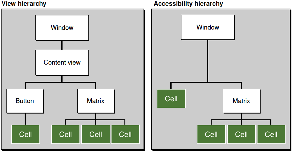
Fig 1. Normal View Hierarchy vs Accessible Elements Hierarchy
In the above example, only the elements which are on the top of the mobile screen or marked in green are relevant for users. UI components in green color in the above figure are those elements on the user mobile screen that the user will interact within the app. In the case above, app developers should disable parent content view accessibility as users will only interact with cells. This will let app developers filter out irrelevant elements and reduce the effort and cost of developing accessibility.
Every native component or element provided by mobile OS vendors are automatically accessible, App developers should use these native components and play with or configure drawing feature of those elements rather than building custom components. App developers can easily develop a fully accessible app without increasing the development time significantly.
Design Recommendations
In addition to using native accessibility tools available through iOS and Android, app developers should follow basic accessibility design rules for color, contrast, and multimedia.
Leverage dark mode
Dark mode (light text on dark background) makes the text more legible for those with vision issues (as well as most users). Most OSs support this feature.
- Smart Invert Colors (iOS, Except Images, Media)
- Classic Invert Colors (iOS, All Elements)
- Night Mode (Android)
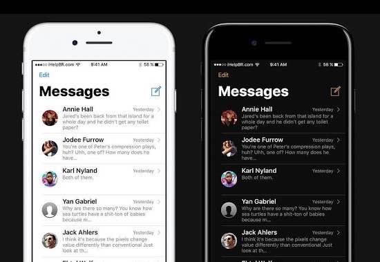
Fig. 2 Light mode vs Dark mode
Ref: (https://www.maketecheasier.com/activate-dark-mode-in-iphone/)
Multimedia
Multimedia makes the content more interactive and interesting for users and should be accessible to all. Differently-abled users should be able to access multimedia using audio and text descriptions. Commonly used multimedia accessibility features are:
- Subtitles and Captioning
- Audio Descriptions
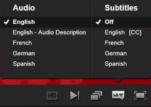
Fig 3. Multimedia
Colors
8% of the male population in the US are color blind, meaning they can’t distinguish between the colors red and green. App developers should not use colors to indicate meaning. For example – the use of green and red to indicate “yes” and “no” or “stop” and “go” should be avoided. To make your app more accessible to the color blind, consider more than color and contrast. Utilize opacity, font choice, patterns, textures, emboldening, and icons to make your message easier for all users to see and read. There are many available design tools to help you check your design and code for legibility.
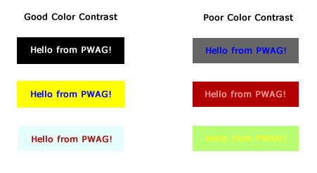
Fig 4. Color contrast comparisons
Ref: (https://www.pwag.org/resources/web-accessibility-tips/tip-7-color-contrasts-jojo-esposa-jr/)
Accessibility in Learning Experience Platforms
Accessible apps are the true friends of differently-abled users, making it possible for them to connect and interact with mobile technology. Products like MagicBoxTM address all aspects of accessibility, making apps available to individuals with all types of disabilities (low vision, hearing loss, physical and learning disabilities).
If you want to improve accessibility and learning in your organization, get in touch with us and discover how MagicBoxTM can help you reach and interact with differently abled users.