The Rapid Elearning Blog

If you want to learn to be a better elearning designer, look for good examples of what you’d like to do and then try to replicate them.  That’s what we discussed in the previous post Now You Can Design E-Learning Courses Like a Pro.  By doing this, you learn new production techniques, think through instructional design ideas, and gain confidence in your skills.

In today’s post, I’ll take you through the Froguts demo that I replicated and talk about some of the things I learned.  But first I want to cover two critical parts of successful rapid elearning design when working with PowerPoint.

Get over the PowerPoint stigma.  A screen’s a screen.  No one cares if what they see was built in PowerPoint or Flash.  All they care about is what it looks like and if it works.  Besides, when you build something in PowerPoint and you publish it with your rapid elearning software, it becomes Flash.  So instead of using Flash to build a SWF, you’re using PowerPoint to build a SWF.

Think in layers and not linear.  People are always asking me about how many slides a course should have.  This is the wrong approach when you’re building elearning courses.  Don’t think slides.  Think content.

You’re building an elearning course and not a presentation.  Even though you might be using PowerPoint to build both types of products, when you build an elearning course you need to think in a different way.

Think of slides as layers of information that you bring to the screen.  In other elearning applications, you have a screen with a layered play track.  Each object on the screen sits on its own layer. 

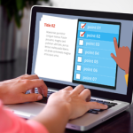
As an example, here’s a screen shot from Quizmaker ’09.  You see a single screen with layers for each object on the screen.

The Rapid E-Learning Blog: Quizmaker layers example

While PowerPoint’s interface is different, you want to think of each slide as a layer of information.  Some screens might consist of one slide of information and some might be ten slides of information.

Here’s a demo from my post, 10 Sure-Fire Tips to Becoming a Rapid E-learning Pro…Rapidly!  It’s a good example of how you see a single screen that’s actually made up of more than one slide.  The learner doesn’t care about slide count.  She’s just focusing on the interaction.

The Rapid E-Learning Blog: nonlinear use of PowerPoint slides

Click here to view the demo.

Once you start to think in layers rather than linear, it really opens up what you can do in PowerPoint.  But most important, it gets you to think about what you can do in different ways.  It’s all just a matter of figuring out how to do it.  And that’s what learning’s all about.

Here’s the Froguts demo.  Below that is a tutorial that is more show and tell.

The Rapid E-Learning Blog: Fruguts recreated in PowerPoint

Click here to view demo.

There are some things in the demo that I would have changed if it was a real project but I left them because I can talk about what I’d do different.  Here’s a quick rundown of what I cover in the tutorial.

Duplicate slides that are linked can create interactivity.  One of the main challenges when working with PowerPoint was trying to replicate the drag and drop interaction.  Since you can’t build those in PowerPoint, what I did was duplicate the slides and use a combination of PowerPoint hyperlinks and custom animation.  When you click on a linked object it goes to the duplicate slide that starts the animation.

The Rapid E-Learning Blog: PowerPoint animation trigger 

Use PowerPoint masters for images that you use a lot.  Originally, I had the frog images on all of the slides.  When I published the files, I ran into some alignment issues plus it took a little longer to publish because of all of the extra objects.

The Rapid E-Learning Blog: place images on the master slide

I fixed that by putting the main frog body on a master slide.  Then all I had to do was drop the dissection pieces on the slide.  The frog body was always in place and I didn’t need to worry about accidentally moving it.  It was also one less object on the screen to worry about during production.

PowerPoint slides can look like anything you want.  Since PowerPoint is a blank screen and you can move objects around freely, you can pretty much create or recreate any look you want.  PowerPoint 2007 has some nice graphic effects so all of the drop shadows and reflections you see in the demo were created with PowerPoint.

The Rapid E-Learning Blog: There's a lot you can do with the look of slides in PowerPoint

I like a more open feel, so I opted to change the darker spotlight effect of the original and went with more white space.  I also used a “fun” font.  I think the white screen with a little color from the grass is fresh.  That (and the font) gives the demo a lighter feel.

It’s important to consider the tone you set with your course.  The fonts, color schemes, and placement of objects on the screen all contribute to that. The tone you set for you course contributes to the impression people have of the course.  It gives you a chance to say something before you actually say something.

That’s a quick overview.  For more detail and to see some of the techniques in action, click on the tutorial below.  I’ve also included the PowerPoint file for you to download and deconstruct.

Here are some relevant tutorials from previous posts:

The Rapid E-Learning Blog: dissecting the course demo

Click here to view tutorial.

As you can see, there’s a lot to learn by deconstructing the elearning courses that you see.  And it doesn’t require that you replicate the entire course.  Perhaps it’s just a matter of figuring out how to get a certain type of interactivity or effect.  You’ll run into some challenges when you work with PowerPoint.  But by making a habit of doing this, you’ll learn new production techniques and you’ll come up with new ways to approach your own elearning courses.  And most of all, you’ll become more confident in your elearning skills.

I’ll be doing more of these types of posts this year.  Let me know what you think and feel free to share your own ideas and tips in the comments section.

Events

Free E-Learning Resources

Want to learn more? Check out these articles and free resources in the community.

Here’s a great job board for e-learning, instructional design, and training jobs

Participate in the weekly e-learning challenges to sharpen your skills

Get your free PowerPoint templates and free graphics & stock images.

Lots of cool e-learning examples to check out and find inspiration.

Getting Started? This e-learning 101 series and the free e-books will help.


28 responses to “Why Dissecting an E-Learning Course Will Improve Your Skills”

Hi Tom,

Nice to know that your blog has become the finalist in Codei and Eaton Blog Web contests. Hope you win an Award and many more laurels.
It is really great to know the masses benefited in all fronts and subjects – b’cos Online took priority over ILT!!!

Anyway three cheers to all the bloggers, learners, and Catalysts!!

Cheers,
Lily

Regarding, “look for good examples of what you’d like to do and then try to replicate them.”

There is a lot of great examples of e-learning out there, whether available free online, visible at conferences, etc. See others’ work is a great way to be inspired! However, also explore outside of e-learning. Although not training, I have see creations in the field of marketing that gave me some great ideas. And also many interactives, for example the interactive sites/tools available on the National Geographic and NASA sites.

I do agree that the focus should be on the end product, not the technology behind it. However, a lot of times there are restrictions set by a client that determine what software/technology can be used during development. We have to consider these on a project by project basis and forward these requirements to our contract trainer.

A great post this time – I can’t wait to try some of these things with my own work!

This is a perfect example where “imitation is the best form of flattery.” It is also a great reference point/practice for those trying to get their arms around ILT to online. Thanks again for a good read.

Thank you for addressing the “PowerPoint” issue. While I agree some may have overdriven the capabilities of PowerPoint, the focus needs to be on the content design and the learner’s needs, not the authoring mechanism. I’ve seen and even built some really nice and interactive PPTs that meet the training need. Tools like our rapid Dev friends today make it a whole lot easier to deliver that design quality.

Keep us focused, Tom!

I must agree whole heartedly that the limits of PowerPoint are extended through the dissection of other eLearnings and with practice. The more I experiment with my own designs in PowerPoint the more I discover I can accomplish. As someone who is learning Flash for personal endeavors, I also agree many eLearning needs can be met via PowerPoint and the aesthetic similarities when published to .swf are usually only detectable by an experienced designer/developer. With the advent of easily embeddable Flash components into PowerPoint 2007, the gap between the development platforms grows smaller and more collaborative for those Flash “must have’s”. I think the key lesson to be taken away from this post is that experimenting in PowerPoint will rarely cease to teach the motivated designer new tricks. Another excellent post Tom!

Hi Tom,

After reading your previous post, I was about to ask you how you managed to do that using PowerPoint. The froguts demo has been on my favourite list for a long time and I thought it required complex animation skills and flash programming to do that.

It was amazing. Thanks for sharing these tips.

I love what you’ve done – but have a question – since Articulate doesn’t support “trigger” animation, how can you get this to work?

Tom,

As usual, a great post! I don’t use rapid elearning tools, other than Captivate for screen recordings, and instead prefer to do everything in Flash. I’ve built custom templates and a set of custom objects and now, especially with Flash CS4’s move to object-based tweening instead of timeline-based tweening, as well as all the built-in tweening animations that can be applied to objects quickly and easily (just like in PPT), I feel that I can pump out quality elearning faster using Flash than a rapid tool can, because gone are the days of multiple keyframes, etc. And on top of that, using Flash we’re not constrained by the tool in any way.

But my biggest issue with developing elearning in PowerPoint is that it is just darn difficult to manage after it gets more than 15 minutes or so of content. I did one a few years ago that, in the end, was hundreds of slides (mostly due to overlay layers and the like). It just got too difficult to get a ‘meta’ view of the course during development. This is why most ‘rapid’-developed courses are just lectures/page-turners, because for longer courses the number of slides becomes unwieldy. And not to mention that multiple designers/developers cannot work on the same PPT at the same time…

That said, I realize most people don’t want to take the time to learn Flash/ActionScript in-depth, at least to the level to be able to create one’s own elearning course UI, templates, content, etc. But for me, it’s the best way to go. And I feel that anyone who is a professional elearning designer should learn Flash just for their own job security/future opportunities.

My 2 cents…

mark

Question about graphics and file size. I like the concept of the master slide, but that only works if the image is on all the slides. I wanted to replicate the effect of a bunch of images where only one piece is changing (like your assembly line example) and I originally created 5 “almost” identical slides to do it. Since they were photo graphics this added to the file size quite a bit. I ended up just using exit transitions with stacked graphics on one slide to create the effect.

Is there any “library” functionality in any of the Articulate products where single graphics can be called rather than duplicated? I ran into this issue in Engage too where I wanted to reuse a graphic on multiple screens in a single Engage, but had to duplicate copies. Just curious since we need to be conscious of file size streaming over the network.

Great post, Tom! Learned a lot as usual, thanks. One question – what tool(s) did you use to capture/record your demo? Are they part of Articulate 09 Suite or ???

Tom,

Great follow-up post! Thank you for your time and effort, and I look forward to testing some of your ideas.

I do have a suggestion, especially in light of the current economy:

Offer a virtual option to your conference, similar to what ASTD is doing for TechKnowledge 2009 in Las Vegas. (I hope the e-Learning Guild will also do this for DevLearn.)

Visit:

http://tk09.astd.org/virtual.html

@Mark – In one day, yesterday, two people told me they are developing e-learning using MS Silverlight. A third person told me Adobe’s Flex will replace Flash. So, one thing is certain…the e-learning development world will never be boring!

Tom this is super and is what I have been envisioning for a long time. You are right we can’t think in a linear manner. There are two reasons for that (1) some people do not learn in a linear fashion and (2) nonlinear allows the explorer in each of us to discover.

I love PowerPoint but I have seen what Articulate can do and want to learn more than anything else. I am determined. I did my dissertation on pedagogical agents and I still believe they have a place in the whole learning e-learning process. My feeling is to take the computer and create something so real that enthusiasm is automatic and transfer is easy.

What do you think?

Maryann

[…] Why Dissecting an E-Learning Course Will Improve Your Skills |

Thanks for the feedback.

Jeff makes a great point. Don’t limit yourself to just elearning courses. I learn a lot from ads and some of the creative blogs.

@Margaret: the tutorials cover how to get the animations to work without using triggers.

@Jenise: Good idea. Articulate Live ’09 is our first big conference. I’d like to do an online conference to accommodate those who can’t attend or want to attend virtually.

Mark also brings up a good point. There’s a point where a rapid elearning solution isn’t always the best for your project. That’s why I use the hierarchy I mentioned in this post on saving time and money. Use the tools to sort your resources. Low hanging projects can be done rapidly and frees up your multimedia developers to work on the projects that need more customization.

The only thing I’d add is that you want to get the most out of the tools which means that you can do more with less. As you can see with this post, you can stretch PowerPoint’s capabilities and do something that might have required a Flash programmer in the past.

Also, you’ll see more hybrid development. For example, Engage is really easy to use. However someone with Flash skills can create custom interactions. So you get the best of both worlds. The easy development and customization within a template that already has the SCORM capabilities and infrastructure. If you use Engage, you can go to the community site and already download three new custom interactions: a stair, flash card, and flip book.

Tom, I thought this was a great post, and will be a useful resource. I have been telling my higher-ups for quite some time that I don’t necessarily have to know flash to still get some great results!

[…] Tom Kuhlmann follows up his previous post about using PowerPoint for Flash-like animated e-learning. […]

Tom,
You are my hero!

What you do with Articulate, PP, etc. is just jaw dropping and I am completely jealous that you can be and are so creative. Thank you for all of your excellent ideas that give me so many more ideas that my head hurts.

Where to begin!!!!!

January 17th, 2009

Aha! I had worked out most of your animations and hyperlinks in my head. But the scalpel had me stumped. I thought, “Pretty complex motion paths.” They weren’t motion paths at all but a series of very fast “flash once” entrances, which, after all, is what an old celluloid movie is, and probably what a Powerpoint motion path really is too.

Any magician knows that there is no such thing as magic. Just illusions.

I’m inspired.

But I do have a question. Often my motion paths are jerky, not smooth like your pushpins. Can it be that my images are too large?

@Jim: That’s a good question. My guess is that size does impact this. I’ve also noticed that the straight motion paths seem to render a smoother path than the hand drawn or curved paths.

No offense but the frog demo, I could not even look at it…poor frog and do I really want to look at the inside of a frog (barf) but the PPT ungrouping and the tips that came with it are great I will put it into use as much as I can. Unfortunately I will be doing a lot of Demo screen shots of applications for the next 5 years…wish me luck!

The idea of breaking down an example and trying to replicate it in PowerPoint makes sense to me. I think I can learn from this. Does anyone have a list of “good” examples we could use?

I found one example that was well done on Global Warming, but I did not bookmark it and I cannot find it again. It had a cool page by page navigation tool in the bottom left hand corner of the screen. I was able to replicate the idea in PP 07. Wish I could find it again.

Collectively I am sure we could come up with a great list.

I’m still amazed by what can be done with PowerPoint. It’s really a fantastic and often underrated tool.

[…] designers and typographers.  As I’ve mentioned in previous posts, a great way to learn is by deconstructing and replicating the work of others.  The same goes with analyzing good typography and design.  Pay attention to how the […]

A bit late maybe but i think its a great article. I never used powerpoint much but you make it so simple 🙂

Very interesting article! I’m looking forward to test some of your ideas! Thanks