


Great inspiration Tom! Thanks for sharing your thoughts on the different iterations – it’s great to see how the final product comes together.
Deconstructing Simple Visual Design for E-Learning
April 2nd, 2019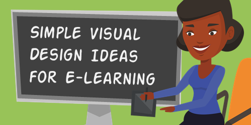
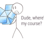
The other day I made some images for a course menu page in Rise 360. I spent some time playing around with different ideas. When I reviewed my final image, I realized that there were several iterations.
Today I’ll share some of the different ideas I considered and why I made changes.
Visual Design: The Set Up
I’ll start by stating that most of this is subjective, so there’s not a right or wrong.
With this particular menu, I needed an image that had a 10:3 aspect ratio. In this case, the images are 1280 x 384. The aspect ratio calculator is a good resource if you ever need to figure out an aspect ratio or the resolution of images.
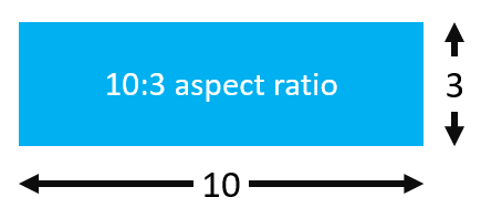
The short but wide aspect ratio creates a challenging constraint with what you can show. And that’s why I played around with different ideas.
Visual Design for E-Learning: Example 1
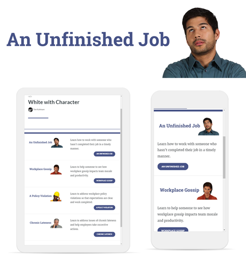
Because of the dimensional constraints, I started with just text. But the text looked empty and uninteresting. Since these images were part of an interactive scenario, I wanted to add a bit more personality.
I added a character to the text. This creates a visual connection to the scenario. I also wanted some white space so it was easier for the eye to scan the screen. Generally, it looks good and the white space is nice as the Rise course responds to the mobile devices.
Visual Design for E-Learning: Example 2
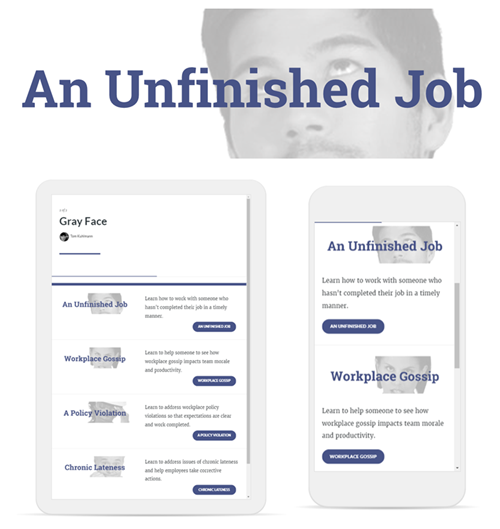
I wasn’t keen on the smaller character but as noted before, the height of the image created some constraints. So I played around with making the character larger. This meant is had to go off screen.
I was also concerned that perhaps the larger image would be too busy if it remained in color. So I got rid of the color and then lighten up the image a bit.
I liked the gray image and text overlay. But it just didn’t feel right, especially in the mobile view with the top of the heads cut off.
The second design is OK. But it looks a bit unbalanced. The right side of the menu has text and a strong visual element with the button. It kind of fills the right side. But the left side just looks odds to me.
Visual Design for E-Learning: Example 3
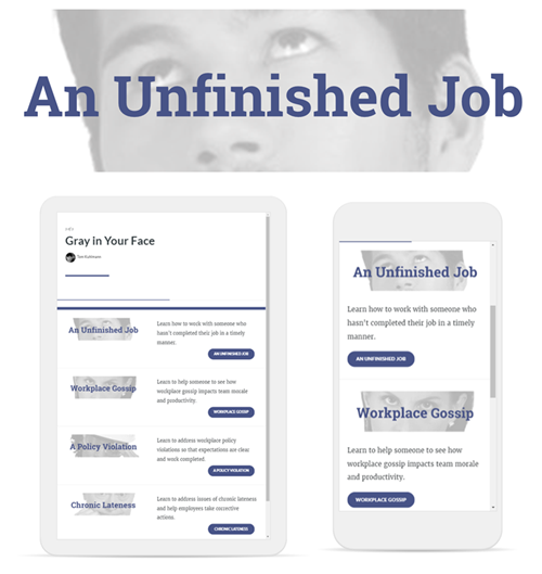
Sticking with the grayscale, I played around with making the character image a bit larger to fill that side of the menu. It does add some heft, but I wasn’t fond of the way the faces were cropped.
I do like it in the phone view because it fills the column and the lighter image with the darker buttons works.
Visual Design for E-Learning: Example 4

In a previous post, I shared an easy graphic design tip that I call the transparent echo technique. The idea is to add the same image twice. One is muted and serves as the background and the other is a focal point.
The image above was my first attempt. The examples in the blog post linked above look nice. But this one felt a bit busy and the eyes were too big. It feels a bit creepy.
So I added a color overlay that I color picked from the button. I also moved the image around and used his shirt and not the face. I like the texture that the echo creates. You can see part of the shirt so there’s some very slight visual context and the texture adds depth which I like better than just a solid color. But the echo isn’t distracting.
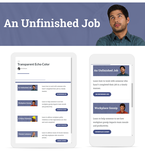
The design seems blocky and the buttons are heavy. My original goal was to have white space. Now I have an image design I kind of like, but it’s just too square and heavy.
Visual Design for E-Learning: Example 5
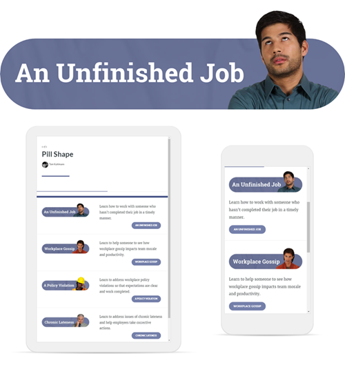
To gain white space and get rid of the block I decided to play off the pill shape of the buttons. That gives it some visual cohesion by tying in the header with the button.
By extending the heads outside the pill shape, it creates additional white space. And the round corners with the characters poking out of the shape feel a bit more organic and informal, which lends itself well to an interactive scenario course.
I also lightened the buttons so that they were a little more subdued and not as heavy. They’re just a bit lighter than the pill shape.
Visual Design Principles
Again, most of this is subjective. But I thought I’d give you some insight into my thought process as I created the graphics and made iterations. While the images are subjective, there are a few core principles to consider when creating the visuals for your courses.
- Use white space to give your eyes a break. White space also helps to discern what content is there and how’s it related to other content on the screen.
- Visual consistency between design elements. I like the final image and that it works with the pill shaped buttons. The colors also work to tie the objects together.
- Play around with color. Remove colors from the images to neutralize them. Then add a few accent pieces or a single color to draw focus. It’s easy to do and a good basic tip for those of us who are visually challenged and opt to over work our images.
In the follow up post, I’ll show how I used PowerPoint to quickly create all of these images and make edits in seconds.
Which design do you like best? Is there something you would have done different?
Events
- Everyday. Check out the weekly training webinars to learn more about Rise, Storyline, and instructional design.
Free E-Learning Resources
 |
 |
 |
|
Want to learn more? Check out these articles and free resources in the community. |
Here’s a great job board for e-learning, instructional design, and training jobs |
Participate in the weekly e-learning challenges to sharpen your skills |
 |
 |
 |
|
Get your free PowerPoint templates and free graphics & stock images. |
Lots of cool e-learning examples to check out and find inspiration. |
Getting Started? This e-learning 101 series and the free e-books will help. |
You might also like:
10 responses to “Deconstructing Simple Visual Design for E-Learning”
Hi Tom,
I prefer Example #4 the most because the square buttons reinforce alignment and the page grid. It would look less blocky if you slightly increase the transparency of the color overlay, which would also make the echo more apparent. I’d probably kill the rounded button in favor or text and a caret (>>) to imply it leads to more information, or reduce the size of the button and its label.
Thank you for the thinking behind the process. It really helps to see why you chose what you chose.
I love the iterative examples – it does a great job explaining what was going on in your head while you were building and is an effective way to teach the “creativity” needed as part of course design.
Question for you: In Rise, what block is this? Or are you building a Storyline block to insert in Rise? I thought it was the button block but I don’t see how you could get the effect with the image to the left of the text/button.
Thanks, Tom, for this. I think the solid purple, which you ended up with, gives some life to the screen. Also, I agreed with your decision to not overlay text over a character’s eyes. That always seems to confuse background and foreground, for me at least.
This is a really cool blog, it was exciting to follow all the iterations, Tom!
I’d have stopped at #4. #5 creates too much white space and it looks unbalanced on a tablet. Plus, having the image looking like the buttons implies they both have the same purpose, i.e. both are buttons.
That’s why I prefer #4: the text, the image and the background all work together perfectly. As Curtis said, maybe just remove the color background of the button and have the button text colored instead if you want to lighten up.
Jeff I feel your last change is the best. It looks structured and consistent. I agree with you that the full color pictures were too busy.
The consistency with the shapes (pill shape) really shows well. The eyes did look kinda creepy when you used them as a background. Cropping the picture down to focus on texture (using the shirt) – the right combo!
Thank you for sharing.
Thanks for sharing the iterations and thought process. I, as probably a lot of e-learning developers, end up doing most of the graphical design, which I don’t feel as confident in, so I love this kind of help!
Thanks Tom – I think this looks great!. I am quite new to Rise and like Derek mentioned above, how did you get the image into the block? Or was it a storyline interaction created to look like a block!


0
comments