WCAG 2.0 vs. 2.1: What You Should Know
Updated: September 20, 2023
WCAG 2.0 and Beyond: Modernizing Web Accessibility [Free Ebook]
WCAG 2.0 vs. 2.1: What’s the difference between them?
When the Web Content Accessibility Guidelines 2.1 were released in 2018, there was confusion about whether web developers would need to change websites and learn new standards. However, this isn’t the case at all! In fact, WCAG 2.1 is an extension of WCAG 2.0, and it follows the same structure and levels of compliance. However, WCAG 2.1 includes standards that benefit individuals with cognitive or learning disabilities, users with low vision, and users with disabilities on mobile devices.
Let’s dive into what you need to know:
WCAG 2.0 vs. 2.1: Why was WCAG updated?

WCAG 2.1 is like an iPhone upgrade. The basic structure is the same, but there are new features to help make your experience more inclusive and user-friendly.
WCAG 2.1 includes 17 new guidelines scattered across each of the four different categories in WCAG 2.0: perceivable, operable, understandable, and robust.
Note: WCAG 2.1 still includes all the guidelines from WCAG 2.0.
A big part of this update includes guidelines for mobile device accessibility. Due to the increase in mobile users, this update was essential to ensure that websites are created to optimize mobile phone usability.
WCAG 2.1 is backward compatible
WCAG 2.1 is backward compatible with WCAG 2.0. But what does this mean?
“Backward compatible” means that the content that conforms to WCAG 2.1 also conforms to WCAG 2.0.
In terms of structure, WCAG 2.1 still follows the same levels of compliance: Level A, Level AA, and Level AAA.
The law mentions WCAG 2.0, but do I have to conform to WCAG 2.1?
Most laws, such as Section 508 and other international laws, mention WCAG 2.0 compliance. So, for now, that’s all you need to keep striving for.
Only if a law explicitly states that web developers have to adapt to the newest WCAG version do you need to make your content compliant with the latest WCAG update.
However, the W3C does suggest that any new websites should be created following WCAG 2.1 guidelines since they are more inclusive and mobile-friendly.
Understanding WCAG 2.1 Guidelines
The 17 new WCAG 2.1 standards are outlined below.
1. Perceivable
Users must be able to perceive all relevant information in your content.
1.3.4 Orientation (Level AA)
Websites and applications should support both landscape and portrait display orientations; they should not restrict to a single display orientation unless a specific orientation is essential – like a bank check or virtual reality content.
This is mainly applicable to mobile phones.
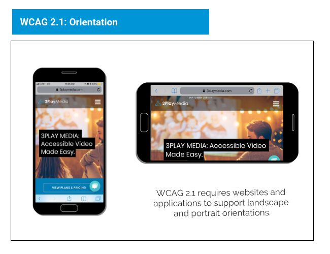
Users can meet this criterion by changing the CSS to allow both landscape and portrait orientation.
1.3.5 Identify Input Purpose (Level AA)
A program, such as an assistive technology, must be able to determine what the user is expected to enter in a field, or what the meaning of the information entered is.
This intends to “help people better recognize and understand the intention of form inputs.” It also allows for the user’s browser to autofill necessary information.
One way to meet this success criterion is to include an autocomplete attribute where suitable.
1.3.6 Identify Purpose (Level AAA)
A program must be able to identify the purpose of interface components, icons, and sections.
HTML code should provide “context, propose, and meaning of symbols, regions, buttons, links, and fields.” For example, if a button links back to home, the code should define the button as a “home button,” not just a button.
This criterion allows assistive technologies like screen readers to understand what a component function does.
1.4.10 Reflow (Level AA)
Basically, this states that your website must be responsive. Users shouldn’t have to scroll horizontally to view your content.
Your website should be able to fit a 320-pixel widescreen.
Users should also be able to zoom in up to 400% on desktop browsers.
Overall, this guideline is great for the user experience. Specifically, it helps users with visual disabilities zoom into content.
Requiring a 320-pixel fit also ensures that your website is mobile-friendly and responsive.
1.4.11 Non-Text Contrast (Level AA)
Active interface components (like buttons) and non-text content (like infographics) must have a contrast ratio of 3:1.
This guideline allows users with low vision to see content more clearly.
Helpful tools for checking contrast include:
1.4.12 Text Spacing (Level AA)
Users must be able to increase the distance between paragraphs, rows, words, and characters without losing content or functionality.
This guideline helps avoid overlapping text or buttons being moved to places where the user can’t interact.
The purpose of this guideline is to help users with low vision customize their reading experience while still being able to interact with the content.
1.4.13 Content on Hover or Focus (Level AA)
If a user triggers content that appears in a modal window, tooltip, or a similar component, the user must be able to:
- Dismiss the content without using the mouse or keyboard focus
- Move their mouse over the content without making it disappear
- Dismiss the content when the user wants to
2. Operable
Users must be able to operate the interface successfully.
2.1.4 Character Key Shortcuts (Level A)
If a website supports keyboard shortcuts that use a letter, punctuation, number, or symbol characters, then at least one of the following must be true:
- The shortcut can be turned off
- The shortcut can be changed to use one or more non-printable keyboard characters (like Crtl, Alt)
- The shortcut for a component is only active when that component has a focus
This guideline benefits users who have dexterity challenges and may be prone to accidentally pressing wrong keys.
2.2.6 Timeouts (Level AAA)
Users are informed when a period of inactivity could lead to data loss unless the data is preserved for more than 20 hours.
This guideline is designed to benefit users with different cognitive disabilities who may need more time to complete a task.
2.3.3 Animation from Interactions (Level AAA)
Users are allowed to turn off animations unless the animation is essential to the functionality or information being conveyed.
An example of this would be a video on a homepage.
This guideline is designed to benefit people with vestibular disorders who can get dizzy, nauseous, or distracted from non-essential movement.
GIFs are automatic or looped animations. Often, there isn’t a mechanism to turn them off.
GIFs can be distracting to viewers, and poorly designed GIFs could trigger epileptic seizures or headaches for some users.
When designing GIFs keep the following points in mind:
- Include sufficient description in the alt text of the GIF.
- Ensure any blinks or flashes are in the safe threshold – i.e. avoid anything that flashes more than three times per second.
To check the accessibility of your GIFs, use the Photosensitive Epilepsy Analysis Tool.
You could also turn your GIFs into an MP4 file. That way, the user is given control to pause or play the content.
2.5.1 Pointer Gestures (Level A)
Complex actions such as pinching for zooming or swiping should also be able to be performed through simpler actions like taps or long presses.
This guideline helps improve the accessibility for users with limited motor skills.
2.5.2 Pointer Cancellation (Level A)
At least one of the following must be true for an action such as a click, tap, or long press:
- A down-event is not used to complete a function
- If a function is triggered by an up-event, a user can cancel or undo the action afterward
- Up-event cancels when triggered on down-event
- Completing the function on the down-event is essential
Up-events are triggered when the mouse button is released or a finger is lifted within the target boundary.
This guideline makes it easier for users to “recover from hitting the wrong target.” It also helps users with visual disabilities, cognitive limitations, and motor impairments.
2.5.3 Label in Name (Level A)
The visible text of a label in a user interface component must match the accessible name or programmatic label.
This is important for speech input functions.
2.5.4 Motion Actuation (Level A)
Actions that can be completed by a motion, such as shaking your phone, must also be able to be completed by a user interface component.
Accidental motions must be turned off unless the motion is essential for functionality or is supported through an accessible interface.
This criteria ensures that users can also complete a functionality by other means, such as touch or voice input.
This guideline benefits people who cannot perform particular motions (like shaking) because their device is mounted or they physically cannot perform the maneuver. This also benefits users who aren’t able to hold a device because their hands are occupied.
2.5.5 Target Size (Level AAA)
A clickable element must be at least 44 by 44 CSS pixels except when:
- The functionality can be achieved through an equivalent link or control that is at least 44 by 44 CSS pixels
- The target is described in a sentence or block of text
- The size of the target is determined by the device
- The look of the target is essential to the information being conveyed
This guideline benefits users who use a mobile device where touch is the primary mode of interaction, users with mobility impairments, users who can only access a device with one hand, users with large fingers, and users with low vision who may better see the target.
2.5.6 Concurrent Input Mechanisms (Level AAA)
Users should be able to add, remove, or switch between input mechanisms like a mouse, keyboard, stylus, touch input, or voice input.
For example, even though most mobile phones are used with touch, a user should be allowed to connect a mouse or keyboard. Or if an application can be controlled through voice, the user may decide to turn that feature off and use a mouse instead.
4. Robust
Content must be accessible to all users, keeping up with advances in technology.
4.1.3 Status Messages (Level AA)
If new content is added to a page, the users of assistive technologies must be alerted without interrupting their work.
For example, if a user presses the Add to Shopping Cart button, the screen reader must announce “item added” or “five items in shopping cart” without interrupting what the user is doing. Another example is if a user enters their postal code incorrectly, the screen reader must announce “invalid entry.”
This guideline aims to assist blind and low-vision users who rely on screen readers. Sighted users can tell, for example, how many items are in a shopping cart or if an item was added by looking at the screen. Often, this doesn’t interrupt their shopping. Adding a status message allows low-vision users to be aware of the same information more equivalently.
WCAG 2.0 vs. 2.1: Improvements for all
While WCAG guidelines are designed to make websites and web content accessible to people with disabilities, the guidelines actually provide a better user experience for all web users.
Many of the WCAG 2.1 guidelines help to improve the usability of websites on mobile devices. In the last couple of years, mobile use has increased significantly. In fact, 80% of global internet use is driven by mobile devices.
Making sure your content is optimized for mobile will help keep users on your website instead of driving them away.
Accessible design is universal design. After all, you never truly know who is consuming your content or how they are consuming it.
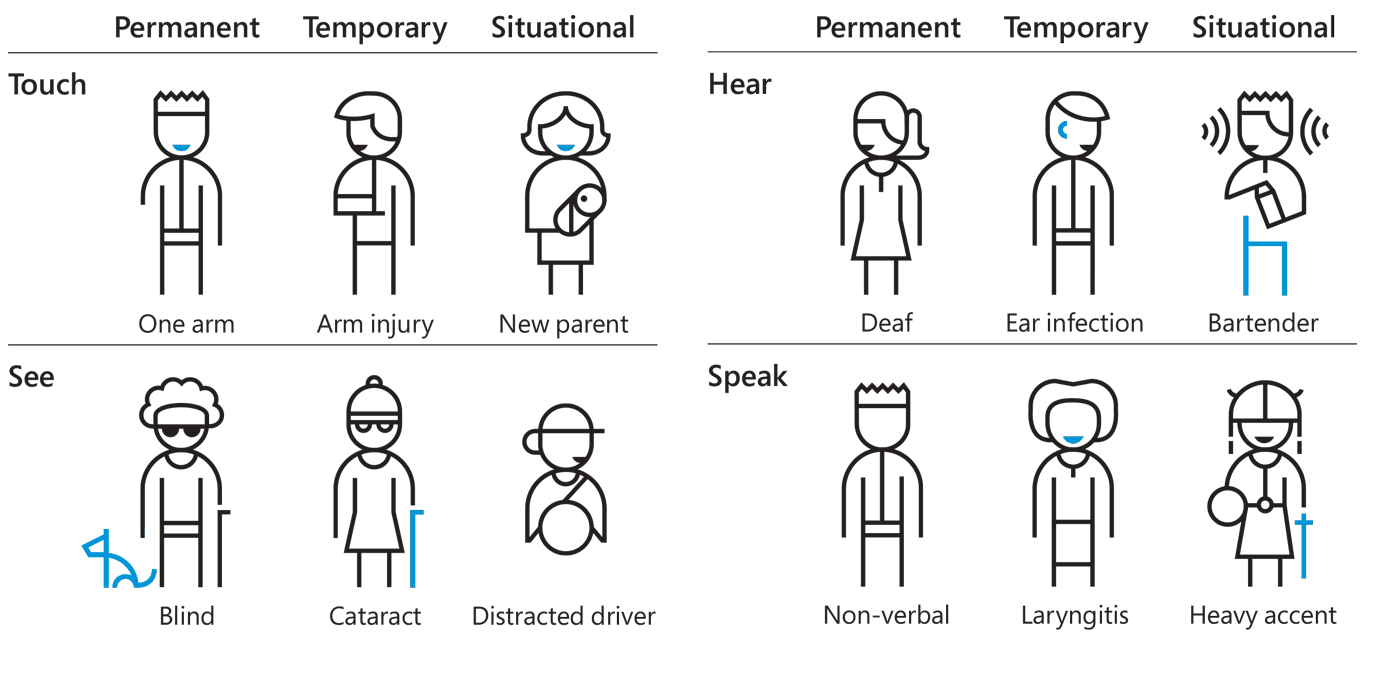
This graph is from Microsoft’s inclusive design toolkit.
Further Reading


Subscribe to the Blog Digest
Sign up to receive our blog digest and other information on this topic. You can unsubscribe anytime.
By subscribing you agree to our privacy policy.