
When your eLearning slides look great, viewer engagement increases, your instructional voice is enhanced, and you hear “I love it!” more often.
But for those of us who aren’t trained designers, slides can be a struggle.
Early in my eLearning development career, I always felt a little cringe-y about my slide designs… It was just embarrassing to feel like I couldn’t make good-looking slides.
Now I realize that there are some easy tricks-of-the trade that jump start great design. Recently I got curious to learn what the eLearning experts might name as their own jump starts.
So I asked a bunch of them one simple question:
What’s your #1 tip for designing a great eLearning slide?
And their responses are golden!
Here’s a quick video summary of all the tips…
…and you can read the full tips just below!
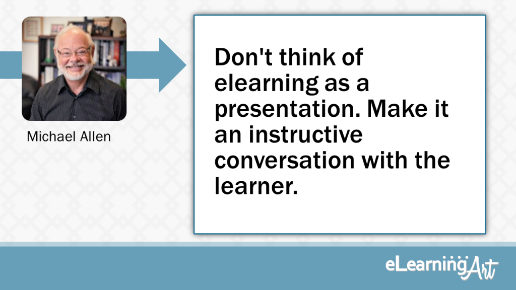
Don’t think of elearning as a presentation. Make it an instructive conversation with the learner.
Slides? I don’t think of elearning in terms of slides (which are tools of presentations) but more in terms of events to engage and stimulate thinking. So design elearning as a conversation with the learner. eLearning should be a good listener, responding to learners as their skills falter and grow. Don’t throw slides at learners, one after the other. Yawn. They don’t stick.
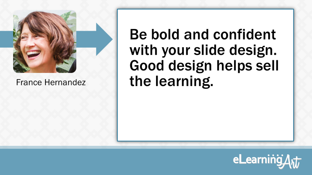
Be bold and confident with your slide design. Good design helps sell the learning.
When you’re considering your design approach, look around for examples of designs that will really work for your project. Analyze what’s making these work — color, fonts, textures, shadows? what are the elements that make the statement? — and incorporate that boldly into your slide designs. Work the elements until they work for you and your project.
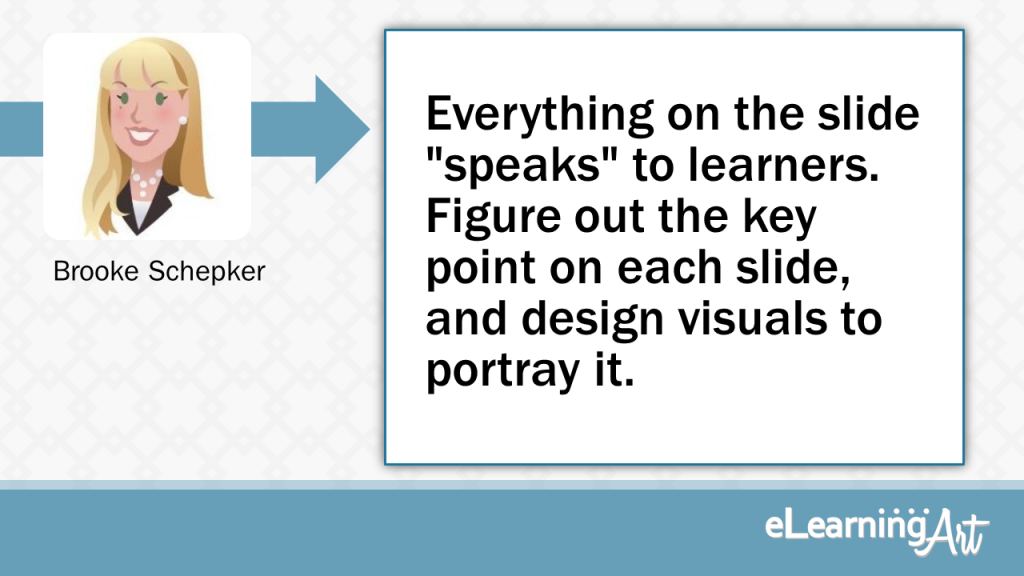
Everything on the slide “speaks” to learners. Figure out the key point on each slide, and design visuals to portray it.
Remember that everything you put on the slide “speaks” to learners so choose what you allow to speak for your content wisely. Figure out what the key point is (or the “must know” portion of that piece of content) and design visuals that portray that key point. Then, do the same for the next slide and the next and the next.
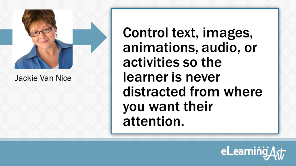
Control text, images, animations, audio, or activities so the learner is never distracted from where you want their attention.
When I design an eLearning slide I try to stay hyper-aware of the learner’s focus. Where do I want their attention right now? The script should be focused and clearly and concisely speak to its audience, of course, and the visuals and activities need to support it and do the same. My aim is to control the text, images, animations, audio, and/or activities so that the learner is never distracted from exactly where I want their attention in each moment. If I’m doing my job well, the learner should find being able to focus and take in key information both effortless and enjoyable.
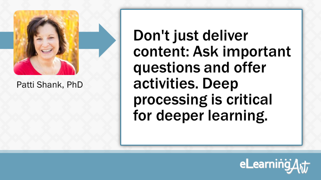
Don’t just deliver content: Ask important questions and offer activities. Deep processing is critical for deeper learning.
Don’t just deliver content. Also ask important questions and offer activities. (For example, “What is wrong with this multiple-choice question?”) Deep processing is critical for deeper learning and content doesn’t go far enough.
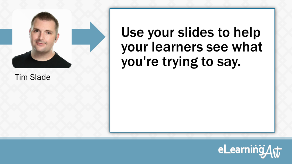
Use your slides to help your learners see what you’re trying to say.
Your slides are a tool for visual communications. Never storyboard anything you can visually communicate. Use your slides to help your learners see what you’re trying to say.
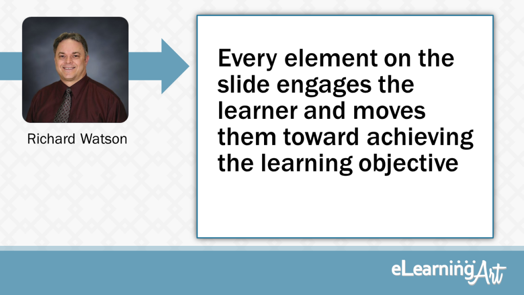
Every element on the slide engages the learner and moves them towards achieving the learning objective
Repetition, contrast, alignment, font selection, and color all play an important role in making a slide look professional. But, what makes a great eLearning slide is that each element on the slide engages the learner and moves them towards achieving the learning objective.
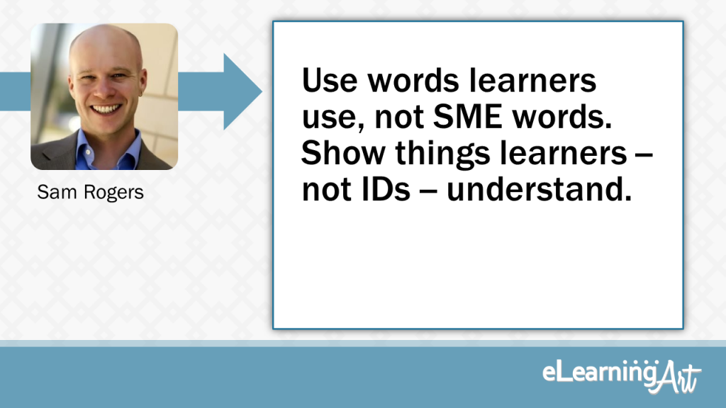
Use words learners use, not SMEs. Show things learners understand, not IDs.
Use words Learners use, not SMEs. Show things Learners understand, not IDs. Give Learners experiences that help them feel in control, then rigorously exercise their judgement. We exist to help our organization make sense to the people in it, not to look smarter than they are.
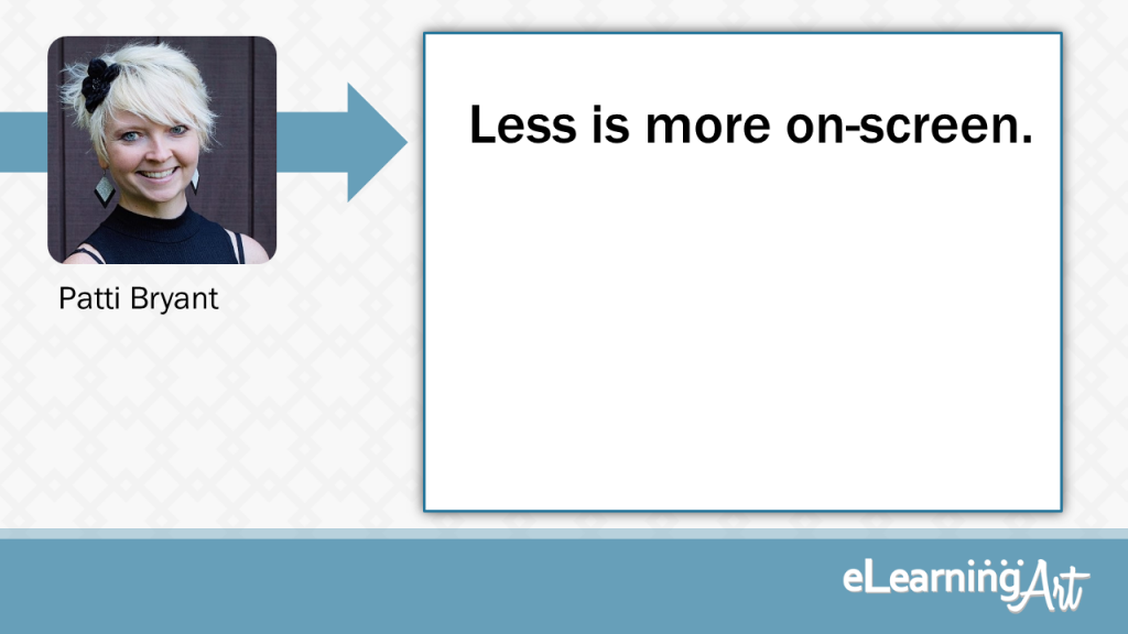
Less is more on-screen.
If you have to instruct learners on how to navigate a slide, you’re doing it wrong. Less is more on-screen. Keep it simple and clean.
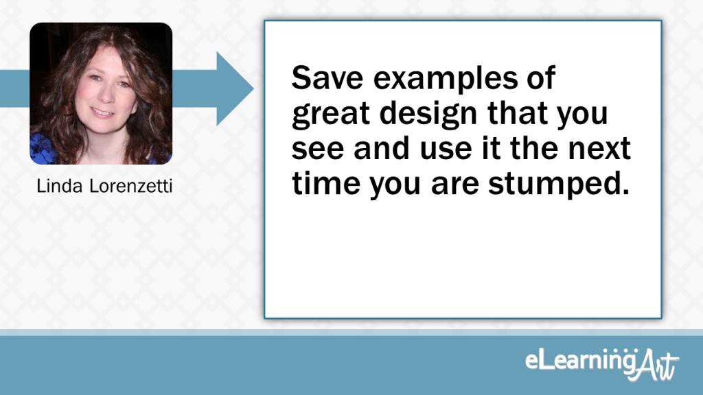
Save examples of great design that you see and use it the next time you are stumped.
Learn from Great Design
How do you layout your eLearning content so that it is attractive and will aid in understanding concepts?Great design is all around us, so why not harness what is already there? Notice the design of print ads, billboards, SlideShare presentations, Pinterest pins, design and software blogs, websites and books. How are fonts combined, what shapes are used, how are images used? If something you like will translate well into eLearning, take a photo of it, save it in a file and use it to inspire you when you’re stumped on your next project.
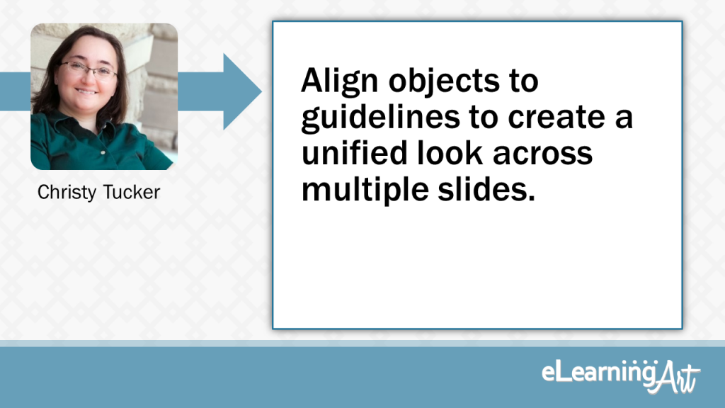
Align objects to guidelines to create a unified look across multiple slides.
Use guidelines to divide the screen, and then align objects to those guidelines. For example, you might have a guideline near the top for headers, one at the bottom for buttons, and one 30% from the left for callouts. You can use those same guidelines for other types of objects throughout your elearning. This helps create a unified look across multiple slides.
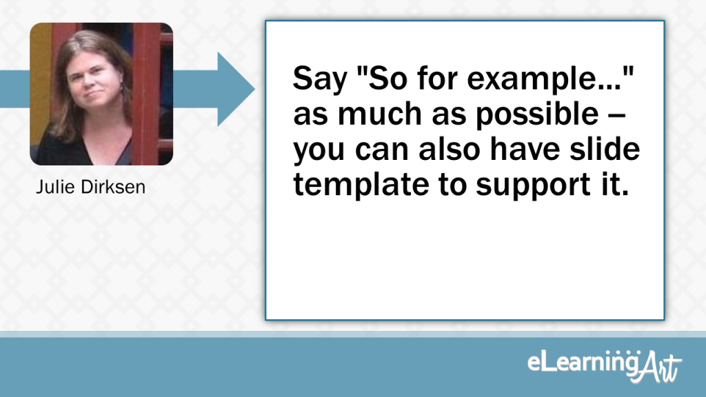
Say “So for example…” as much as possible — you can also have slide template to support it.
My number one presentation tip is to find as many ways to add “So, for example…” to your presentations as possible. A lot of presentations have good ideas, but not enough examples of how to apply those ideas. You can even create an “example” template slide to make it easier. Also, see if you can get some of those examples from your audience — I start most presentations with the question “What problems are you trying to solve related to this topic?” and you can refer back to the examples of specific audience problems as you present.
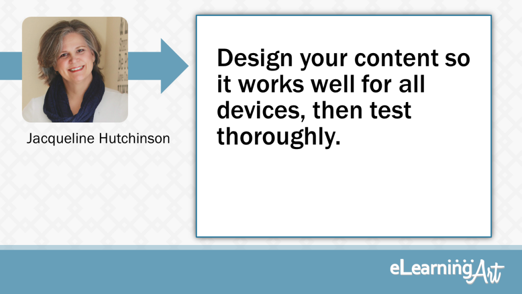
Design your content so it works well for all devices, then test thoroughly.
Design your interactive page content so that it works well for all devices, and test it with the devices you know your audience is using. More people are accessing content with smart devices, so when you design your slide content, keep that in mind. It will help you avoid “it’s not working” or issues accessing layers or linked information. Don’t design for one mode of delivery unless you know it’s the only mode being used.
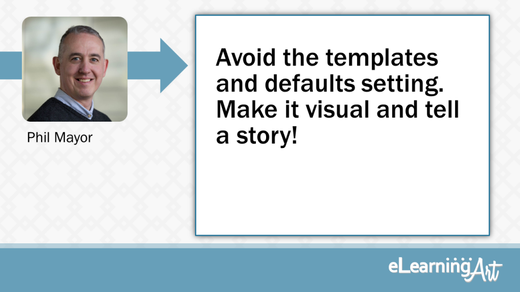
Avoid the templates and defaults setting. Make it visual and tell a story!
Avoid using any of the built-in templates and change default setting (i.e. fonts, colours) The templates are full of design cliches and chances are someone has seen it before. Using something that you have developed yourself will have more impact.
One example of why changing the default setup is important is the default button colour in Storyline, I would guess that 70% of people never change that.
Ideally, as a designer you want to differentiate your work from other developers, we can do that by creating a visual language for our courses. As well as being consistent with fonts, font size, colours, and using high quality imagery.
One caveat, If you do have design block, you can use a template as a starting point, However, make it your own. Change the fonts, make it visual, avoid using bullet points, set the colour scheme and tell a story.
If you are not a developer look to the web for inspiration, web designers are doing amazing things with design work and we can copy that design aesthetic into our courses.
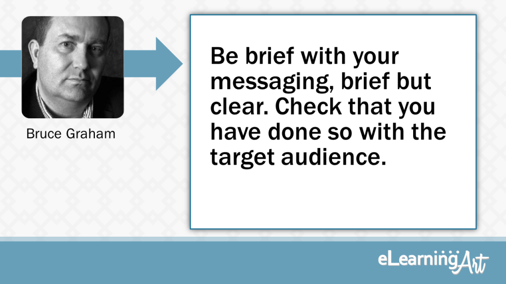
Be brief with your messaging, brief but clear. Check that you have done so with the target audience.
Make sure that the message you are trying to convey is clear! Use enough words to do that, no less, no more. Once you have crafted your messages/course, check it out with a few people to see if THEY think it works, as your perception of “clarity” and “the message” may be different. Only use visuals if they add to the message, random “nice” visuals detract.
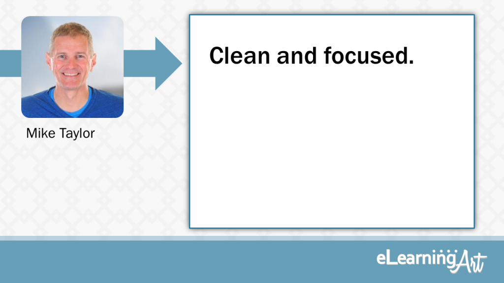
Clean and focused
Keep your slides clean and focused with plenty of white space and only make one point per slide. The slides are free, so use as many as you need!
Mike Taylor
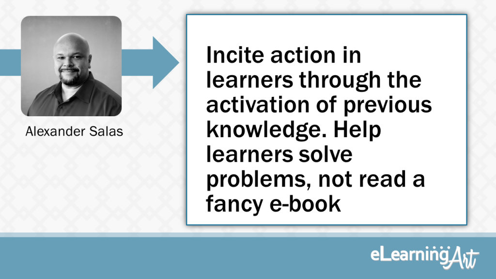
Incite action in learners through the activation of previous knowledge. Help learners solve problems, not read a fancy e-book
Don’t use slides to deliver knowledge content, instead use them to incite action in learners through the activation of previous knowledge. Embed the content on downloadable PDFs and help learners solve problems through purposeful eLearning interactions. We learn best when we are engaged through relevant problem-solving experiences.
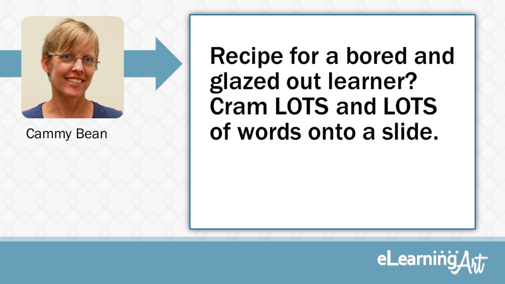
Recipe for a bored and glazed out learner? Cram LOTS and LOTS of words onto a slide.
Recipe for a bored and glazed out learner? Cram LOTS and LOTS of words onto a slide. For better eLearning, spread it out (think more slides with fewer words).
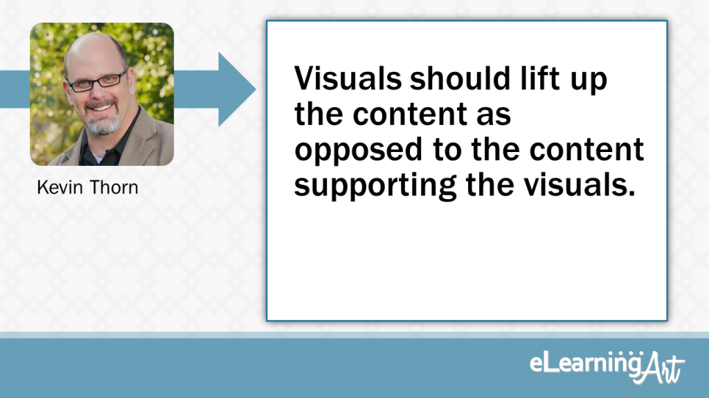
Visuals should lift up the content as opposed to the content supporting the visuals.
Vision is the first of our senses that is stimulated when first viewing and elearning slide. Understanding that means to visualize the message with good visual design and few if no onscreen text. Obviously, content dictates but if we start with the rule of visual design first, the rest will fall into place.
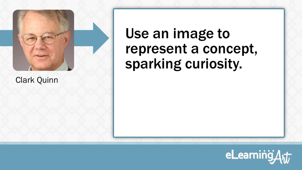
Use an image to represent a concept, sparking curiosity.
No text! Use an image or a diagram. (And for diagrams, build them with one step per slide). Instead of bullet points, use an image to convey the concept. That opens audiences up to an idea without them knowing what exactly how it’ll be used. I maintain that the curiosity created sparks retention.
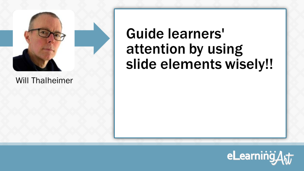
Guide learners’ attention by using slide elements wisely!!
“When designing an elearning slide (or any slide), we must align our design with our audience’s human cognitive machinery. People always frenetically scan their visual environment. It’s normal. It’s natural. As designers, we must guide learners’ attention. We should (1) avoid distracting elements (avoiding logos and decorative branding), (2) use white space to make elements pop to salience, (3) show elements one at a time, (4) keep slide elements to a minimum, (5) maximize the usable screen geography, and (6) avoid bullet points, transforming lists into something else (like objects).”
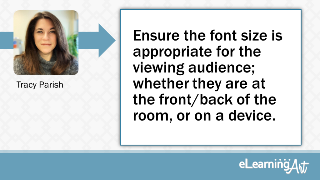
Ensure the font size is appropriate for the viewing audience; whether they are at the front/back of the room, or on a device.
Make sure you don’t have too much text on the slide. Keep it brief and concise and if you need to use more than one slide to convey the message, then that’s okay. Also, make sure that the font you use is appropriate for the room (or device) you are presenting in. Viewers at the back of the room should be able to read the slide just as easily as those at the front.
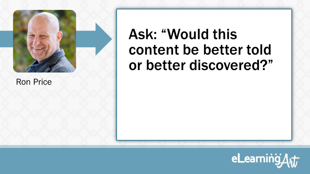
Would this content be better told or better discovered?
My background is in experiential learning and I often err too much on the side of letting the students discover or uncover the importance of the content. So my favorite tip is simply a question to ask that helps me keep that temptation in check and prevent me from creating unnecessary interaction (busy work). “Would this content be better told or better discovered?” Asking this question helps me create more meaningful interactivity.
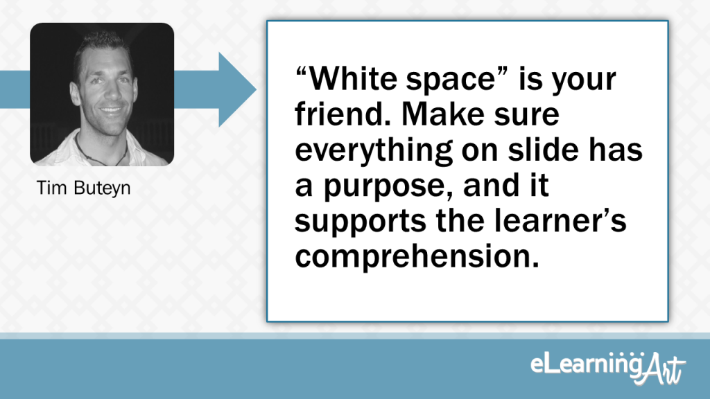
“White space” is your friend. Make sure everything on slide has a purpose, and it supports the learner’s comprehension.
Less is more. Think of great visual presentations you’ve seen (Steve Jobs comes to mind) and one thing is common, slides that are clean and uncluttered. Often, slides focus solely on a particular thought. While most eLearning won’t be this singular in focus, too much information can provide more distraction than benefit. “White space” is your friend, and a little restraint can go a long way. Make sure that everything on slide is there with a purpose, and that it supports the learner in comprehending the topic in some tangible way.
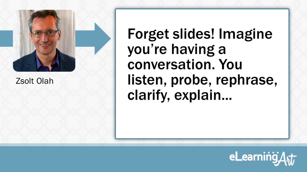
Forget slides! Imagine you’re having a conversation. You listen, probe, rephrase, clarify, explain…
Forget slides! Imagine you’re having a conversation. You listen, probe, rephrase, clarify, explain… Instead of focusing on how to present content, explain how someone use this information on the job.
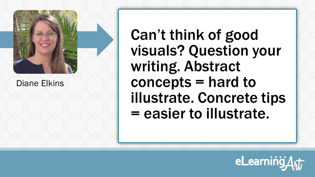
Can’t think of good visuals? Question your writing. Abstract concepts=hard to illustrate. Concrete tips =easier to illustrate
If you can’t think of a good visual, question your writing. General, abstract concepts are hard to illustrate. Concrete, practical tips are easier to illustrate.
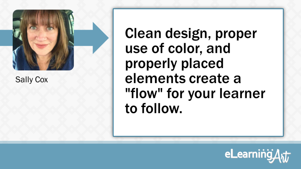
Clean design, proper use of color, and properly placed elements create a “flow” for your learner to follow.
Pay attention to the hierarchy of all the elements on your slide. Clean design, proper use of color, and properly placed elements create a “flow” for your learner to follow. Less is more, so remove elements or extra text that don’t contribute to the story.
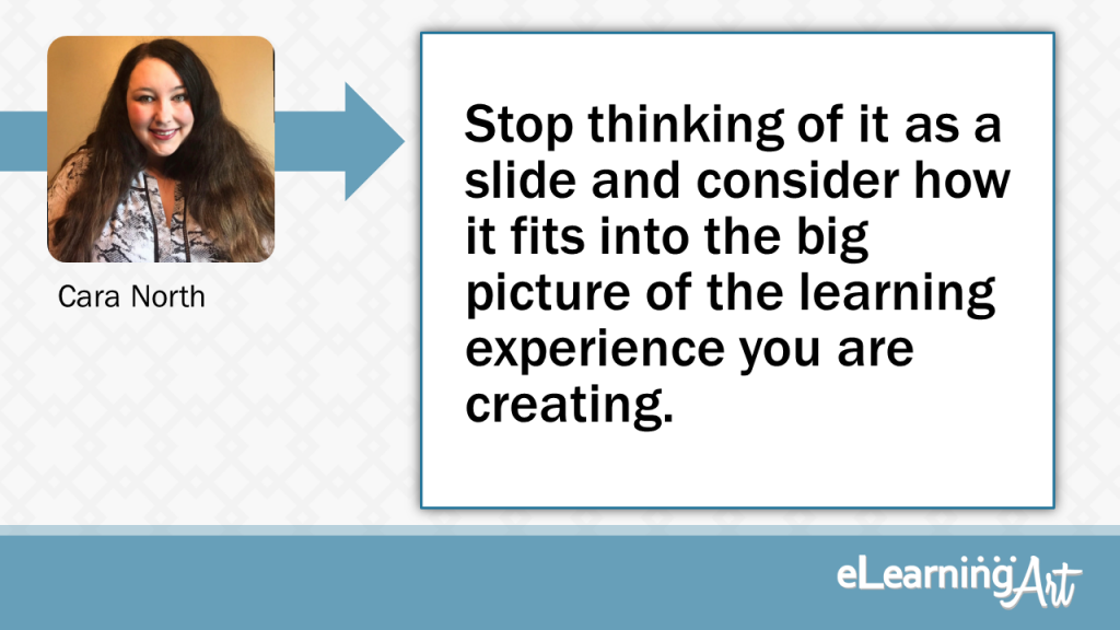
Stopping thinking of it as a slide and consider how it fits into the big picture of the learning experience you are creating.
Don’t think of it as a slide but as part of the journey. Often designers get stuck in the “slide” format when developing their learning experiences. How does the slide advance the story and content? It doesn’t have to be full of written content, it can be something as simple as an opportunity to pause and reflect or an opportunity for folks to ask questions about the content.
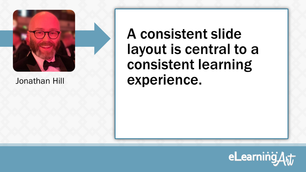
A consistent slide layout is central to a consistent learning experience.
Whatever slide layout you decide upon, apply it consistently. This will help your learner to navigate your course and focus on the content without being distracted by an ever-changing design. Recognise that your slides cannot ignore the law of ‘reading gravity’. Look up The Gutenberg Diagram and arrange your slide to take advantage of this principle. A consistent slide layout is central to a consistent learning experience.
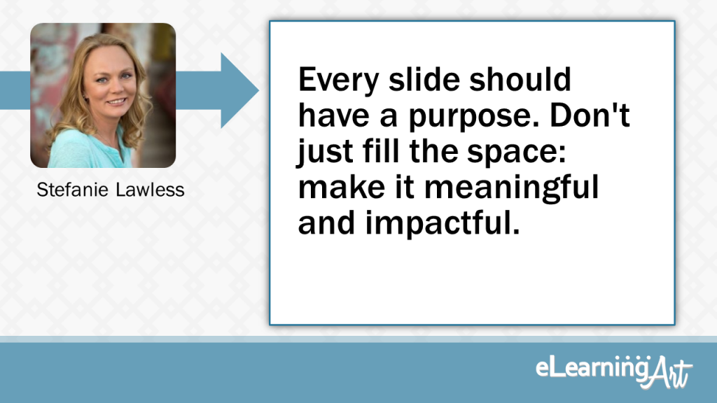
Every slide should have a purpose. Don’t just fill the space: make it meaningful and impactful.
Many people create slides, and add content just because they have the content on their hands. They then force their learners to go through all of the content, whether it’s relevant to them, or not. Allow your learners to discover the content they want to learn. Some content is meant to be told, while other content is meant to be discovered.
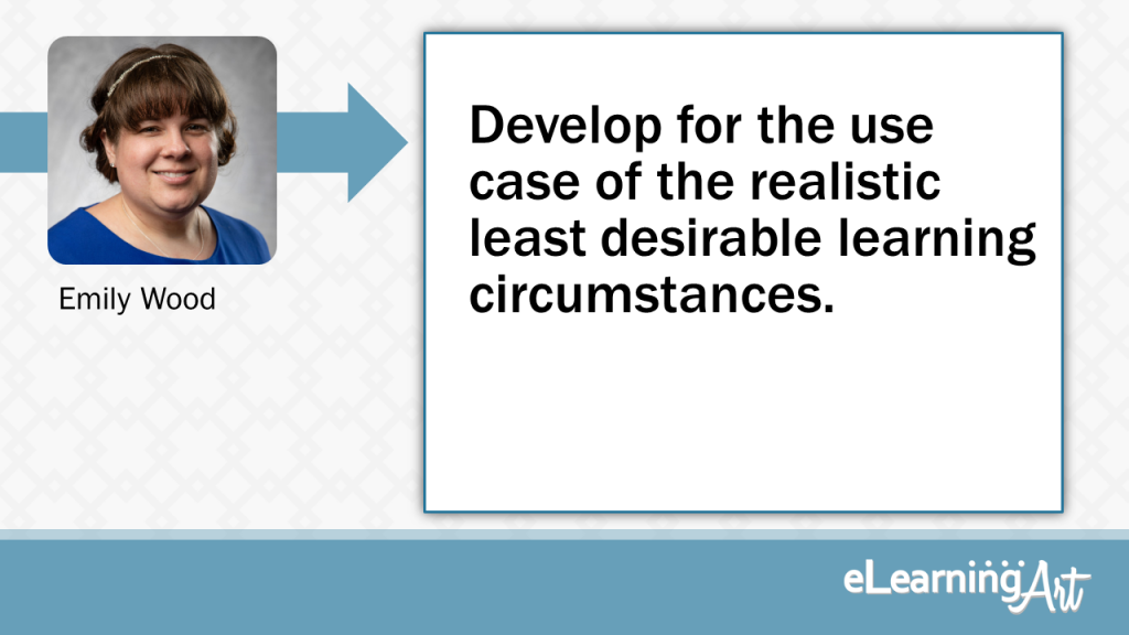
Develop for the use case of the realistic least desirable learning circumstances.
Develop for the worst case user experience a learner is likely to have and build a workable solution. If that’s a low bandwidth, older generation smartphone, create a slide where every object adds value. Focusing on the expense with of each object being added, you will end up with meaningful and high impact design.
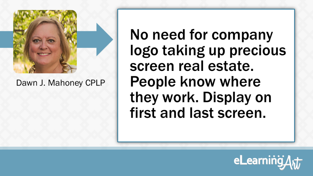
No need for company logo taking up precious screen real estate. People know where they work. Display on first & last screen.
Do whatever you can to maximize screen real estate. One way is to remove the company logo from your slides. Of course, display it on the first screen and, if needed, the last screen. (People know where they work)
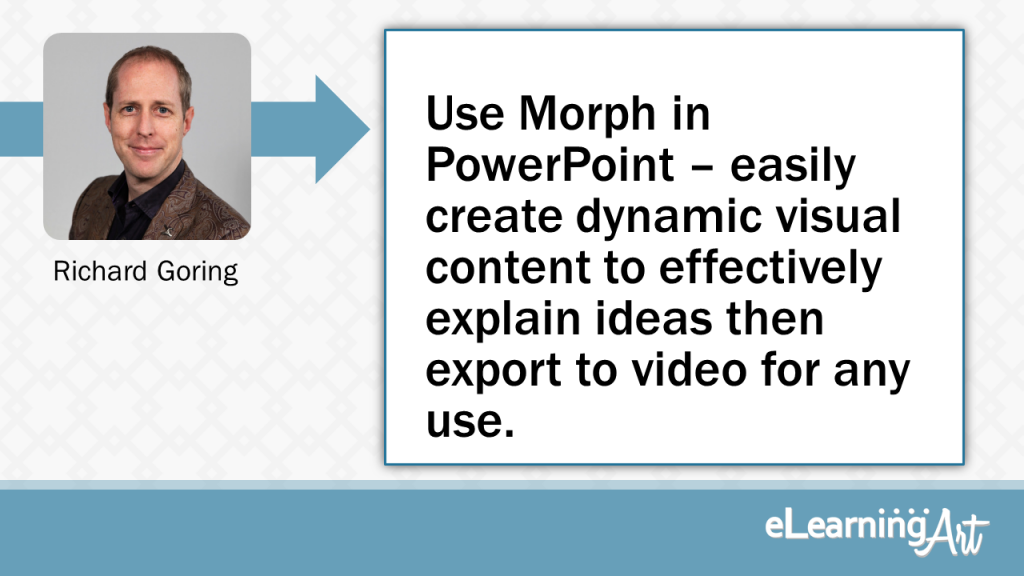
Use Morph in PowerPoint – easily create dynamic visual content to effectively explain ideas then export to video for any use.
Use the Morph transition in PowerPoint to quickly and easily create dynamic, visual content that explain even the most complex ideas elegantly and effectively. It’s so easy to use and encourages compelling visual storytelling that helps people learn far more effectively. And then use PowerPoint’s export to video function to create a standard MP4 file for use in eLearning authoring tools or as a standalone video for people to view.
Good elearning is a digital playground. Make it engaging!
Think about the content. Not so much Text.
Readability
Make it clear and and esy to read.
Good content. use infographics.
Prioritize your goal try not too many subjects at a time.
Tell a visual story with image and graphics.
Use less words and more visuals. Utilize stock resources for photographs and illustrations that bring the script to life. If you have Photoshop skills, consider creating surprising and interesting images for your slides. Once I Photoshopped a large elephant into a small empty room to illustrate a common saying. I don’t have to tell you what the saying is. You know it from the visual. If you must use words in your slides, don’t write out sentences that match the script.
Start by asking yourself “why would a person spend their limited time on this slide?”
Purpose. Every piece of content you ask someone to review must have a clear purpose and value. People have a great capacity for paying attention when they want/need to, but they also have unlimited options for their attention. Start by asking “why would a person spend their limited time on this slide?”
Learn to balance design and instruction. Learners don’t care how pretty the content is if they don’t learn anything.
Don’t overwhelm your learners with too much or irrelevant content. Sure, being creative is awesome, but there should be a balance between aesthetics and instruction.
Great instructional designers understand how to manage cognitive load during the design process. They also know the differences between Intrinsic, Extraneous, and Germaine cognitive load. Designing good elearning is about balancing instructional elements, UI/UX, and graphic design to create engaging content that helps learners achieve the learning outcomes.
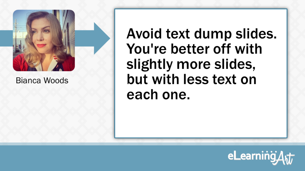
Avoid text dump slides. You’re better off with slightly more slides, but with less text on each one.
Content dump slides might keep your slide count down, but they tend to get in the way of people actually learning anything from them. In most cases you’re better off having slightly more slides that have less content on each one. It will help with retention of information and also not make people’s eyes automatically glaze over when they look at them.
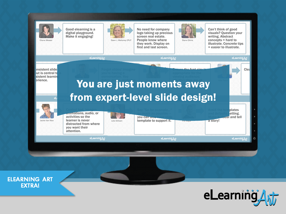
And that’s it! 38 awesome tips from the pros. Here they all are, summarized below:
- Be bold and confident with your slide design. Good design helps sell the learning. – France Hernandez
- Everything on the slide “speaks” to learners. Figure out the key point on each slide, and design visuals to portray it. – Brooke Schepker
- Control text, images, animations, audio, or activities so the learner is never distracted from where you want their attention. – Jackie Van Nice
- Don’t just deliver content: Ask important questions and offer activities. Deep processing is critical for deeper learning. – Patti Shank, PhD
- Use your slides to help your learners see what you’re trying to say. – Tim Slade
- Every element on the slide engages the learner and moves them towards achieving the learning objective. – Richard Watson
- Use words learners use, not SMEs. Show things learners understand, not IDs. – Sam Rogers
- Less is more on-screen. – Patti Bryant
- Save examples of great design that you see and use it the next time you are stumped. – Linda Lorenzetti
- Align objects to guidelines to create a unified look across multiple slides. – Christy Tucker
- Say “So for example…” as much as possible — you can also have slide template to support it. – Julie Dirksen
- Design your content so it works well for all devices, then test thoroughly. – Jacqueline Hutchinson
- Avoid the templates and defaults setting. Make it visual and tell a story! – Phil Mayor
- Be brief with your messaging, brief but clear. Check that you have done so with the target audience. – Bruce Graham
- Clean and focused. – Mike Taylor
- Incite action in learners through the activation of previous knowledge. Help learners solve problems, not read a fancy e-book. – Alexander Salas
- Recipe for a bored and glazed out learner? Cram LOTS and LOTS of words onto a slide. – Cammy Bean
- Visuals should lift up the content as opposed to the content supporting the visuals. – Kevin Thorn
- Use an image to represent a concept, sparking curiosity. – Clark Quinn
- Guide learners’ attention by using slide elements wisely!! – Will Thalheimer
- Ensure the font size is appropriate for the viewing audience; whether they are at the front/back of the room, or on a device. – Tracy Parish
- Would this content be better told or better discovered? – Ron Price
- “White space” is your friend. Make sure everything on slide has a purpose, and it supports the learner’s comprehension. – Tim Buteyn
- Forget slides! Imagine you’re having a conversation. You listen, probe, rephrase, clarify, explain… – Zsolt Olah
- Can’t think of good visuals? Question your writing. Abstract concepts = hard to illustrate. Concrete tips = easier to illustrate. – Diane Elkins
- Clean design, proper use of color, and properly placed elements create a “flow” for your learner to follow. – Sally Cox
- Don’t think of elearning as a presentation. Make it an instructive conversation with the learner. – Michael Allen
- Stopping thinking of it as a slide and consider how it fits into the big picture of the learning experience you are creating. – Cara North
- A consistent slide layout is central to a consistent learning experience. – Jonathan Hill
- Every slide should have a purpose. Don’t just fill the space: make it meaningful and impactful. – Stefanie Lawless
- Develop for the use case of the realistic least desirable learning circumstances. – Emily Wood
- No need for company logo taking up precious screen real estate. People know where they work. Display on first & last screen. – Dawn J. Mahoney CPLP
- Use Morph in PowerPoint – easily create dynamic visual content to effectively explain ideas then export to video for any use. – Richard Goring
- Good elearning is a digital playground. Make it engaging! – Chana Messer
- Tell a visual story with image and graphics. – Theresa Jackson
- Start by asking yourself “why would a person spend their limited time on this slide?”- JD Dillon
- Learn to balance design and instruction. Learners don’t care how pretty the content is if they don’t learn anything. – Aaron King
- Avoid text dump slides. You’re better off with slightly more slides, but with less text on each one. – Bianca Woods