


For what my opinion is worth, _I_ think this is a gem! Thank you.
Engage Your Learners By Mimicking the Real World
May 12th, 2009People already use their computers for things like checking email, surfing the web, and sharing the latest news on Facebook. Since that’s the case, why not design a course structure that mimics how they already use their computers?
I see a lot of elearning courses and I’d say that most of them are linear and almost exclusively focused on sharing information. They are also usually light on interactivity. I’m not going to stand on my soapbox and tell you that these courses are the worst thing since not slicing bread. Because sometimes it’s all you need, or all the customer wants.
With that said, there’s no reason why you can’t change up how you share the information by mimicking a technology the learner already uses. So instead of clicking a next button to get to new information, you start inside a page that looks like Outlook and click on an email link to open a new message. Or explore a fake Facebook page to collect information.
Even if there’s little interactivity, it’s still more interesting than the standard linear course. On top of that, things like email and Facebook have a personal element to them. By trying some of the following ideas, you are also able to bring a different perspective to the content and possibly wrap it around a story or something that is both relevant and engaging. It might also trigger some ways to make the content more interactive for the learner.
Here are three ideas to whet your appetite.
Mimic an Instant Message Experience
A lot of people use some sort of instant messaging application like Skype, AIM, or Messenger. Use an instant chat screen to make it look like two or more people are chatting.
To do this you need to create two or more people who will chat. They represent different parts of the information. You also need to create a reason for their conversation. And then make the information that you share conversational. You can have them click the forward button to advance or add a hyperlink on the actual chat interface.
I did a quick version of this on the blog post about building elearning courses in PowerPoint. The chat section is only a few slides. Click the play button to advance.

Click on this link to go right to the Skype slides.
Dig Through Someone’s Email Inbox
I read an article a couple of years ago about the Internet and new technologies. They interviewed some college students and one of them said that “email is what you did with old people.” So let’s say you have to train some of those old people. Why not create a screen that mimics an Outlook inbox?
Then have the learners click through email messages to collect information. The message titles could match what would have been the slide titles. And in the body of the email you’d present the information. If you really wanted to make it engaging wrap the emails into some sort of interesting story where each one builds off of the other.
I took that old soap story from the Internet and built a quick prototype to show how something like that could work. I just added all of the emails to the inbox for you to click through. In a real course, some would be in the sent box or other folders. Then I’d create a case study that required the learner to collect information through the emails. You could even bury links in the body of the emails to provide additional resources and information.

Click here to view the Outlook demo.
An Outlook type interface makes progressive storytelling a good approach. Think of it like a virtual scavenger hunt. Let the learner dig through someone else’s emails. You could even add distracters or funny emails to make it a little more interesting. Of course, if you’re training financial analysts then you’re kind of out of luck because it’s hard to make what they do exciting. 🙂
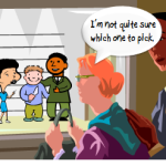
Create a Facebook Scavenger Hunt
A Facebook screen is kind of cool because of the types of information you find on a Facebook page. There’s the information wall, an inbox, pictures, and a host of files and applications. It’s a great way to integrate all sorts of media and information in your courses.
What I’d do is create some sort of reason the learner needs to click around the screen to collect information. Then assess them based on the information they should have collected. For example, say I was doing a course on workplace violence. By using a Facebook page I could add more interest than a series of bullet point slides.
I’d start with a story about Kelly Christopher, a disgruntled financial analyst, who attacks a well known blogger that happens to be visiting the analyst’s work location. Everyone is in shock and not sure how such a thing could happen, especially to such a nice blogger.
At this point, you invite the learners to visit Kelly’s Facebook page. As they click through it, they can read about him and get clues as to what triggered his outburst. Then build the assessment or case study around the clues they collected.

Click here to view the Facebook demo.
So there you have it, three ideas on how you can mimic everyday uses of the computer for your course design. Essentially you’re creating pages of information and just changing the way the learner navigates it. So even if you have a standard click and read course, you can still make it a bit more engaging this way. The novelty itself is more interesting.
If you want to make it more engaging and interactive, create a case study or scavenger hunt type activity where the learner collects information and then has to use that to solve a problem. This could work in corporate or academic settings. What would the CEO’s Facebook page look like? Or, what could a high school student glean from Einstein’s Outlook inbox?
I think you’d agree that this approach is more engaging than just a series o
f click and read slides. The personal connection and the ability to build a story around your content will help make the information more relevant and probably more interesting.
What are some other ways people interact with their computers that could make for an interesting course design? Feel free to share them by clicking on the comments link.
Events
- Everyday. Check out the weekly training webinars to learn more about Rise, Storyline, and instructional design.
Free E-Learning Resources
 |
 |
 |
|
Want to learn more? Check out these articles and free resources in the community. |
Here’s a great job board for e-learning, instructional design, and training jobs |
Participate in the weekly e-learning challenges to sharpen your skills |
 |
 |
 |
|
Get your free PowerPoint templates and free graphics & stock images. |
Lots of cool e-learning examples to check out and find inspiration. |
Getting Started? This e-learning 101 series and the free e-books will help. |
You might also like:
40 responses to “Engage Your Learners By Mimicking the Real World”
Hi Tom,
I saw you at the Articulate Live conference in March and so I’ve seen this idea develop. The first thing I did when i got back to the UK was to dump my original learning design in the trash and implement your ideas!
I have developed the facebook/skype/twitter theme within a linear learning scenario. We have received very positive feeback from focus group users (PhD students) who found the learning scenarios realistic and engaging. It helps create a narrative that is within a context that they are familiar with.
I have experimented with several approaches to the interactions; some using Presenter, others by embedding .swfs. If you follow this link: http://ismedia.exeter.ac.uk/flash/ee/skills/rdo/player.html and then go to SECTION 4: Scenario you can see one of these in action.
What a creative way to present information and entice multiple age groups! Thanks for the ideas!
Great ideas. Aside from mimicking the computer, you can also apply this to the physical world. You can graphically recreate a physical environment like a retail store or bank branch and have “hot areas” that open interactions or content. This works great for a scavenger hunt type approach. I have used this type of approach for introducing a new service in which they had to enter a branch and find “clues.” These included brochures, knowledgable staff, desktop computers, even customers all of which provided content when found and clicked.
Jeff
Very clever stuff Tom, and to add to it all, you Rickrolled us! You made my day!
I love that everyone that watches your demo will get RICKROLLED!
Awesome ideas as usual!
Tom, I really liked your ideas on call/response theory in these videos. Tell me this: to truly mimic the Outlook experience, would you be better inverting the order of the messages, so the most-recent post would be at the top?
In contrast, it’s the post most likely to be viewed first.
Thanks
Tom Sakell :: harborsights.com
[…] instance, when I add this excellent blog post on innovative instructional design to my Delicious account, I add tags like “e-learning” and […]
I work in an industry that requires documented assessment of the learning. How would you document that the learners actually “learned” while they were navigating this interesting format?
Great ideas! I actually used the IM one a few years ago in a short film I made for a film class. I wonder how I can integrate this with our training?
And loved the Rickroll! 🙂
I always enjoy your ideas, Tom, as well as the little surprises you throw in! Are there copyright issues involved with using Facebook, Twitter, and Outlook interfaces and names?
Great, practical ideas to spice up dull content. BTW, this is the 3rd time I’ve been Rickrolled this week, so this trend seems to be catching on. Darn that Rick Astley and his baby-faced crooning. That song will be in my head for the rest of the day.
Cool ideas! And it’s not hard to do even if you’re just using basic graphics. In a recent privacy course, we showed a fake Facebook-like page for an employee and asked the learners to see how much information they could glean about the person’s job and employer. The point was that a visitor to that page could learn enough about the employee to send him a convincing phishing email and get inside information.
Cindy, an activity like this can become the assessment. For example, in the example I just gave, if the learner fails to identify the risks on the page, they fail the assessment.
Always the best ideas! Thank you, Tom.
Thanks Tom, as usual…a great post. I would like more detail on ‘how’ you created both the email and the facebook scenarios…think they are great. Thanks again, Scott
I understand the need to be creative in e-learning design and avoid the “point and click” method which can bore the learner. But the improtant question is: Do these designs increase learning? I read study after study that says “pumpkin graphics” and other additions that are not necessary to the course are distracting and actually inhibit learning. Is there evidence that these kinds of approaches are more effective than courses with basic designs at Level 2 and 3?
For further clarification, being Rickrolld in the demo was just to show what you could potentially do? I cant imagine being Rockrolld bolsters learning in any setting.
Tuesdays are my new Fridays…always look forward to them!
Scoping out an iPhone experience learning activity that follows this idea. The learner thumbs through several screens of apps on the iPhone looking for specific apps to gather information. Haven’t detailed the storyboarding yet, but the concept has gained traction so here’s to keeping my fingers crossed.
Havent’t been Rickrolled since H.S. 🙂
Tom,
I was working on 3 “Articulate courses” all day today, and at the end, rushed to your blog to see what was new.
LOL
Thanks for the Rickroll!
As for the Facebook idea… we users/members are still complaining about the newest UI they came up with, so YES! e-learning designers/developers can improve upon the FB look-and-feel. 🙂
If mimicking well known interfaces, the content could age quite soon. I guess this might not affect Rapid E-Learning but might affect courses with longer shelf-lifes.
My 2 cents about this interesting idea.
Great ideas, as usual, Tom! A few jobs ago, I did a whole interactive Outlook email sequence for a workplace violence course where the learner had to click on the words in the email that they thought were potentially threatening. A second activity required the learner to read a series of emails and determine when there was cause to escalate to HR. We got a lot of great feedback on those activities, although I’m sure they weren’t as slick as what you’ve put together.
Thanks for sharing!
P.S. I can’t believe I fell for the Rickroll. I feel like such a schmuck…
@Tom: What did Rickrolling have to do with the financial analyst attacking the blogger? According to that Wiki link, Rickrolling directs a person to a link that is totally unrelated to what the user thought it was. How does directing some one to Rick Astley improve rentention of course content?
Great ideas on creative interfaces. Love it.
I must be psychic. I was just reading someone else’s post about a FF extension that shows the long version of a tinyURL. They talked about how people don’t like being sent to somewhere they don’t expect. My immediate thought was RickRolling. Fast forward 30 minutes to when I’m reading your post, and to my utter elation, I get RickRolled.
Does it make me strange that I LOVE getting RickRolled?!?
Oh no – I have been Rickroll’d! But it feels good ;). Now, let’s all spend a little more time on the interfaces. I am sure that our learners will enjoy that.
Hi Tom. I love all your posts, specially this one about hyperlinks! Isaw the tutorial teaching how to create them (in the old version).
But when I tried to the same on my project trainnning (I use the 09 version) it did’t work when published. Could you help me?
Hi Tom,
I wanted to thank you for all your blog topics, they have helped me a great deal as someone who is new to the e-learning world. For a project that I am currently working on, I have decided to use an interactive conversation to make the course content more engaging to the learner . What is your take on this type of method and do you have any suggestions as to how to make a course that is content rich more interactive and engaging?
Looking forward to hearing your thoughts.
Tom, how do you get your audio in Articulate to sound so good. Ours always sounds like we are talking into a tin can. We use Audacity as our recording tool. What tool do you use, and what settings do you use when you record your audio? Do you import into Articulate, or do you record your audio directly in the PowerPoint?
Please let us know – we are going crazy trying to figure it out!
Thanks – Nicole
As always fabulous! I have used similar techniques in face-to-face training (scavenger hunts are great) – never thought to use it for eLearning stuff. Wonderful! Thanks as always!
You dog! I had actually made it this far without being Rick Rolled. I can’t believe you got me! Aside from that, I love these ideas. Really nice examples of interactivity.
FANTASTIC! Thanks for sharing the great ideas. I think this will be particular effective with younger learners. Definately will make it easier encouraging staff to get off facebook and do their e-learning courses. Loved the RickRoll!
Hi Tom. I tried to use the skype idea including a skype sound when the messages appears, but when I published, the skype sound disappeared. Do you know what’s wrong?
[…] Taken from the Rapid Elearning blog http://www.articulate.com/rapid-elearning/engage-your-learners-by-mimicking-the-real-world/ […]
I read on the support section that hyperlinks just works on presenter for next, previous, last and first slides. If you make a hyperkink in a slide for another in the midle of the presentation it won’t work.
So, how did you do on the outlook presentation?
Tom:
I am using Presenter 5 version. How do you create the internal link within the page that takes you to the next slide? For instance, with the Outlook page, when you click on the email, how do you ensure it takes you to the correct email? Is that done through hyperlink in PowerPoint or through Presenter. I’ll play around and see what happens but I didn’t realize Presenter could be so interactive. This will be great for what I am trying to work on. I’m trying to design a course where learners have to investigate a possible grievance and determine from a variety of documents whether or not to file. Can you create a form into which information can be entered?
When you used the facebook page or IM did you create the page/IM box from scratch or did you import the format through a screen shot or something similar? I’ve had real trouble inporting screan shots and maintaining clarity of the image.
Tom:
I figured out how to do the internal PPT links. Let’s say I want to show a form and have various sections of the form link to documents or slides. But I don’t want the slides to show as part of the course outline or be generated as part of the course without the user going through the links. I’ve tried hiding them in the PPT which solves my problem of them being seen in the course but seems to drop the link. Thanks for your help with this. I love this concept and really want to try to incorporate this into my course. This is my first course.
Guy
[…] a mock up I did for creating a course that looks like an email exchange for a previous post on mimicking the real world in your courses. Something like this is different than a typical course and could be a fun. Just […]


0
comments