
Design Your Virtual Learning Assets For Success
The definition of virtual learning and its usefulness in meeting employees’ Learning and Development needs have long been under discussion. Particularly in today’s unpredictable environment, organizations are leaning on various forms of virtual learning more than ever. To be truly effective, however, virtual learning must be well-designed. While our tolerance for less-than-perfect video may have increased with the rise of YouTube and TikTok, the same cannot be said for boring, page-turner courses.
With more employees working remotely than ever before, it is crucial that we create learning assets that really engage. Let’s talk about two aspects of design that are equally important if you want to provide virtual learning that really gets results—Instructional Design and visual design.
Instructional Design Tips
The first set of design tips comes from the viewpoint of Instructional Design—how you organize your content to maximize information transfer.
1. Keep It Short
We’ve talked about this in several other places, but adult learners are busy people constantly bombarded with information. Their attention spans and ability to absorb new information is becoming shorter and shorter. If you have enough content to create a robust 30-minute course, consider creating a series of 2-5-minute "microlearnings" easily deployed to a smartphone instead. And always allow for the chance to pause and jump back in as needed [1].
The challenge with lots of little nuggets is keeping them organized and easy to access in the correct order. You may need to spend as much time on the structure of your learning portal as you do on course development. No one has time to hunt for the next lesson.
2. Keep It Interactive—Even Fun!
Training team managers, encourage your designers to appropriately leverage the various options for interactivity in your development software. Add those interactive elements throughout the course, giving learners a way to discover the content, not just review or be quizzed on it.
Include elements of gamification. Can you develop a meaningful point or badge system? Can you include a few fun surprise elements to further entice active participation?
Remember that not every feature will function that same way on a phone or tablet interface as it does on a laptop or desktop. Be sure to test your courses before implementation to avoid frustration on the part of your users. Whenever possible develop virtual learning that works effectively over the widest range of devices to give your learners maximum flexibility.
If your virtual learning program includes elements of Virtual Instructor-Led Training (VILT), encourage your presenters to use their video cameras as they present. It’s tempting to turn off the camera and just rely on your visuals, but human connection encourages engagement.
Not sure what works for your remote team? Ask for their feedback and input. Likely you will get a wide variety of answers—every learner is different and their tolerances and preferences in terms of processing information remotely will likely vary too.
3. Keep It Simple
This applies to both the interface as well as the content. Stick to need-to-know information. It’s great to include graphics and visuals, as learners take in a great deal of information visually, but only add them where they support a key message, not just because they look nice. Be conscious of reducing rather than increasing cognitive load. While learners appreciate variety in terms of content delivery, they also need a consistent and predictable interface. Your virtual learning elements should be easy to use and simple to navigate.
4. Make It Real World
Balance fun and gamification with real-world applicability. Yes, virtual learning should be interactive, but to be effective with adults, the application must be obvious. If you have users shooting aliens in a negotiation skills virtual learning, it better be obvious how that activity applies to the learner’s life. Also, be sure your learning objectives are clear and linked to business goals so the tangible benefits a learner will get out of completing this virtual learning are apparent. Use real-world scenarios and examples whenever possible.
Read on to learn some tips for improving the “real-world” elements in your virtual learning.
Visual Design Tips
Now let’s talk about the other element of design—the visual element. We talked with top eLearning developer and senior motion designer Tim Spencer to get some additional tips.
5. Make Your Simulated Situations More Immersive
The best-case scenario in learning would be to work through real-life examples in the real world. The smells, colors, textures, and sounds all help to bring a bigger picture to the learning experience. Such elements draw focus to the context of the information being presented. All too often virtual learning falls a bit short as compared to reality. Integrating art direction and illustration techniques, sound effects, and User Experience Design can transform a bland page-turner into a much more immersive event. With a rich, contextual environment, such detailed scenarios will deepen the learning experience and increase the likelihood of knowledge transfer.
6. Have A Strategy For Visual Continuity And Revitalization
When working across an array of platforms, your well-thought-out learning strategy can quickly seem disjointed. A clear and consistent vision for imagery, illustration, color, and font can snap that continuity back into place. Following company brand standards is a pretty obvious first step, but what happens when you have specific learning deliverables that aren’t addressed in those standards? Or perhaps you want a deliverable that stands out visually from the “company blue” on a white background. Give careful thought to this step and develop a holistic look and feel for your entire program—not just this course.
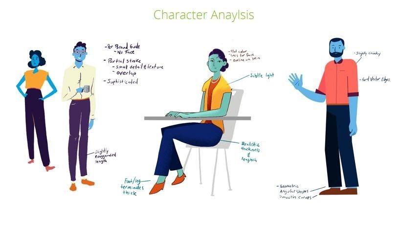
7. Develop Or Select Characters/Avatars With Intention
There are a host of considerations that need to be taken into account when depicting individuals. Perhaps the most important of these are: What is the tone of your content and how will your content be perceived? If your topic is a serious one, you may want to avoid characteristics that lend to a more playful or cartoon-like vibe. Body proportions can generate a lot of subconscious reactions. For example, large heads are characteristic of infants and can be perceived as indicating immaturity.
Are your characters diverse and inclusive? There is a fine line to walk when making decisions about features like hair, eyes, and noses. On the one hand, we want to illustrate diversity, including a wide range of characteristics that communicate racial and regional differences. On the other hand, are your characters subsequently reinforcing conscious or unconscious stereotypes? If your program is global, how best can you represent all learners? These questions require careful thought.
Another consideration is skin color. This is a common area of concern. Will you choose to incorporate a variety of skin tones to represent the diversity of your potential audience, or choose to have everyone a color that does not exist in real life (i.e., blue)?
Here is an example of an early phase of character development that was meant to help drive a targeted conversation with a client:
8. Create An Engaging Color Palette
Creating and implementing new color palettes can be a lengthy process; here are a few tips and tricks to help push your project in the right direction.
Color language defined
- Hue: Refers to the actual color you see (red, green, blue, etc.).
- Saturation: Refers to the vibrancy of a color. A very saturated color can look almost neon while a desaturated color is grey.
- Value: The lightness or darkness of a color. The lighter shift of a hue (adding white) is described as a tint. The darker value (adding black) is described as a shade.
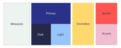
So how do you build an effective color palette for your project? Start by determining your primary color. This color will be the predominant color used and will anchor the continuity of your design. For our example, we’re choosing a rich blue, then choosing two variations of this color, one darker and one lighter. This ensures legibility whether we need dark text on a light background or light text on a dark background. Of course, we need a white, but just for fun, we’ll add a little bit of a hue to it. Our secondary color will be a complementary color (across the color wheel)—yellow—and our two accent colors will be red and pink.
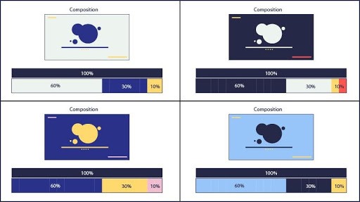
So we’ve determined our colors, now let’s look at how to use them for maximum effect. The ratio of colors that should be used for any given composition is 60:30:10. This means that for any particular layout (or screen in your course) if you consider the surface area 100%, you know about how much of a color to display.
It isn’t a hard and fast rule, but it’s a great starting place. You can play around with the ratios a little and maybe add another accent color, making your ratio more along the lines of 60:30:5:5.
Quick color tips
- Limit the number of colors. You don’t need to use all the spices on the rack.
- Don’t over saturate. For every saturated color, you need a counterpart. It’s hard to notice how bright something is without also seeing something dark.
- Contrast is key; contrast creates clarity. If there’s not enough contrast between values, then it’s hard to know where to look. A quick trick to check on your contrast is to desaturate your composition and see if the focal point is still clear.
Conclusion
Whether you are a training or HR manager or even a small business leader, you are no doubt grappling with the new reality of remote teams. Remote employees must continue to learn and develop, but how best to meet this challenge? Well-designed virtual learning is possible and can be a highly effective means of meeting your organization’s Learning and Development needs. Applying these instructional and visual design tips can be the first step toward improving your virtual training strategy.
If you're wondering how you can effectively implement virtual training in your organization and meet the needs of your learners and your organization, download the eBook How Virtual Learning Meets Employee Training Needs In Today’s Remote Working Environment. Find more virtual learning resources and tips by joining this webinar too!
References:
