Sustainability is one of those hot topics of the moment, and I’ve recently come across a couple of things that I think could be adapted really effectively for a sustainability e-learning course. I thought today I’d share them – let me know if these give you the inspiration you’ve been looking for!
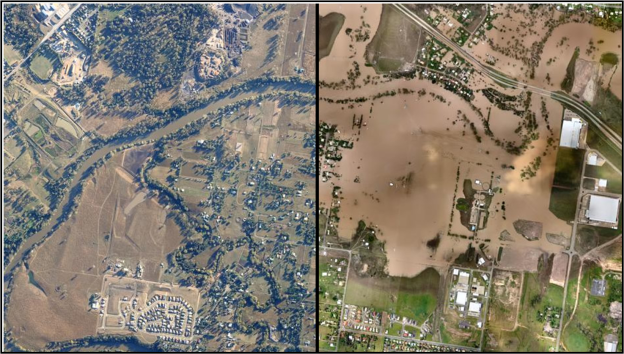
I came across this thanks to Karyn Romeis (I think) and have returned to it several times since then. Essentially it’s a comparison of ‘before’ and ‘after’ photos, but there’s something about being able to slide between the two that makes this special.
When I shared this in our most recent creative show-and-tell session, everyone loved it; far from just glancing at the images, we spent several minutes sliding the bar on each image backwards and forwards – for whatever reason, this design concept really does engage. I can see this working incredibly well in a sustainability course. Imagine being able to slide between an image of the rainforests 20 years ago and an image of what they’ll look like in another 20 years, for example.
There’s a similar site showing satellite images of Japan before and after the quake and tsunami.
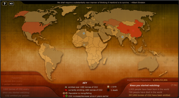
This was shared on Twitter by Nick Shackleton-Jones and is another idea we took a look at in the creative show-and-tell. What I like about this is the real-time counter in the bottom right – you can see how many people have been born and died, and how much carbon dioxide has been emitted, while you’ve been watching the animations on the map.

