7 Essentials for a High-Converting Course Landing Page

It’s an online course creator’s worst fear.
Spending countless nights working on the most valuable content possible, only to have no one sign up for your course.
Your potential students don’t receive the education they need to get to that next level, and you don’t get rewarded for all your hard work.
A lose-lose for everybody .
But don’t worry, it doesn’t have to be that way.
Your course landing page is your opportunity to showcase the value of your course and convince potential students to take the next step and enroll.
If you can direct your audience to a course landing page that’s optimized for conversions, you’ll be seeing new signup notifications come in faster than you can swipe them away.
In this post, we’ll be sharing seven essential elements that every high-converting sales page should include.
1) A compelling headline that communicates the benefits of your course.
The first thing your potential students will see is your headline, so it’s important to spend all the time you need to get this right.
The best course sales page headlines are specific, compelling, and action-oriented.
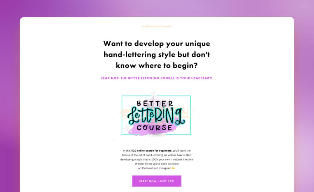
It should grab the reader’s attention, clearly communicate the benefits of your course, and encourage the reader to take action.
What is the outcome you’re promising your students? And why should they learn this from you as opposed to anywhere else?
Here are some example frameworks you can use to craft your headlines:
- Discover how to [Achieve a Specific Goal], even if you’ve never [Common Obstacle] before
- How to [Achieve a Specific Goal] in [Timeframe] or less
- Master [Topic] in [Timeframe] with [Course Name]
- Use the [Method] to Become an Expert [Skill]
- Want to [Specific Outcome] but don’t know where to begin?
Helpful tip: ask a friend in your target audience if your headline sounds appealing to them. Their answer might surprise you.
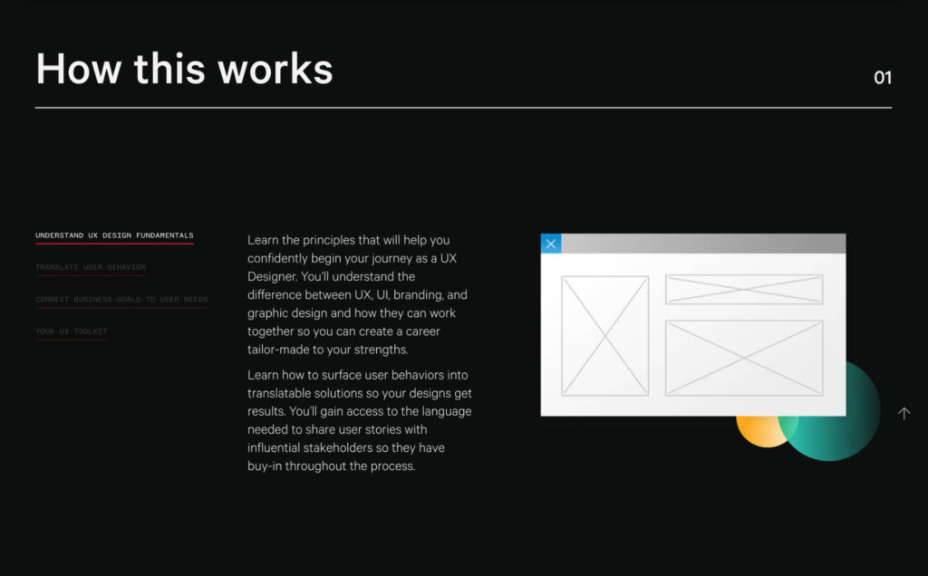
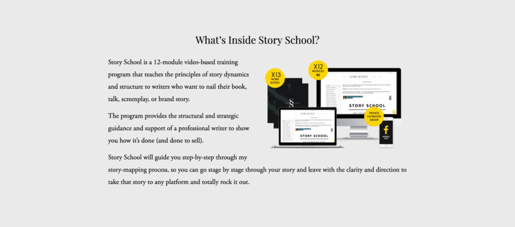
2) A comprehensive description of the course content & structure.
Now that you’ve got their attention, it’s time to expand on how you’ll deliver your promised outcome.
What are your students going to learn? What does the course structure look like? How is the information going to be presented?
This will give potential students a sense of the scope and depth of the course, and help them determine if it’s a good fit for their needs.
Just be careful to not give away too much of ‘the good stuff’ here.
You want to continue focusing on why your content will help them achieve X, without going too deep into the details.
Helpful tip: come up with a benefit for each module of your course, and use that as the outline for your course description.
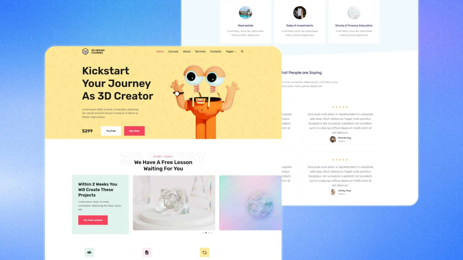
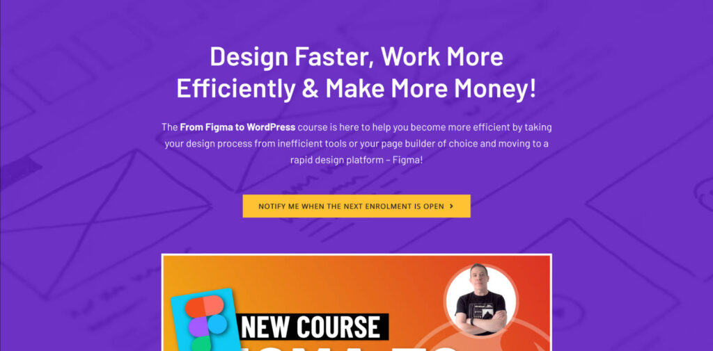
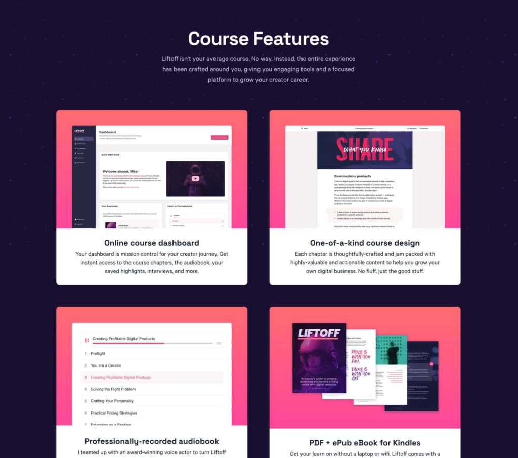
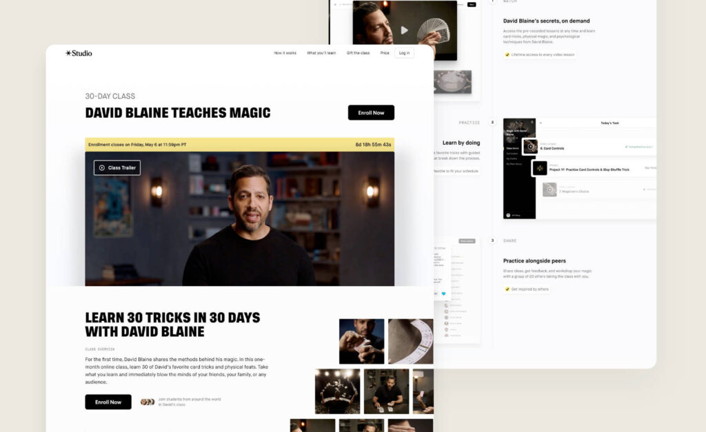
3) A clean and professional design.
The design of your course landing page says a lot about how you present yourself.
If it’s well-designed and professional, people will be more likely to trust you.
On the other hand, if it’s cluttered or looks like it was cobbled together in an hour, it might raise questions about the quality of your content.
It’s also important to take into consideration the audience that you’re targeting when choosing an aesthetic.
If you’re selling a high-end course for business professionals, you’ll want your landing page to convey a sense of luxury.
If you’re selling a course on gardening, you’ll want to keep the design light & fun.
Again, if people have a positive experience with your course landing page, they’re going to see it as an extension of the rest of your course.
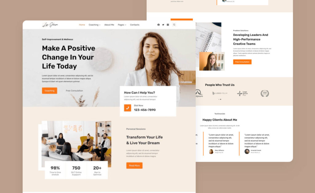
Getting a nice design doesn’t need to be expensive either.
There are plenty of beautiful pre-built templates available if you’re looking to get started quickly, or high-quality UI kits if you want to design something more custom.
Helpful tip: when in doubt, it’s always better to keep your design simple.
4) Testimonials from happy customers.
Potential students will look for proof that your course actually works, and there’s no better way to show them than through testimonials.
If you’ve had students go through your course before, reach out and ask them if they’d be willing to provide a short testimonial about their experience (here’s a great tool that makes this entire process easy).
It’s a good idea to get in the habit of writing these testimonials down or saving screenshots any time you see someone mention your course positively.
That way you’ll slowly build a repository of testimonials you can use throughout your ads, landing pages, checkout pages, email sequences etc.
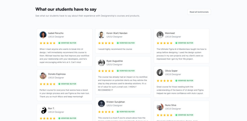
If you don’t currently have any testimonials, don’t worry! You still have a couple options when first starting out.
A) You can offer course access for a hefty discount to anyone who is willing to provide a testimonial in return.
B) You can showcase testimonials of people you’ve worked with in the past. They only need to comment on your expertise in your niche, and not necessarily the contents of your course.
You can then sprinkle in more course-specific testimonials over time as more students are enrolled.
Helpful tip: you can never have too many testimonials on a page!
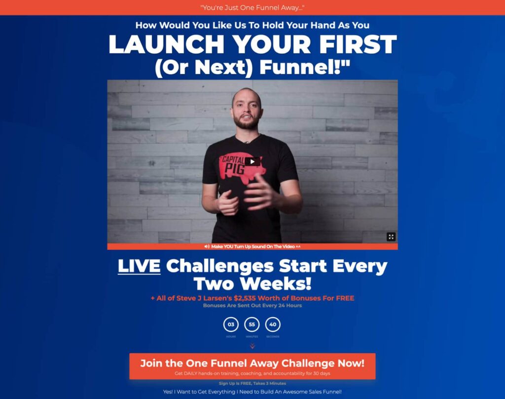
5) A clear and enticing call-to-action (CTA).
Now that your visitor understands how they’ll benefit from taking your course, it’s time to get them to take action.
This is generally via a button that takes the user to your course checkout page.
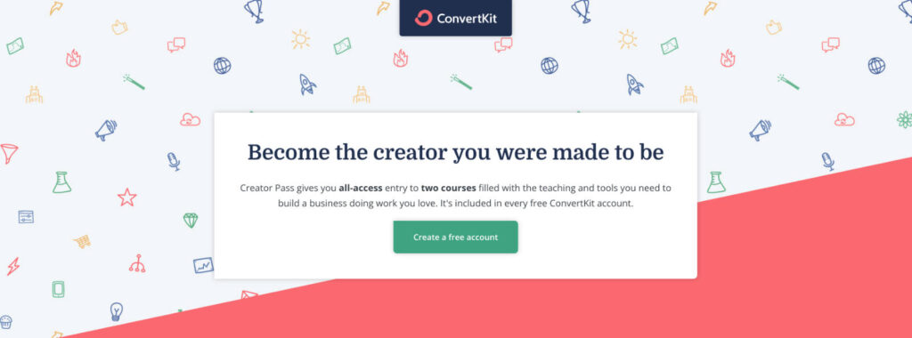
While this sounds straightforward, there are a couple mistakes we see people make often.
A) They don’t use enough CTAs.
You’ll want to make sure you present multiple opportunities throughout the page for your reader to take the next step.
Some people will be ready to sign up after reading your headline. Some will be ready after going through your course description. And others after they’ve gone through all testimonials.
Including multiple CTAs on your page makes it easier for them to take action the moment they’re ready.
B) They use a generic call-to-action.
You’ll often see a button with the text “Get Started” or “Sign Up”.
While this is still far better than nothing, it misses out on the opportunity to give your potential student that final push.
Try tying your selling proposition back into your CTAs.
You can do this through the button text itself, or by including a subheading right above your button.

Helpful tip: you can use different CTAs throughout your page. Just make sure they all point to the same destination.
6) A money-back guarantee to reduce risk for your student.
If there’s anything stopping someone from purchasing your course, it’s the fear that they could potentially waste their time and money.
The more you can remove any risk from their purchase, the more likely they’ll be to sign up.
A common way course creators do this is through a money-back guarantee.
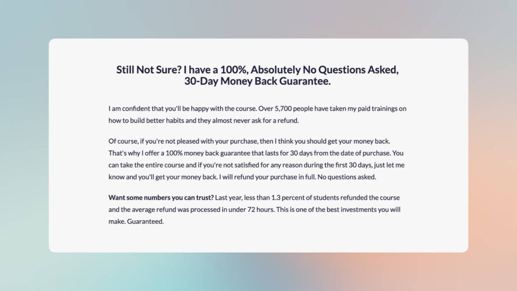
Depending on what you’re teaching, there may be a couple different approaches you can use for a money-back guarantee.
A) You can offer an *unconditional 14-day money-back guarantee.
This option reduces risk for your student the most, as they’ll feel they have the freedom to change their mind after making the purchase.
The downside is that you may have students who take advantage of the guarantee – getting value from all the lessons, and then requesting a refund simply to get their money back.
B) You can offer a *conditional 60-day money-back guarantee.
This option often requires the student to show some kind of proof that the course didn’t work for them.
They tried the methods that you taught, but didn’t get the result you promised.
This will help prevent students from taking advantage of your money-back guarantee.
The downside is that since your student isn’t guaranteed a refund, this doesn’t reduce as much risk as option A.
Helpful tip: don’t be afraid to experiment with different money-back guarantees to see how they impact your bottom line.
7) A personable instructor bio.
Courses are a highly personal experience.
It’s just as important for your student to resonate with you as it is for them to resonate with your content.
By including a section about yourself (and any other instructors) on your landing page, you’re giving your potential student a chance to connect with you.
If you share the story of how you’ve come to be in the position you’re now in, they’re more likely to draw similarities to their own lives.
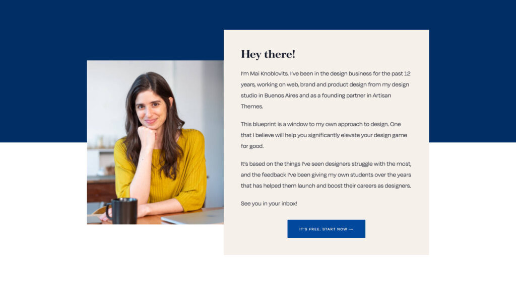
Done right, a good bio will go a long way in building trust and credibility for your potential student.
Helpful tip: don’t be shy to inject your personality alongside your accomplishments. You don’t want to make it sound like a robot wrote your bio!
Wrapping Up
Now that you know the key components of a successful course landing page, it’s time to make magic happen!
Fine-tune your design & copy so that you’re effectively communicating what life will look like for your student after they’ve finished your course.
And be sure to include multiple calls-to-action throughout your page so that they have plenty of opportunities to take the next step.
With these elements in place, you can be confident that your course content will reach the most number of students possible.
A win-win for everyone .
That’s all for this one.
Thanks for reading!
Additional Resources
- Selling Your Online Course
- 4 Tips for Writing Better Sales Copy for Your Online Course
- Why Your LearnDash Course Needs A Better Checkout Experience To Increase Conversions
—
This article was contributed by Sunny Trochaniak, who publishes helpful web design tutorials and reviews over at NewPulse Labs.

LearnDash Collaborator
@LearnDashLMS