19th Apr 2024
Mastering high-impact conference presentations
Conference presentations are really hard to get right compared to day-to-day presentations. How do you tackle bigger stages, bigger rooms, bigger audiences and higher stakes?

It’s no secret that at BrightCarbon we generally recommend keeping text on slides to a minimum. The main reason you need to avoid lots of text in presentations is because it’s virtually impossible to read and listen to someone speaking at the same time. In a presentation, you want to allow the audience to listen to the presenter while looking at an appropriate visual or diagram with minimal words, so that it all comes together seamlessly. Whereas, with documents like reports – while you can create them in PowerPoint – they aren’t presentations; there won’t be anyone talking over them. So you can (and possibly should) have a lot more text.
So, when you are using text in a presentation or document, how do you decide what size it should be? We’ve found there’s no hard-and-fast rule for how big or small text on slides should be. Each presentation has its own unique requirements – it all depends on what you’re using the slides for, what you’re hoping to achieve with them, and how your audience will be viewing them. Accessibility considerations also come into play, as well as readability across different typefaces and devices.
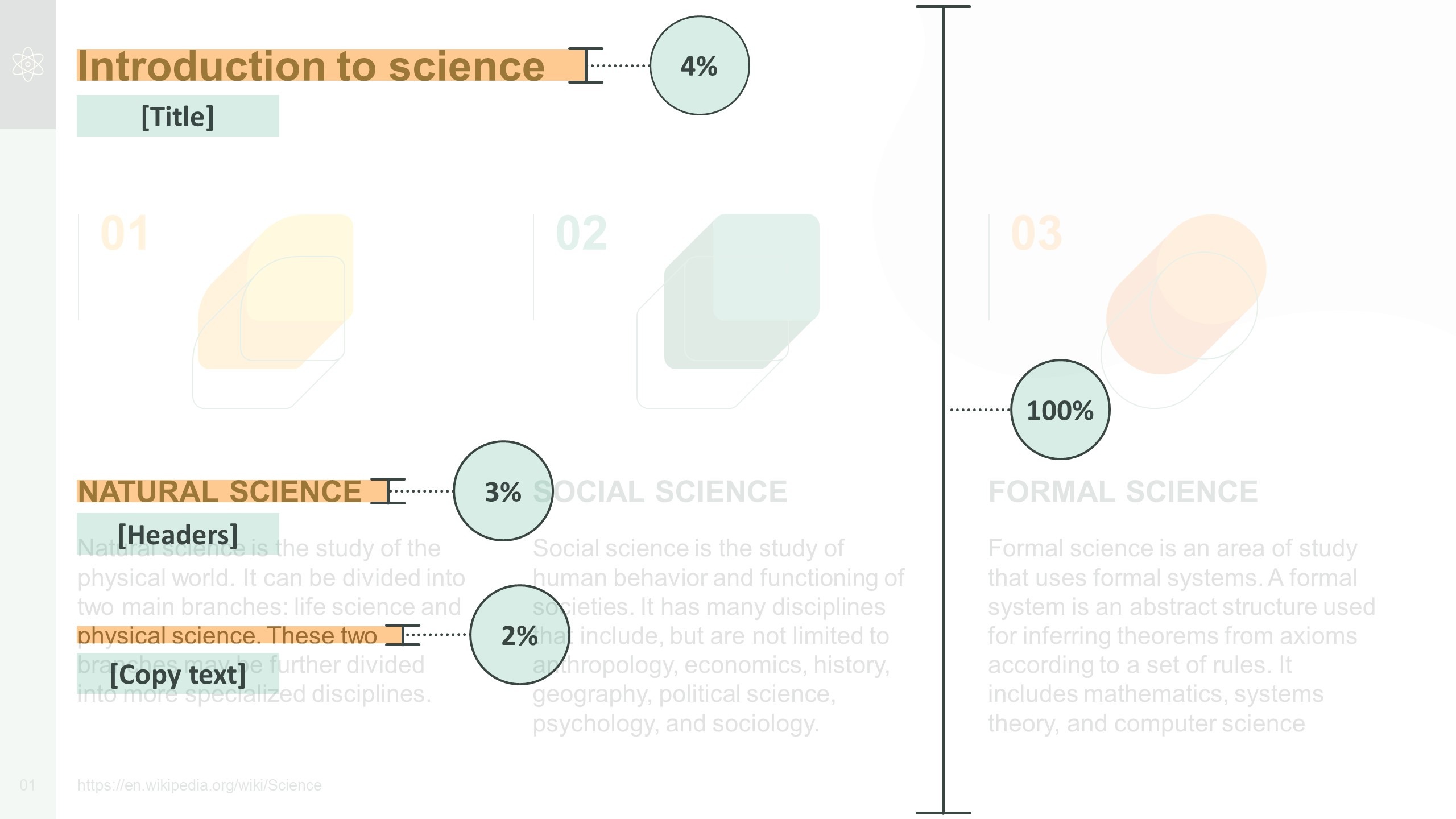
One way to decide on the right size for your text is to consider the height of each line of text in proportion to the total height of the slide. For example, in a sales or training presentation, the height of the title (per line) should take up approximately 4% of the slide’s total height; headers around 3%; and copy text around 2%.
This principle can be applied to text appearing in other types of presentation, too. For example, in a keynote presentation, the height of the text should take up around 6.5% of the slide’s total height. And in a document or report, aim for the height of the title text to take up around 4% of the slide’s total height; headers around 3%; and copy text around 1.5%.
When deciding on the right font size for a face-to-face presentation, it’s also worth considering how close audience members should be seated to the screen in order to be able to read the text easily. Check out presentation expert Dave Paradi’s table on comfortable viewing distances for text in presentation visuals[1] for more on this.
We called upon our team of designers to determine what size they would make the text in a set of example slides. To create the slides, we used PowerPoint’s default widescreen slide size (19.05cm x 33.86cm, or 7.5”13.33”), and Arial – one of the most commonly used fonts.
The examples covered three different use-cases where text is sometimes used:
Based on our team’s responses, we’d make the following recommendations:
| Text type: | No smaller than: | Aim for: |
| Titles | 20pt | 28pt or larger |
| Headers | 16pt | 20pt or larger |
| Copy | 12pt | 16pt or larger |
| Callout labels | 12pt | 18pt or larger |
Top tip: As a general rule, aim to keep the number of different font sizes you use across your presentation to a minimum – ideally, no more than three different sizes per slide. And try to use font sizes consistently. For example, if you’ve used 20pt for headers on one slide, make sure headers on other slides are the same size.
| Text type: | No smaller than: | Aim for: |
| Body text | 28pt | 48pt or larger |
Top tip: If you’re also using text labels or callouts in a keynote presentation, then make sure the font is slightly smaller than the rest of your text – ideally no smaller than 28pt.
| Text type: | No smaller than: | Aim for: |
| Titles | 20pt | 28pt or larger |
| Headers | 16pt | 18pt or larger |
| Copy | 10pt | 14pt or larger |
Top tip: It’s also worth using visual hierarchies to help readers navigate documents like these – check out our blog post for tips on how to do this.
Hopefully, our recommendations help you to decide what size text on your slides should be. Remember, every presentation is different and will have its own individual requirements – for guidance on your particular use-case, get in touch and we’ll be happy to look over your slides. And if you want more help with upping your sales presentations’ font game, have a read of our article packed with typography tips and tricks!
[1] PARADI, D. 2008. Comfortable Viewing Distance for Text on Presentation Visuals [online]. Available from: https://thinkoutsidetheslide.com/wp-content/uploads/2012/08/ViewingDistanceTable16x9.pdf [Accessed 14 November 2022].
Leave a commentConference presentations are really hard to get right compared to day-to-day presentations. How do you tackle bigger stages, bigger rooms, bigger audiences and higher stakes?
A PowerPoint template is the foundation on which polished and professional presentations are built. We interview BrightCarbon’s new Templates Lead, Gemma Leamy, and pick her brains on the ideal process for creating robust PowerPoint templates.
It's Christmas! After a late night with too much eggnog and brandy snaps we set ourselves a challenge to see who could come up with the wildest PowerPoint Christmas card! So it's the day after the night before, and through blurry eyes we can reveal our efforts...
Join the BrightCarbon mailing list for monthly invites and resources
Tell me more!Throughout all stages of this project we have had a world class experience. The team was uber-responsive and open to feedback and collaboration to ensure we were getting the best presentation possible.
Marc Chaanine Jamaica Bearings


thank you so much that was helpful