.
“A wise man can learn more from a foolish question than a fool can learn from a wise answer.”
Bruce Lee
Happy Friday! I’m putting the finishing touches on everything for DevLearn next week and as I sit here looking out at the dreaded wintry mix out the window I’m also looking forward to some warm sunny weather. As always, meeting new people and getting to spend time in -person is definitely the highlight for me. So you’re gonna be there, please drop me a note and let me know so we can connect in-person. Alternatively, I’d love for you to stop by one of my sessions. Here is my conference schedule.
Thanks for reading!
What I’m Listening to: Working to this personalized playlist and I’m amazed how well Spotify does with these curated playlists. This one just might be the best one ever.
(If you’re on Spotify, you can follow me here.)
.
Last week’s most clicked item:
7 Books on the Science of Learning

.
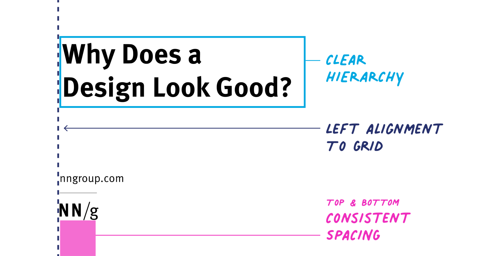
Why Does a Design Look Good?

It’s easy to look at a design and notice it looks good. It’s often much harder to pinpoint why it looks good. This NN Group article analyzes three user-interface designs and discusses the visual-design principles that make them attractive.
A Five-Minute Guide to Better Typography

This is a fantastic guide that will help you with your typographic design, which is the number one thing most “non-designers” can do to improve their visual designs in 5 minutes or less. Bookmark this one and refer to it often!
TOP 5 TIPS TO DO CONTENT CURATION LIKE AN L&D PRO

L&D pros help organizations by attracting (and retaining) talent, helping to build the company brand, motivating and consistently engaging employees, and focusing on ways to upskill the entire staff by empowering them to own their career growth and path. All the above job roles, especially the last one, require good content curation skills. Here are 5 pro tips for L&D content curation from Filtered.
How to use Datawrapper to make fast—and free—visualizations

Datawrapper makes it easy to create your own data visualizations. It’s free and easy to use for non-designers. If you just want to make a nice chart or map, try diving in with any data you have at hand.
Learn how to make visualizations with Datawrapper
Build Power Apps from a drawing & Power Automate Flows using natural language
Are you following the #NoCode movement? If you’re not, you should be. This video illustrates the direction things are headed. See how you can build Power Apps from a drawing & connect it with Power Automate Flows using natural language

- The Role of Standalone L&D With Aimee Young on the Learning & Development podcast
. - Does Workflow Learning Work? with David James on the Learning Hack podcast
. - Sharpening your L&D skills with Ed McLean on the MindTools podcast
.

.
- Talkadot collects feedback and testimonials from your speaking events
. - Air is a platform to help you manage and organize visual assets
. - Yoodli is an online speaking coach that gives you “with judgement free feedback from our AI-powered speech coach.”
. - Swapflo gives you a sustainable digital business card designed to work beautifully with Apple and Google Wallet
. - Beams is a virtual event platform with ‘one window technology’

- DevLearn – October 24-28
- Genially “Elearning in the Age of Information Overload” – October 26 11am Eastern
- New Zealand ATD Conference March 15-16, 2023
