
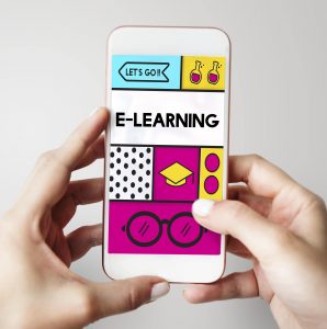
The Benefits of Mobile-First in eLearning
Smartphones are now attached to our hands, it’s what we utilize for everything we need. To expand the usage, Mobile Learning is a new way to use mobile devices to access learning or training content. Mobile-first Learning is any type of content, including any eLearning courses, that is developed or consumed on mobile devices or smaller screen devices.
What is a Mobile-first strategy?
In the past, the users’ primary attention was on the desktop web, the mobile device was an afterthought. However, people are now using their mobile devices more than ever before to shop online and socially network, and companies have recognized that customers now access more material on their mobile devices than anywhere else. The digital landscape has shifted.
 Thus, mobile-first is developing an online experience for mobile before designing it for the desktop web or any other device. Mobile technology is increasingly used in various sectors of society. In turn, education is constantly updated to help the learner. This brings new challenges in the educational sector, such as the Mobile Learning strategy (M-Learning). This type of technology can provide learners the ability to build and improve their knowledge at any time or location, and the learning is often used for microlearning content. It includes videos, animations, how-to guides, games, quizzes, and full eLearning courses delivered in small chunks in short sessions.
Why does it matter?
Mobile phones have become quite useful in our daily lives, such as checking emails at the get-go or listening to music while exercising. It’s not a surprise that our mobile devices take over 5 hours of our day or even more. We have invested in mobile applications to assist us in carrying out our responsibilities, daily tasks, catching up on news, and even for entertainment purposes. Not forgetting that they’re also incredibly valuable for education and learning.
Benefits of Mobile-first Learning
Learner engagement and completion rates are higher with Mobile Learning. According to one study, 86% of college students now own a smart device, and 50% of them use their mobile devices for daily college work which is nothing short of remarkable. Furthermore, according to an Ofcom report, handheld devices, are currently the most popular means for accessing the internet, accounting for more than half of all browsing activity worldwide.
These are the key benefits of Mobile-first Learning:
- Flexibility to learners: Learners can choose the device they want to learn on, the time, and, most importantly, the pace at which they are comfortable learning. Increasing the learning flexibility by the instructional content such as podcasts, videos, and other multimedia are available on smartphones and tablets, and learners enjoy the advantage of being able to access this content from their mobile devices at any time and from any location.
- Improved completion and retention rates: Courses designed for Mobile-first Learning are bite-sized and short. This encourages learners to complete the course and move on to the next as it is adapted to the learners’ device, usage habits, and learning patterns. This considerably increases the retention rates.
- Accessible in multiple devices: Mobile-first Learning designs support all devices that learners want and need and are eventually convenient for training courses. The same courses are available on laptops, desktops, tablets, smartphones, and mobile devices.
- Learning on the go: Learners prefer learning methods that do not interfere with their daily routines. The most significant advantage of Mobile-first Learning is that material is made easy to access while at work or doing other activities, resulting in the capability to provide anytime and anywhere learning on the go.
- Direct route to learning: The Mobile-first Learning platform is integrated with phone-based learning reminders and organizers. In this way, learners receive prompt notifications and updates about the course and can access it on their smartphones while on the go. Learners can also easily start the course from where they left off without losing previously learned content.
The Need of Mobile-first in eLearning
Mobile-first Learning or m-learning is a simple eLearning concept that works on mobile devices. It is often video, text, audio, game content, or multimedia. What’s important is that learners can access and use them on their smartphones and tablets. Ideally, it’s available everywhere, can be downloaded, and used offline.
 There are several reasons to take into account why mobile-first for eLearning is a must, the main one being that more than a billion people use smartphones and tablets to learn, find information, and connect with family, friends, and colleagues. It is convenient and easier to deliver Mobile Learning for overall performance support of deskless workers, including learners who spend time on on-the-road meetings with clients, or who live in far-off places, or learners in particular countries that rely on mobile connections more than computing devices or laptops.
Mobile-first eLearning is more than simple access. On a mobile device, it’s not enough for a website or other content materials to work. But modern eLearning provides a great user or learner experience on mobile since learners can easily access and finish their eLearning course and can take advantage of features that allow them to use voice instructions or listen to content materials while driving or exercising. It turns unproductive time into learning opportunities. It provides control to the learners with the advantage of facilitating higher usage and application as it is accessible to all learners within their workflow. They can access the required inputs at the moment in their need.
The differences between mobile-first and responsive design
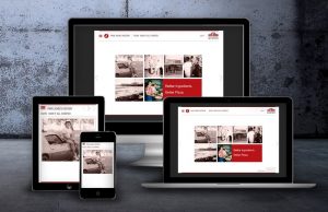 In a mobile-first design, the website layout consists of small screens then moves on to bigger screens. This approach helps improve the user experience for mobile users and also helps increase the page speed on mobile browsers. Mobile-first design helps in making the pages load quicker on mobile devices and reduces white space from the page. The layout of the page is based on the mobile design.
While in responsive design, the website layout is designed for the desktop first and then moves to smaller screens. The design automatically adapts to the user’s screen size. It can also change based on the platform, but the responsive design will have a longer page load time and unnecessary white space in between elements on smaller screens. In responsive design, CSS is used to adjust the design of the page according to the screen size.
Click here to see how Aptara analyzed large legacy courses of the fourth largest pizza delivery restaurant chain in the United States , then redesigned and developed device agnostic, smaller courses.
Conclusion
Accessible content improves the learning experience for all learners, not just those with disabilities. Mobile-first is changing the landscape of the internet as well as the learning strategy. Using this approach, we were able to create a high-impact mobile-first design in eLearning. These designs are visually engaging, and interactions are optimized for mobile devices as the users needed.
What are your views on Mobile-first Learning? Tell us in the comments section below or write to us at moreinfo@aptaracorp.com.

No Comments