
By far, he most common misstep I see with presentations and elearning is putting too much text on the slides. As you may have heard me say before, visual slides are better than slides overloaded with text. Too much text requires your audience to do a lot of mental processing as they constantly switch back and forth between reading and listening. It doesn’t take much of this to cause cognitive overload which makes it hard for people to understand your message. And if it is hard to understand, the odds they’ll remember what you want them to aren’t very good.
I get it – you’re busy and don’t have time ot learn a “new” way to craft your slides. I’m here to tell you that a small investment of your time to learn a better way of communicating is more than worth it. Fortunately, I have a great “insider” tip you can learn in about 30 seconds that can rescue you and take your slides from “death by PowerPoint’ to “why doesn’t everyone do it like that”.
Let’s take a look at a pretty typical example. This desk was part of a last-minute request for help. (Free bonus tip: Don’t wait until the last minute to ask for help!) Here you can see what the original slides looked like. The logo, names and colors have been changed to protect the innocent.
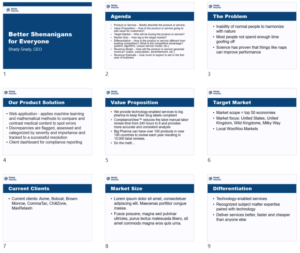
Holy smokes! This avalanche of text this is not going to get the kind of attention these presenters want.
A super-fast fix for improving these slides quickly and easily is SmartArt. PowerPoint’s SmartArt feature can turn boring bullet points into a more professional-looking visual design in just a few clicks.
I’ll use this Agenda slide to illustrate. The original version requires a fair amount of cognitive work to “get it”. Let’s see if we can do better.
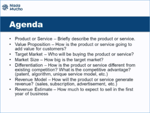
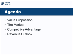
The first step is reducing the amount of text to the bare minimum. As you can see, I’ve cut anything that didn’t add value and combined a couple of similar topics to arrive at this new version. Even this simple step is a big improvement. Doesn’t it already look and feel much better? And it doesn’t require any hard mental work to parse out what is happening.
If you don’t want to lose all of the original text, you can copy and paste it into the Notes area. Or if you have a lot of details you want people to walk away with, you should consider creating a separate handout,.
Now for the icing on the cake — upgrading the text to a graphical illustration by using SmartArt.
Convert slide text to a SmartArt graphic
All you have to do is select the placeholder containing the text that you want to convert. Then click the Convert to SmartArt button ![]() on the Home tab. This brings you into the Smart Art gallery where you can pick the layout you want and presto! Goodbye text. Hello graphics.
on the Home tab. This brings you into the Smart Art gallery where you can pick the layout you want and presto! Goodbye text. Hello graphics.
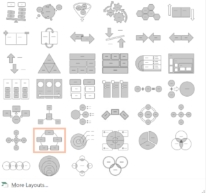
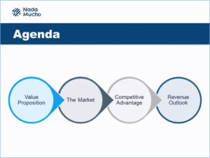
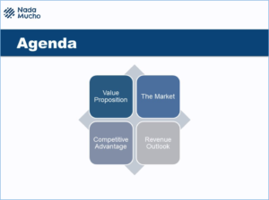
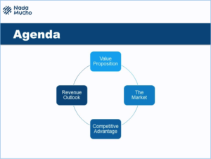
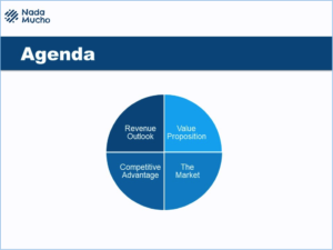
Here are a few examples PowerPoint offered up to replace the bullet list text. Any one of these layouts is a huge improvement over what we started with. And the great thing is how fast and easy it was.
There you go! Now you impress your audience (and your boss) with great looking slides that stand out from the crowd without spending extra hours you don’t have doing it.
Learn more about converting slide text to SmartArt graphics here.

One thought on “Better Slides For People In A Hurry”