
In this blog post, we'll dive into how you can leverage Lectora to build responsive and interactive eLearning experiences.
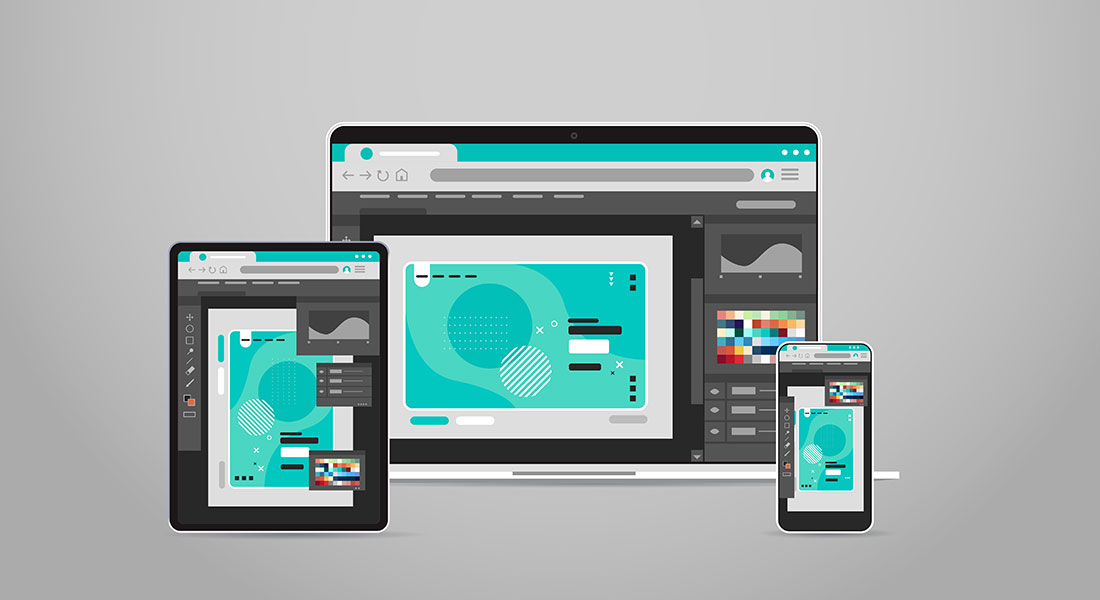
In today's world, learners access training content from a multitude of devices – desktops, laptops, tablets, and smartphones. Responsive design ensures your eLearning content dynamically adjusts its layout, images, text, and navigation to provide an optimal viewing experience across devices. Lectora, a robust eLearning authoring tool, offers powerful features to help you easily create responsive and engaging courses. In this blog post, we'll dive into how you can leverage Lectora to build eLearning experiences that are both beautiful and functional on any device.
Want to Develop Responsive and Interactive eLearning? Try Lectora!
Here are a few aspects it helps with -
- Flexible layouts
- Media optimization
- Navigation considerations
- Scenario-based learning
If your eLearning courses aren't designed to adapt seamlessly to these different screen sizes and orientations, you risk delivering a frustrating and ineffective learning experience. This is where responsive design comes in and here are a few advantages of having a responsive design.

Key Principles of Responsive eLearning Design with Lectora
1. Flexible Layouts
- Responsive Course Design (RCD): Lectora's RCD feature intelligently resizes and rearranges your course content to fit different screen sizes and orientations. This means that you primarily focus on designing an optimal layout for the desktop view. Lectora will handle the adjustments for tablets (portrait and landscape) and phones (portrait and landscape).
- Device Views: The device selection bar at the top of Lectora's interface lets you easily switch between device views. This allows you to visualize how your content will adapt and make any necessary adjustments.
- Inheritance and Device-Specific Adjustments: By default, Lectora uses inheritance, meaning the layout and properties you define for the desktop view will cascade down to smaller devices. However, you have the flexibility to make adjustments for specific devices when needed. For example, you might reposition a text block on a phone for better readability.
→ Download Tool Now: Authoring Tool Finder
2. Media Optimization
- Images: When choosing images, consider both resolution and aspect ratio. High-resolution images that are sized with common aspect ratios (like 16:9 for widescreen) will scale well across devices. Lectora also allows you to crop and adjust image scaling within the tool itself.
- Videos: The easiest way to ensure responsive videos is to embed them from platforms like YouTube or Vimeo, which have built-in responsive players. Lectora also offers settings to control how embedded videos resize for different screen sizes. Here are a few popular video platforms you can use.
- Audio: Use audio formats supported by most browsers (like MP3). Provide player controls that allow learners to easily adjust volume or pause playback, which is especially important on smaller devices.
3. Navigation Considerations
- Intuitive navigation: Clear and consistent navigation is essential on all devices. For smaller screens, simplify menus (e.g., collapsible or off-canvas menus) or replace them with navigation icons.
- Touchscreen vs. Buttons: Design for both touchscreen gestures and traditional mouse clicks. Make sure buttons and clickable areas are large enough for fingers to tap. Consider spacing elements further apart on smaller screens.
Building Interactivity in Lectora
1. Interactive Elements
Lectora provides a wide range of elements to engage learners:
- Buttons: Trigger actions, reveal content, or navigate to other sections
- Clickable areas/hotspots: Create interactive zones on images or diagrams
- Drag-and-drops: Let learners match concepts or sort items
- Input fields: Collect text-based responses
- Sliders: Allow learners to manipulate variables or explore a range.
These interactive elements transform passive learning into active participation and makes your custom eLearning courses more engaging. For example, a clickable diagram could have hotspots that reveal detailed information when tapped or clicked.
2. Scenario-Based Learning
Lectora's BranchTrack feature lets you craft decision-based scenarios where learners' choices impact the path they take through the course. This mimics real-world problem-solving and consequences. For example, you can create a scenario for customer service training where learners must handle different customer interactions. Their choices lead to positive or negative outcomes, providing valuable feedback.
3. Quizzes and Assessments
Lectora offers various question types, including multiple-choice, true/false, matching, fill-in-the-blank, and more. You can use quizzes throughout your course for informal knowledge checks (formative) or as a final knowledge assessment (summative) and provide customized feedback based on learner responses. This could be immediate corrective feedback or more detailed explanations to guide their learning.
Testing and Refinement
- Preview Importance: Lectora's built-in preview tool is your best friend. Use it extensively to see how your course looks and functions on desktops, tablets, and phones. Pay close attention to how text wraps, images resize, and interactive elements behave across different screen sizes and orientations.
- Test on Real Devices: While the preview is helpful, testing on actual devices is ideal if possible. This gives you the most accurate picture of the user experience, especially for touch interactions.
- User Feedback: Before launching your course, consider getting feedback from a small group of test users across different devices. Their insights can reveal issues you might not have spotted. Utilize forms or surveys to gather structured feedback on the responsiveness and functionality of the course. Here’s a short video to learn more about how to give feedbacks professionally.
Bonus Tips!
- Keep it Simple: Mobile devices favor clean, minimalist designs. Focus on the essential content and avoid cluttering the screen. Use ample whitespace to improve readability.
- Use High-Quality Assets: Grainy or pixelated images and videos detract from the learning experience, especially when scaled up on larger screens. Choose high-quality visuals whenever possible.
- Leverage Templates: Lectora offers pre-built templates and themes that are already optimized for responsive design. These can save you time and ensure a consistent look and feel across your courses.
Here are a few more great features of Lectora you can explore.

Wrapping Up!
By following the principles and best practices outlined in this post, you can harness Lectora's capabilities to create eLearning content that is both responsive and engaging. Lectora simplifies the process of responsive design, empowering you to focus on delivering impactful learning experiences. Start exploring Lectora today and see how you can take your eLearning courses to the next level of adaptability and user-friendliness. And, if you feel like Lectora isn’t the ideal choice for you, here’s a free tool you can use and figure out what’s best for your training needs.