Don’t let the challenge’s title fool you. This challenge is not about interactivity. It focuses heavily on improving the visual part of our projects so the users can enjoy a modern-looking course. Let’s dive in.
Interactive Buttons - My submission
My submission features a map of the Minoan Palace of Knossos located in Heraklion, Crete (my hometown!), built around 7000BC (yes, we Greeks are kind of ancient people:P). I wanted the user to view the most important findings of today’s ruins from the majestic Palace of King Minos. Therefore, I added a map of the Palace, as well as three Oval Objects that act as hotspots. Upon clicking each Object, its contents, found within separate layers of the main slide, are revealed.
Why didn’t you use regular hotspots instead?
Hotspots are entirely invisible on the user’s screen. Therefore I had to find another solution that acted as a hotspot, but it wasn’t a hotspot!
As you know, shapes in Storyline are just dull items that don’t do anything by themselves. They don’t react to users’ choices, and they are mostly static. Thankfully, the fantastic software called Articulate Storyline allows us to undo that by adding states to these shapes.
Besides acting as hotspots, the oval shapes had to perform the same way as buttons. They had to be able to change states. So, I had to turn ovals into interactive buttons. To do that, I added each oval three states. These are:
- Normal
- Hover
- Selected
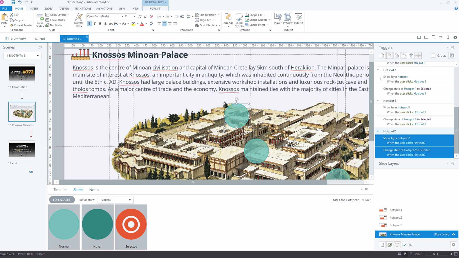
- The Normal state is obvious. This is the initial state of the Oval. To make it a bit cooler so the user could see what lay beneath it, I reduced its transparency to 25%.
- The Hover state is the state that the oval shape takes as soon as the user’s mouse/hand hovers over it.
- Finally, the Selected state has a double role. On the one hand, it indicates that the user has visited this particular object, acting as a ‘Visited State’. On the other hand, when the user clicks on the Oval object, it becomes active, revealing the information. Design-wise it includes a small white circle and a larger white circle with no colour fill but with a substantial white outline.
Why didn’t you use buttons instead?
Well, the pre-built buttons are kind of ugly. They remind me of websites we used to create using Dreamweaver back in 1999. So, I chose this approach as it looks more appealing to my eyes.
That was all, folks. Hope you liked this week’s submission. If you speak Greek by any chance, feel free to join my Youtube eLearning Academy and broaden your elearning and instructional design knowledge! Until next time, peace!