As a follow up on my last post about optimizing graphics, I want to address a few ideas concerning the best image format for elearning graphics.
When you create graphics for a course, do you save all of the images in the same format? That isn’t uncommon. However, you can use various image formats to optimize the graphics in your course. No image format does everything perfectly. You should choose the format based on the image’s characteristics. The table below can help you do that.
| JPEG | PNG-24 | GIF | |
| Transparent Background | X | X | |
| Semi-transparency | X | ||
| Colored Background (including white) | X | X | X |
| Many Colors (>32) | X | X | |
| Few Colors (<32) | X | X | |
| Gradient Colors | X | X | |
| Solid Colors | X | X | |
| Large dimensions | X | X |
You may ask, “Why wouldn’t I use PNGs all the time? They seem to cover the gamut of images.” That’s true, but if an image perfectly meets the JPEG or GIF criteria, you’ll often get a smaller file size using those options. Let’s see how this works for a few images.
| JPEG | PNG-24 | GIF | |
|
320 x 42, white background |
6KB Medium Quality |
16KB High Quality |
3KB High Quality (smallest) |
|
1000 x 650 |
196KB High Quality (smallest) |
700KB High Quality |
266KB Medium Quality |
|
350 x 130, transparent background and semi-transparent radial gradient |
N/A | 6KB High Quality (smallest) |
11KB Low Quality |

The data in this chart is for graphics optimized for elearning.
If an image meets the criteria of multiple formats, I suggest comparing file sizes in the Photoshop or Illustrator export window using a 2-up or 4-up display.
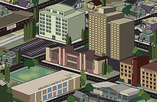
Application time! See if you can select the best format for the images in the activity below.
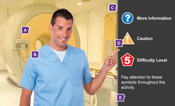
Let’s see how this applies to the images in our sample activity.
What is the best format for the background (Image A)?
What is the best format for the narrator (Image B)?
What is the best format for the shadow (Image C)?
What is the best format for the icons (Image D)?
It takes a little thought to select the right format for your elearning images, but the benefits are huge. You’ll be a faster, better developer and your learners will appreciate the shorter load times.
Bonus Material: Optimize the Image Format Settings
After selecting the best format for an image, you need to set the options for that format to get the most out of it. Don’t accept the default settings. I’ll share the settings I typically use and explain why so you can make educated decisions.
Note: The “Save for web…” export options are similar in Photoshop and Illustrator, so, I will only show the settings for Photoshop.
JPEG

The only setting I change for JPEGs is the Quality setting. I typically set the quality to 60. That seems quite low, but the difference in quality between 100 and 60 is very small. Decreasing the quality below 60 will add noise to the image.
Inspect the two images below. The first one’s quality is 100 – look at how big that file is compared to the second one! The second image’s quality is 60 – much smaller file size with negligible difference in quality.
Quality 100, 720 x 540, 165KB

Quality 60, 720 x 540, 69KB
PNG
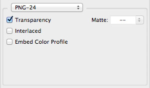
Boy…not much to change here. Basically, you just need to choose if the image requires transparency or not. I almost never apply a matte to the image.
Interlacing or embedding the color profile will increase the file size.
GIF
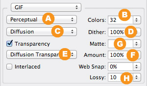
There are several settings to adjust for a GIF. Let’s make sense of the settings one or two at a time.
Color Palette – I typically choose a Perceptual palette (A) and limit the number of colors as much as possible (B) without causing discoloration.
Image Dither – Whether the image has gradients or not, I use a Diffusion dither (C) set to 100% (D). That’s the cleanest option in most cases.
Transparency and Transparency Dither – If the image requires transparency, I use a Diffusion Transparency Dither (E). It produces the cleanest result. The Amount of dithering (F) depends on the image. Simple shapes with sharp edges look better with low percentages of dithering. Images with curves or feathered edges look better with 100% dithering.
Matte – If the image has transparency applied, select a matte color! (G) Select the color of the background the image will be on. For example, the icons in the sample activity in this post are going on a dark gray background, so I would select that dark gray color for the matte. If the GIF will be on a multicolored background, I have found that a medium gray matte works well.
Lossiness – If you set the lossiness to 10 (H), you will see a reduction in file size without a change in image quality, in most cases.
Summary
Getting the right combination of file size and quality is important for excellent elearning experiences. You should rarely settle for an image that is larger than 70KB. The exception to that is a large background image, as you saw earlier.
If you have additional tips you’d like to share, I’d like to hear them. Please leave your ideas using the comments area below.
Leave a Reply