
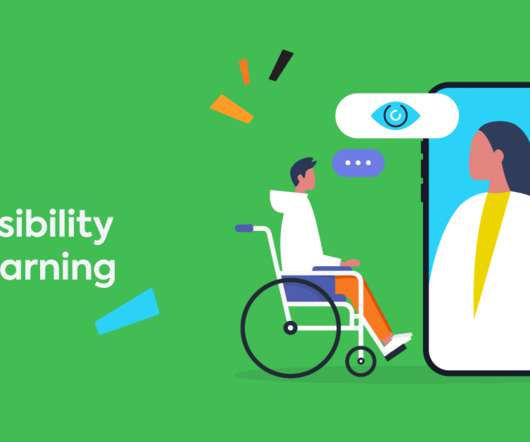
Building accessible training for people with disabilities
TalentLMS
OCTOBER 11, 2021
1) contrast ratio in your product palette/accessible learning navigation design. With the right ratio, colors work well in terms of navigation and user interface. And, rather than using block colors in graphs and charts, add textures or patterns to signal the differences in data. Look over the rainbow. Mix things up.


Let's personalize your content