As a designer and as a learner I try to avoid e-learning that’s comprised entirely of click-to-reveal screens. But neither do I particularly like a course that is one long multiple choice quiz. I thought I’d share my tool for achieving the balance needed with interactions.
In a previous post I explained how I group interactions, into ‘telling’ and ‘testing’ categories. Both are valuable, when used in the right place, so there’s definitely a need to make the decision on a screen-by-screen basis. However, it’s also important to keep an eye on the big picture and how each individual screen fits into the context of the course.
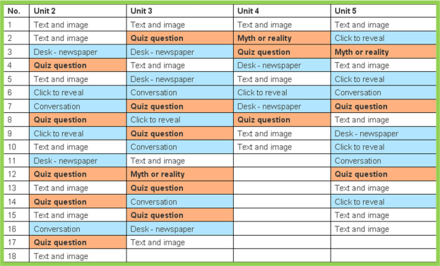
The way I do this is to create what I call a ‘screen type index’. I put this at the start of every storyboard I write to give me that at-a-glance big picture information.
This is what it looks like:
It’s nothing more complex than a table summarising the storyboard – it pretty much speaks for itself. I use three colours (one for text-and-image screens, one for telling interactions and one for testing interactions) to create a patchwork representing the whole course. I can quickly and easily see the balance of interactivity to non-interactivity, and of testing to telling.
Of course, like any patchwork, there’s no perfect design. One course might justify heavier use of roll-over activities; another might be comprised of branching scenarios that require lots of multiple choice questions. But in every case, it needs to be a conscious decision, and the screen type index encourages that thought process.
So, when I’ve completed my storyboard, I complete the screen type index, assess the balance and make the appropriate changes. It gives me that little bit of distance that helps me be objective about the storyboard and my initial choices. If I can see there are far more telling interactions than testing ones, for example, I’ll make sure that the key learning point screens use testing interactions (I explained why this is preferable in my last post). Likewise, if I notice a constant stream of interactions with no respite, I’ll consider whether they are all needed. Interactivity for the sake of interactivity has little value; often less is more.
What do you think? Am I examining things too closely, or do you have your own methods for achieving balance in your storyboards?


Hi there
It’s a good idea to use a summary like that with colours. So far I just used to scroll down my XX pages of SB and read through to see if I’ve balanced things correctly but I will try your technique.
In a previous company I worked for the GD requested that each screen was labelled as
-Infographics
-Narrative
-Instructive
-Explorative
– or Simulative
so that he knew more or less exactly how long he was going to take to develop everything.
Then that label can appear in your table of contents automatically so you don’t have to build a new table.
Pingback: Day 2: The right interactions at the right time | Good To Great
Hello Stephanie!
I think yet another approach to ensure balanced interactivity in the storyboard is to simply list down, beforehand, what are the most crucial elements desired (for e.g.- using a storyline, appealing to emotions, doing activities, challenging thinking patterns….making it INSPIRATIONAL ) ….and then go ahead and plan accordingly using this as a kind of reference check.
I am just into learning storyboarding. I find it a useful idea. I would like to use it both for the planning and for iterative use i.e, to incorporate adjustments and take a holstic look. Would it not be also useful for converting the mind map of the course design into this index and check out the balance of telling and testing. Thanks for the tool