
When Captivate 2017 debuted the new Fluid Box workflow, my thoughts immediately turned to mobile training, and in particular Fluid Boxes’ ability to handle multimedia. Could the responsive design accommodate short, high impact video clips across devices easily? If so, what are the design implications when building, and finally does the sequential learning object approach work?
I thought, since this is new, I would bring you along on the journey so we can learn together, in a series of posts — if it interests you.


About the Course
I work with Project Managers who oversee the entire multi-year project. Training is just one small part of it. Competing for their time and attention, particularly at project-cycle-end is difficult, as resources are diminishing and deadlines are fast approaching. If they don’t fully understand the training project cycle (process and deliverables) then it can drastically impact my development and deliverable timelines. I created this microlearning course to address this.
Why Microlearning
This style of course lends itself really well to Microlearning. Microlearning and smartphones are made for each other. I envision my Project Manager drinking a coffee and taking this 8-minute course just before our first meeting. So, in essence it really is a blended learning model.
Fluid Boxes and Multimedia,
The short answer is yes! The boxes scale flawlessly and provide an elegant and dynamic way to separate the videos from the static content.
Early Alpha,
One of the first things I learned was that you have two serious restrictions when developing microlearning for mobile.
- One, every word, graphic and interaction has to earn its right to be in the training, for both technical and educational design reasons.
- Two, you have to keep the file size as low as possible, so you have to weigh the use of every multi-media element (for example motion backgrounds and music overlays) in terms of how much does it add to the overall weight against the value it provides.
- Three, you have to bear in mind that different phone browsers handle video differently, for example Apple automatically loads all video full-screen, which can detract from the overall design aesthetic.
So, with that in mind my course comes in a just a little over 7 mg currently, which is awesome, considering I have two videos in there so far. I won’t be able to add more complex motion graphics or a sound design until I test it on multiple devices for user feedback. (Load times, usability etc)
Technical Issues
This course is formatted specifically for a mobile device, it will scale in a web browser because of its responsive design, but it won’t look nearly as cool. To access it on your phone just copy the link or send it to yourself in a txt/email or copy it here. If you do use a browser, I suggest you make the browser scalable and scale it to a phone dimension.
Please Note: It will not load properly in a iPhone 5 as the screens are too small. I purposely chose this constraint, due to design impact on overall project.
Finally the content will change as I move to a completed Beta,I will complete the final two probably add more custom graphics and change the narration as well.
Here is the link: http://chilp.it/f36a211
Feedback
I can emulate different devices but I need the actual phones to really tell if its rendering and playing as expected. If you do load this onto your phone I would really appreciate your technical feedback – but be aware that it will take cellular bandwidth to play it, unless you are connected to WiFi.
- What type of phone?
- How fast did it load?
- Did the navigation make sense?
- Were there any technical issues
Hi Stephen,
I agree with the others that this is a great product! The content is wonderful and will serve as a great electronic job aid on the design process. I viewed the course on an I-Phone 6S. I began in portrait mode and tried to go to landscape – and was told that its best viewed in portrait. Then I launched one of the videos. It opened up outside of the course interface so at the end when you told me to click below, I had to click DONE on the video player, then return to the course. But something was wonky there and I only had the back button. The other buttons that led to the screens with text disappeared. So I did have some tech issues. I do like the information you had on the non-video screens. Very short, concise. Good job on separating the need to know from the nice to know.
CHUCK
Hey Chuck,
Thanks for taking the time to test and comment, really appreciate it! The UI info about the video is really helpful. I purposely constrained playback to portrait view, in this alpha, just to limit potential bugs in this round. I will revisit it for the next version, but I was concerned about the video on IPhones, for exactly that reason you stated. iPhones play all videos natively in a new screen, they won’t play video in-line like Samsung Galaxys will. I’m not sure what happened at the end of the video, I will need to look into that.
It is definitely something I will need to address prior to beta.I have heard rumors that the latest IOS will let you play videos in-line, but it will take years to achieve market updates, so I can’t count on that.
In order for this to succeed It needs to be a flawless experience for the user and as you pointed out, so far its not on the iPhone. This is what testing is all about!
Cheers,
Steve
Hey Steve,
I’m glad I was able to help out. Good luck with your project. Shoot me a message if you want to me to test it again on my phone.
CHUCK
Thanks Chuck,
Will definitely take you up on that offer!
Cheers,
Steve
I tested this on my iPad mini and my Samsung Galaxy Core LTE (4.5″ screen phone).
I noticed that I had to click more than once on some of the icons and the down state of several of the buttons showed either no text or a completely different text formatting. I would double check what fonts and formatting you have on your multi state buttons.
I think your audio quality could be improved by purchasing a better microphone. I know everyone is focused on video and images these days but I think a more studio quality sound would push the professionalism of this project to the top.
Overall my impression was that it was a nice looking project and well thought out. For me the most important thing is that your user interface required no explanation which is great.
Hi Paul,
Thanks for taking the time to test this. Super helpful. Good-eye on the down-state buttons, I haven’t actually decided what I want to do with the down-states yet so I haven’t approached it yet. Will be clean once I finish the alpha and create the beta.
My voice is what you probably perceiving as sub-standard audio. Like you, am very particular about audio, particularly for eLearning. I am running a professional Rhode NT1-A recording mic through a Focusrite pre-amp. It really records natural tones. There are two elements to good narration. The equipment and the voice itself. I can control the equipment but not my voice : ) If this were a regular gig I would generally farm out the narration because actual voice actors and studio grade recording can’t be beat.
I’m glad the user interface worked well, I’ve had a couple of reports of folks missing the videos altogether, they just assumed they were graphics and never clicked them.
Thanks again Paul.
Cheers,
Steve
You should check out Fivr.com and see if someone can do the voice for you real cheap. Seeing as it’s a mobile training, may be just delete the roll over and down states all together. They are less critical on a smartphone (especially the roll over).
Nice clean look for sure. Over all I like it.
Hi Paul,
Thanks for the tips, I will definitely take your advice on the roll-overs. I actually don’t mind my own voice, but really appreciate your feedback (it really is a subjective thing) and since only about 6 people a year will use this training, I can live with that. I will however take a gander at Fiver.com for future projects.
Thanks again for taking the time to review and give feedback!
Cheers,
Steve
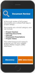
I like the layout for the Gap Analysis and Learning Objectives. Not a lot of room for content, but easy to navigate and engaging.
Hi Bob,
Thanks for commenting. I agree this is probably the biggest challenge. How much information to have, given that it will be consumed on a tiny little screen. That is why I opted for the high level overview motion graphic videos first, so I would not have to explain the context or sequential order again, for each one. I was thinking I could always add a “Next” page if I couldn’t cover it all in one page.
Cheers,
Steve
We are building our first app for what has been a web-based product. I want to build a responsive training project (primarily for mobile) to accompany that product. It will be the first time we have done that.
Hi Bob,
I found during the creation of this project (so far), that the biggest issue for a mobile-first strategy is information design, because you have to take into account the small screen size of mobile devices and also ensure it is as technically small as possible, so it loads and plays quickly on most mobile devices.
What works in a large screen format doesn’t necessarily convert to a mobile one.
Cheers,
Steve
Very cool article Stephen, thanks.
Thanks Bhim, looking forward to your webinar later this month. I’m hoping you can shed some light on static box configuration at mobile screen sizes.
Cheers,
Steve
You must be logged in to post a comment.


