19th Apr 2024
Mastering high-impact conference presentations
Conference presentations are really hard to get right compared to day-to-day presentations. How do you tackle bigger stages, bigger rooms, bigger audiences and higher stakes?

If ‘a picture is worth a thousand words’, how much value do visuals of people in our presentations have? Well, rather a lot actually. When used well…. But we’re getting ahead of ourselves! Before we talking about storytelling in presentations, let’s ask…
Humans are hardwired to respond to images. In fact, almost half our brain is involved in visual processing and can identify images in as little as 13 milliseconds. We also know that part of the decision-making process happens in our visual cortex, so images are a great way to grab attention, communicate ideas quickly and inspire action.
But don’t take my word for it (pun intended)! See for yourself. In the image below, do you read and understand the words first or the image?
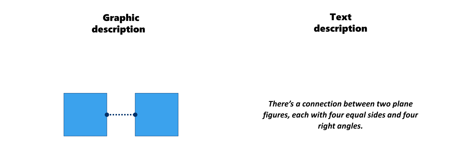
Yeh… exactly! At BrightCarbon, we use visuals all the time to help tell stories, simplify core messages and engage people or compel them to action. In our blog post on how to create visual presentations and e-learning we outline how visuals play a big part in helping an audience understand a concept or story (so check that out for more of the theory).
So, we’ve established that visuals can help you communicate better. But why should you opt to use visuals of people? Well, for exactly the same reasons.
Studies have shown that pictures on social media with humans attract more views than pictures without. Simply put, people are drawn to people. Customers like to imagine themselves using and enjoying products. This is the reason lifestyle images are so popular in the stock media industry. Photographs featuring people are the most relatable and can evoke powerful emotions. Pictures focused on a person’s face can even make a brand seem more reliable and trustworthy. Most people’s emotional response to bullet points is boredom or frustration, but by using visuals of people you can supporting the story and improve your chances of creating an emotional connection.
To find out more on how to create an emotional response to your content delve into our blog post on creating compelling content.
One great technique is using named “hero-characters” to humanise your product or company. Naming characters helps your audience to identify with them or even imagine themselves in the character’s place. For example:
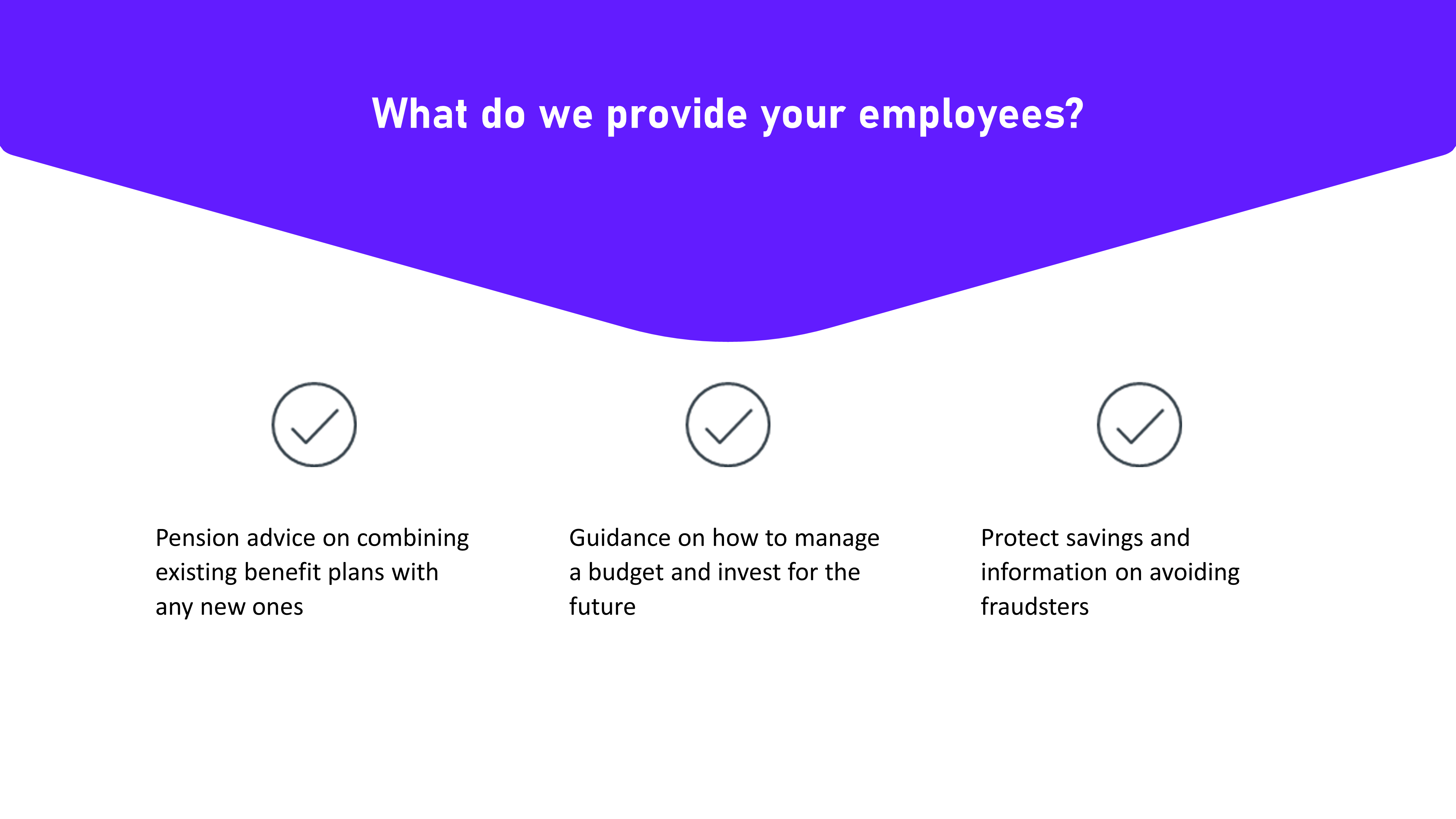
This slide shows financial solutions for specific groups of people. Here we have faceless statements which lack any sense of emotion or story making it more difficult to understand who could benefit from the service.
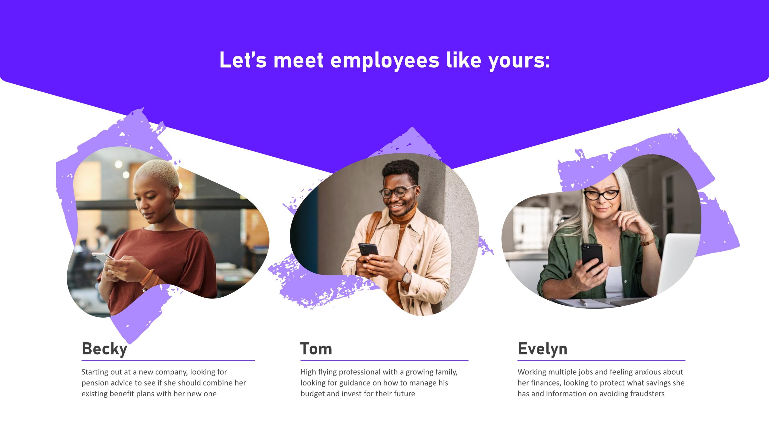
This slide is very similar but, thanks to our use of images of “Becky”, “Tom” and “Evelyn”, the audience can connect with the characters and get drawn into their stories, not only understanding their pain points but empathising with them. Once you’ve introduced your characters continue storytelling! Your presentation can follow them through their customer journey. Rather than cobbling together a bunch of disjointed features, use characters to create a cohesive storyline throughout your deck showing how these features solve real peoples’ problems.
Like the old Sun Tzu saying goes: Know your audience. Think about the purpose of the presentation and the messages you want to convey. There may be times when it’s not appropriate (or possible) to include stock images of people, for example in medical presentations about serious conditions. On the other hand, including irrelevant images can create confusion or dilute the impact of your ideas. Using stock images of friends laughing in a park might not be the best way to bring your corporate software to life. And finally, if you have a varied audience it can be difficult to pictorially represent everyone (as opposed to just students, mid-level engineers, or owners of small companies – these audience segments are all quite specific).
Even if you decide photography is not appropriate for your deck, you should still use other visuals – such as graphs, charts, diagrams, icons or even creative illustration – to encourage engagement and show how your content relates to your audience!
It’s important to think about how you want your audience to see themselves – who is it that you’re portraying and how? If you’ve done your homework and learnt about your audience before you design your presentation, you should understand what will work best for them. Choose the type of people images that will appeal and resonate most.
Here are some quick tips to help you decide between using illustrations or photographic images of people.
When photography is perfect
High quality photographic images of people are stereotypically corporate. If you have an image library of your own staff, customers and/or products in action use it. This type of imagery can evoke emotions, create atmosphere or mood and establish credibility. Photographs tend to make a strong connection with the viewer as adults relate more easily to reality than imaginary things. However, you’re limited to the stock photography you can find. Check out our blog post on Shutterstock vs iStock for more information on choosing the right images for storytelling in your presentation with photos.
When illustrations are inspired

Illustrations can add an interesting and more differentiated visual component to presentations, increasing visual appeal and fun. It can be easier to celebrate diversity as you can customise illustrations to reflect your audience. In fact, you can control every illustrative element you choose to include – need everyone in your presentation to be wearing your company colours? Done! However, because of this high level of customisability, it can take longer to design slides using illustrations.
Regardless of whether you pick photography or are intrigued by illustration, a final crucial point to consider is consistency. Throughout your presentation, use visuals that have a similar look and feel as this will help you create a strong visual identity or brand. Using cohesive images (be they photographic, illustrative or a combination of the two) will also make it easier for your audience to follow your presentation storytelling.
Leave a commentConference presentations are really hard to get right compared to day-to-day presentations. How do you tackle bigger stages, bigger rooms, bigger audiences and higher stakes?
It’s finally here, the holiday season! As the nights grow longer and the air grows colder, we know that all you want to do is settle down near a roaring fire, and snuggle up under the blankets with a good book PowerPoint presentation. Well BrightCarbon are here to help, with our festive presentation advent calendar.
As a presentation agency, we know a thing or two about keeping audiences engaged with effective storytelling and eye-catching design. So, we put together a few pointers to help your CPD blossom and get your audience buzzing!
Join the BrightCarbon mailing list for monthly invites and resources
Tell me more!You guys are amazing! Looks awesome, and works great. Perfect!
Mila Johnson InComm