Colour has always been powerful; from warning us which berries to avoid, to establishing iconic global brands. Many of us consider it a key tool when designing presentations – but what effect does this reliance on colour have on people with colour blindness?
This post is part of our mini-series on accessibility in PowerPoint. Check out the other post in the series: Presentations and Dyslexia
Colourblind Awareness say that people with colour blindness have “been forgotten in the race for progress in a digital world.” Though colour is an important tool, many designers don’t understand the needs of people with colour blindness. However, not understanding how to optimize your presentations for people with colour blindness could mean losing up to 10% of your audience before you even begin. To help you make your design more inclusive, we’re going to break down what exactly colour blindness is, before giving some practical tips to use in your slides.
What is colour blindness and how does it affect people?
People with colour vision deficiency or CVD – commonly called colour blindness – find it difficult to distinguish between different colours. Complete colour blindness – being unable to see any colours at all – is very rare, but different types of CVD affect approximately 8% of men and 0.5% of women worldwide.
People are affected by CVD for a variety of reasons. It’s usually genetic but can also develop in adults as the result of health conditions, such as diabetes, multiple sclerosis and glaucoma. Colour blindness can also be a side effect of some medications, and it’s fairly common for people to find it more difficult to distinguish between colours as they get older. If you want to test your own colour perception try this online test.
As there are multiple types of CVD, and each affects sight differently, the effects of CVD on people’s day-to-day lives differ. A few common problems are:
Children finding it difficult when colours are used to help with learning or games
Certain career paths, like becoming a pilot, being unavailable to those with CVD
Struggling to know when meat is properly cooked or whether fruit is ripe
Getting medications confused
Having trouble understanding signs
Why should this affect presentation design?
Here at BrightCarbon, we are brave champions of the visual presentation. We encourage presentation creators to rid their slides of boring bullets and put effective, dynamic visuals in their place. But we also understand that without proper consideration, this is where problems can sneak in.
Though ever-advancing technology means that lots of smartphones and computers have specific settings to assist people with colour blindness, this doesn’t help when they are sitting in front of projected slides. Slides that rely too heavily on colour to tell their story could be leaving some of your audience behind.
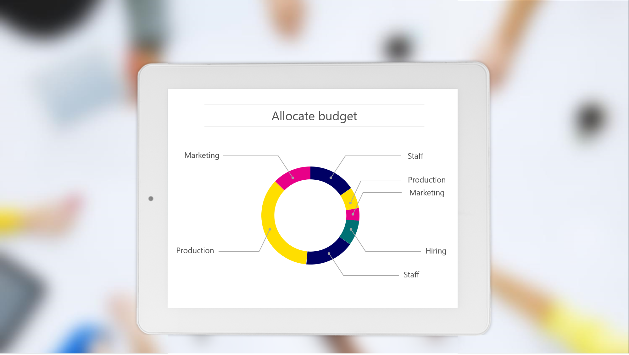
This problem is common in data visualisations as colours are often used to highlight comparative data points. Here is what a typical pie chart could look like to people with different types of CVD.
The difference between the colours is much less clear, rendering the legend useless.
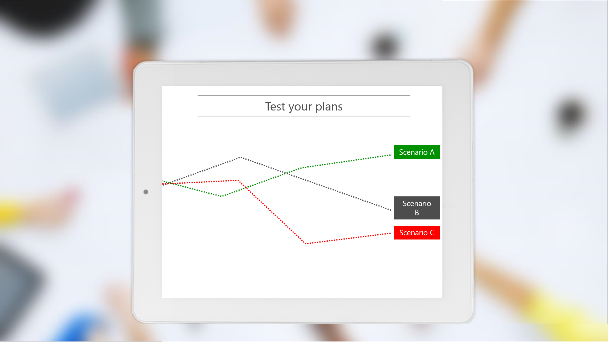
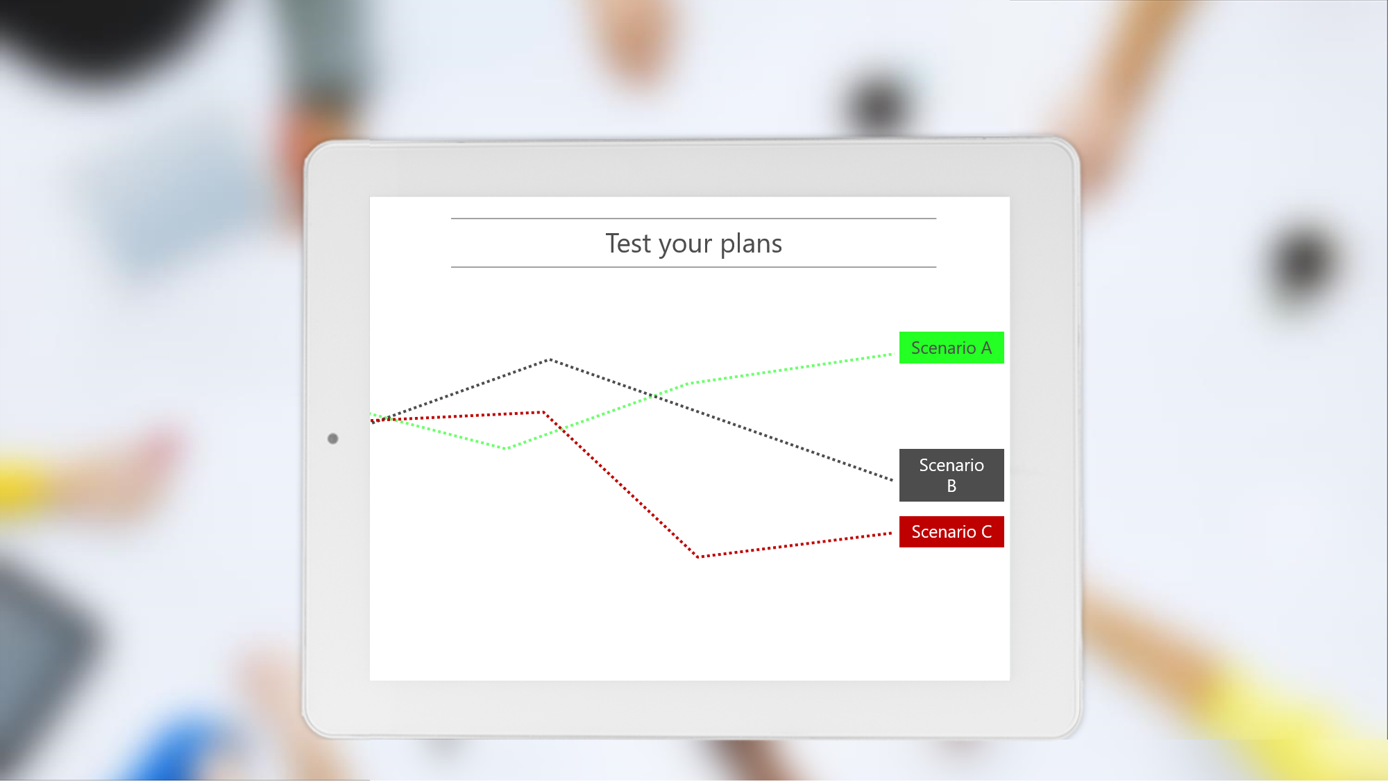
In this example, the colours green and red are used to show positive and negative results. This is really common colour coding, but red and green is one of the most troublesome colour combinations for people with colour blindness.
As you can see, to someone with CVD, the colours are indistinguishable.
Other colour combinations that can cause problems are green and brown, green and blue, blue and grey, blue and purple, green and grey, green and black, and light green and yellow.
Using coloured text and coloured backgrounds can also cause problems. Though we would never recommend using a slide like this with so much text (Death-by-PowerPoint alert!), it is also totally useless for people with colour blindness.
How to optimise presentations for people with colour blindness
So, how to tackle this? One option is to simply use colour-blindness-friendly colour palettes. There are lots of resources online if you chose to go down this route.
Using a colour blindness-friendly palette means you can just pull slides together without having to check your colours every time. If you want to create your own colour blindness-friendly palette in PowerPoint, download our resource that will help you set custom colours and read our blog post on changing theme colours.
However, if you’re creating slides in a corporate setting it’s likely that you have limited colour options set by your branding department. In fact, you probably have a brand-compliant colour palette that you have to stick to. But there is no need to give up. There are three things you can do to optimize your presentations for people with colour blindness.
1. Contrast
CVD does not affect perception of colour value – the lightness or darkness of a colour – but the colour hue. Explaining hue can get a bit scientific (check out this site for a detailed explanation), but an easy way to think of hue is as a position on the colour wheel – colours in their purest form. What this means is that people with colour blindness can distinguish between light and dark colours, even if they both appear the same hue. When optimising your presentations for people with colour blindness, you can increase the contrast between colours to help make things stand out.
For example, in the red/green example earlier, we can change the brightness of the colours to help people distinguish between the two lines.
2. Clarity
Be sure to use more than just colours to tell your story. You can also employ patterns, shapes, text, positioning and hierarchy, and animation to create dynamic slides with a clear message. This is a great habit to get into anyway, as, if your presenting space has bad lighting or a dodgy projector, you might find the colours on your slides don’t look quite how they did on your laptop in the office. In that situation, it won’t just be those with CVD struggling to understand your slides!
We can sort out that pie chart by choosing colours with greater contrast and integrating the legend into the chart. We always recommend labelling your chart in this way as it makes the information quicker to process because your audience aren’t constantly looking back and forth.
Redundancy is a good way to safeguard against issues with colours. Use icons or other visual markers to make sure colour is not the only visual means of communicating your message, like with these simple symbols:
3. Check
The most important thing you can do to ensure your use of colour is magical instead of miserable is to check that your slides are crystal clear when seen in greyscale. As we saw above, the difference between colours that have the same brightness can disappear when viewed by someone with colour blindness. When you convert your slides to monochrome you will be able to quickly tell whether your visuals make sense.
This is very easy to do directly in PowerPoint. You can either go to View and then choose Greyscale about halfway along the ribbon, or you can go to File, click Print, then select Grayscale. You can then view your slides in the preview window. You could also use an online contrast analyser (like this one) for checking text on a background.
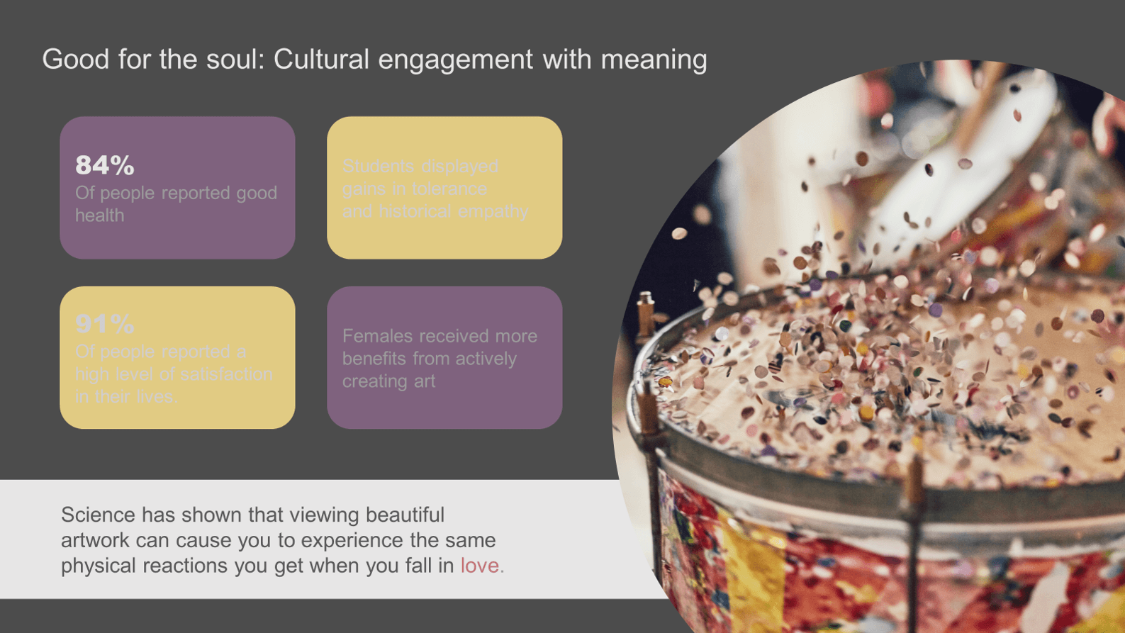
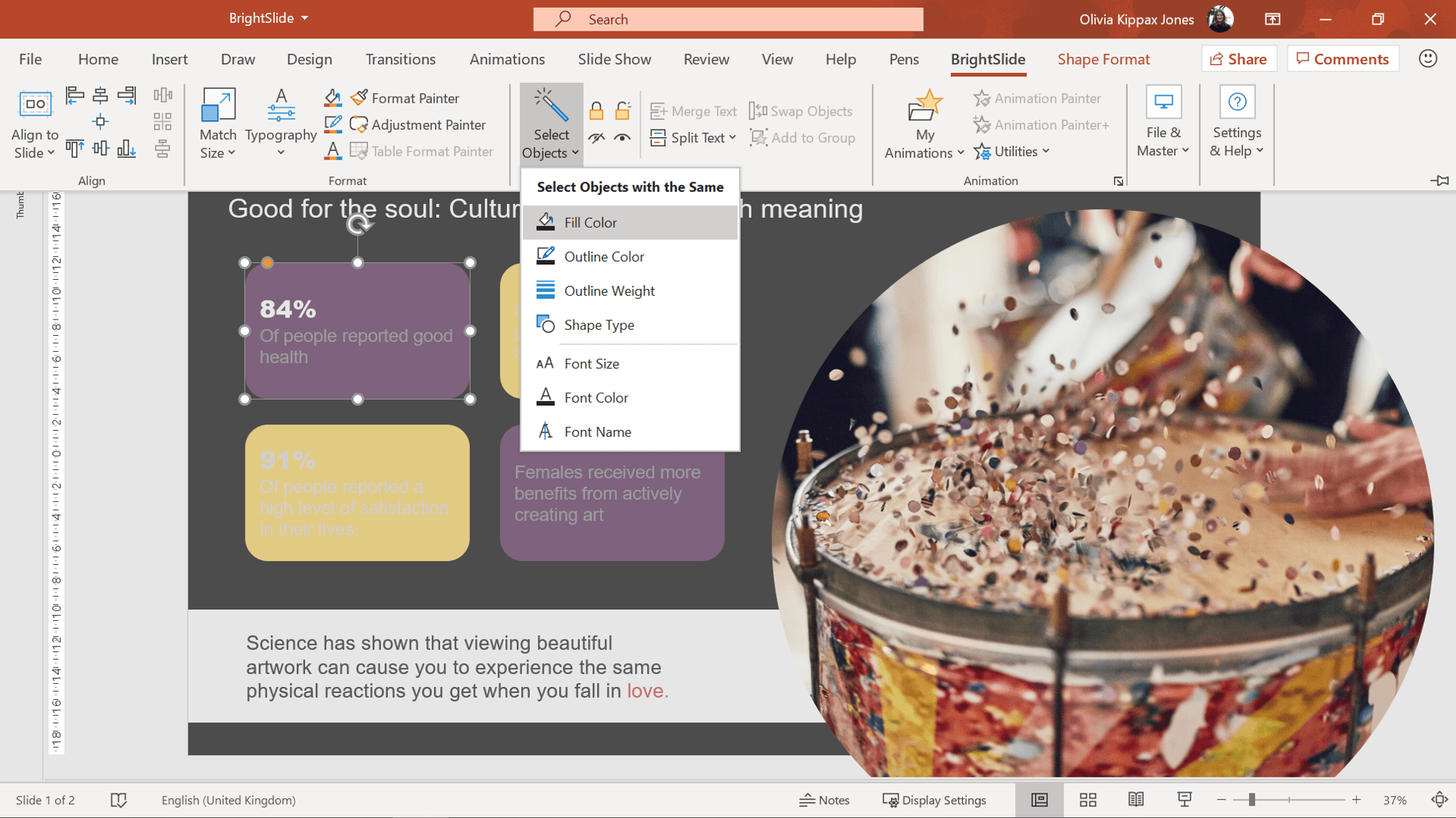
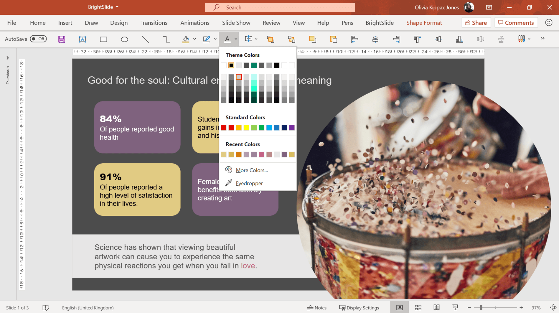
Realised you need to change the contrast on every text box? Or on every other shape? What a nightmare! Actually, it doesn’t have to be. Download our free PowerPoint add-in BrightSlide and use the Select Objects tool to edit multiple objects in seconds. Let’s look at an example.
The contrast between the text and background on this slide is clearly not great! To use BrightSlide’s Select Objects tool and edit super speedily, click on one object then head to the BrightSlide tab, under Selection & Object, click Select Object and chose the appropriate formatting option from the drop down menu. In this example, you want to select the purple text boxes, so Fill Color is the appropriate formatting option.
All the objects with the same fill color will be selected and you can go ahead and edit as usual.
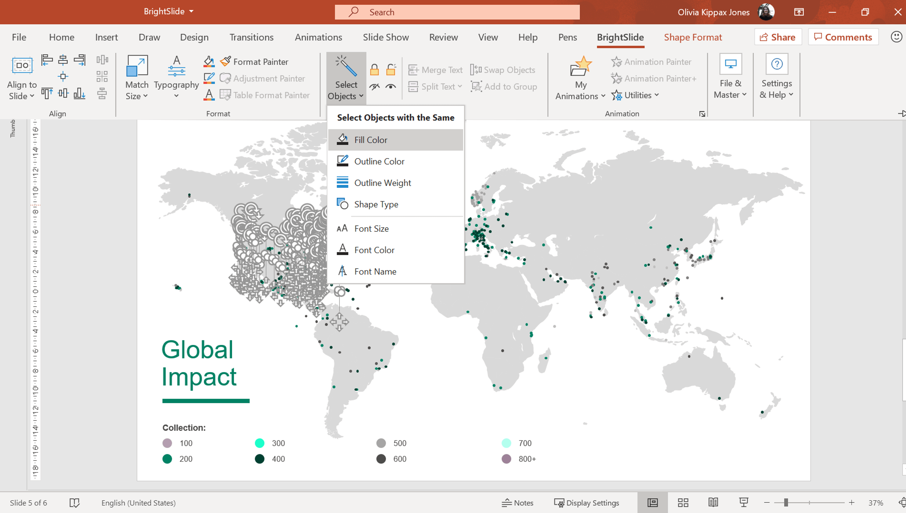
Now, this is just a simple slide but imagine how much time this tool could save you if you’re editing a more complex slide, like this world map!
A PowerPoint template is the foundation on which polished and professional presentations are built. We interview BrightCarbon’s new Templates Lead, Gemma Leamy, and pick her brains on the ideal process for creating robust PowerPoint templates.
It can seem daunting to take a text-heavy slide or list of bullets and turn it into something visual, especially if you don’t think you’re super creative. However, the first step is simply reducing the amount of text on your slides – and you don’t have to be an artist to do that!
As we were novice and non-marketing professionals, everyone took the time to explain and teach while also doing, which came in handy to feel more comfortable with what we were creating.