
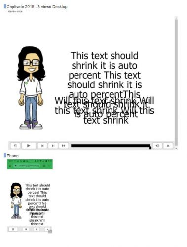
We are testing converting our projects from Captivate 8 & 2017 to Captivate 2019. We currently use Break point mode for all our modules, this is our preferred method. We know the settings for responsive text need to be set at auto, % in order to “be responsive.We have no problem with our other versions, however in Captivate 2019. The feature of auto, % for text just does not seem to be working.
Simply put, the text is not shrinking, see images below. I also tested creating a brand new project with Captivate 2019 and got the same results. Does the text responsiveness no longer work in Captivate 2019 Break point mode? Or is this simply a bug that can/will be fixed?
We want to move our projects to an upgraded version of Captivate but we cannot proceed unless we know it will work responsively in all views.
Converting Older versions to CP2019
New project in CP 2019
Thanks!
There are several differences between the two workflows for responsive projects, which I discussed in this blog post:
https://elearning.adobe.com/2017/11/tough-choice-breakpoints-or-fluid-boxes/
I explained the limitations of both. Responsive fonts are only available in Fluid Boxes workflow. For Breakpoint views you have fixed font sizes for each breakpoint. You have to set up the font size in the Object style for the text. The shapes or captions used as text containers ca, be responsive, but in between the breakpoints the font size is fixed. The minimum font size is set to 10pt. Please read that blog, and set up the appropriate font sizes in the Object Style manager for all the text styles you are using.
You must be logged in to post a comment.


