At the end of February I co-presented at STLUX’11 with Dave Gray. Our presentation was called Exploring the Usefulness of Chartjunk. The collaboration behind the presentation started as an exchange between the two of us on Twitter regarding whether the whole concept of Chartjunk is a myth. Over a series of conversations about recent research on the relative importance of visual embellishment in how people remember and understand data, I suggested to Dave that we develop a presentation around the topic. Dave agreed and suggested that we also build the presentation in a manner that engaged the audience to share their thinking about the issues involved.
Dave and I designed the presentation as a simulated debate between the pre-eminent critic of Chartjunk (actually the design theorist who formulated the concept) Edward Tufte and Nigel Holmes, an illustrator and the former Graphics Director at Time Magazine. Homes is well known for his use of visual embellishment in designing graphics that tell stories about data relationships. We designed the presentation around four graphic displays, two by Tufte and two by Holmes. We discussed the graphics and then asked members of the audience to consider each graphic on four dimensions.
- ease of understanding what it is about
- ease of understanding the categories and values displayed
- ease of seeing the basic trend
- ease of determining whether it conveys a message
I designed a simple survey that allowed us to gather data on those four dimensions using an implicit five point scale, eliciting participation and dialogue with the audience at the same time. The graphic below provides a view of the survey’s instructions. The participants seemed overall to enjoy the approach and the evaluations confirmed the impression.

We drew the four dimensions from research done in 2010 by members of the Interaction Lab at the University of Saskatchewan. The Interaction Lab researchers designed an experimental study to test two basic questions: “first, whether visual embellishments do in fact cause comprehension problems; and second, whether the embellishments may provide additional information that is valuable for the reader.” I’m not going to detail the methodology used, however the researchers asked four questions to participants in the research as they reviewed graphics by Holmes with a great deal of visual embellishment or the same graphics after applying the data-ink ratio used by Tufte.
Q1–Subject: ‘What is the chart is about?‘ ‘Tell me about the basic subject of the chart.’
Q2–Values: ‘What are the displayed categories and values?‘ ‘Tell me how the chart is organized and any relevant values.’
Q3–Trend: ‘What is the basic trend of the graph?‘ ‘Tell me whether the chart shows any changes and describe these changes.’ (Note that this question was not relevant for pie charts.)
Q4–Value Message: ‘Is the author trying to communicate some message through the chart?‘ ‘Is the author trying to get across a specific point or is he or she merely presenting objective information?’
We reported on the major findings of the research team to the audience as follows:
- There was no significant difference between plain and image charts for interactive interpretation accuracy (i.e., when the charts were visible).
- There was also no significant difference in recall accuracy after a five-minute gap.
- After a long-term gap (2-3 weeks), recall of both the chart topic and the details (categories and trend) was significantly better for Holmes charts.
- Participants saw value messages in the Holmes charts significantly more often than in the plain charts.
- Participants found the Holmes charts more attractive, most enjoyed them, and found that they were easiest and fastest to remember.
At the end of the presentation, after we covered the research study findings, we then asked the participants to list as many of the graphics from the four discussed earlier and to rate each along the four dimensions. As we broke up the session a few participants asked if we could share the findings from the participative survey.
I agreed to post the results and I am now getting around to it.
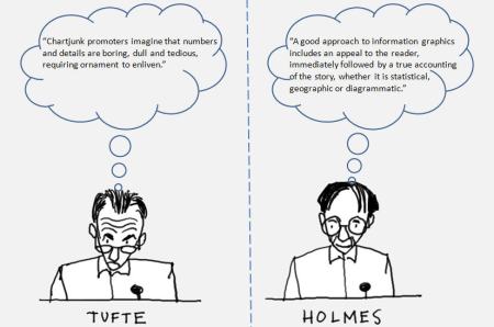
We used a couple of sketches done by Dave to give the debate a simulcra, and we then worked through our presentation of the four graphic displays mentioned above, adding appropriate quotes to the Tufte and Holmes sketches and asking the audience to complete the survey questionnaire about the four dimensions of use for each graphic as we went along.
Just to make this clear, we were not interested in doing a survey to produce “findings” that would prove or disprove the assertion that chartjunk is useful in communicating data relationships. The researchers discussed above already accomplished that objective in our view. Those interested can take a closer look following the link provided above. Our interest was to elicit participation from the audience, structured around a series of questions we asked them to answer for each graphic.
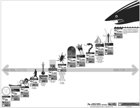
Never Bitten, Twice Shy
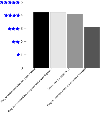
Never Bitten, Twice Shy is a Holmes graphic that accompanied a story in the New York Times August 10, 2003 edition. Members of the audience responded to questions about each of the four dimensions with the following average values:
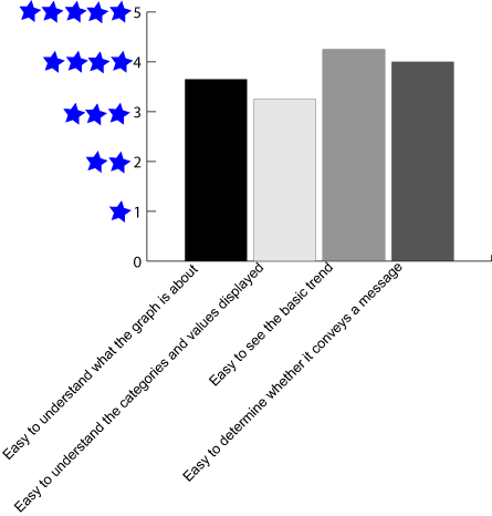
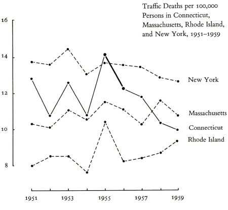
Traffic Deaths is a graphic from Tufte’s book The Visual Display of Quantitative Information. Members of the audience responded to questions about each of the four dimensions with the following average values:
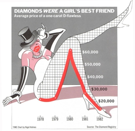
Diamonds Were a Girl’s Best Friend is a Holmes graphic from his book Designer’s Guide to Creating Charts & Diagrams. Members of the audience responded to questions about each of the four dimensions with the following average values:
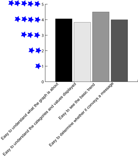
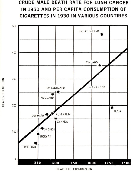
Crude Male Death Rates for Lung Cancer is a graphic drawn from Tufte’s book The Visual Display of Quantitative Information. Members of the audience responded to questions about each of the four dimensions with the following average values:
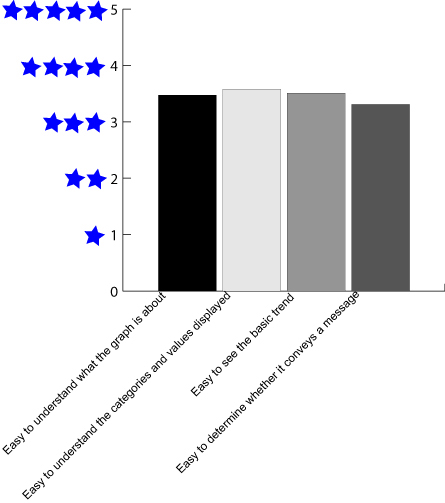
Without trying to bring statistical precision to the responses to our participative survey, the overall averages on the four dimensions for the graphics from Tufte and Holmes seem much the same, as the findings by the study of the Interaction Lab at the University of Saskatchewan suggest. However, the second part of the presentation where we asked the participants to list the graphics discussed earlier and rate them along the four dimensions shows an interesting pattern.
The 34 participants in the presentation did not go into detail in their attempt to remember the graphics. The overall responses broke down according to a) those who remembered the topics of the four graphics and wrote them out (14 responses), b) those who remembered the topic of each graphic and mostly the trend depicted (9 written responses), and c) a third group (11 responses) that remembered the shape of the graphic including the topic, the trend, along with the categories involved in several instances.
I don’t think the presentation really added anything to the findings by the Interaction Lab, though it did seem to confirm much of it if nothing more. All in all I think Brian Suda’s post summed up the implications of the Interaction Lab findings on visual embellishment as succinctly as anyone I’ve seen.
…chart junk isn’t as bad as it seems. In fact, it can even be valuable in certain circumstances. If you are trying to maximize recall and general trends, then having kitschy chart junk tends to build better associations and help people remember at a later date.These results suggest that extraneous information isn’t always bad. You don’t always have to show data and only data when presenting. In certain circumstances pictures can aid with memory and recall (though not necessarily understanding). In other cases, such as when you are displaying exact values for cross-comparison, then minimizing ink and removing chart junk is paramount. You always need to remember that your goals, your readers’ goals and the data may not always align and you need to choose the right tool for the job. And chart junk, in some cases, might just be a valuable tool.
Related Articles
- Edward Tufte – Guru of the Information Class (babelniche.wordpress.com)

