5 Ways to Improve Bad eLearning September 24, 2010
Posted by Eric Matas in eLearning.Tags: eLearning, maintenance, revision
trackback
Experience tells me that elearning people do not have a lot of time to go back to the vault of existing training and revise it. New projects dripping with deadlines take priority.
Still, it’s not easy knowing that the older elearning is out there and that new hires will be required to take those courses–or worse: that whole teams or the entire company will retake one of those old modules every year.
It might be more embarrassing if you actually made the old stuff (as awkward as looking at old school work you were once proud of), and it might be touchy if you are new to the company and working with the guy who made the old module, but revision and updating is important. If nothing else, it makes it easier for elearning employees to pass people on the way to the cafeteria.
Using time constraints is wise. If you are an elearning designer or developer, I don’t think you’ll have any trouble making this claim. So, point to the lack of time for revision and then recommend some or all of these five simple ways to improve the bad elearning.
5 Ways to Improve Bad eLearning
1. Open Navigation–BIG Time
Existing elearning modules almost always have navigation locked down. Learners are forced to watch every second of every screen. The elearning either advances automatically or features grayed-out next buttons or arrows. The really old stuff will not have a menu. But if there is an outline, it will likely be locked down, too.
Unlock all of it. Every time a learner is forced to experience locked navigation in elearning, an angel weeps.
This revise does not take much time but enhances user experience big time. Be careful–sometimes there is text or audio that refers to the locked navigation. When you unlock the controls, remove all related references.
2. Reduce Content
Early elearning suffered from project scope creep and from SMEs who were creeps. The modules are bursting at the e-seams with content. You’ll quickly see that much is supplemental or nice to have information. These items need to be on the side where they belong. Move the information into tabs or links. Or just delete. So, move it or remove it! Related to this technique, tip #3 helps avoid frustrating the learners.
3. Start on Screen One
More than likely, old elearning has 45 screens of navigation instructions, learning objectives, and other hand-holding sludge. Then on screen 46, finally, the start prompt appears. No more! Get that start prompt on the first screen. There might be a very small percentage of learners who need instructions or who want to read learning objectives, so put that succinctly in a branch of the module where nobody else has to go. I’ve used a “help” icon or character so information like that is one click away on every screen.
4. Layer Chunks
Existing elearning has a grandpa named PowerPoint and a grandma named Linear. The linear nature of many presentations has led to many inefficient elearning modules. Typically, a PowerPoint slide deck features a title slide, some section header slides, and multiple body slides. Sometimes, the sections have sub sections–chunks–that are thin on body slides. These sections of presentations make wasteful elearning, but they can be revised by layering instead of pushing forward in the linear habit.
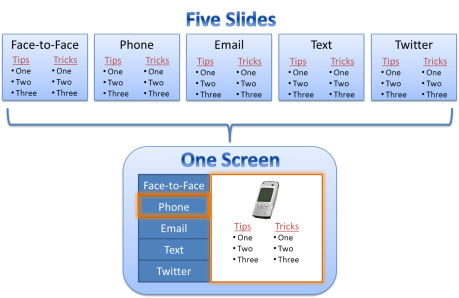
For example, picture a sales training that has a section on communication. Sales reps have many ways to contact a client, and the training presentation could have a slide of tips and tricks for each contact method. These subsections of communication might include face-to-face meeting, phone call, email, text, and Twitter. These five sub-sections require five separate slides in a PowerPoint presentation. And you have probably seen such a section of training that has been re-packaged as elearning that takes 5 screens to review.
Instead of the five screen staccato effect, keep the five types of communication together on one screen as buttons and change only the text and image items on the screen when learners click on the buttons. If you have used Articulate’s Engage, you have done this before. But you don’t have to have Engage to create the effect.
5. Repaint
Keep all the furniture and accessories, but repaint the walls and trim. That is, change the background. Swap out the template. Keep the top layer items and assets. Admittedly, this make-over might take some time–that’s why it’s #5. Depending on the original masters, or lack thereof, your make-over could require many hours, but for some projects, you can skip the first four suggestions and just revise the background. It is no different than freshening up the paint in a house that is going on the market: simple idea but major impact.


Thanks, it is useful!
Nice.. simple and USABLE tips!
Excellent tips. I took this all to heart and the course I’m working on now is using all 5 tips.
Thanks BJ for the help.
Hi Tracy! Glad you found the tips helpful, but I have to give credit to Eric Matas. He’s the smart guy who wrote this post. 🙂
Have a great week,
-B.J.
I couldn’t agree more. I’m always surprised at how much intro information clients want to retain in the introduction.
-Tracy Bissettee, WeejeeLearning
[…] https://elearningweekly.wordpress.com/2010/09/24/5-ways-to-improve-bad-elearning/ Like this:LikeBe the first to like this post. Categories: Instructional Design (ID) Comments (0) Trackbacks (0) Leave a comment Trackback […]
I disagree with tip number one. If there is important information that the learners need to get, they shouldn’t be able to skip it. Having it be open navigation so they don’t have to see the whole presentation is like having a college lecture where people come in half way through the class or leave half way through the class. The other tips are nice though!
Thanks Ellen – your college lecture analogy is a good reference point. To open navigation in elearning would be like a recorded lecture, which a learner could listen to in any order. We want them to listen to the whole thing, of course, but why not give them the control to do so as they wish?