.svg)
Accessible eLearning Example: Preventing Slips and Trips in the OmniAll Workplace


Several months ago, we blogged about why everyone should care about accessibility standards in eLearning. We made our case for tackling accessibility head-on, rather than making it an afterthought.
We wanted to follow up by exploring the ways we put this philosophy into practice with dominKnow | ONE. We've worked hard to include features in our authoring tools that empower users to do more than meet minimum legal standards.
Our goal is to help you optimize the eLearning experience of your entire audience.
Accessibility Done Right
Our authoring tools are, of course, 508-compliant. Section 508 of the U.S. Rehabilitation Act of 1973 is the legal accessibility hurdle for information technology in the United States – literally the least you can do.
We didn't want to stop there, so we also keep up to date with Web Content Accessibility Guidelines (WCAG), an international standard that continually grows and evolves.
We've taken steps to ensure we're not just meeting these standards but applying them in a way that is helpful and sensible to all learners. We've conducted internal testing of accessibility experiences and made changes based on solicited input from clients with their own stringent accessibility testing.
Wherever possible, we baked optimal accessibility into our authoring tools so "it just works" without any special effort on your part. However, some important aspects of accessibility require an author's attention during content creation.
We set out to make it as easy as possible for authors to make good decisions for accessibility in these cases.
Meet the Inline Accessibility Tab
When you select a particular element in either Claro or Flow, there's an Accessibility Settings tab with a couple nifty features.
There are two ways to find these settings – an accessibility icon above the stage and the tab itself below the stage:
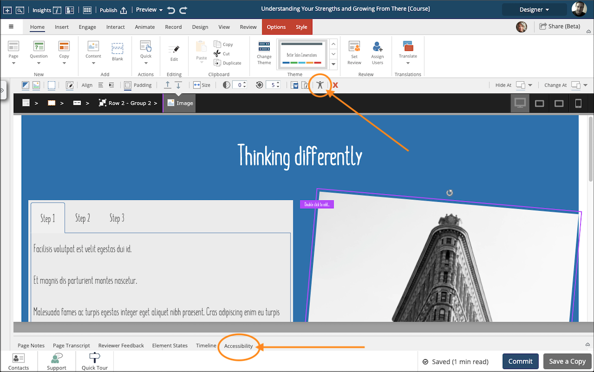
The content of the Accessibility tab is context-sensitive, meaning what you see is relevant to the specific element you've selected.
The left side of the tab content contains setting controls relevant to that element. On the right, we provide tips and best practices for how to optimize accessibility. If you're new to accessibility standards, this helps you to tackle them like a pro.
Now that we've shown you how we optimize accessibility in dominKnow | ONE, let's look at an example of various accessibility features.
Slips and Trips: An eLearning Example of Vision Impairment Accessibility Options
When you check out our gallery of eLearning examples built in dominKnow | ONE, you'll see a sample of a responsive workplace safety course called Slips and Trips.
This course is a great illustration of eLearning optimized for screen reader technology and vision impairment accessibility. To most people, it just looks like a regular course, but that's illuminating in its own way, isn't it?
Let's break down the ways in which this authoring example is designed to be accessible.
Keyboard Navigability: To Focus or Not to Focus
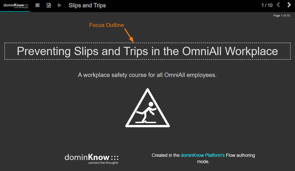
One important principle of accessibility is for all substantive content or interactive elements to be navigable by keyboard (as opposed to or in addition to by screen or by mouse). This provides accessibility for blind users relying on screen readers, as well as users who have motor disabilities.
Even without screen reader technology, you can see keyboard navigability in action by using the Tab key to move through this eLearning example. In this instance, your current location is marked by a white dashed line around an element. If you used a screen reader, it would read the content of this outlined element and pause until you tabbed to the next item.
This dashed line is an accessibility feature called a "focus outline." They're helpful for users who need keyboard navigation but aren't entirely blind. It allows them to visualize where they are on the page and follow along, in the case of screen readers.
Focus outline styles – like color, line thickness, and dash style – are part of theme settings in dominKnow | ONE. They come preset to complement stock themes, and you can customize them in the theme designer.
You can also mark certain elements "not focusable" to optimize the experience for anyone using a screen reader. You would do this for purely decorative elements, like the yellow-orange break line in this eLearning example.
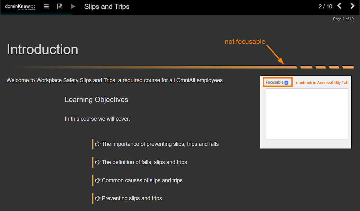
Unchecking the Focusable setting in the Accessibility tab will make a screen reader skip that element. This means vision-impaired users don't waste time hearing a description of an item that has no real value or meaning.
Getting the Whole Picture: Supportive Accessibility Text
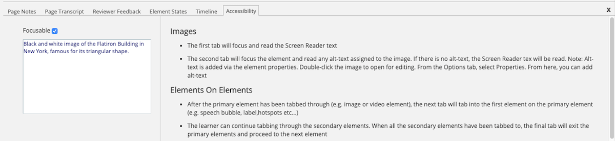
Some elements in a course provide visual cues or information that doesn't appear in the course text. For optimal accessibility, you need to add supportive text to these items. You can input this within the Accessibility tab as alt-text or screen reader text.
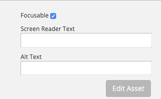
Doing so ensures all learners experience the entire course. It can also prevent learners from getting confused by the way their assistive technology interacts with project elements.
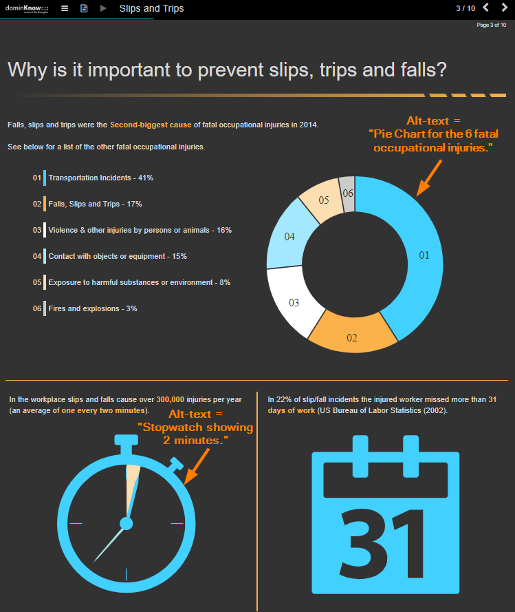
Alt-text is useful for providing brief information about focusable images. In the Slips and Trips example, there is one long page of infographics whose alt-text is a good demonstration of best practices. These include:
- Making alt-text descriptions succinct
- Including the purpose or function, if applicable
- Skipping the phrase "Image of," since most screen readers will provide this beforehand
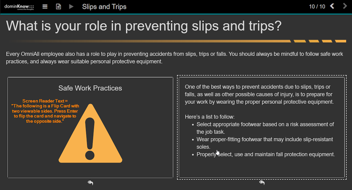
For elements that require a more detailed explanation, you would use the Screen Reader Text field, instead.
In this eLearning example, interactive elements like flip cards or carousels have screen reader text that explains how to access the content using a keyboard. For example, the screen reader text on a pair of flip cards reads, "The following is a Flip Card with two viewable sides. Press Enter to flip the card and navigate to the opposite side."
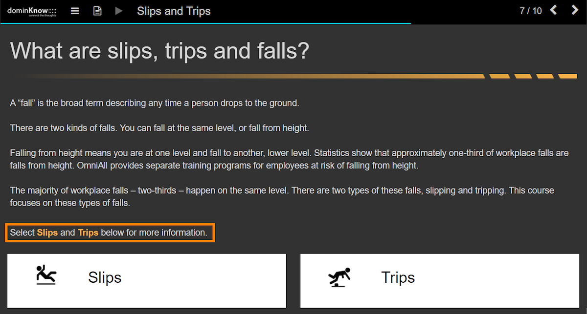
You may also notice that throughout this eLearning example, aside from alt-text and screen reader text, there are explanations of interactive elements within the course text itself.
This is less an accessibility feature of dominKnow | ONE and more an example of an inclusive authoring choice. Placing instructions within the text is more appropriate when visual cues are ambiguous, therefore opening the door for confusion regardless of whether learners use screen reader technology.
For example, in the screenshot below, the final sentence of the main text area prompts a user to click on the tabs below for more information – a step that learners of all visual acuity could potentially miss.
One Thing Leads to Another: Ensuring Meaningful Focus Order
The order in which focusable items appear as you tab through a page can be illogical if programming isn't done with a mind toward accessibility. Quirks of the source code can cause a screen reader to jump between elements out of sync with the way a sighted person would navigate.
We took pains, through internal testing, to ensure that screen readers take a sensible pathway through projects authored in either "mode" of dominKnow | ONE.
The Slips and Trips eLearning example was built in Flow, our responsive authoring tool. Responsive design lends itself naturally to a logical focus order, so the effort to ensure good movement largely focused on components like tabs and other template elements that are programmatically complex.
Things work a little differently in Claro, our fixed-pixel authoring tool. We put the same care into the focus order of Claro as Flow, but in Claro, the author's choices have an unavoidable impact on focus order.
As in conventional presentation software, fixed-pixel authoring tools use layers to create and organize complex page content. These layers offer creative flexibility and enable animations that aren't possible in Flow. However, the order in which you "stack" these layers affects the way a user moves through the content with the tab key.
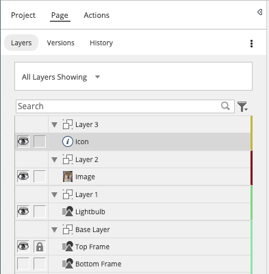
The focus order for layers on a page is bottom-to-top, as they appear in the Layers Panel. The order for elements within each layer is top-left to bottom-right.
So, authors need to make sure the stacking order makes sense for a screen reader. For example, the title of a page should be placed within the layer that is lowest on the list. Within that layer, the title would need to be the upper-left-most element. Together, this would guarantee that the title is read by assistive technology first.
The focus order would then move through elements in the same layer before jumping to the layer immediately above it, and so on.
If you want to optimize screen reader accessibility in a Claro project, you should take a moment to check and clean up the layer order of each page. Making extraneous items unfocusable can also smooth the experience.
None of this means creating accessibility in Claro is impossible or that you should only use Flow. Each of these tools has its own strengths and applications. They just require a slightly different approach.
Accessibility with Options: Transcripts for Streamlined Screen Reading
Regardless of how carefully focus order and focusable elements are constructed, some learners may not want the hassle of tabbing through so many items.
That's why we provide the Page Transcript option in our authoring tool.
You can see it in the Slips and Trips eLearning example by selecting the dogeared page icon in the upper left. A panel slides out from the side that contains all the substantive text on that page. You may choose to omit less useful items like image alt-text.
You can see the potential streamlining in the example below. The alt-text description of the image in the middle of the course page ("Caution sign emoticon of a person tripping") doesn't appear in the transcript. The transcript version also makes the hyperlink to dominKnow at the bottom right of the page easier to digest through a screen reader by breaking the phrase into two separate sentences.
Although no videos are included in this sample course, you can also add sophisticated interactive transcripts to video or audio media.
Can You See The Pretty Colors: Accessible Palettes & WCAG-Compliant Themes
In this eLearning example, we applied a color palette with a contrast ratio of around 9:1 for the regular text and 6.5:1 for emphasis text. That's well above WCAG recommendations.
We comply with WCAG 2 Level AA standards, which call for text and interactive elements to have a color contrast ratio of at least 4.5:1. If the text is "large," then 3:1 is acceptable. Large text is defined as anything above 18pt or 24px in a regular weight. If the text is in a bold weight, the minimum "large" size is 14pt or 19px.
Why are contrast ratios important? All learners have trouble reading text when the contrast ratio is too low. An accessible contrast ratio allows certain learners with low vision or color vision deficiency to distinguish the text. High contrast text also reduces the likelihood of eyestrain for everyone.
We design some of our system themes specifically for this type of accessibility, so you don't have to calculate contrast ratios. Look for the WCAG compliant icon when you browse our themes.
Accessibility and Beyond
The accessibility features we discussed above are just the ones that appear in our Slips and Trips eLearning example. We have so much more to offer, in accessibility and beyond.
Want to learn more? Contact us today for a free 14-day trial or to request a demo from our experts.
Related Resources
.png)
New to IDIODC?
Instructional Designers in Offices Drinking Coffee (#IDIODC) is a free weekly eLearning video cast and podcast that is Sponsored by dominknow.
Join us live – or later in your favourite app!