Pictures…

Diagrams…
Charts…

They don’t just look pretty. They can also be a useful means of delivering extensive information to your audience in a concise format.
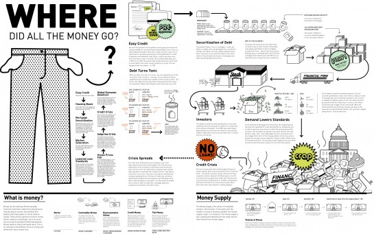
For example, how would you explain the GFC to your colleagues? Via a thousand words of text, or via this infographic:
On the space of one page, this graphic does a good job of explaining the key concepts of a complex and convoluted situation.
Multimedia summaries
The power of pictures has been recognised in educational psychology for a long time.
For example, back in 1996, Richard Mayer and several of his colleagues from the University of California studied the effects of a multimedia summary (a sequence of annotated illustrations depicting the steps in a process) on learning how lightning is formed.
Through a series of experiments, the researchers found that the students who read a multimedia summary on its own recalled the key explanative information and solved transfer problems as well as or better than the students who read the multimedia summary accompanied by a 600-word passage. Both groups of students performed as well as or better than the students who read the text passage on its own.
I consider these results important because, not only do they support the idea of pictures enhancing learning, but they also suggest that an infographic can achieve similar learning outcomes whether or not it is accompanied by a relatively large amount of text.
The researchers interpreted their results in terms of their “cognitive theory of multimedia learning”, which draws heavily from cognitive load theory. They proposed that lengthy verbal explanations may in fact distract the learner with unnecessary information, which adversely affects their cognitive processing and thus their learning.
In contrast, a concise infographic provides only the important information. This reduces the cognitive load, making it easier to process and to “learn”.
Text ain’t half bad
I’ve professed my support of text in a previous blog article, so before we all abandon tedious words in favour of flashy infographics, I caution that text will always have its place – especially to explain the details.
For example, the multimedia summary studied by Mayer may have been sufficient for first-year science students, but probably not for meteorology majors. Those guys need the detail, and text is usually the most efficient way of providing it.
However, I still feel that pictures can be a useful pedagogical device for students who aspire to be experts. In particular, by using an infographic as an advance organizer or pre-reading, the instructional designer can promote a mental model of the domain.
This approach enables the student to devote their cognitive efforts to processing the initial conceptual framework, prior to following it up with more substance once a broad understanding of the main concepts is achieved.
My two cents’ worth
So, in summary, here is my reflection on the power of pictures:
- Pictures look pretty. Use them to increase engagement.
- A picture paints a thousand words. Use one to replace wads of text.
- An infographic is a concise means of delivering the key concepts to novice students.
- An infographic can provide experts-to-be with an initial conceptual framework, which can subsequently be “filled in” with further detail.
Putting it into practice
I decided to put my ideas into practice and create an infographic for my workplace.
So, using nothing more than Microsoft PowerPoint and some clipart, I created a customer-centric explanation of what we do:

I feel this picture would be a useful addition to our inductions, to explain to new recruits up-front the overall purpose of our company.
The graphic may also act as an introductory piece for our product training, placing it into context for the learner.
The graphic might even act as an attractive desk poster to reinforce the key messages on a day-to-day basis.
I’m sold, give me more!
For more smokin’ hot graphics about a whole range of topics more interesting than finance, visit 40 Useful and Creative Infographics.
If you can’t find any relevant pictures, create your own!


as a predominantly visual learner, I can’t agree more about the importance of images. I tend to find when designing programs and materials that I always refer back to models like VARK to ensure that I’m not being too visual with my design.
Also, I once heard a remark in a class that you can sometimes hear a strong communication preference by investigating (I almost wrote looking at… there’s that visual for you) how people give street directions.
Most people tend to retain more data with visuals when learning, rather than paragraphs of black text on a white background. But the key is to have a balance of text and white space, and to have visuals that are relevant to the content on the page.
Pictures, color, and graphics are definitely more captivating then black and white text. Dr. Ruth Clark actually believes that a balance of white space and graphics/images on the page significantly improves learner retention rates.
If you are implementing a new training plan for your organization be sure to find out how your users/clients or employees learn best.