.svg)
eLearning Infographic sample: A Brief History of Wind Power


If you are an eLearning developer, you have likely learned that your authoring tools can do more than develop eLearning courses. The days of PowerPoint-style courses being your only option are long gone. The era of mobile devices and responsive web designs have expanded our ability to create more types of digital learning content.
Infographic as Learning Content?
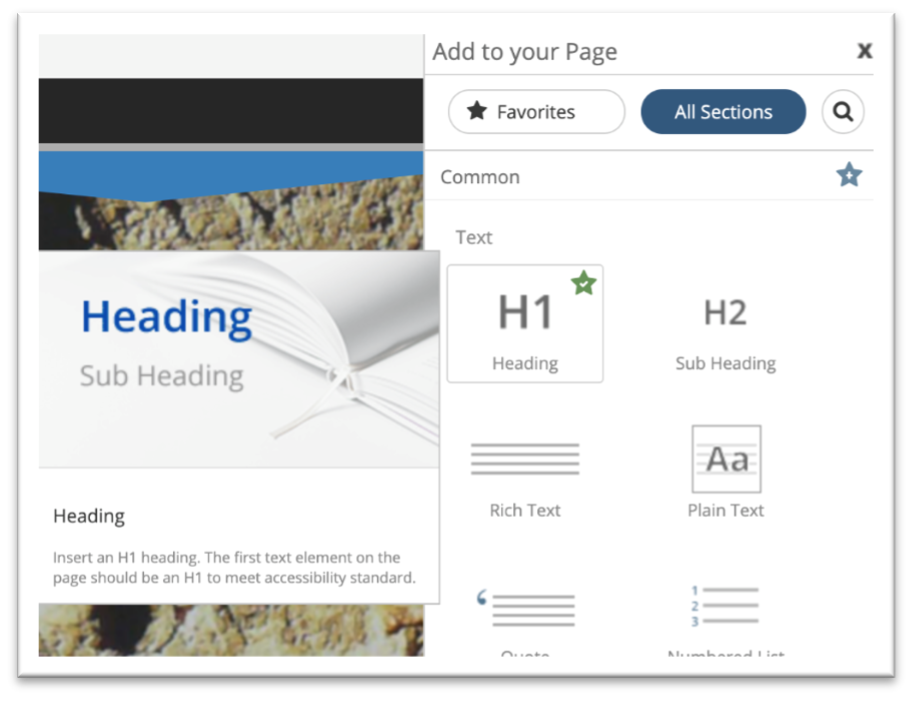
In this article we’ll review a popular design style called the infographic. Infographics are used to present an overview of complex content in a clear, concise, and visually appealing image. If you are new to infographics, you can learn more about them on the Infographic wikipedia page.
One of the most common infographic styles is the timeline. Infographics are great for quickly communicating historical context and organizing decades or centuries of content is the perfect use of a visual timeline.
A Brief History of Wind Power
While I’m not the one giving you a brief history of wind power, my friend Tom Spiglanin at Palm Spring Windmill Tours would be happy too. We’ve used Tom’s original infographic which he asked me to review and ultimately started this project.
Tom’s image got my attention because of the simple timeline depicting “A Brief History of Wind Power”. Tom is a retired L&D professional and now working with Palm Springs Windmill Tours. He created the following prototype infographic poster and was looking for some feedback. My feedback was, “can I turn it into a responsive web infographic for you?”

Tom answered with an enthusiastic “Yes”! And as most Instructional Designers know, there is nothing more important than having access to a motivated SME.
Tom sent me the original image files and the text, and with a few hours free over a weekend I created a single page scrolling infographic using the Flow authoring option in dominKnow | ONE.
Here's a link to the responsive infographic I made.
Open the link and take minute or two to scroll through the infographic first. Then continue reading to learn how it was constructed.
Building this eLearning Infographic in dominKnow | ONE
This project is a very simple setup, but it takes advantage of a few very cool responsive features that, with dominKnow |ONE, were very easy to add.
- Header Section
- Subheading Section
- Divider Section
- Content Section
- The Divider and Content Sections are then duplicated over and over for the other sections.
Header Section
The header section uses a single H1 text element.
The image is a background image in the section.
The section properties are set to 100% Height and 25% Alignment. The 100% Height option enabled me to make sure that, no matter what device or screen size, the learner saw this section fill their entire screen when they first viewed the content.
Subheading Section
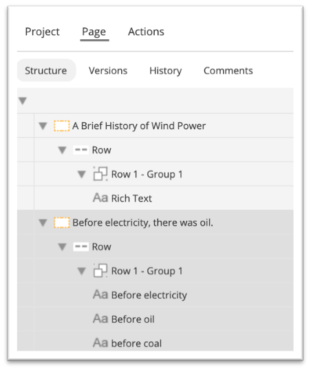
This section was created by inserting 1 text element and then duplicating it 2 times. All 3 text elements are set to H2 in the Format tab. When you duplicate an element and place it above or below the original it ends up inside the same group, row, and section as the original. This helps the content to “hang together” as screen sizes change.
You can also see the element hierarchy and structure in the Page tab as seen in this image.
The image effect is created by adding a background image to each text element. To have the text element appear to scroll over the image we use the same settings as the Content Section properties in the Content Sections section below.
Pages, Sections, and media elements are the only elements that can have a background image. However, you can change background colors on media elements, groups, rows, sections, and pages.
Design Note: Another common design choice is to have the H2 subheading text element within the same section as the H1 heading text. Because, in this case, the subheading is more like a new page of content than a traditional subtitle, we chose to put it in its own section.
Divider Sections
Section Dividers are exactly what you would think: They are premade sections designed to separate content sections on a page and provide a bit of flair.
You won’t always need a divider between your content sections, but knowing they are available as templates, speeds up your design prototyping process.

Content Sections
When a text element is inserted, it is added within a group, in a row, in a section, and of course on the page. Even if the text is the only element, it sits inside of a group, in a row, in a section, on the page.
So, by inserting a text element you’re also adding the elements it sits inside: a group, a row, and a section. Even though you don’t need to know this when adding content, it does give you a window into many of the design possibilities.
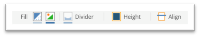
In this case, to achieve the desired effect we add the image as a background image to the section.
The Media Background popup shows the settings we used to achieve the effect of scrolling the view port over the top of the background.
- The position is set to center the image within the section.
- Fit is set for the image to fill the width of the screen.
- Scroll is set for the background to remain still as the viewport scrolls over it.
If you scroll back to the top of the page you can see that the background images also moves as you scroll. We could have chosen to use the same settings described above to lock it in place as the view port, and other content, scrolls over it. As in the opening section or “Title Section” we made the decision to have it scroll with the view port to distinguish it from the timeline content sections.
As you begin to test out more of the Media Background settings you’ll discover a wide range of options for creating these different visual experiences for your users.

Conclusion
This is the type of learning content that is perfect for responsive design solutions. And with the many prebuilt section templates within dominKnow | ONE, it also takes very little time to develop. Well, that is, if you have a subject matter expert like Tom Spiglanin to create the content first.
Projects like this are also great opportunities for new eLearning developers to apply their design ideas, learn new tools, and add to their career portfolio. And if you’re a seasoned professional I’ve found these projects are great for keeping your ideas fresh and for challenging your own prior notions of what responsive designs can be.
Responsive design requires developers to think differently about learning content. It’s a transition in thinking and requires practice. But it’s also fun and we’d love to see what you create.
Not a dominKnow | ONE user already? Sign up for a free trial and see what you can create starting today!
Related Resources
.png)
New to IDIODC?
Instructional Designers in Offices Drinking Coffee (#IDIODC) is a free weekly eLearning video cast and podcast that is Sponsored by dominknow.
Join us live – or later in your favourite app!
Make more than just elearning with dominKnow | ONE!
Explore infographics and more in dominKnow | ONE